


The Gatorade logo stands as one of the most recognized symbols in sports beverage history. It represents more than hydration. It signals athletic performance, endurance, and competition at every level.
A logo carries weight in consumer products. Gatorade’s mark has evolved through multiple iterations since the brand launched in 1965 at the University of Florida. The current version, featuring the iconic lightning bolt and bold wordmark, arrived in 2009.
PepsiCo owns the brand today. The logo has gone through roughly six major redesigns. Each version reflected shifting marketing strategies and design trends of its era.
What is the Gatorade Logo?

The Gatorade logo is a combination mark featuring an italicized wordmark alongside a lightning bolt symbol. Introduced in its current form in 2009, the design was created to represent energy, speed, and athletic power. The bolt serves as both a standalone icon and integrated brand element.
Design Type: Combination mark (wordmark plus symbol)
Primary Elements:
- Lightning bolt icon
- Italicized “GATORADE” wordmark
- Stylized “G” mark for secondary applications
Official Introduction Date: 2009 (current version)
Designer/Agency: Developed in partnership with brand consultants during PepsiCo’s ownership period
Trademark Status: Registered trademark of Stokely-Van Camp, Inc., a subsidiary of PepsiCo
Color Palette:
- Primary Orange: #F26522
- Black: #000000
- White: #FFFFFF
- Secondary Green: #009639 (used in specific product lines)
Usage Context: Product bottles, packaging design, stadium signage, athlete sponsorships, digital marketing, merchandise, and sports equipment
How Has the Gatorade Logo Evolved Over Time?

Gatorade’s visual identity has shifted dramatically across six decades. The brand moved from simple text treatments to dynamic, athletic imagery.
Early versions felt clinical. Almost scientific.
Later designs pushed toward energy and motion. The lightning bolt didn’t appear until the 1990s, and it changed everything about how consumers perceived the brand.
Original Gatorade Logo (1965-1970s)
Years Active: 1965-1970s
Design Description: Basic text-only treatment. The word “Gatorade” appeared in a straightforward typeface without graphic embellishment. Functional rather than flashy.
Color Scheme: Green and white, referencing the Florida Gators connection
Context: Created when Gatorade was still a university research project turned regional product. The design prioritized legibility over brand personality.
Cultural Significance: Established the name recognition that would carry the brand through future decades. Nothing fancy here. Just getting the job done.
Transitional Gatorade Logo (1980s)
Years Active: Early 1980s to late 1980s
Design Description: Updated wordmark with more stylized lettering. The text gained weight and presence.
Color Scheme: Orange began appearing alongside traditional green
Key Changes from Previous: Bolder letterforms. More shelf presence. The brand started looking like it belonged in sports rather than laboratories.
Context: Quaker Oats acquired the brand in 1983. Marketing budgets expanded. The logo needed to compete on television and in retail environments.
Lightning Bolt Era (1990s-2009)
Years Active: 1990s to 2009
Design Description: Introduction of the lightning bolt graphic element. The wordmark became italicized, suggesting forward motion.
Color Scheme: Orange solidified as the primary brand color
Designer: Various iterations developed through agency partnerships
Key Changes from Previous: First appearance of the bolt symbol. This single addition transformed brand recognition completely.
Cultural Significance: Coincided with Gatorade’s dominance in professional sports sponsorships. Michael Jordan. The “Be Like Mike” campaign. The logo became synonymous with elite athletics.
Current Gatorade Logo (2009-Present)
Years Active: 2009 to present
Design Description: Refined lightning bolt with cleaner geometry. Streamlined wordmark. Introduction of the standalone “G” icon for digital and compact applications.
Color Scheme: Orange primary with black and white supporting elements
Key Changes from Previous: Simplified forms. Better digital scalability. The “G” icon allowed flexible placement across social media and app environments.
Context: PepsiCo ownership drove modernization. The G Series product line launch accompanied this refresh.
What Do the Design Elements of the Gatorade Logo Mean?

Every component in the Gatorade logo communicates athletic performance. The lightning bolt suggests instant energy transfer.
Speed. Power. Quick results.
The italicized text reinforces forward momentum. Nothing about this design sits still. It leans into action, matching how athletes think about competition.
Why Did Gatorade Choose These Specific Colors?
Orange dominates Gatorade’s identity for good reason. Understanding color psychology explains why this choice works so well.
Primary Orange (#F26522)
- Symbolizes energy, enthusiasm, and vitality
- Creates urgency and excitement
- High visibility on retail shelves
- Associates with warmth and physical exertion
The color stands out among orange logos in the beverage space because of its specific saturation level. Bright enough to grab attention. Not so neon that it feels cheap.
Black (#000000)
- Adds weight and seriousness
- Creates contrast against lighter backgrounds
- Suggests professional-grade products
What Typography Style Is Used in the Gatorade Logo?
The Gatorade wordmark uses a custom sans-serif font designed specifically for the brand.
Bold weight. Italicized at roughly 12 degrees. No serifs to slow down the visual movement.
The typography feels athletic without trying too hard. Clean edges. Consistent stroke width. Good legibility at small sizes, which matters for bottle labels and digital ads.
Earlier versions used different typeface treatments. The current custom font arrived with the 2009 redesign.
What Are the Hidden Meanings in the Gatorade Logo?
The lightning bolt carries multiple interpretations. Obviously, it represents energy and electrical power.
But look closer.
The bolt’s angle matches the italic slant of the wordmark. This creates unity across design elements. Everything moves in the same direction.
The psychology of shapes tells us diagonal lines suggest action and instability. In sports, instability means movement. Progress. The opposite of standing still.
Some have noted the bolt resembles a stylized “G” when viewed from certain angles. Whether intentional or not, this double reading strengthens brand recall.
How Does the Gatorade Logo Compare to Competitor Logos?
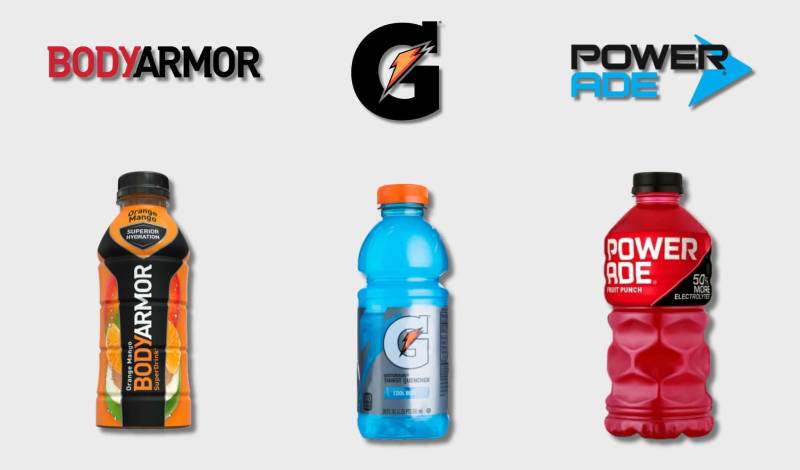
Sports drink branding tends toward similar visual territory. Blue dominates many competitors. Gatorade’s orange creates immediate differentiation.
Powerade uses red and blue. BodyArmor leans into metallic effects. Neither matches Gatorade’s straightforward boldness.
Powerade: Shield-based emblem with layered effects. More complex. Harder to reproduce at small sizes.
BodyArmor: Shield shape with gradient fills. Modern but busy.
Gatorade: Clean symbol plus wordmark. Scales beautifully. Works in one color or full color.
The lightning bolt gives Gatorade something competitors lack. An ownable icon that functions independently from the wordmark. Powerade and BodyArmor rely on their full logos. Gatorade can drop a “G” or a bolt alone and still communicate the brand.
That flexibility matters. Especially in social media environments where space is limited.
What Are the Technical Specifications of the Gatorade Logo?

Official Color Codes:
Primary Orange
Black
- Hex: #000000
- RGB: (0, 0, 0)
- CMYK: (0, 0, 0, 100)
Dimensions and Proportions:
- The lightning bolt maintains specific angular measurements
- Clear space requirements equal the height of the “G” in the wordmark
- Minimum reproduction size ensures legibility across applications
- The standalone “G” icon uses simplified geometry for small-scale use
Working with vector graphics ensures the logo scales without quality loss. This matters for everything from app icons to stadium billboards.
What Cultural Impact Has the Gatorade Logo Had?

Few beverage logos achieve genuine cultural status. Gatorade managed it through relentless sports marketing.
The “Gatorade shower” tradition puts the logo on national television every championship season. Coaches get doused. The brand gets exposure.
Sideline coolers display the logo at every major sporting event. NFL. NBA. MLB. College football. The mark appears in highlight reels constantly.
Athletes recognize the bolt instantly. Consumers associate it with peak performance, even if they’re just recovering from yard work.
How Does the Gatorade Logo Fit Into the Overall Brand Identity?

The logo anchors a broader visual system. Product lines like G Zero, Gatorade Frost, and Gatorade Fierce all reference the parent brand while establishing individual identities.
Each sub-brand modifies color treatments but keeps the bolt consistent.
The Gatorade Sports Science Institute uses the logo alongside scientific messaging. Same mark, different context. Still works.
Proper brand guidelines govern how partners and licensees apply the logo. Consistency across touchpoints builds recognition. The mark appears the same on a water bottle and a stadium scoreboard.
How Should the Gatorade Logo Be Used?
Official Usage Guidelines:
- Never stretch or distort the logo proportions
- Maintain required clear space around all versions
- Use approved color combinations only
- Don’t place the logo on busy backgrounds that reduce legibility
- The lightning bolt should never be separated from approved configurations
Accessing Official Assets:
- Licensed partners receive logo files through PepsiCo brand portals
- Press and media kits available through official Gatorade channels
- Unauthorized use violates trademark protections
Trademark Information:
- The Gatorade name and lightning bolt are registered trademarks
- The “G” icon carries separate trademark protection
- Unauthorized commercial use may result in legal action
Understanding logo design principles helps explain why these restrictions exist. Consistency protects brand equity built over decades.
FAQ on The Gatorade Logo
What Does the Gatorade Logo Look Like?
The Gatorade logo features a bold lightning bolt symbol alongside an italicized wordmark. Orange dominates the color palette.
The design includes a standalone “G” icon for compact applications. Clean lines. Forward-leaning text. The bolt creates a strong focal point that draws attention instantly.
What Does the Gatorade Lightning Bolt Mean?
The lightning bolt represents energy transfer and athletic power. It symbolizes the quick hydration and electrolyte replenishment the sports drink provides.
Speed matters in sports. The bolt communicates instant results.
This symbol aligns with how athletes think about performance and recovery during competition.
When Was the Gatorade Logo Created?
The original Gatorade brand identity launched in 1965 at the University of Florida. Simple text only.
The lightning bolt first appeared in the 1990s. The current logo version debuted in 2009 under PepsiCo ownership, featuring refined geometry and the modern “G” icon.
Who Designed the Gatorade Logo?
Multiple agencies contributed across different eras. The brand worked with various design consultants throughout its logo evolution history.
No single famous graphic designer receives sole credit. PepsiCo’s internal teams and external partners collaborated on the 2009 refresh.
What Colors Are in the Gatorade Logo?
Primary orange (#F26522) leads the brand identity. Black provides emphasis and weight.
The orange hue was chosen for high visibility and energy associations in sports beverage marketing.
Why Did Gatorade Change Its Logo?
Each redesign responded to market conditions. The 1980s update followed Quaker Oats acquisition. More shelf presence needed.
The 2009 refresh supported the G Series product line launch. Digital scalability became a priority. The standalone icon improved web design and social media applications.
What Font Does Gatorade Use?
Gatorade uses a custom font designed specifically for the brand. Bold weight. Italicized stance.
The typography elements suggest forward movement and athletic speed. No serifs. Clean edges throughout the wordmark for strong legibility.
Where Can I Download the Gatorade Logo?
Official logo files come through PepsiCo’s brand portal. Licensed partners receive approved assets directly.
Press kits offer media-approved versions. Random downloads from the web may violate trademark rules. The brand style guide specifies proper file formats and usage.
Is the Gatorade G Logo Trademarked?
Yes. Both the lightning bolt and “G” icon carry registered trademark protection. Stokely-Van Camp, Inc. (a PepsiCo subsidiary) owns the marks.
Unauthorized commercial use triggers legal consequences. The Gatorade trademark symbol appears on all official brand materials.
What Is the History of the Gatorade Logo?
The brand visual identity spans six decades. It started as basic text in 1965 when Robert Cade invented the formula.
The 1980s brought bolder wordmarks. The 1990s introduced the iconic bolt. The 2009 version refined everything for modern hydration brand identity across digital and print design applications.
Conclusion
The Gatorade logo stands among the most recognized symbols in sports beverage history. Six decades of evolution brought us from simple text to the lightning bolt icon now visible at every NFL and NBA sideline.
PepsiCo maintains strict brand recognition standards for good reason. The mark carries real equity.
Understanding color theory and visual hierarchy helps explain why this athletic drink branding works. Orange commands attention. The bolt suggests instant energy.
Few beverage logos achieve this level of cultural status. Gatorade did it through consistent design and relentless sports marketing presence.

Renowned for his expertise in logo design and visual branding, Bogdan has developed a multitude of logos for various clients.
His skills extend to creating posters, vector illustrations, business cards, and brochures. Additionally, Bogdan's UI kits were featured on marketplaces like Visual Hierarchy and UI8.
He also wrote in the past years on sites like Design Your Way, WebDesignerDepot, WPDean, Designmodo, Speckyboy, Slider Revolution, and more.
- The Cursor Logo History, Colors, Font, And Meaning - 24 September 2026
- Top 7 Web Design Subscription Services That Replace Full-Time Hires - 24 September 2026
- Canva vs PowerPoint: Which Is Better for Presentations? - 22 September 2026

Bogdan Sandu is a seasoned designer who has been designing websites since 2008. Renowned for his expertise in logo design and visual branding, Bogdan has developed a multitude of logos for various clients. His skills extend to creating posters, vector illustrations, business cards, and brochures. Additionally, Bogdan's UI kits were featured on marketplaces like Visual Hierarchy and UI8. He also wrote in the past years on sites like Design Your Way, WebDesignerDepot, WPDean, Designmodo, Speckyboy, Slider Revolution, and more.
You Might Also Like


