The Dave’s Hot Chicken logo captures everything the brand stands for: bold flavors, no-frills attitude, and a street food origin story that actually feels authentic. It’s not trying to be fancy. That’s the whole point.
Founded in 2017 as a parking lot pop-up in East Hollywood, Los Angeles, the brand exploded into a franchise phenomenon backed by celebrity investors like Drake and Samuel L. Jackson. The current logo has remained largely consistent since the early days, though minor refinements happened as the company scaled.
What makes this logo work? It looks like something someone might have scribbled on a chalkboard menu. And that’s exactly why it works.
What Is the Dave’s Hot Chicken Logo?
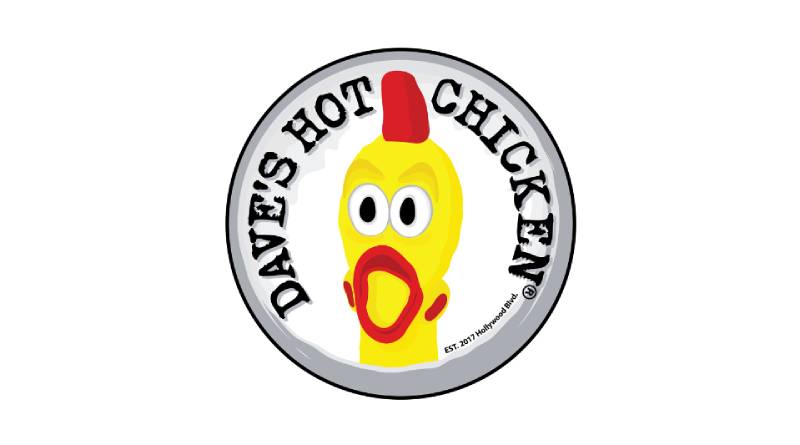
The Dave’s Hot Chicken logo is a custom wordmark featuring hand-drawn style lettering in red and white. It was introduced around 2017 when the brand launched. The design reflects Nashville hot chicken culture with an intentionally rough, casual aesthetic that signals authentic street food roots.
Design Type
Wordmark with custom hand-lettered typography. No separate icon or mascot element.
Primary Elements
- Custom hand-drawn letterforms
- Stacked text arrangement (“DAVE’S” above “HOT CHICKEN”)
- Intentionally imperfect letter spacing
- Rough edges on characters
Official Introduction Date
2017, coinciding with the brand’s founding as a pop-up operation.
Designer/Agency
The original logo emerged from the founders’ early branding efforts. Specific designer attribution isn’t publicly documented, which honestly fits the scrappy startup vibe.
Color Palette
- Primary Red (approximately #C41E3A)
- White for backgrounds and contrast
- Black used in secondary applications
Usage Context
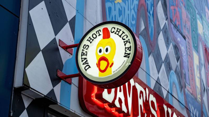
Restaurant signage, menu boards, packaging, merchandise, mobile app, and social media. The logo appears on everything from employee uniforms to the chicken tender boxes.
How Has the Dave’s Hot Chicken Logo Evolved Over Time?
The logo hasn’t undergone dramatic transformations since launch. Most changes involved subtle refinements rather than complete redesigns.
This consistency makes sense. When your brand identity already communicates exactly what you want, why mess with it?
Original Dave’s Hot Chicken Logo (2017-2019)
Years Active: 2017 to approximately 2019
Design Description: Raw, hand-painted aesthetic. The letterforms looked genuinely handmade with visible imperfections in stroke weight and letter shapes.
Color Scheme: Red lettering on white, occasionally reversed.
Context: Created for a parking lot pop-up. The founders needed something fast, cheap, and attention-grabbing. They got all three.
Cultural Significance: Represented the DIY spirit of LA’s food scene. No corporate polish. Just good chicken and honest branding.
Refined Dave’s Hot Chicken Logo (2019-Present)
Years Active: 2019 to present
Design Description: Same core concept with cleaned-up execution. Letter shapes became slightly more consistent while retaining the hand-drawn character.
Color Scheme: Standardized red with defined hex values for franchise consistency.
Key Changes from Previous: Improved legibility at smaller sizes. Better digital reproduction. The “imperfections” became more intentional and controlled.
Context: Franchise expansion required a logo that could scale across hundreds of locations while maintaining brand recognition.
What Do the Design Elements of the Dave’s Hot Chicken Logo Mean?
Every visual choice in this logo points back to authenticity and heat. The rough lettering says “we started small.” The red screams “this food is spicy.”
Nothing about this design tries to be something it’s not.
Why Did Dave’s Hot Chicken Choose These Specific Colors?
Red dominates for obvious reasons. It signals heat, spice, and intensity. Understanding color psychology explains why so many fast food logos use red.
It triggers appetite and creates urgency.
White provides the necessary contrast for readability. Together, these colors create a color palette that’s impossible to ignore on a busy street corner.
The specific red sits somewhere between fire engine and chili pepper. Warm enough to feel inviting, intense enough to promise real heat.
What Typography Style Is Used in the Dave’s Hot Chicken Logo?
The typeface is custom and hand-lettered. You won’t find it in any font library.
Letter shapes vary slightly, mimicking actual handwriting. The kerning appears deliberately inconsistent.
This approach creates personality. A geometric sans-serif font would feel corporate and cold. The hand-drawn style feels human and approachable.
What Are the Hidden Meanings in the Dave’s Hot Chicken Logo?
There’s no elaborate symbolism here. No hidden chicken shape in the negative space. No secret messages.
The “hidden meaning” is actually the absence of hidden meaning.
In an industry full of overthought logos, Dave’s Hot Chicken succeeds by being straightforward. The name tells you what they sell. The style tells you they’re not pretentious about it.
How Does the Dave’s Hot Chicken Logo Compare to Competitor Logos?
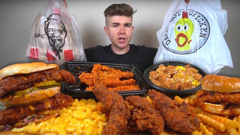
Most Nashville hot chicken competitors lean into similar visual territory. Red appears frequently. Hand-drawn aesthetics show up often. But few execute it as cleanly.
Compare it to larger chains and the difference becomes obvious.
KFC uses a refined illustration of Colonel Sanders. Chick-fil-A has that polished cursive script. Popeyes went bold and angular.
Dave’s Hot Chicken sits in a different space entirely. It looks more like an independent restaurant than a franchise, even though it now operates hundreds of locations.
That’s a tricky balance to maintain. Most brands lose their indie credibility during expansion. This one hasn’t. Yet.
What Are the Technical Specifications of the Dave’s Hot Chicken Logo?
Official Color Codes
Primary Red
White
- Hex: #FFFFFF
- RGB: (255, 255, 255)
- CMYK: (0, 0, 0, 0)
Black (Secondary)
- Hex: #000000
- Used for certain applications and text elements
Dimensions and Proportions
The stacked arrangement creates a roughly square overall shape. This works well for social media profile images and app icons.
Minimum size requirements exist for franchise applications, though specific measurements aren’t publicly available.
Clear space around the logo typically equals the height of the “D” in Dave’s.
What Cultural Impact Has the Dave’s Hot Chicken Logo Had?
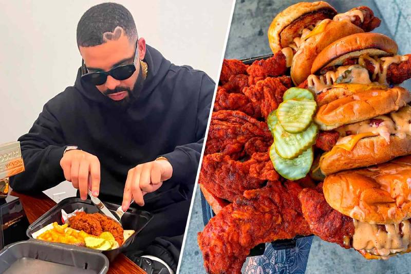
The logo helped legitimize the “elevated street food” aesthetic in restaurant branding. It proved that a scrappy, hand-drawn look could scale nationally.
Other emerging chains took notice. The past few years brought dozens of similar visual identities to market.
Beyond industry influence, the logo became recognizable in pop culture through celebrity associations. When Drake invests in your chicken spot, people pay attention to every visual detail.
How Does the Dave’s Hot Chicken Logo Fit Into the Overall Brand Identity?
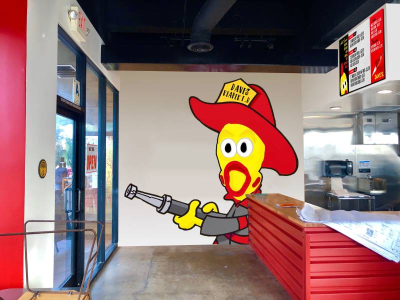
The logo anchors a cohesive brand system. Interior design at locations features the same red-and-white palette. Menu boards use similar hand-drawn type treatments.
Even the spice level names (Lite, Medium, Hot, Extra Hot, Reaper) carry through the no-nonsense communication style.
This creates strong unity across touchpoints. Walk into any location and you’ll recognize it immediately. The brand guidelines clearly work.
How Should the Dave’s Hot Chicken Logo Be Used?
Official Usage Guidelines
Do:
- Maintain the red-on-white or white-on-red color relationship
- Preserve the stacked text arrangement
- Use provided logo files for all official applications
- Maintain required clear space
Don’t:
- Stretch, skew, or distort the proportions
- Apply unauthorized color treatments
- Recreate the logo using standard fonts
- Place the logo on busy backgrounds without proper contrast
Accessing Official Logos
Franchisees receive logo assets through corporate brand portals. Media inquiries typically go through the company’s PR channels.
Trademark Protection
The Dave’s Hot Chicken name and logo are trademarked. Unauthorized commercial use isn’t permitted. Fan art exists in a gray area, as with most brands.
FAQ on The Dave’s Hot Chicken Logo
What Does the Dave’s Hot Chicken Logo Look Like?
The logo features a custom wordmark with hand-drawn red lettering on white. “DAVE’S” stacks above “HOT CHICKEN” in rough, imperfect letterforms.
It looks deliberately unpolished. Think chalkboard menu at a parking lot pop-up, not corporate franchise.
What Colors Are Used in the Dave’s Hot Chicken Logo?
Red and white dominate the brand identity. The primary red (around #C41E3A) signals heat and spice. White provides clean contrast.
This combination appears across all Nashville hot chicken restaurant branding for good reason. It works. The hue sits between fire engine and cayenne pepper.
Who Designed the Dave’s Hot Chicken Logo?
No specific designer has been publicly credited. The founders, including Dave Kopushyan and Arman Oganesyan, developed early branding themselves.
This fits their origin story. A parking lot operation in East Hollywood doesn’t hire fancy design agencies. They just make something that works.
When Was the Dave’s Hot Chicken Logo Created?
The logo emerged in 2017 when the brand launched in Los Angeles. It has remained largely unchanged since then.
Minor refinements happened during franchise expansion. But the core design elements stayed consistent throughout the company’s growth.
What Font Is Used in the Dave’s Hot Chicken Logo?
It’s not a standard font. The typography is custom hand-lettered, created specifically for the brand.
You won’t find it downloadable anywhere. The irregular tracking and varied stroke weights give it that authentic street food character.
Has the Dave’s Hot Chicken Logo Changed Over Time?
Not dramatically. The visual identity stayed consistent from pop-up to franchise.
Some cleanup happened for better reproduction across print design and digital applications. The hand-drawn aesthetic remains intact though. Smart move, honestly.
What Does the Dave’s Hot Chicken Logo Mean?
The rough lettering represents authenticity and humble beginnings. No hidden symbols or clever negative space tricks here.
It communicates exactly what the brand sells: hot chicken. The emphasis falls on straightforward messaging over fancy design concepts.
Can I Use the Dave’s Hot Chicken Logo?
Not commercially. The trademark protects the logo from unauthorized use on products or marketing materials.
Fan content exists in gray areas. For official partnerships or media use, contact their corporate team directly through proper channels.
Where Can I Download the Official Dave’s Hot Chicken Logo?
Franchisees access logo files through internal brand portals. The company doesn’t offer public downloads of vector graphics files.
Media outlets typically request assets through PR contacts. Random downloads from image sites? Probably low-quality bitmap versions. Not recommended.
Why Is the Dave’s Hot Chicken Logo Red?
Red signals spice and heat. It also triggers appetite, which explains why red logos appear throughout the food industry.
The choice aligns with color theory basics. Red grabs attention on busy streets and creates urgency. Perfect for a spicy chicken franchise competing for customers.
Conclusion
The Dave’s Hot Chicken logo proves that expensive design agencies aren’t always necessary. Sometimes a hand-drawn wordmark beats polished corporate graphics.
This Nashville hot chicken brand built recognition through consistency and authenticity. The red and white restaurant signage stands out from Los Angeles to every new franchise location.
Celebrity investors like Drake noticed. So did millions of customers.
The logo follows solid logo design principles without feeling calculated. It tells a story about street food origins and staying true to those roots, even after rapid expansion.

Renowned for his expertise in logo design and visual branding, Bogdan has developed a multitude of logos for various clients.
His skills extend to creating posters, vector illustrations, business cards, and brochures. Additionally, Bogdan's UI kits were featured on marketplaces like Visual Hierarchy and UI8.
He also wrote in the past years on sites like Design Your Way, WebDesignerDepot, WPDean, Designmodo, Speckyboy, Slider Revolution, and more.
- How to Install Fonts on Mac (Step-by-Step Guide) - 20 September 2026
- From Mockup to Code: How AI-Augmented Development Speeds Up the Design Handoff - 19 September 2026
- The Beehiiv Logo History, Colors, Font, And Meaning - 18 September 2026

Bogdan Sandu is a seasoned designer who has been designing websites since 2008. Renowned for his expertise in logo design and visual branding, Bogdan has developed a multitude of logos for various clients. His skills extend to creating posters, vector illustrations, business cards, and brochures. Additionally, Bogdan's UI kits were featured on marketplaces like Visual Hierarchy and UI8. He also wrote in the past years on sites like Design Your Way, WebDesignerDepot, WPDean, Designmodo, Speckyboy, Slider Revolution, and more.
You Might Also Like