


Look at the FedEx logo long enough and you’ll spot an arrow hiding between the letters. That’s negative space at work, and it’s one of the most powerful techniques in logo design.
So what is negative space in logo design, exactly? It’s the empty area around and between visual elements that actively shapes meaning, creates hidden imagery, and makes a brand mark unforgettable.
This guide breaks down how figure-ground perception drives the technique, which famous designers have used it best, and how to tell whether a negative space logo is actually working or just being clever for its own sake.
What Is Negative Space in Logo Design

Negative space is the empty area around, between, and inside the main elements of a logo. It’s the part most people don’t consciously look at, and that’s exactly what makes it powerful.
Instead of being “blank” or “leftover,” negative space acts as a structural part of the design itself. It shapes how we read the visible elements. It gives them room to breathe. And when used with intention, it carries meaning on its own.
The concept comes from the figure-ground relationship in Gestalt psychology, a set of perception principles first studied by Max Wertheimer, Kurt Koffka, and Wolfgang Köhler in the early 20th century. Their research showed that the human brain doesn’t process visual elements in isolation. It groups them, fills in gaps, and constantly switches between seeing the “figure” (the main subject) and the “ground” (everything else).
That switching behavior is what negative space logos exploit.
When a designer hides a secondary image in the empty areas of a logo mark, they’re triggering this figure-ground reversal on purpose. Your brain sees the primary shape first, then catches the hidden one. The result is a logo that feels richer, smarter, and more memorable than the sum of its parts.
Logo and brand identity design currently dominates the graphic design market. Mordor Intelligence reports that this segment reached $17.27 billion in 2025, accounting for 31.35% of total market share. Negative space is one of the core techniques driving that kind of brand value because it lets a simple mark carry layered meaning without adding visual clutter.
Think of it this way. Positive space is what you draw. Negative space is what you leave behind. Both tell the story.
How Negative Space Works in Logos
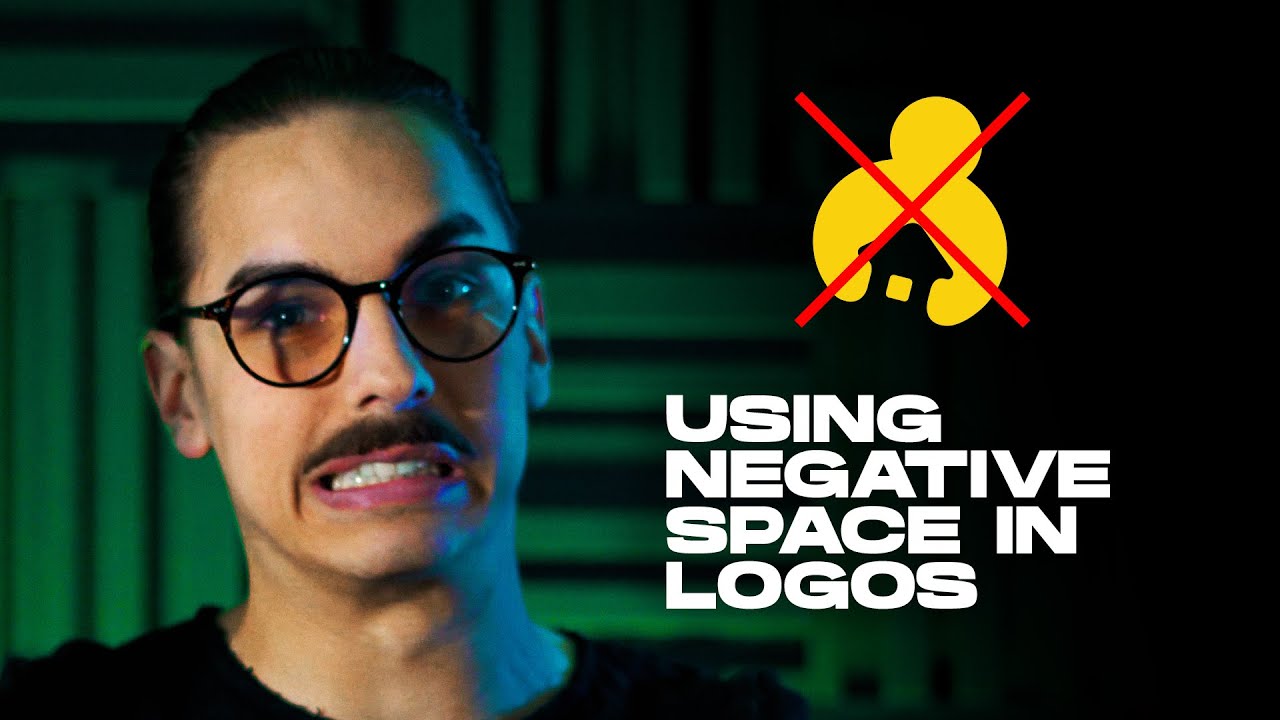
The mechanics are straightforward once you see them. A designer creates a primary shape, and the unused area around or within that shape forms a second, independent image.
Your eye reads the obvious shape first. Then the hidden shape registers, sometimes consciously, sometimes just below awareness. That double reading is what gives negative space logos their sticking power.
Figure-Ground Reversal in Practice
Danish psychologist Edgar Rubin first demonstrated figure-ground reversal with his famous vase illusion. Two face profiles form the “ground,” and the vase between them is the “figure.” Your brain flips between the two interpretations.
Logo designers use this exact mechanism. They build shapes where the boundary between positive and negative space serves double duty, defining two different images at once.
Color contrast is the engine. Without strong tonal separation, the hidden element won’t read. Most successful negative space logos use two colors (or a single color against a background) to make the switch between figure and ground as clean as possible.
Single-Layer vs. Multi-Layer Negative Space
Not all negative space logos work the same way. Some embed a single hidden element. Others pack in two or three readings.
| Approach | How It Works | Best For |
|---|---|---|
| Single-layer | One hidden shape inside or around primary mark | Clear, instant dual meaning |
| Multi-layer | Two or more secondary shapes stacked | Complex brand stories |
| Typographic | Letterforms create shapes in their counters | Wordmark-heavy brands |
Single-layer is easier to pull off. The FedEx arrow is the textbook example: one hidden element, perfectly formed, universally readable.
Multi-layer gets tricky fast. When you stack too many readings into one mark, none of them land properly. Your mileage may vary, but I’ve seen far more multi-layer attempts fail than succeed.
Famous Logos That Use Negative Space
Talking about negative space in the abstract only gets you so far. The real learning happens when you look at specific brand marks that have nailed it.
The FedEx Arrow

Lindon Leader designed the current FedEx logo in 1994 while working at Landor Associates. He combined two typefaces, Univers 67 and Futura Bold, and spent nine months adjusting letter spacing until a forward-pointing arrow appeared naturally between the “E” and the “x.”
Over 40 international design awards. Rolling Stone ranked it among the top eight logos of the last four decades. When the design was first presented, most senior executives didn’t even notice the arrow. CEO Fred Smith spotted it immediately.
More than 200 logo variations were created before the final version emerged. The arrow wasn’t forced. It grew out of typographic precision and obsessive refinement.
The NBC Peacock
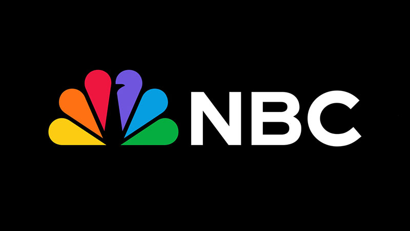
The negative space between the six colored segments of the NBC logo forms the body and beak of a peacock. It’s been there since the 1986 redesign, and it works because the colorful “feathers” are the positive space while the white bird sits quietly in the gaps.
Most people see the colors first. The peacock reveals itself second. That sequencing is classic negative space behavior.
The WWF Panda
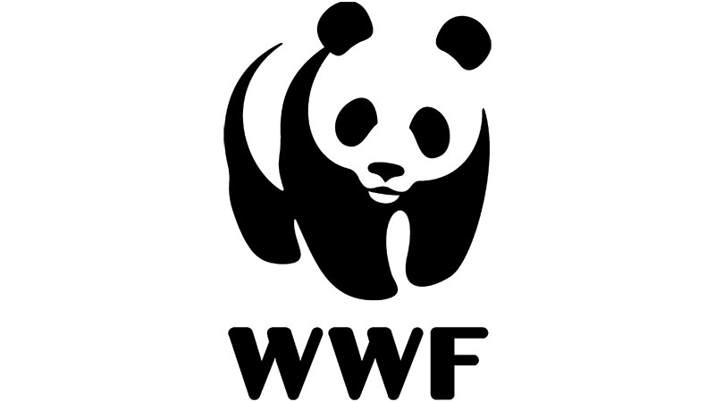
The World Wildlife Fund panda uses black-and-white monochrome contrast to suggest a full panda shape with minimal detail. The white areas of the body aren’t painted in. They’re implied by the black patches and the viewer’s brain fills the rest.
It’s a slightly different technique. Instead of hiding a second image, the negative space completes the primary image. Still Gestalt. Still negative space. Just applied differently.
Lesser-Known Examples Worth Studying
- Spartan Golf Club: A golfer mid-swing also reads as a Spartan warrior helmet in profile
- Guild of Food Writers: A fountain pen nib with a spoon hidden in the center gap
- Pittsburgh Zoo: A tree formed by the negative space between a gorilla and a lion facing each other
These logos don’t have billion-dollar marketing budgets behind them, but designers study them constantly. The Spartan Golf Club mark, in particular, shows up in nearly every design school lecture about dual-meaning logos.
Why Negative Space Makes Logos More Memorable
There’s a reason these logos get shared more, talked about more, and remembered longer. It comes down to how the brain processes visual surprises.
When someone discovers a hidden element in a logo, their brain releases a small hit of satisfaction. That “aha moment” creates a stronger memory trace than seeing a straightforward mark. People remember what they had to work slightly to understand.
Stanford research shows the human brain processes visuals 60,000 times faster than text. Logos are already at an advantage. Add a hidden negative space element and you double the visual information without doubling the complexity.
The Shareability Factor
Negative space logos get shared because discovering the hidden element feels like finding a secret. People want to show others what they just noticed. It’s the same impulse that makes optical illusions spread on social media.
“Did you know there’s an arrow in the FedEx logo?”
That sentence has probably been said millions of times. It’s free brand marketing, triggered entirely by a design decision made in 1994.
Recognition at Speed
A consistent color palette can boost brand recognition by up to 80%, according to Reboot research. Negative space logos tend to use fewer colors and simpler shapes by nature, which helps them score high on instant recognition.
They also tend to scale better. A logo that relies on fine detail loses its punch at small sizes. A logo built from negative space is, by definition, built from large shapes and clear boundaries. So it reads well on a billboard and a favicon alike.
Brands that have transitioned from complex logos to simplified ones have seen a 21% increase in positive brand perception, according to StudyFinds. Negative space is one of the most direct routes to that kind of simplification without losing depth.
Negative Space vs. White Space in Design
People mix these up constantly. And honestly, a lot of design blogs don’t help by treating them as synonyms. They’re related concepts, but they do very different jobs.
White space (or whitespace) is about layout breathing room. It’s the padding around text blocks, the margins on a page, the gap between a heading and a paragraph. It exists to make content scannable and comfortable to read. Web designers think about white space every day.
Negative space in logo design is structural and semantic. It carries meaning. It creates hidden images, secondary readings, and visual double-takes. It’s a compositional technique, not a spacing decision.
| Feature | White Space | Negative Space in Logos |
|---|---|---|
| Purpose | Readability, breathing room | Hidden meaning, dual imagery |
| Intent | Passive, functional | Active, communicative |
| Where used | Layouts, pages, UI | Logo marks, symbols |
| Effect | Clarity and comfort | Discovery and memorability |
A logo can absolutely use both. The FedEx mark has generous white space around it in most applications (clean label placement, uncluttered trucks). But the arrow itself is negative space inside the typographic structure.
Confusing the two leads to bad decisions. I’ve watched people add more padding around a logo and call it “using negative space.” That’s not it. Padding is layout. Negative space is design architecture.
How Designers Create Negative Space Logos

The process looks messy from the outside, and that’s because it actually is messy. There’s no formula. But there’s a general sequence that most working designers follow.
Starting With Two Concepts
Every negative space logo starts with at least two ideas that need to merge. Could be the brand name and an industry symbol. Could be an abstract quality (speed, trust, precision) and a literal object. Could be two letters that overlap.
Lindon Leader started the FedEx project knowing he needed to communicate “forward motion” and “reliability.” The arrow wasn’t planned from day one. It emerged from the overlap of concept and craft over months of iteration.
Sketch on paper first. Adobe Illustrator and Figma are great for refining, but figure-ground relationships are easier to spot in loose pencil sketches than in pixel-perfect vectors. The hand catches things the screen misses.
Tools and Techniques
Once the concept clicks on paper, designers move to vector graphics software.
- Pathfinder in Illustrator: Boolean operations (unite, subtract, intersect) let you carve secondary shapes out of primary forms
- Boolean tools in Figma: Same concept, different interface, increasingly popular with younger designers
- Manual bezier adjustment: The final polish almost always comes from hand-tweaking anchor points to make the negative space “read” properly
Took me forever to accept that the automated tools only get you about 70% of the way there. The last 30% is manual refinement, adjusting curves pixel by pixel until the hidden image clicks.
Common Mistakes When Designing With Negative Space
This is where most attempts fall apart. The concept is sound, but the execution breaks down.
Forcing a hidden image that doesn’t fit. If you have to distort your letterforms or primary shape beyond recognition to embed a secondary image, it’s not working. The hidden element should feel natural, almost inevitable. Not like a puzzle you crammed together.
Making it too subtle. If nobody sees the hidden element after staring at it for five seconds, it’s not doing its job. The FedEx arrow works because it’s genuinely hard to unsee once you’ve noticed it. There’s a sweet spot between “hidden” and “invisible.”
Also, test it small. A negative space trick that only reads at poster size is useless for app icons, social media avatars, and business cards. Considering how many logos now live primarily on screens (Mordor Intelligence found digital platforms dominate the design market’s application segment), scalability isn’t optional.
The psychology of shapes matters here too. Organic, curved hidden elements are generally easier for the eye to resolve than angular, complex ones. Keep the secondary image as simple as the primary one.
When Negative Space Does Not Belong in a Logo
Not every brand needs a hidden arrow or a dual-meaning mark. Sometimes the clever approach is the wrong approach.
Negative space works when a brand has two clear concepts that can overlap, like a delivery company and forward motion, or a food writers’ guild and a pen plus spoon. When those two concepts don’t exist naturally, forcing a hidden element into the design usually backfires.
Brands That Need Zero Ambiguity
Safety-critical industries are the clearest case. Hospital signage, emergency services, pharmaceutical labels. These logos need instant, unambiguous recognition. A figure-ground reversal, even a subtle one, introduces the possibility of misreading.
Medical device company Medtronic, for instance, uses a straightforward wordmark. No hidden shapes. No visual tricks. The brand identity is built on trust and clarity, not cleverness.
Amra and Elma research shows 91% of consumers want a redesigned logo to still feel connected to the original identity. Introducing a hidden negative space element during a rebrand, especially for a legacy brand, can confuse that connection rather than strengthen it.
Pure Wordmarks Without Symbol Components
Some brands are just words. Google. Coca-Cola. Visa.
These typographic logos work because the letterforms themselves carry all the brand’s personality. Trying to embed hidden shapes into a wordmark where no natural figure-ground opportunity exists leads to distorted letters and forced compositions.
The FedEx arrow worked because the specific letter pairing (E and x) created a natural pocket. That’s rare. Most letter combinations don’t produce clean negative space shapes without heavy modification.
The Cleverness Trap
Here’s a thing that happens more often than designers want to admit: the hidden element becomes the entire point of the logo, and the brand message gets lost behind the trick.
A logo that makes people say “oh cool, a hidden elephant” but doesn’t communicate what the company actually does has failed its primary job. Logo design psychology research consistently shows that logos which clearly communicate brand personality are 27% more likely to connect with consumers, according to The Logo Company.
If the brand story doesn’t naturally contain a dual concept, skip the negative space technique. A clean, well-crafted mark with strong balance and good proportions will outperform a forced visual pun every time.
Negative Space in Logo Redesigns and Brand Evolutions
Brands don’t stay still. They grow, merge, shift strategy, and eventually their visual identity needs to catch up. Negative space often enters the picture during these transitions, either introduced for the first time or refined from a rougher earlier version.
Amra and Elma data shows brands see an average 11% revenue increase in the first year after a well-executed logo redesign. And companies that actively promote their new logos experience a 30% spike in web traffic. The redesign itself becomes a marketing event.
Adding Negative Space to an Existing Mark
The FedEx logo evolution is the best-documented case. The original 1973 “Federal Express” wordmark had no hidden elements at all. The transitional 1991 version didn’t either. The arrow only appeared in 1994 when Lindon Leader found the right typeface combination.
That’s the pattern most brands follow. Simplification over time reveals negative space opportunities that were buried under detail in earlier versions.
| Brand | Before | After Redesign |
|---|---|---|
| FedEx | Full “Federal Express” wordmark | Hidden arrow between E and x |
| USA Network | Standard text logo | White “S” formed by negative space |
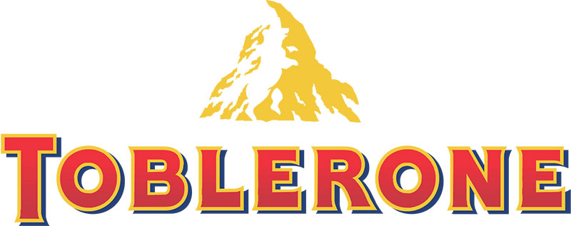
| Toblerone | Detailed mountain illustration | Bear hidden in mountain shape |
Lamborghini’s 2024 logo refresh followed a similar path. The redesign flattened and simplified the iconic bull shield into a 2D version, making the negative space between the bull and the border sharper and more readable at small sizes.
Flat Design and Negative Space
The industry-wide shift toward minimalist design made negative space more visible by default. When you strip away gradients, shadows, bevels, and 3D effects, what remains is shape and space. That’s it.
Linearity research projects that 70% of new logos will follow minimalist principles. Flat, clean marks where the relationship between filled and unfilled areas does most of the communicating.
PayPal’s 2024 identity simplification is a good recent example. The brand stripped its mark down to cleaner lines, and the overlapping “P” shapes now create a more pronounced negative space interplay than the previous version allowed.
Balancing Heritage With New Elements
The tricky part of any rebrand: keeping existing customers while attracting new ones.
Consumer surveys on Jaguar’s 2024 rebrand tell the cautionary tale. Positive impressions dropped from 23.1% to 15.3%, while negative impressions surged from 21% to 40.5%, according to btrax research. The brand departed too far from its heritage too fast.
When introducing negative space into a rebrand, the safest route is evolution, not revolution. Keep the brand style guide colors. Keep the general shape language. Let the hidden element emerge from what’s already there.
How to Evaluate Negative Space in an Existing Logo

Whether you’re reviewing your own logo or assessing a designer’s work, you need a framework. Not opinions. Not “I like it” or “I don’t like it.” Actual checkpoints.
The Squint Test
Blur your vision or shrink the logo to thumbnail size. If the hidden element still registers, it works. If it vanishes entirely, the negative space is too subtle or too dependent on fine detail to survive real-world usage.
AppsFlyer research found that changing an app icon can increase conversion rates by 100%. Logos today live on screens as small as 16×16 pixels for favicons. A negative space element that only reads at billboard size isn’t pulling its weight.
The Discovery Test
Show the logo to someone unfamiliar with the brand. Don’t tell them anything.
- Do they see the primary image? (If not, the overall design has problems.)
- Do they notice the hidden element within 10-15 seconds? (Sweet spot.)
- Do they need it pointed out? (Borderline, but can still work if the primary mark is strong.)
- Do they never see it? (The negative space isn’t doing its job.)
When FedEx’s logo was first presented, most of the company’s own senior executives didn’t catch the arrow. CEO Fred Smith did, and he recognized its value. The line between “pleasantly hidden” and “functionally invisible” is thin.
Brand Message Alignment
The most overlooked check. Does the hidden element actually reinforce what the brand stands for?
FedEx arrow = forward motion and speed. Directly tied to a delivery brand’s core promise.
Guild of Food Writers spoon = writing about food. Perfectly fused with the pen nib.
If the hidden shape is just “cool” but has no connection to the brand story, it’s a party trick. Fun for designers on Dribbble and Behance. Not useful for the business.
Logos that clearly express brand personality perform measurably better. 75% of consumers recognize a brand by its logo alone, according to GaggleAMP research. The negative space element should deepen that recognition, not distract from it.
Context Testing Checklist
Run the logo through every context it will actually appear in before signing off.
| Context | What to Check |
|---|---|
| App icon | Does the hidden element read at 60×60 pixels? |
| Business card | Does the mark hold up at roughly 1 inch wide? |
| Social avatar | Circular crop, does the negative space survive? |
| Monochrome | Remove color. Does figure-ground still work? |
That monochrome test catches a lot of problems. Some negative space logos depend entirely on color contrast between two hues rather than on shape alone. Strip the color out and the hidden element disappears.
If the logo passes all four contexts, the negative space is doing real structural work. If it only passes one or two, the design needs refinement.
FAQ on What Is Negative Space In Logo Design
What is negative space in logo design?
Negative space is the empty area around and between the main elements of a logo. Designers use it intentionally to create hidden shapes, dual meanings, or secondary imagery that makes a brand mark more memorable and layered.
What is the most famous negative space logo?
The FedEx logo is the most recognized example. Designer Lindon Leader embedded a forward-pointing arrow between the “E” and “x” using careful typeface pairing. The mark has won over 40 international design awards since 1994.
How does negative space differ from white space?
White space refers to breathing room in layouts, like margins and padding. Negative space in logos is structural. It carries meaning and creates hidden images rather than just providing visual comfort.
Why does negative space make logos more memorable?
Discovering a hidden element triggers a small “aha moment” in the viewer’s brain. That surprise creates a stronger memory trace than straightforward marks. People also share these logos more because the discovery feels like finding a secret.
What design principle makes negative space work?
The figure-ground relationship from Gestalt psychology drives it. Your brain constantly switches between seeing the main subject (figure) and the background (ground). Logo designers trigger this switch on purpose to embed secondary imagery.
Can any logo use negative space effectively?
No. The technique works best when a brand has two clear concepts that naturally overlap. Forcing a hidden image into letterforms or shapes that don’t support it produces distorted, unreadable results. Some brands are better served by clean, direct marks.
What tools do designers use to create negative space logos?
Most start with pencil sketches to find figure-ground relationships. Then they move to vector software like Adobe Illustrator or Figma. Boolean operations (unite, subtract, intersect) help carve secondary shapes from primary forms.
How do you test if negative space in a logo works?
Shrink the logo to thumbnail size. If the hidden element still reads, it works. Also test in monochrome and across contexts like app icons, business cards, and social media avatars to confirm scalability.
Does negative space only work with two colors?
Strong tonal contrast between figure and ground is what makes the technique readable. Two colors (or one color against a background) is most common. More colors can work but risk muddying the hidden element.
What are common mistakes with negative space logos?
The biggest errors are forcing hidden images that don’t fit naturally, making the secondary element too subtle to notice, and ignoring scalability. A negative space trick that only reads at large sizes fails on screens where most logos live today.
Conclusion
Understanding what is negative space in logo design changes how you look at every brand mark you encounter. The empty areas aren’t empty at all. They carry meaning, create hidden imagery, and make the difference between a logo people glance at and one they remember.
The best negative space logos share common traits: strong color theory foundations, clean figure-ground separation, and a hidden element that genuinely ties back to the brand narrative.
But the technique isn’t for everyone. Some brands need direct, unambiguous marks. Others have the perfect two-concept overlap that makes negative space sing.
Test at small sizes. Test in monochrome. Ask someone who’s never seen the logo if they catch the hidden shape. If it passes those checks, you’ve got something that works harder than most marks ever will.

Renowned for his expertise in logo design and visual branding, Bogdan has developed a multitude of logos for various clients.
His skills extend to creating posters, vector illustrations, business cards, and brochures. Additionally, Bogdan's UI kits were featured on marketplaces like Visual Hierarchy and UI8.
He also wrote in the past years on sites like Design Your Way, WebDesignerDepot, WPDean, Designmodo, Speckyboy, Slider Revolution, and more.
- The Windsurf Logo History, Colors, Font, And Meaning - 10 October 2026
- How to Remove Background From Product Photos (No Photoshop) - 10 October 2026
- How Designers can Build a Stronger Online Creative Identity - 9 October 2026

Bogdan Sandu is a seasoned designer who has been designing websites since 2008. Renowned for his expertise in logo design and visual branding, Bogdan has developed a multitude of logos for various clients. His skills extend to creating posters, vector illustrations, business cards, and brochures. Additionally, Bogdan's UI kits were featured on marketplaces like Visual Hierarchy and UI8. He also wrote in the past years on sites like Design Your Way, WebDesignerDepot, WPDean, Designmodo, Speckyboy, Slider Revolution, and more.
You Might Also Like


