


The Nutanix logo represents one of the most recognizable symbols in enterprise cloud computing and hyperconverged infrastructure. This distinctive brand mark has become synonymous with data center modernization since the company’s founding in 2009.
Within the competitive landscape of enterprise software branding, Nutanix positioned itself alongside industry giants like VMware and Dell Technologies. The current iteration was introduced in 2016 as part of a broader rebranding effort coordinated with San Francisco-based design agency Method.
Founded by Dheeraj Pandey, Mohit Aron, and Ajeet Singh, Nutanix has undergone two major logo refinements since its inception. The original wordmark featured a more technical aesthetic, while subsequent versions evolved toward cleaner, more approachable design language that better reflected the company’s mission to simplify enterprise infrastructure.
What is the Nutanix Logo?
The Nutanix logo is a contemporary wordmark featuring custom sans-serif typography paired with a geometric dot pattern that suggests interconnected infrastructure nodes. Officially introduced in 2016, the design was created by Method agency to represent the company’s hyperconverged platform. The mark symbolizes unified computing resources and simplified data center operations.
Design Type: Combination mark (wordmark with abstract icon element)
Primary Elements:
- Custom sans-serif typeface with slightly rounded terminals
- Grid of dots forming an abstract pattern
- Lowercase letterforms for approachability
- Geometric precision suggesting technical sophistication
Official Introduction Date: March 2016
Designer/Agency: Method (San Francisco-based brand consultancy)
Trademark Status: Registered trademark owned by Nutanix, Inc. (USPTO Registration Number 5076442)
Color Palette:
- Nutanix Blue: #0091DA
- Dark Navy: #003B5C
- Supporting neutrals in grayscale variations
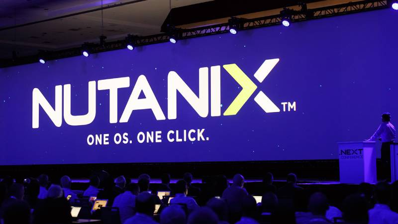
Usage Context: The logo appears across software interfaces (Prism management console), corporate communications, partner materials, conference booth graphics, product packaging, and digital marketing platforms. It’s particularly prominent in enterprise technology publications and data center industry events.
How Has the Nutanix Logo Evolved Over Time?

Nutanix has implemented two distinct logo designs since launching in 2009, reflecting the company’s transition from startup to publicly traded enterprise software leader. The original design emphasized technical capabilities, while the 2016 refresh broadened appeal to business decision-makers beyond IT departments.
Each iteration corresponded with major business milestones. The initial mark coincided with early product launches, while the redesign aligned with the company’s IPO preparation and expanded cloud services portfolio.
Original Nutanix Logo (2009-2016)
Years Active: 2009-2016
Design Description: The founding logo featured an angular, uppercase wordmark with sharp geometric letterforms. A stylized “X” served as the primary visual anchor, rendered with intersecting diagonal strokes that suggested convergence and integration.
Color Scheme: Deep blue (#0047AB) with occasional black variations for print applications
Designer: Created in-house during the company’s founding phase
Context: Introduced when Nutanix emerged from stealth mode with its first hyperconverged infrastructure appliance. The design reflected the highly technical nature of early adopters, predominantly IT administrators and infrastructure engineers evaluating alternatives to traditional three-tier architectures.
Key Changes from Previous: First iteration (no predecessor)
Cultural Significance: Represented the disruption of legacy data center models dominated by separate compute, storage, and networking vendors. The bold, technical aesthetic aligned with the company’s positioning as an infrastructure革命 challenging established players.
Current Nutanix Logo (2016-Present)
Years Active: 2016-Present
Design Description: The current design features a refined lowercase wordmark with softer, more organic letterforms. The signature dot matrix element appears as a standalone icon, composed of multiple circular nodes arranged in a grid pattern with varying opacity levels.
Color Scheme: Bright blue (#0091DA) as primary, with expanded palette including dark navy, teal accents, and warm supporting colors
Designer: Method agency in collaboration with Nutanix brand team
Context: Launched as part of a comprehensive rebrand coinciding with Nutanix’s expansion beyond hyperconverged infrastructure into multi-cloud management, database services, and desktop virtualization. The refresh targeted C-suite executives and business unit leaders, not just technical buyers.
Key Changes from Previous: Lowercase replaced uppercase typography, sharper angles softened to curves, introduction of the modular dot pattern as separate brand element, lighter and more vibrant blue replaced darker tone, overall shift from aggressive to accessible
Cultural Significance: Marked Nutanix’s evolution from infrastructure vendor to enterprise cloud platform provider. The friendlier aesthetic reflected industry-wide shift toward user experience and business outcome messaging rather than purely technical specifications.
What Do the Design Elements of the Nutanix Logo Mean?

The Nutanix logo’s primary visual element, the dot matrix pattern, represents the fundamental concept of distributed computing where multiple nodes work together as a unified system. This directly mirrors the company’s hyperconverged infrastructure architecture, where separate components converge into simplified, software-defined platforms.
The varying opacity of dots suggests resource flexibility and dynamic allocation, core capabilities of Nutanix’s virtualization technology.
What Is the Symbolic Meaning Behind the Nutanix Logo?
The interconnected dots symbolize the convergence of compute, storage, and networking into a single, manageable infrastructure layer. Each node represents an individual server or resource that contributes to collective system intelligence.
This visual metaphor extends to Nutanix’s hybrid cloud philosophy, where on-premises and public cloud resources appear as unified entities rather than siloed environments. The geometric precision reflects reliability and predictability, while the organic spacing between elements suggests scalability without rigidity.
What Historical Context Influenced the Nutanix Logo Design?
The 2016 redesign occurred during a pivotal industry moment when cloud computing shifted from experimental to mainstream enterprise strategy. Traditional vendors struggled to simplify complex infrastructure, creating an opportunity for Nutanix to position itself as the simplification leader.
Method’s design approach drew from modernist principles of form following function. The dot pattern echoes constellation imagery found in early computer science literature, connecting Nutanix to the broader history of distributed systems research dating back to the 1980s.
What Cultural References Are Embedded in the Nutanix Logo?
The logo’s modular aesthetic references the broader tech industry shift toward component-based architectures and microservices. It visually aligns with design languages from companies like Dropbox and Slack that emerged in the 2010s, emphasizing collaboration and integration over isolation.
The dot pattern subtly recalls punch cards and early data visualization techniques, grounding the modern brand in computing history. This creates cultural continuity for IT professionals while remaining accessible to business audiences unfamiliar with technical legacy.
Why Did Nutanix Choose These Specific Colors?

Primary Blue (#0091DA):
Nutanix selected this vibrant blue to convey trust, stability, and technological innovation. The shade sits between the deeper blues of traditional enterprise vendors (IBM, Dell) and the lighter tones of pure-play cloud providers.
Psychologically, this particular blue reduces anxiety around infrastructure changes while suggesting forward momentum. It performs well across digital displays and print materials, maintaining vibrancy in various contexts.
Dark Navy (#003B5C):
The supporting navy provides contrast and depth in applications requiring text legibility or layered information hierarchy. This darker tone connects to financial services and enterprise sectors where Nutanix maintains strong customer bases.
It suggests gravitas and established credibility, balancing the more energetic primary blue. This combination allows the brand to flex between approachable (bright blue dominant) and authoritative (navy dominant) depending on audience and context.
What Typography Style Is Used in the Nutanix Logo?
The wordmark employs a custom sans-serif typeface with humanist characteristics, featuring slightly rounded terminals and optically adjusted letterforms. The lowercase treatment creates approachability while maintaining professional credibility through careful spacing and proportion.
Readability remains strong at small sizes due to generous x-height and open counters. The custom nature prevents commodification, the typography evolved from geometric foundations with organic refinements that prevent the coldness of purely mathematical fonts like Futura or Avant Garde.
What Are the Hidden Meanings in the Nutanix Logo?
The dot pattern contains precisely 16 elements when displayed in its standard 4×4 configuration, a number significant in computing (2^4, representing binary systems and data architecture). Some designers interpret the varying opacity as a visual representation of data deduplication, one of Nutanix’s core storage optimization technologies.
Method’s creative director stated the design intentionally avoided literal imagery (servers, clouds, gears) to prevent rapid obsolescence as technology evolves. The abstract nature allows the mark to remain relevant across product expansions, from databases to Kubernetes management, without requiring redesign.
How Does the Nutanix Logo Compare to Competitor Logos?
Nutanix distinguishes itself through geometric abstraction while competitors often employ literal cloud imagery or legacy computing symbols. VMware maintains angular, architectural forms suggesting infrastructure layers, while Dell Technologies uses geometric shapes evoking traditional enterprise solidity.
The dot pattern provides stronger differentiation than purely typographic marks like those used by Cisco or HPE. Among hyperconverged vendors, Nutanix achieves greater visual memorability than SimpliVity (acquired by HPE) or Pivot3, whose marks relied more heavily on conventional letterform treatments.
The color choice positions Nutanix between IBM’s darker, more conservative blue and Microsoft Azure’s brighter, cloud-focused palette. This middle position reflects the company’s hybrid positioning, bridging traditional enterprise IT and modern cloud-native approaches.
Compared to pure-play cloud providers, Nutanix’s design language appears more structured and less playful. The systematic dot arrangement contrasts sharply with the organic, flowing forms of AWS or the smooth gradients of Google Cloud, signaling different architectural philosophies.
What Are the Technical Specifications of the Nutanix Logo?
Official Color Codes:
Nutanix Blue (Primary):
Dark Navy (Secondary):
- Hex: #003B5C
- RGB: (0, 59, 92)
- CMYK: (100, 36, 0, 64)
- Pantone: 302 C
White (Reversed applications):
- Hex: #FFFFFF
- RGB: (255, 255, 255)
- CMYK: (0, 0, 0, 0)
Dimensions and Proportions:
Aspect Ratio: The full wordmark with icon maintains approximately 3.5:1 width-to-height ratio
Minimum Size Requirements:
- Digital: 120 pixels wide for full logo with icon
- Print: 0.75 inches (19mm) wide minimum
- Icon alone: 24 pixels or 0.25 inches minimum
Clear Space Specifications: Minimum clear space equals the height of the lowercase “n” in the wordmark, applied on all sides
Official Usage Guidelines:
- Do not recreate or modify the logo
- Maintain specified color relationships
- Do not apply effects (shadows, glows, bevels)
- Use only approved file formats from official sources
- Do not place on busy backgrounds that compromise legibility
What Cultural Impact Has the Nutanix Logo Had?
The Nutanix logo became a symbol of infrastructure modernization during the critical 2015-2020 period when enterprises migrated from traditional three-tier architectures to software-defined systems. IT professionals began recognizing the mark as shorthand for hyperconverged infrastructure itself, similar to how Kleenex represents facial tissue beyond the specific brand.
At major industry events like VMworld and Dell Technologies World, the logo’s prominence on conference materials and partner exhibits reflected Nutanix’s rapid market penetration. The dot pattern appeared in countless architectural diagrams and reference materials, becoming visual language for distributed computing concepts.
Within design communities, the 2016 rebrand received recognition for successfully humanizing enterprise infrastructure branding. It demonstrated how technical B2B companies could adopt approachable visual identities without sacrificing credibility, influencing subsequent rebrands by companies like HashiCorp and Confluent.
How Does the Nutanix Logo Fit Into the Overall Brand Identity?
The logo serves as the foundational element of a comprehensive design system extending across product interfaces, marketing collateral, and partner ecosystems. The dot pattern translates into data visualization components within Prism management software, creating visual continuity between brand and user experience.
Nutanix’s brand guidelines specify how the logo interacts with photography styles (authentic data center imagery rather than stock photos), iconography systems (geometric and modular), and typography (extended font family for various applications). This creates cohesive expression across customer touchpoints.
The brand identity positions Nutanix as the “infrastructure invisibility” company, where complex technology fades into the background. The logo’s simplicity supports this messaging, acting as memorable shorthand for simplified operations rather than technical complexity.
How Should the Nutanix Logo Be Used?

Official Usage Do’s:
- Use vector formats (SVG, EPS) for scalability
- Download from official Nutanix brand portal
- Maintain specified color values exactly
- Provide adequate clear space around the logo
- Use reversed (white) version on dark backgrounds
- Place on solid colors or subtle gradients that don’t compromise legibility
Official Usage Don’ts:
- Never rotate, skew, or distort the logo
- Don’t change colors or apply custom tints
- Avoid placing on photographs without sufficient contrast
- Never recreate the logo from scratch
- Don’t use outdated logo versions
- Avoid combining with other company logos without proper spacing
Where to Access Official Logos:
Nutanix maintains a brand resource center at nutanix.com/brand-central where authorized partners and customers can download approved logo files. Standard formats include SVG for web applications, EPS for print production, and PNG with transparent backgrounds for presentations.
Licensing Information:
The Nutanix logo is a registered trademark. Partners must complete brand certification and accept usage terms before incorporating the logo into marketing materials. Customer references require written approval from Nutanix marketing teams.
Trademark Protection Details:
Nutanix actively protects its trademark through USPTO registration and international equivalents. Unauthorized use, particularly implying partnership or endorsement without agreement, may result in cease-and-desist actions. The company monitors marketplace listings, conference materials, and digital properties for trademark infringement.
FAQ on The Nutanix Logo
Where Can I Download the Official Nutanix Logo?
Access official logo files through the Nutanix brand portal at nutanix.com/brand-central. Authorized partners and customers can download vector formats including SVG, EPS, and PNG variations.
Registration and brand certification are required before accessing high-resolution assets for marketing materials and presentations.
What File Formats Are Available for the Nutanix Logo?
Nutanix provides vector graphics in SVG and EPS formats for scalable applications. PNG files with transparent backgrounds are available for presentations and digital use.
Each format maintains proper color specifications and dimensions. AI and PDF versions exist for Adobe Illustrator workflows requiring editable paths.
Can I Use the Nutanix Logo on My Website?
Partners with active agreements can display the logo following brand guidelines. Customer references require written approval from Nutanix marketing teams before publication.
Unauthorized use implying partnership or endorsement violates trademark protections. Always maintain specified clear space and minimum size requirements when implementing the mark online.
What Colors Should I Use for the Nutanix Logo?
The primary Nutanix Blue uses hex code #0091DA with Pantone 2191 C for print applications. Dark navy (#003B5C) serves as secondary color for text and supporting elements.
Never alter the official color palette or apply custom tints that deviate from brand standards.
How Small Can the Nutanix Logo Appear?
Digital applications require minimum 120 pixels width for the full wordmark with icon. Print materials must maintain 0.75 inches (19mm) minimum width.
The standalone icon can appear at 24 pixels or 0.25 inches when space is limited, though the complete mark is preferred.
Can I Change the Nutanix Logo Colors?
No modifications to official colors are permitted under brand guidelines. Use only approved Nutanix Blue or reversed white versions on appropriate backgrounds.
The dark navy variation is reserved for specific applications outlined in the brand style guide, never for arbitrary color preferences.
What Does the Dot Pattern in the Nutanix Logo Represent?
The geometric dots symbolize hyperconverged infrastructure where multiple nodes converge into unified systems. Each element represents distributed computing resources working as integrated platforms.
Varying opacity suggests dynamic resource allocation and flexibility, core capabilities of Nutanix’s virtualization technology and cloud platform.
Who Designed the Current Nutanix Logo?
San Francisco-based agency Method created the 2016 redesign in collaboration with Nutanix’s brand team. The refresh coincided with the company’s expansion beyond infrastructure into multi-cloud management services.
Method’s approach emphasized accessible modernism over aggressive technical aesthetics.
How Is the Nutanix Logo Different from VMware’s Logo?
Nutanix employs modular dot patterns suggesting convergence, while VMware uses angular geometric forms representing infrastructure layers. The color palettes differ significantly, with Nutanix choosing vibrant blue versus VMware’s darker tones.
Both avoid literal cloud imagery but take different symbolic approaches to enterprise technology.
What Trademark Protections Cover the Nutanix Logo?
The mark holds USPTO Registration Number 5076442 as a registered trademark owned by Nutanix, Inc. International protections exist through equivalent registrations in major markets.
The company actively monitors for infringement across digital platforms, marketplace listings, and conference materials to protect brand integrity.
Conclusion
The Nutanix logo stands as a defining symbol within enterprise cloud computing and data center modernization. Its geometric dot pattern effectively communicates the company’s hyperconverged infrastructure philosophy through visual simplicity.
From the original 2009 wordmark to Method’s 2016 refinement, each iteration reflected broader shifts in cloud platform positioning.
The brand identity balances technical credibility with approachable design language. Color specifications, typography choices, and usage guidelines ensure consistent application across software interfaces and marketing materials.
Whether examining the symbolic meaning behind interconnected nodes or comparing the mark to competitors like VMware and Dell Technologies, this corporate identity demonstrates how enterprise software branding can achieve both differentiation and lasting recognition in competitive technology markets.

Renowned for his expertise in logo design and visual branding, Bogdan has developed a multitude of logos for various clients.
His skills extend to creating posters, vector illustrations, business cards, and brochures. Additionally, Bogdan's UI kits were featured on marketplaces like Visual Hierarchy and UI8.
He also wrote in the past years on sites like Design Your Way, WebDesignerDepot, WPDean, Designmodo, Speckyboy, Slider Revolution, and more.
- The Windsurf Logo History, Colors, Font, And Meaning - 10 October 2026
- How to Remove Background From Product Photos (No Photoshop) - 10 October 2026
- How Designers can Build a Stronger Online Creative Identity - 9 October 2026

Bogdan Sandu is a seasoned designer who has been designing websites since 2008. Renowned for his expertise in logo design and visual branding, Bogdan has developed a multitude of logos for various clients. His skills extend to creating posters, vector illustrations, business cards, and brochures. Additionally, Bogdan's UI kits were featured on marketplaces like Visual Hierarchy and UI8. He also wrote in the past years on sites like Design Your Way, WebDesignerDepot, WPDean, Designmodo, Speckyboy, Slider Revolution, and more.
You Might Also Like


