The Percepto logo represents one of the most recognized visual identities in the autonomous drone technology sector. This Israeli company, founded in 2014, has built a brand that communicates precision, innovation, and industrial reliability.
Within the broader landscape of tech company logos, Percepto’s mark stands out for its clean approach. The current version has remained consistent since the company’s major growth phase, reflecting stability in an otherwise fast-changing industry.
The brand has gone through refinements since its founding. Each iteration moved toward greater simplicity. Today’s version balances technological sophistication with approachability.
What is the Percepto Logo?

The Percepto logo is a modern wordmark featuring custom typography in a deep blue color, officially representing the autonomous drone inspection company since its commercial expansion around 2018. The design communicates precision, technology, and trustworthiness through clean letterforms and strategic color choices.
Design Type: Wordmark (logotype)
Primary Elements: Custom sans-serif typography spelling “Percepto” with slightly rounded letterforms
Official Introduction Date: Current version established circa 2018
Designer/Agency: Not publicly disclosed
Trademark Status: Registered trademark of Percepto Robotics Ltd
Color Palette: Deep blue primary (#1A3B5C approximate), with white for reversed applications
Usage Context: Drone hardware, Percepto AIM software interface, marketing materials, trade show displays, investor presentations, digital platforms
How Has the Percepto Logo Evolved Over Time?
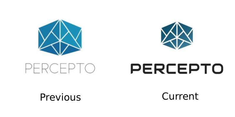
Percepto’s visual identity has undergone subtle refinements since 2014. The company started with a more complex mark during its startup phase.
As the business matured and secured Fortune 500 clients, the branding became cleaner. The current wordmark reflects the company’s position as an industry leader.
Original Percepto Logo (2014-2017)
Years Active: 2014-2017
Design Description: Earlier versions featured more experimental typography with additional graphic elements suggesting drone technology and computer vision.
Color Scheme: Blue tones with occasional accent colors
Designer: Internal team, specific designer unknown
Context: Introduced during the company’s founding as a computer vision platform for drones. This was the startup phase when Percepto developed its PerceptoCore on-board module.
Key Changes from Previous: This was the original mark, establishing the blue color direction.
Cultural Significance: Represented the Israeli tech startup spirit and the emerging drone industry.
Refined Percepto Logo (2018-Present)
Years Active: 2018-Present
Design Description: Streamlined wordmark with custom sans-serif font styling. Clean, professional appearance suitable for enterprise clients.
Color Scheme: Deep navy blue as primary, white for contrast applications
Designer: Not publicly attributed
Context: Coincided with the company’s pivot toward enterprise drone-in-a-box solutions and major partnerships with utilities and energy companies.
Key Changes from Previous: Simplified graphic approach, more refined letterforms, stronger enterprise positioning.
Cultural Significance: Represents the maturation of commercial drone technology and Percepto’s TIME Magazine Best Inventions recognition.
What Do the Design Elements of the Percepto Logo Mean?

The Percepto wordmark carries intentional design choices that reflect the company’s mission. Every curve and angle serves a purpose.
The name itself derives from “perception,” connecting directly to the company’s computer vision technology. The visual treatment reinforces themes of clarity and precision.
Why Did Percepto Choose These Specific Colors?
Deep blue dominates the Percepto color palette. This choice aligns with aerospace and technology conventions.
Blue communicates trust, reliability, and technical competence. For a company whose drones monitor critical infrastructure, these associations matter.
The specific shade sits between navy and royal blue. It reads as serious without feeling cold or unapproachable.
What Typography Style Is Used in the Percepto Logo?
The wordmark uses a custom or modified typeface with geometric characteristics. Letterforms appear clean and modern.
Slight rounding softens the technical feel. This balance works well for a company bridging industrial applications with cutting-edge AI.
The x-height creates good readability at various sizes. Important for a mark that appears on everything from drone hardware to mobile apps.
What Are the Hidden Meanings in the Percepto Logo?
The wordmark prioritizes clarity over hidden symbolism. What you see is what you get.
That said, the clean lines suggest precision. The letter spacing creates a sense of technological order.
Some see the “o” as representing a drone’s circular form or a camera lens. Whether intentional remains unknown.
How Does the Percepto Logo Compare to Competitor Logos?
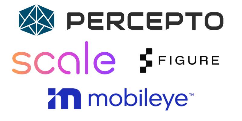
In the autonomous drone sector, most companies lean toward blue color schemes. Percepto fits this pattern while maintaining distinction.
Compared to the Scale AI logo or Mobileye logo, Percepto’s approach is more conservative. Less flashy, more enterprise-focused.
The Samsara logo operates in a similar industrial IoT space with a comparable wordmark strategy. Both prioritize professionalism over creativity.
Where companies like Figure AI or Kodiak Robotics use more distinctive marks, Percepto keeps things straightforward. This suits their Fortune 500 client base.
What Are the Technical Specifications of the Percepto Logo?
Official Color Codes:
Primary Color: Deep Blue
Secondary Color: White
- Hex: #FFFFFF
- RGB: (255, 255, 255)
- Used for reversed applications on dark backgrounds
Dimensions and Proportions:
The logo maintains a horizontal orientation with an approximate aspect ratio of 6:1. Minimum size requirements ensure legibility on drone hardware and digital interfaces.
Clear space specifications typically require padding equal to the height of the letter “P” on all sides. This prevents visual crowding in various applications.
Official assets are available through Percepto’s media kit in vector graphics formats including SVG, PDF, and AI files.
What Cultural Impact Has the Percepto Logo Had?
Within industrial automation circles, the Percepto mark carries significant recognition. The TIME Magazine Best Inventions feature in 2021 boosted visibility considerably.
The logo appears across major infrastructure sites worldwide. From Florida Power & Light substations to Chevron facilities in the Permian Basin.
For drone industry professionals, seeing that blue wordmark signals enterprise-grade capability. It has become shorthand for “serious autonomous inspection.”
How Does the Percepto Logo Fit Into the Overall Brand Identity?
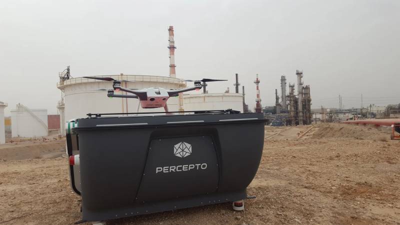
The logo anchors a broader visual system that spans hardware, software, and marketing. Consistency matters when you’re dealing with critical infrastructure clients.
Percepto AIM software carries the branding throughout its interface. The Sparrow drone units display the mark prominently. Marketing materials follow strict brand guidelines.
This cohesion builds trust. When a utility company sees the same professional identity across every touchpoint, it reinforces reliability.
How Should the Percepto Logo Be Used?
Official Usage Guidelines:
- Maintain minimum clear space around the logo
- Do not stretch, rotate, or distort the wordmark
- Use only approved color variations (blue on white, white on blue)
- Do not add effects like shadows or gradients
- Ensure sufficient contrast against background colors
Where to Access Official Logos:
Percepto provides media resources through their official website. The media kit includes various file formats for different use cases.
Licensing Information:
The logo is a registered trademark of Percepto Robotics Ltd. Usage requires express permission from the company for any commercial or promotional purposes.
Trademark Protection:
Unauthorized use may result in legal action. Partners and media should request official assets rather than sourcing from third-party logo databases.
FAQ on The Percepto Logo
What Does the Percepto Logo Look Like?
The Percepto logo is a clean wordmark in deep blue. No icons or symbols, just the company name in custom typography.
The design reflects the Israeli tech startup’s focus on autonomous drone technology. Simple and professional.
It works across digital platforms and drone hardware equally well.
What Colors Are Used in the Percepto Logo?
Deep navy blue serves as the primary color. White appears in reversed applications.
This blue logo approach aligns with aerospace and industrial inspection industry standards. Blue signals trust and technical expertise.
The specific shade balances authority with approachability.
Where Can I Download the Percepto Logo?
Official Percepto logo PNG and vector files are available through the company’s media kit. Third-party sites offer downloads, but official sources ensure accuracy.
The media resources page at percepto.co provides SVG, PDF, and AI formats.
Always request permission for commercial use.
Who Designed the Percepto Logo?
The designer remains publicly unknown. Percepto Robotics Ltd has not disclosed the agency or individual behind the current wordmark.
The mark evolved alongside the company’s growth from startup to Fortune 500 partner. Internal refinements likely shaped it over time.
What Font Does Percepto Use in Its Logo?
The wordmark uses a custom or heavily modified font. It features geometric characteristics with slight rounding on letterforms.
This typography choice balances technical precision with modern appeal. Good readability at all sizes was clearly a priority.
Is the Percepto Logo Trademarked?
Yes. The logo is a registered trademark of Percepto Robotics Ltd, headquartered in Israel.
Unauthorized use violates intellectual property protections. Partners, media, and vendors must follow official brand guidelines for any logo usage.
What File Formats Is the Percepto Logo Available In?
The official media kit includes multiple formats. PNG for web use. SVG and PDF for scalable applications.
AI files support professional design work. These formats ensure the Percepto vector logo maintains quality across drone hardware, Percepto AIM software interfaces, and marketing materials.
What Does the Name Percepto Mean?
The name derives from “perception.” It connects directly to the company’s computer vision and AI inspection technology.
The brand identity reinforces this meaning. Clean visuals suggest clarity of sight, which is exactly what their autonomous drones provide for industrial monitoring.
When Was the Current Percepto Logo Created?
The current version emerged around 2018. This coincided with major partnerships including Florida Power and Light and Chevron.
Earlier versions from 2014 featured more complex elements. The refined wordmark arrived as Percepto secured TIME Magazine Best Inventions recognition.
How Can I Use the Percepto Logo Legally?
Contact Percepto directly for usage permissions. The company provides official assets through their media resources page.
Follow their brand style guide requirements. Maintain clear space, use approved colors only, and never distort the wordmark.
Partners receive specific guidelines for co-branding situations.
Conclusion
The Percepto logo does what a good logo should. It communicates trust, precision, and technical capability without overcomplicating things.
For a company powering autonomous inspection solutions across oil and gas facilities, electric utilities, and mining operations, that clarity matters.
The deep blue wordmark has become synonymous with drone-in-a-box technology. From the Percepto Sparrow hardware to the AIM software platform, the brand identity stays consistent.
Whether displayed on equipment in the Permian Basin or referenced in a TIME Magazine feature, the mark holds up. Sometimes simple is exactly right.

Renowned for his expertise in logo design and visual branding, Bogdan has developed a multitude of logos for various clients.
His skills extend to creating posters, vector illustrations, business cards, and brochures. Additionally, Bogdan's UI kits were featured on marketplaces like Visual Hierarchy and UI8.
He also wrote in the past years on sites like Design Your Way, WebDesignerDepot, WPDean, Designmodo, Speckyboy, Slider Revolution, and more.
- The Windsurf Logo History, Colors, Font, And Meaning - 10 October 2026
- How to Remove Background From Product Photos (No Photoshop) - 10 October 2026
- How Designers can Build a Stronger Online Creative Identity - 9 October 2026

Bogdan Sandu is a seasoned designer who has been designing websites since 2008. Renowned for his expertise in logo design and visual branding, Bogdan has developed a multitude of logos for various clients. His skills extend to creating posters, vector illustrations, business cards, and brochures. Additionally, Bogdan's UI kits were featured on marketplaces like Visual Hierarchy and UI8. He also wrote in the past years on sites like Design Your Way, WebDesignerDepot, WPDean, Designmodo, Speckyboy, Slider Revolution, and more.
You Might Also Like