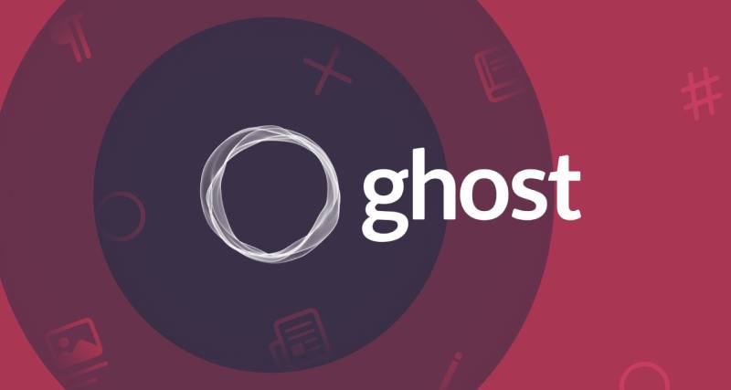
The Ghost logo is the visual identity of Ghost, an open-source publishing platform built by the Ghost Foundation and launched in 2013.
It consists of a geometric icon and a lowercase wordmark, together communicating the platform’s core focus on clean, purposeful writing.
Ghost sits among a new generation of tech company logos that prioritize function over decoration. The current brand uses a distinctive “orb” icon alongside the wordmark, a shift from the original text-lines icon that debuted at launch.
What is the Ghost Logo?
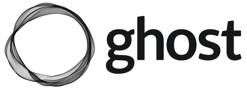
The Ghost logo is a combination mark featuring a stylized geometric icon and a lowercase sans-serif wordmark. Introduced in 2013 alongside the platform’s launch and later updated with the “orb” icon, it was developed with input from designer Mackey Saturday. It represents Ghost’s identity as a minimal, creator-focused publishing tool owned by the Ghost Foundation.
- Design Type: Combination mark (icon + wordmark)
- Primary Elements: Abstract geometric icon (original: stacked quadrangles resembling text lines; current: orb/sphere shape), lowercase wordmark
- Official Introduction Date: 2013 (original); updated orb version introduced in later brand refresh
- Designer/Agency: Ghost Foundation; alternate version by Mackey Saturday
- Trademark Status: Trademarked by Ghost Foundation; use governed by official brand guidelines and Trademark Policy
- Color Palette:
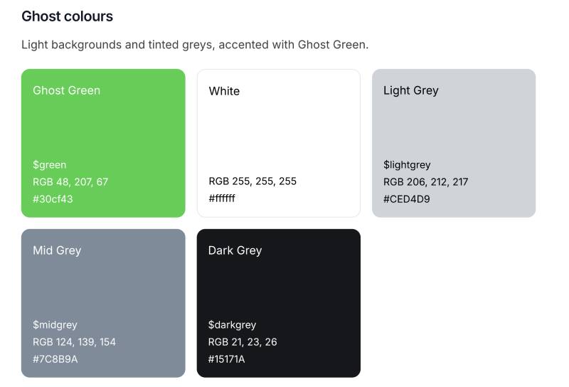
- Ghost Green: #30CF43 / RGB (48, 207, 67)
- Dark Grey: #15171A / RGB (21, 23, 26)
- Mid Grey: #7C8B9A / RGB (124, 139, 154)
- Light Grey: #CED4D9 / RGB (206, 212, 217)
- White: #FFFFFF
- Usage Context: Ghost.org website, admin dashboard, marketing materials, developer documentation, app icons, merchandise, and partner referral assets
How Has the Ghost Logo Evolved Over Time?
Ghost launched in 2013 with a text-lines icon and a serif-influenced wordmark, then gradually refined both elements over the following years. The biggest shift came with the introduction of the orb icon, which replaced the original stacked-rectangles symbol and gave the brand a more modern, digital-native feel.
Original Ghost Logo (2013-c. 2018)
- Years Active: 2013 to approximately 2018
- Design Description: A combination mark with a geometric icon showing five quadrangles arranged in three rows (resembling lines of text on a page), paired with the lowercase word “ghost” in a typeface closely resembling Times New Roman
- Color Scheme: Ash grey for the icon, dark graphite for the wordmark, with light grey and white variations
- Designer: Ghost Foundation; alternate version by Mackey Saturday
- Context: Created in parallel with the platform itself. The team wanted a mark that matched the product’s focus on writing and publishing, so the icon directly referenced text on a page
- Key Changes from Previous: N/A (first version)
- Cultural Significance: Established Ghost’s identity as a serious, no-frills publishing tool in the crowded blogging platform space. The serif-adjacent typography signaled that this was a place for real writers, not just casual bloggers
Refined Wordmark Version (c. 2018-c. 2021)
- Years Active: Approximately 2018 to 2021
- Design Description: A cleaner version of the combination mark, with tighter proportions and updated spacing between icon and wordmark. The typeface shifted toward a more geometric sans-serif feel
- Color Scheme: Dark grey and white primary versions; grey-scale palette maintained
- Designer: Ghost Foundation internal team
- Context: As Ghost grew beyond a “just a blogging platform” identity into a full publishing and membership tool, the branding needed to reflect that maturity
- Key Changes from Previous: Cleaner icon rendering, updated letterform proportions in the wordmark
- Cultural Significance: Reflected Ghost’s transition from indie blogging tool to a platform competing with Substack and other creator economy products
Current Orb Logo (c. 2021-Present)
- Years Active: Approximately 2021 to present
- Design Description: A sphere-like orb icon with a gradient green glow, used primarily as the app icon and standalone brand mark. The wordmark uses a clean, modern sans-serif in dark grey. Both elements can be used separately or together
- Color Scheme: Ghost Green (#30CF43) as the signature accent, dark grey (#15171A) for the wordmark, with white and grey system variants
- Designer: Ghost Foundation
- Context: Introduced as Ghost expanded its membership, newsletter, and subscription product set. The orb gives the brand a more premium, platform-level feel
- Key Changes from Previous: Completely new icon concept (orb replaces text-lines symbol), Ghost Green introduced as primary brand color, cleaner contemporary wordmark
- Cultural Significance: Positions Ghost alongside modern SaaS and creator economy brands. The green accent is distinctive in a space where competitors like Substack and Beehiiv use orange and yellow respectively
What Do the Design Elements of the Ghost Logo Mean?
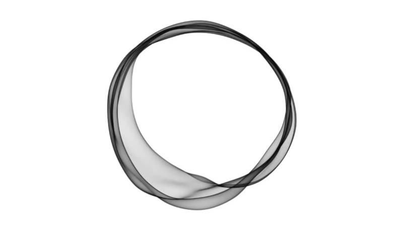
The Ghost logo communicates simplicity and independence through two main elements: an abstract icon that has evolved from text-lines to an orb, and a clean lowercase wordmark. Together, they signal that the platform is built for people who take publishing seriously, without the noise of overcrowded CMS tools.
The lowercase treatment of the wordmark is a deliberate choice.
It avoids authority-signaling capital letters in favor of something more approachable and peer-level.
That fits the platform’s audience: independent writers and publishers who want tools that work for them, not corporate software that talks down to them.
The orb icon is harder to read literally, which is actually the point. It doesn’t try to illustrate “writing” or “content” the way the original text-lines icon did. It’s more of a brand mark in the purest sense, a shape you recognize rather than decode.
Why Did Ghost Choose These Specific Colors?
- Ghost Green (#30CF43)
- Color Name: Ghost Green
- Hex: #30CF43
- Symbolic Meaning: Growth, forward motion, originality
- Psychological Impact: Energetic without being aggressive; signals action and productivity
- Brand Connection: Differentiates Ghost in a publishing space dominated by reds, oranges, and neutral tones. It reads as fresh and independent
- Dark Grey (#15171A)
- Color Name: Dark Grey
- Hex: #15171A
- Symbolic Meaning: Precision, seriousness, editorial credibility
- Psychological Impact: Near-black without being cold; works across digital and print contexts
- Brand Connection: Keeps the wordmark grounded and readable, anchoring the brightness of Ghost Green
- Mid Grey (#7C8B9A) and Light Grey (#CED4D9)
- Color Names: Mid Grey, Light Grey
- Symbolic Meaning: Neutrality, flexibility, support
- Psychological Impact: Reduces visual fatigue in UI contexts; useful for secondary elements
- Brand Connection: Part of the full grey system used across the Ghost admin UI and documentation
The color psychology here is fairly intentional. Green as a primary accent is unusual in publishing software, and that’s exactly why it works. It sticks in your memory.
What Typography Style Is Used in the Ghost Logo?
The current Ghost wordmark uses a clean geometric sans-serif typeface.
All lowercase, tight but not cramped, with even letterform weights throughout.
The original 2013 logo used a typeface closer to a classic serif, reminiscent of Times New Roman. That made sense for a platform marketing itself as a writing tool. The serif said “this is where words live.”
The move to sans-serif in the updated branding reflects Ghost’s expansion into newsletter delivery, membership management, and broader publishing infrastructure. It needed to look like software, not just a blogging platform.
The lowercase setting has stayed consistent across both eras. That’s a deliberate brand choice, not just an aesthetic preference. It keeps Ghost feeling human-scale.
What Are the Hidden Meanings in the Ghost Logo?
The original icon, five stacked quadrangles in three rows, was a direct abstraction of text on a page. Not a metaphor. Literally: the thing the platform is for.
But there’s a secondary reading too. Those shapes, with edges that seem to blur or dissolve at their ends, suggest something fading or semi-transparent. Something ghostly. That’s not accidental.
The name “Ghost” itself came from John O’Nolan’s frustration with WordPress becoming too heavy. A ghost is light, weightless, invisible in the best way. The original icon captured that.
The orb takes a different approach. It’s less literal, more atmospheric. The green glow references energy and presence, a ghost that’s alive rather than haunting. Whether that was a fully conscious decision or just a design that looked good, the symbolism holds up.
How Does the Ghost Logo Compare to Competitor Logos?
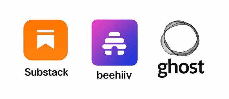
Ghost sits in a space with Substack, Beehiiv, and WordPress as primary competitors. Each brand takes a different visual approach, and Ghost’s identity is noticeably more restrained and design-forward than most of them.
Substack’s logo is a bold orange wordmark, deliberately warm and approachable.
Beehiiv uses a yellow and black palette, energetic and startup-coded.
WordPress sticks with a blue circular icon and has barely changed in years.
Ghost’s green-and-dark-grey palette stands apart from all of them. Where competitors lean into warmth or familiarity, Ghost reads as precise and independent. That matches what it’s selling: a platform for serious publishers who want full control over their brand.
In terms of visual hierarchy, Ghost’s combination mark is well-balanced. The orb icon and wordmark have a clear size relationship that works whether stacked or side-by-side. Substack’s wordmark-only approach is simpler but less flexible at small sizes.
The fundamental job of any logo is to be recognizable at scale, across contexts, and in one color. Ghost’s orb handles all three better than its 2013 predecessor did.
| Platform | Logo Type | Primary Color | Design Approach |
| Ghost | Combination mark | Green (#30CF43) | Minimal, precise, independent |
| Substack | Wordmark only | Orange | Warm, bold, writer-first |
| Beehiiv | Combination mark | Yellow/Black | Energetic, growth-focused |
| WordPress | Emblem | Blue (#21759B) | Established, institutional |
| Webflow | Wordmark + icon | Blue | Technical, design-forward |
What Are the Technical Specifications of the Ghost Logo?
Official Color Codes
- Primary Color: Ghost Green
- Hex: #30CF43
- RGB: (48, 207, 67)
- CMYK: Approximately (77, 0, 68, 19)
- Pantone: Closest match Pantone 360 C
- Primary Dark: Dark Grey
- Hex: #15171A
- RGB: (21, 23, 26)
- CMYK: Approximately (19, 12, 0, 90)
- Secondary: Mid Grey
- Hex: #7C8B9A
- RGB: (124, 139, 154)
- Secondary: Light Grey
- Hex: #CED4D9
- RGB: (206, 212, 217)
- Neutral: White
- Hex: #FFFFFF
- RGB: (255, 255, 255)
For digital use, the logo is available in vector format (SVG) for scalability, as well as PNG with transparent backgrounds. The RGB values are the reference for screen use; for print reproduction, the CMYK equivalents apply. A Pantone match is recommended for any physical merchandise or printed collateral requiring consistent color accuracy. Screen resolution for raster exports should meet a minimum DPI of 144 for web and 300 for print.
Dimensions and Proportions
- Aspect Ratio: The full combination mark (icon + wordmark horizontal) follows an approximately 4:1 width-to-height ratio
- Minimum Size: Ghost recommends publication logos have a minimum width of 600px at 72px height for digital contexts
- Clear Space: A padding zone equal to the height of the “g” letterform on all sides is the standard minimum clear space
- Official Usage Guidelines: Full details available via Ghost’s developer documentation at docs.ghost.org/logos. Dark logo on light backgrounds, light/white logo on dark backgrounds. The orb icon can be used standalone as an app icon or avatar
What Cultural Impact Has the Ghost Logo Had?
Ghost launched during a moment when the independent web was pushing back against platform consolidation. The logo, minimal and direct, became a small symbol of that resistance.
It stood for the idea that publishing tools didn’t need to be bloated or corporate-looking.
Over the years, as the creator economy exploded, Ghost’s visual identity held its ground. While competitors chased growth-hacking aesthetics, Ghost kept its restraint. That consistency built trust with a specific type of user: developers, journalists, and serious writers who value ownership over reach.
The orb rebrand gave Ghost a more contemporary look without abandoning that ethos. It can sit alongside modern SaaS logos without looking like it’s trying too hard. That’s harder to pull off than it looks. Compare it to something like the Linear logo or the Figma logo and you’ll see a shared visual language: clean, geometric, anti-decorative.
Ghost’s branding also influenced how the open publishing community thinks about identity. Small publications built on Ghost often adopt similar minimal aesthetics, partly because the platform’s own design sensibility is so clear.
How Does the Ghost Logo Fit Into the Overall Brand Identity?
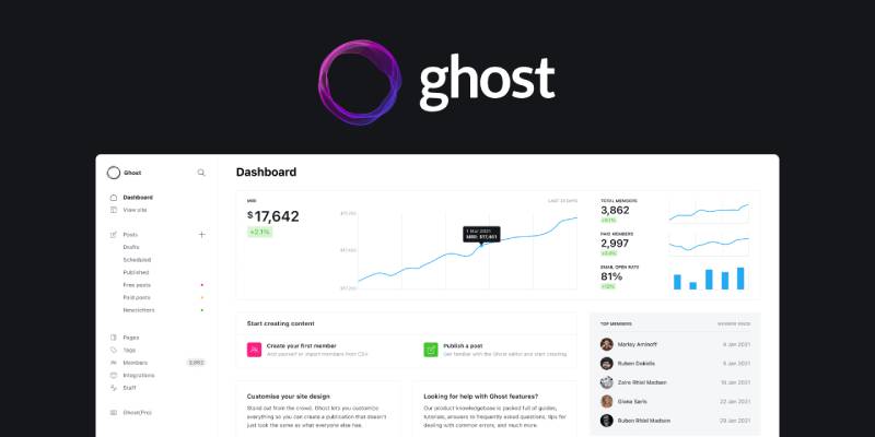
The Ghost logo doesn’t exist in isolation. It’s the entry point to a full visual system built around simplicity and editorial credibility. Every piece connects: the green accent, the dark grey type system, the clean sans-serif used across the admin UI, the minimal theme marketplace.
Ghost Green shows up in buttons, links, and highlights across the product.
The dark grey anchors all text-heavy interfaces.
The grey scale system provides breathing room in dense content environments.
The brand guidelines that govern logo use also govern how partner sites and third-party integrations reference Ghost. That consistency matters when your product is used by thousands of independent publications that each have their own identities. Ghost’s brand has to be recognizable without overpowering the publications built on it.
The orb, in particular, works well as a standalone app icon on mobile home screens and favicons, contexts where the full wordmark would be unreadable. That kind of scalability is a sign of solid brand style guide thinking.
Ghost’s identity also relates clearly to the broader independent publishing ecosystem. The Notion Calendar, Framer, and Loom brands share a similar approach: clean, purposeful, built for people who care about their tools. Ghost fits naturally in that company.
How Should the Ghost Logo Be Used?
Official Do’s
- Use the dark logo version on light or white backgrounds
- Use the white/light logo on dark backgrounds
- Use the orb icon as a standalone app icon, favicon, or avatar where appropriate
- Download official assets from docs.ghost.org/logos or ghost.org/referrals/logos-and-images
- Maintain clear space around the logo equal to the height of the lowercase “g” on all sides
- Use SVG format for web and digital contexts requiring scalability
- Use PNG with transparent background when SVG is not supported
Official Don’ts
- Do not alter the logo colors outside the approved palette
- Do not stretch, distort, rotate, or add effects to the logo
- Do not place the logo on visually busy backgrounds that reduce legibility
- Do not recreate the logo from scratch or use unauthorized variations
- Do not use the Ghost brand to imply endorsement or official partnership without authorization
- Do not use Ghost trademarks in your own product or company name
Accessing Official Assets
Official Ghost logos are available in SVG and PNG formats through the Ghost developer documentation. Assets include the dark combination mark, the light/white combination mark, and the standalone orb icon. All downloads are provided directly by the Ghost Foundation.
Licensing and Trademark
The Ghost Foundation holds the trademark on all Ghost brand assets. Using any Ghost brand material counts as acceptance of Ghost’s Terms of Service, Trademark Policy, and brand guidelines. Ghost reserves the right to review or end use of brand materials at any time. Any goodwill built through use of Ghost trademarks belongs solely to Ghost Foundation, not to the user of those assets.
If you’re building a product, theme, or integration on Ghost and need to reference the brand, review the official trademark policy at ghost.org before publishing. When in doubt, reach out to the Ghost team directly through their official channels.
FAQ on The Ghost Logo
What does the Ghost logo look like?
The Ghost logo is a combination mark: a geometric orb icon paired with a lowercase sans-serif wordmark.
The orb has a soft green glow using Ghost Green (#30CF43). The wordmark sits in dark grey (#15171A). Clean, minimal, no decoration.
Who designed the Ghost logo?
The Ghost Foundation created the core brand identity. Designer Mackey Saturday contributed an alternate version of the original mark.
The current orb-based logo was developed internally as Ghost evolved from a blogging tool into a full publishing platform.
When was the Ghost logo first introduced?
The original Ghost CMS logo launched in 2013 alongside the platform itself.
It featured a stacked-quadrangles icon resembling lines of text. The current orb icon came later, introduced as part of a broader Ghost brand refresh around 2021.
What are the official Ghost logo colors?
Ghost uses a tight color system. The primary accent is Ghost Green (#30CF43). Dark Grey (#15171A) anchors the wordmark.
The full Ghost color palette also includes Mid Grey (#7C8B9A), Light Grey (#CED4D9), and White (#FFFFFF) for supporting contexts.
What font is used in the Ghost logo?
The current wordmark uses a clean geometric sans-serif font, set entirely in lowercase.
The original 2013 version used a serif typeface closer to Times New Roman, which matched Ghost’s early identity as a writing-focused blogging platform.
What does the Ghost logo symbolize?
The original text-lines icon literally referenced writing on a page. The orb is less literal but communicates energy and presence.
The lowercase wordmark signals approachability. Together, the Ghost brand identity reflects the platform’s values: simple, independent, built for serious publishers.
Where can I download the official Ghost logo?
Official assets are available at docs.ghost.org/logos. Downloads include SVG and PNG versions of the dark mark, light mark, and standalone orb icon.
All files are provided by the Ghost Foundation and governed by their Trademark Policy and brand guidelines.
Can I use the Ghost logo on my website?
Yes, within limits. Ghost’s brand guidelines permit use when referring to the platform honestly, such as “built on Ghost” or “powered by Ghost.”
You cannot alter the logo, imply official partnership, or use Ghost trademarks in your own product or company name without authorization.
How has the Ghost logo changed over time?
Ghost has gone through roughly three logo phases: the original 2013 serif-and-text-lines mark, a refined wordmark version around 2018, and the current orb-based identity.
Each update tracked the platform’s growth from Ghost CMS blogging tool to full publishing and membership platform.
How does the Ghost logo compare to Substack and Beehiiv?
Substack uses bold orange, Beehiiv uses yellow-black, and Ghost uses green-on-dark-grey. Ghost is the most restrained of the three.
That visual restraint is intentional. The Ghost publishing platform logo targets independent publishers who want brand control, not platforms that push their own identity over yours.
Conclusion
The Ghost logo has stayed true to one idea across every iteration: less is more. From the original text-lines icon to the current Ghost CMS visual identity, the Ghost logo reflects a platform that knows exactly what it is.
The orb, the green, the lowercase wordmark. None of it is accidental.
For independent publishers, the Ghost brand mark signals something beyond aesthetics. It represents open-source publishing, zero platform fees, and full ownership of your content and brand.
That’s a lot for one logo to carry. And it does.

Renowned for his expertise in logo design and visual branding, Bogdan has developed a multitude of logos for various clients.
His skills extend to creating posters, vector illustrations, business cards, and brochures. Additionally, Bogdan's UI kits were featured on marketplaces like Visual Hierarchy and UI8.
He also wrote in the past years on sites like Design Your Way, WebDesignerDepot, WPDean, Designmodo, Speckyboy, Slider Revolution, and more.
- Friendly Karla Font Pairing Ideas for Modern Brands - 26 September 2026
- The Cursor Logo History, Colors, Font, And Meaning - 24 September 2026
- Top 7 Web Design Subscription Services That Replace Full-Time Hires - 24 September 2026

Bogdan Sandu is a seasoned designer who has been designing websites since 2008. Renowned for his expertise in logo design and visual branding, Bogdan has developed a multitude of logos for various clients. His skills extend to creating posters, vector illustrations, business cards, and brochures. Additionally, Bogdan's UI kits were featured on marketplaces like Visual Hierarchy and UI8. He also wrote in the past years on sites like Design Your Way, WebDesignerDepot, WPDean, Designmodo, Speckyboy, Slider Revolution, and more.
You Might Also Like