The Beehiiv logo is the visual identity of Beehiiv, a newsletter publishing platform built for creators and media companies. It functions as a combination mark, pairing a custom wordmark with a distinct honeycomb-inspired icon.
Launched alongside the platform in 2021, the logo sits within a broader wave of creator economy brands that prioritize clean, minimal aesthetics over flashy visual complexity.
Beehiiv was founded by Tyler Denk and his co-founders, and the logo has remained largely consistent since its debut, with only minor refinements applied over time.
What Is the Beehiiv Logo?
The Beehiiv logo is a combination mark introduced in 2021, featuring a geometric honeycomb-shaped icon paired with a bold, modern wordmark. It reflects the platform’s identity as a creator-focused newsletter tool. No external design agency is publicly credited.
- Design Type: Combination mark (icon + wordmark)
- Primary Elements: Hexagonal/honeycomb icon, custom sans-serif wordmark
- Official Introduction Date: 2021
- Designer/Agency: Designed in-house; no public external agency credited
- Trademark Status: Beehiiv is a registered trademark of Beehiiv Inc.
- Color Palette: Primary black (#000000), white (#FFFFFF), with accent use of a warm yellow-gold tone associated with honeybee imagery
- Usage Context: Web platform, mobile app, email newsletters, social media profiles, marketing materials, and press kits
How Has the Beehiiv Logo Evolved Over Time?
Beehiiv launched in 2021 and has kept its visual identity stable since then. The logo has seen minor polish rather than full redesigns, which is common for young tech platforms still building brand recognition.
Original Beehiiv Logo (2021-Present)
- Years Active: 2021 to present
- Design Description: A hexagonal icon suggesting a honeycomb cell, paired with the lowercase wordmark “beehiiv” in a clean, geometric sans-serif
- Color Scheme: Black and white as primary; gold/yellow used in select brand contexts
- Designer: In-house team
- Context: Introduced at platform launch to signal a modern, creator-first product aimed at newsletter writers moving away from older email tools
- Key Changes from Previous: No prior version; this is the founding identity
- Cultural Significance: Positioned Beehiiv alongside a new generation of creator tools with confident, minimal branding rather than corporate-style visuals
What Do the Design Elements of the Beehiiv Logo Mean?
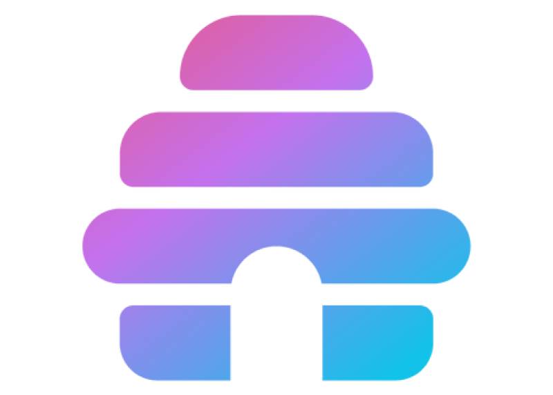
The Beehiiv logo draws directly from the meaning behind the brand name. “Bee” references a hive, a system built on collective activity and structured output. The hexagonal icon mirrors that concept visually.
The wordmark uses all-lowercase lettering. That choice feels deliberate. Lowercase branding signals approachability, which fits a platform trying to attract independent writers rather than corporate marketing teams.
The overall design stays minimal. No gradients, no decorative strokes, no complex illustration. Just geometry and type. That restraint communicates reliability, which matters a lot when your product handles someone’s subscriber list.
What Does the Honeycomb Icon Represent in the Beehiiv Logo?
The hexagonal icon is a direct nod to a beehive’s structure. Honeycombs are efficient, organized, and built for scale.
That maps well onto what the platform does. It helps creators build, organize, and grow newsletter audiences systematically.
There’s also a subtle community angle. A hive works because of many contributors. Beehiiv’s ecosystem includes writers, readers, and sponsors all interacting within one structure.
Why Did Beehiiv Choose These Specific Colors?
The black-and-white base gives the logo maximum flexibility. It works on any background, in any size, across digital and print contexts without losing clarity.
- Black (#000000): Conveys authority and confidence. Psychologically, black signals premium positioning. In the context of tech company logos, it reads as modern and no-nonsense.
- White (#FFFFFF): Provides contrast and breathing room. Allows the icon and wordmark to hold their own on dark backgrounds without modification.
- Gold/Yellow (brand accent): Ties back to bee and honeycomb associations. Yellow also carries psychological warmth and optimism, which softens the otherwise stark black-and-white pairing.
The limited palette also makes the logo easy to reproduce consistently. One thing I’ve noticed with early-stage startups is that they often overcomplicate their color systems and then struggle with brand consistency. Beehiiv avoided that.
What Typography Style Is Used in the Beehiiv Logo?
The wordmark uses a geometric sans-serif font. The letterforms are clean and evenly weighted, with no serifs or decorative terminals.
The double “i” in “beehiiv” is worth noticing. That unconventional spelling gives the wordmark a distinctive rhythm. Repeated vertical strokes create a visual pattern that feels structured, almost like a row of hive cells.
The all-lowercase setting keeps the typography friendly rather than formal. It’s readable at small sizes, which matters for favicon use and mobile displays.
No publicly confirmed custom typeface name exists. The letterforms suggest a modified geometric sans, possibly derived from or inspired by type families like Inter or similar neutral grotesques popular in product design circles.
What Are the Hidden Meanings in the Beehiiv Logo?
The double “i” in the name isn’t just a spelling quirk. Set in a monospaced or near-monospaced typeface, those two i’s visually echo the repeating vertical cells of a honeycomb structure.
The hexagonal icon, when isolated, also functions as a geometric container. It could represent a single newsletter issue, a subscriber, or a content block. That ambiguity is probably intentional.
There’s no publicly documented designer statement about hidden symbolism. But the cohesion between the name, the icon shape, and the typographic rhythm suggests the decisions were made together rather than assembled separately.
How Does the Beehiiv Logo Compare to Competitor Logos?
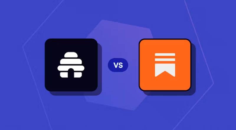
Beehiiv operates in a space alongside platforms like Substack and Ghost. Each brand takes a different visual approach, and the differences reflect real strategic positioning.
Substack uses a bold orange and a chunky serif wordmark. It signals editorial tradition, print media heritage. Ghost goes with a minimal black circle icon, almost brutally simple.
Beehiiv sits between those two poles. More geometric than Substack, more expressive than Ghost. The honeycomb icon gives it something neither competitor has: a recognizable standalone symbol that connects directly to the brand name.
Compared to tools like Mailchimp, which leans into a mascot-based identity with the Freddie chimp, Beehiiv stays entirely abstract. That keeps it feeling more like a professional publishing platform and less like a general email marketing tool.
The logo design choices signal where Beehiiv wants to live in the market. It’s gunning for serious creators and media operators, not small business email senders.
What Are the Technical Specifications of the Beehiiv Logo?
Official Color Codes
Primary Color: Black
Secondary Color: White
- Hex: #FFFFFF
- RGB: (255, 255, 255)
- CMYK: (0, 0, 0, 0)
- Pantone: N/A (process white)
Accent Color: Gold/Yellow
- Hex: Approximately #F5C518 (not officially published; estimated from brand materials)
- RGB: Approximately (245, 197, 24)
- CMYK: Approximately (0, 20, 90, 4)
- Pantone: Closest match approximately Pantone 116 C
Dimensions and Proportions
- Aspect Ratio: The combination mark is wider than tall, roughly 4:1 ratio for horizontal lockup
- Minimum Size Requirements: Not publicly specified; standard practice for digital logos suggests 32px minimum height for legibility
- Clear Space: Beehiiv follows standard brand practice of maintaining clear space equal to the height of the icon on all sides
- Official Usage Guidelines: Available via Beehiiv’s press kit and brand assets page; logo files are provided in PNG, SVG, and bitmap formats for various use cases
- File Formats Available: SVG (preferred for web), PNG with transparent background, high-resolution JPEG for print
- Resolution: SVG files are resolution-independent; PNG assets are typically provided at 2x for standard screen DPI requirements
What Cultural Impact Has the Beehiiv Logo Had?
Beehiiv launched during a period when the creator economy was being taken seriously as a real industry. The logo arrived at the right moment.
It became a recognizable mark in newsletter and media circles faster than most platforms of its size would expect. That’s partly because Beehiiv grew through word-of-mouth among professional writers and journalists who share brand references constantly.
The honeycomb icon shows up regularly in Twitter (now X) profiles, newsletter footers, and creator media kits. That organic presence gave the logo visibility that paid advertising couldn’t replicate.
It also influenced how people perceive the newsletter space more broadly. Before Beehiiv, most newsletter tools looked like enterprise software or mass-market email products. The Beehiiv logo helped signal that this space could have sharp, considered brand guidelines like any serious tech product.
How Does the Beehiiv Logo Fit Into the Overall Brand Identity?
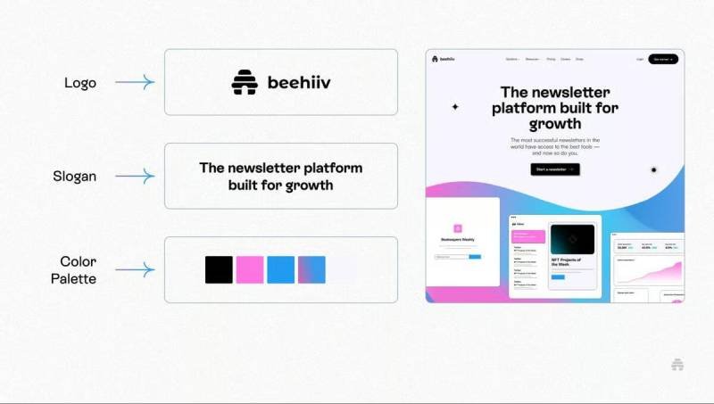
The logo is the anchor for a broader brand style guide that runs through every Beehiiv touchpoint. The hexagonal motif appears in UI patterns, marketing illustrations, and product design details, not just in the standalone mark.
The black-and-white palette gives the brand a consistent look across the platform dashboard, marketing site, social media, and sponsored content. Consistency at that level builds recognition faster than visual variety does.
The color palette also positions Beehiiv alongside other premium creator tools. Compare it to something like Notion Calendar or Linear. All three use restrained, high-contrast palettes. All three are targeting the same general audience of professionals who care about craft.
The visual hierarchy in Beehiiv’s marketing materials consistently puts the logo in a supporting role, not a dominant one. The content and creator stories take center stage. That humility in brand placement actually reinforces trust.
Typography across the brand extends the logo’s clean geometric approach. The same sans-serif sensibility runs through headings, body copy, and UI labels, creating coherence between the mark and the product experience.
How Should the Beehiiv Logo Be Used?
Official Usage Guidelines
Beehiiv provides official brand assets through its press kit, accessible on the Beehiiv website. Approved logo files include transparent PNG, SVG, and standard JPEG versions in both light and dark variants.
Do’s:
- Use the official files provided in the press kit without modification
- Maintain clear space around the logo on all sides
- Use the dark version on light backgrounds, light version on dark backgrounds
- Scale proportionally to preserve aspect ratio
- Use SVG format for web applications to maintain sharpness at all sizes
Don’ts:
- Do not alter the logo colors outside of officially approved variations
- Do not stretch, skew, or distort the mark
- Do not add drop shadows, outlines, or effects not present in the official files
- Do not place the logo on visually cluttered backgrounds without adequate contrast
- Do not use the logo in a way that implies Beehiiv endorses a third-party product or service without written permission
Licensing and Trademark Details
The Beehiiv name and logo are trademarks of Beehiiv Inc. Use of the logo for editorial or journalistic purposes (press coverage, reviews, comparisons) is generally permitted under fair use principles.
Commercial use, co-branding, or integration into third-party products requires explicit written approval from Beehiiv. This is standard practice for platform brands, and Beehiiv is no different from peers like Figma or Webflow in how it protects its visual identity.
For access to official assets, visit Beehiiv’s official website press or brand section directly. Do not use third-party logo repositories as a source, since those files are often outdated or incorrectly formatted.
FAQ on the Beehiiv Logo
What does the Beehiiv logo look like?
The Beehiiv logo is a combination mark.
It pairs a geometric hexagonal icon with a lowercase sans-serif wordmark.
The default version uses black on white. Clean, minimal, no decorative elements.
The double “i” in the wordmark gives it a subtle visual rhythm that sets it apart from similar newsletter platform logos.
What colors are used in the Beehiiv logo?
The primary colors are black (#000000) and white (#FFFFFF).
A warm gold/yellow accent appears in select brand contexts, referencing the honeybee theme behind the name.
The two-color base keeps the logo flexible across digital platforms, print materials, and email newsletter footers.
What font does the Beehiiv logo use?
Beehiiv uses a geometric sans-serif typeface in its wordmark.
No custom font name has been publicly confirmed by the company.
The letterforms suggest influence from neutral grotesque families common in product design, similar to Inter or related typefaces.
What does the Beehiiv logo symbol mean?
The hexagonal icon references a honeycomb structure, directly tied to the platform name.
It signals organization, efficiency, and scale. Those are also the platform’s core functional promises to newsletter creators.
The shape works as a standalone brand symbol without the wordmark, which is useful for favicon and app icon use.
When was the Beehiiv logo introduced?
The logo launched in 2021 alongside the platform itself.
Beehiiv was co-founded by Tyler Denk and has maintained a consistent visual identity since launch with only minor refinements.
No major redesign has been released. The original beehiiv brand identity remains active.
Where can I download the official Beehiiv logo?
Official beehiiv logo PNG and SVG files are available through Beehiiv’s press kit on their website.
Avoid third-party logo repositories. Files there are often outdated or incorrectly formatted.
The brand kit includes transparent background versions in both light and dark variants for different usage contexts.
How does the Beehiiv logo compare to Substack’s logo?
Substack’s logo uses bold orange and a chunky serif wordmark, referencing print editorial tradition.
Beehiiv goes the opposite direction: black, geometric, minimal.
That contrast reflects real positioning differences. Beehiiv targets professional creators and media operators. Substack casts a wider net.
Can I use the Beehiiv logo on my website?
Editorial and press use is generally fine under standard fair use principles.
Commercial use, co-branding, or placing the beehiiv wordmark inside your own product requires written approval from Beehiiv Inc.
When in doubt, check Beehiiv’s official brand usage guidelines before publishing.
Is the Beehiiv logo trademarked?
Yes. The Beehiiv name and logo are trademarks of Beehiiv Inc.
This is standard practice for newsletter platform branding. Similar protections apply to peers like Ghost and Loom.
Unauthorized commercial use or modification of the mark without permission is a trademark violation.
What file formats is the Beehiiv logo available in?
Beehiiv provides the logo in SVG, PNG with transparent background, and JPEG formats.
SVG is the preferred format for web use since it scales without quality loss at any size or resolution.
High-resolution PNG versions are suitable for presentations, media kits, and print materials.
Conclusion
The Beehiiv logo is a well-considered piece of newsletter platform branding that holds up across every context it appears in.
The hexagonal icon, the lowercase wordmark, the restrained black-and-white palette. Each decision reinforces the others.
For a platform competing in a crowded creator economy space, that kind of visual identity consistency matters more than most people realize.
The beehiiv brand kit stays minimal, the logo vector files are clean, and the overall mark communicates exactly what the platform wants to communicate: professional, structured, built for serious newsletter publishers.

Renowned for his expertise in logo design and visual branding, Bogdan has developed a multitude of logos for various clients.
His skills extend to creating posters, vector illustrations, business cards, and brochures. Additionally, Bogdan's UI kits were featured on marketplaces like Visual Hierarchy and UI8.
He also wrote in the past years on sites like Design Your Way, WebDesignerDepot, WPDean, Designmodo, Speckyboy, Slider Revolution, and more.
- Friendly Karla Font Pairing Ideas for Modern Brands - 26 September 2026
- The Cursor Logo History, Colors, Font, And Meaning - 24 September 2026
- Top 7 Web Design Subscription Services That Replace Full-Time Hires - 24 September 2026

Bogdan Sandu is a seasoned designer who has been designing websites since 2008. Renowned for his expertise in logo design and visual branding, Bogdan has developed a multitude of logos for various clients. His skills extend to creating posters, vector illustrations, business cards, and brochures. Additionally, Bogdan's UI kits were featured on marketplaces like Visual Hierarchy and UI8. He also wrote in the past years on sites like Design Your Way, WebDesignerDepot, WPDean, Designmodo, Speckyboy, Slider Revolution, and more.
You Might Also Like