

The Substack logo is the visual identity of Substack, the newsletter publishing platform that lets writers send free and paid posts directly to subscribers. It works as a brand mark built from an orange bookmark icon and a lowercase gray wordmark.
What Is the Substack Logo?
The Substack logo is an orange bookmark icon, two horizontal bars above a ribbon with a notched bottom, set beside the lowercase word “substack” in gray. Substack introduced it on April 26, 2019, replacing a logo its CEO had made himself. The designers behind the 2019 version were not named publicly.
| Symbol | Bookmark: two bars above a notched ribbon |
| Designer/agency | Not publicly credited (“actual designers” per Substack’s 2019 announcement) |
| Current version since | April 2019 |
| Colors (hex) | Orange, approx. #FF6719; wordmark gray, approx. #58595B (sampled from the logo file) |
| Typeface | Lowercase sans-serif wordmark; the exact typeface has not been publicly confirmed |
| Previous major version | 2017–2019: an “S” inside a notched circle, made by the CEO |
How Has the Substack Logo Evolved Over Time?
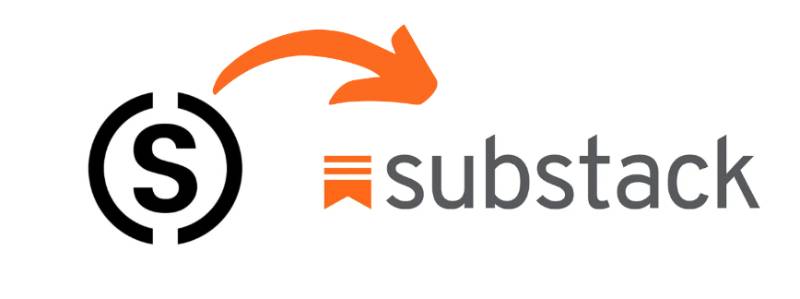
Substack has had two logos. The first came with the company’s 2017 launch and was replaced in April 2019. No later redesign has been announced as of 2026, although the app itself was redesigned in September 2023.
Original Substack Logo (2017-2019)
The first logo was a black letter “S” inside a circle with notches cut into its sides. Substack’s own announcement said the CEO, Chris Best, made it in Photoshop in about twenty minutes and joked that it looked like a dollar sign. The company used it for almost a year and a half before replacing it.
Current Substack Logo (2019-Present)
On April 26, 2019, Substack published “We have a real logo now” and introduced the bookmark. The post says the icon is a bookmark, a choice a reader makes when something is worth coming back to. The company said professional designers produced it but did not name them.
What Do the Design Elements of the Substack Logo Mean?
The icon has two flat bars stacked above a ribbon whose bottom edge is cut into a notch. The bars can also read as lines of text, which fits a platform built around writing. Substack itself explains only the bookmark meaning, so any further symbolism is interpretation.
What Is the Substack Symbol?
The symbol is a bookmark. Substack describes it as the mark of a choice you make when something is worth coming back to. It replaced the earlier “S” in a circle, so the current logo has no letter in it at all. The app icon places the bookmark in white on an orange rounded square.
What Are the Substack Logo Colors?
The icon is a single bright orange, widely listed as #FF6719; sampling the logo file gives about #FF681A. The wordmark is a dark neutral gray, approx. #58595B. Substack publishes no color specification, so treat these as sampled values. It sits in a small group of orange logos among tech brands.
What Font Does the Substack Logo Use?
The wordmark is a lowercase sans-serif in a medium weight. Substack has not published the typeface name, and no reliable source identifies it, so any specific font name would be a guess.
How Does the Substack Logo Compare to Competitor Logos?
Beehiiv uses a white beehive on a near-black square, while Ghost uses a ghost-shaped mark. Substack is the only one of the three whose icon refers to reading rather than to the brand name. Among tech company logos, its orange also sets it apart from the many blue marks.
What Are the Substack Logo Colors Used For?
The orange bookmark carries the brand on its own in the app icon and favicon, and the gray wordmark is added where there is room for the full name. On a phone screen, as in the photo, the full logo shows the orange icon followed by the gray lettering.
How Should the Substack Logo Be Used?
Substack’s brand page offers two downloadable files, a full logo and a wordmark, and asks that they not be altered. It also says not to imply partnership or endorsement without written permission, and to leave white space around them. Substack is a registered trademark, so editorial uses such as news coverage and reviews are the safe case. Anything commercial or promotional should be cleared with Substack first.
FAQ on The Substack Logo
What does the Substack logo look like?
It is an orange bookmark made of two horizontal bars above a ribbon with a notched bottom, followed by the lowercase word “substack” in gray.
What font does the Substack logo use?
Substack has not named the typeface. The wordmark is a lowercase sans-serif, and no reliable source identifies it, so any specific font name is a guess.
What colors does the Substack logo use?
Orange for the icon, widely listed as #FF6719, and dark gray for the wordmark, about #58595B when sampled from the logo file. Substack publishes no official color codes.
What does the Substack logo mean?
Substack says the icon is a bookmark, representing a choice you make when something is worth coming back to.
Who designed the Substack logo?
Substack’s 2019 announcement says “actual designers” made the current logo but names no one. The earlier “S” logo was made by CEO Chris Best.
What was the old Substack logo?
A black letter “S” inside a notched circle, used from the 2017 launch until April 2019. Substack’s own post said it looked like a dollar sign.
When did Substack change its logo?
On April 26, 2019, when the company introduced the bookmark logo. No newer logo change has been announced as of 2026.
Is the Substack logo a wordmark or an icon?
Both. The full logo combines the bookmark icon with the wordmark, and the icon is also used alone as the app icon and favicon.
Can I change the font on Substack?
That is separate from the logo. Substack lets writers upload a wordmark image for their own publication, and without one the publication name appears in a default font.
Can I download the Substack logo?
Yes. Substack’s brand page offers a full logo and a wordmark file. Use them unaltered and do not imply endorsement.
How does the Substack logo compare to Beehiiv and Ghost?
Beehiiv uses a beehive and Ghost a ghost shape. Substack’s bookmark is the only one that points at reading and saving content.
Conclusion
The Substack logo has had two versions: a CEO-made “S” in a notched circle from 2017, and the orange bookmark introduced in April 2019 that is still in use in 2026.
The bookmark is the part that carries the meaning, and the gray lowercase wordmark keeps the rest quiet. Anyone looking for the Substack logo PNG should take it from Substack’s brand page.
Sources
- Substack, We have a real logo now – https://on.substack.com/p/we-have-a-real-logo-now
- Substack, Brand and media page – https://substack.com/brand
- TechCrunch, Substack redesigns its mobile app to boost discovery and engagement – https://techcrunch.com/2023/09/20/substack-redesigns-its-mobile-app-to-boost-discovery-and-engagement/

Renowned for his expertise in logo design and visual branding, Bogdan has developed a multitude of logos for various clients.
His skills extend to creating posters, vector illustrations, business cards, and brochures. Additionally, Bogdan's UI kits were featured on marketplaces like Visual Hierarchy and UI8.
He also wrote in the past years on sites like Design Your Way, WebDesignerDepot, WPDean, Designmodo, Speckyboy, Slider Revolution, and more.
- The YouTube Logo History, Colors, Font, and Meaning - 10 November 2026
- Monthly Retainer Billing for Freelance Designers: How to Get Paid on Time, Every Month - 10 November 2026
- How Design Studios Lose New Clients Between the First Email and the Signed Proposal - 10 November 2026

Bogdan Sandu is a seasoned designer who has been designing websites since 2008. Renowned for his expertise in logo design and visual branding, Bogdan has developed a multitude of logos for various clients. His skills extend to creating posters, vector illustrations, business cards, and brochures. Additionally, Bogdan's UI kits were featured on marketplaces like Visual Hierarchy and UI8. He also wrote in the past years on sites like Design Your Way, WebDesignerDepot, WPDean, Designmodo, Speckyboy, Slider Revolution, and more.
You Might Also Like


