


The Cerebras logo represents one of the most ambitious players in the AI hardware space. As a visual identity, it carries the weight of a company building the world’s largest computer chips.
Within the broader landscape of tech company logos, Cerebras sits among a growing wave of AI-focused brands competing for recognition. The current logo version emerged alongside the company’s founding in 2016, designed to communicate innovation without unnecessary complexity.
Cerebras Systems was founded by Andrew Feldman and a team of semiconductor veterans. The logo has remained largely consistent since launch, with only minor refinements to adapt to digital and print applications.
What Is the Cerebras Logo?
The Cerebras logo is a combination mark featuring a custom wordmark alongside an abstract geometric symbol. Introduced in 2016, it was developed to represent the company’s focus on wafer-scale computing. The design emphasizes precision and technological advancement through clean lines and calculated proportions.
Design Attributes:
- Design Type: Combination mark (wordmark plus abstract icon)
- Primary Elements: Geometric symbol representing interconnected nodes, custom sans-serif wordmark
- Official Introduction Date: 2016
- Designer/Agency: Not publicly disclosed
- Trademark Status: Registered trademark of Cerebras Systems Inc.
- Color Palette: Primary orange (#FF6B00 approximate), white, and occasional black variants
- Usage Context: Corporate communications, product branding, digital platforms, investor presentations, trade show materials
Understanding what makes a logo effective helps explain why Cerebras opted for this particular approach. The mark needed to work across everything from tiny favicon sizes to massive conference backdrops.
How Has the Cerebras Logo Evolved Over Time?
The Cerebras logo has maintained remarkable consistency since the company’s founding.
Unlike many tech startups that undergo dramatic rebrands, Cerebras kept its core visual identity intact.
Minor adjustments have occurred for digital optimization, but the fundamental design remains unchanged from 2016.
Original Cerebras Logo (2016-Present)
- Years Active: 2016 to present
- Design Description: Abstract geometric icon paired with a clean wordmark. The symbol suggests interconnected processing nodes or neural pathways.
- Color Scheme: Orange primary with white and black variants for different backgrounds
- Designer: Not publicly credited
- Context: Launched when the company emerged from stealth mode, positioning itself as a challenger to NVIDIA in AI computing
- Key Changes from Previous: N/A (original version)
- Cultural Significance: Represents the new wave of specialized AI hardware companies emerging in Silicon Valley
The decision to maintain visual consistency aligns with minimalist design principles that many tech companies have adopted in recent years.
What Do the Design Elements of the Cerebras Logo Mean?
The Cerebras logo communicates scale and interconnection through its geometric symbol.
Each element suggests neural networks and parallel processing.
The abstract nature allows viewers to project their own interpretations while maintaining technological associations.
This approach works well for a company whose products are highly technical and difficult to visualize.
Why Did Cerebras Choose These Specific Colors?
Orange dominates the Cerebras color palette. This is no accident.
Orange signals energy, creativity, and technological ambition. You see it among the most distinctive tech brands. It works because it works.
The choice fits within a broader pattern of orange logos across the technology sector.
- Primary Orange: Approximately #FF6B00. Conveys innovation and reliability. Creates immediate tech-sector association.
- White: Used for contrast and clarity. Represents precision and cleanliness.
- Black: Reserved for monochrome applications. Adds versatility for print materials.
The psychology here is straightforward. Understanding color psychology reveals why orange stands out in enterprise technology branding.
What Typography Style Is Used in the Cerebras Logo?
The Cerebras wordmark uses a custom sans-serif font.
Clean. Modern. No decorative elements.
The letterforms are geometric with consistent stroke weights. This approach prioritizes readability at any size.
The typography choices reflect the company’s engineering-first culture. Nothing flashy. Just functional.
What Are the Hidden Meanings in the Cerebras Logo?
The geometric symbol contains layered meaning. Look closely.
The interconnected shapes suggest neural networks and parallel processing architectures.
Some interpret the form as representing the company’s wafer-scale approach, where entire chips are manufactured as single units rather than assembled from smaller pieces.
The designers haven’t publicly discussed hidden elements. But the visual language clearly points toward connectivity and scale.
How Does the Cerebras Logo Compare to Competitor Logos?
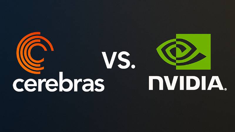
In the AI hardware space, Cerebras competes visually with companies like NVIDIA, Graphcore, and various AI-focused startups.
Most competitors also lean into blue and geometric forms.
What sets Cerebras apart is the restraint. No gradients. No 3D effects. Just clean geometry.
Compare this to the xAI logo or the DeepMind logo, and you’ll notice Cerebras sits somewhere between minimalist and technical.
The industry overall trends toward abstract symbols that suggest intelligence and processing power without being too literal about it.
What Are the Technical Specifications of the Cerebras Logo?
Official Color Codes (Approximate):
- Primary Orange: Hex: #FF6B00, RGB: (255, 107, 0), CMYK: (0, 58, 100, 0), Pantone: 151 C (approximate)
- White: Hex: #FFFFFF, RGB: (255, 255, 255), CMYK: (0, 0, 0, 0)
- Black: Hex: #000000, RGB: (0, 0, 0), CMYK: (0, 0, 0, 100)
Dimensions and Proportions:
- Aspect Ratio: Horizontal orientation, approximately 3:1 for full lockup
- Minimum Size: Icon can scale independently for small applications
- Clear Space: Standard practice requires padding equal to the height of a letter in the wordmark
- File Formats: Available as vector graphics (SVG, EPS, AI) and raster formats (PNG, JPG)
What Cultural Impact Has the Cerebras Logo Had?

The Cerebras logo appears frequently in AI industry coverage and investor presentations.
It has become shorthand for “alternative to NVIDIA” in many tech discussions.
For a relatively young company, the visual identity has achieved solid recognition within specialized circles.
Among semiconductor enthusiasts and AI researchers, the mark carries weight.
How Does the Cerebras Logo Fit Into the Overall Brand Identity?
The logo anchors a broader visual system that includes presentation templates, product photography, and marketing materials.
Cerebras maintains consistency through strict adherence to brand guidelines.
The warm orange tones and clean geometry extend across all touchpoints.
Effective use of white space keeps materials feeling premium and technical.
How Should the Cerebras Logo Be Used?
Usage Guidelines:
- Do: Maintain clear space around the logo. Use approved color variations. Scale proportionally.
- Don’t: Stretch or distort. Add effects like shadows or gradients. Place on busy backgrounds without proper contrast.
- Official Assets: Contact Cerebras Systems directly for press kit and approved logo files
- Licensing: The Cerebras logo is a registered trademark. Third-party use requires explicit permission.
- Trademark Protection: Unauthorized use may result in legal action. Editorial and informational use generally permitted under fair use principles.
For media inquiries or brand asset requests, reach out through official Cerebras Systems channels.
FAQ on The Cerebras Logo
What Does the Cerebras Logo Look Like?
The Cerebras logo features an abstract geometric symbol alongside a custom wordmark. The icon suggests interconnected nodes, representing the company’s wafer-scale engine technology.
Clean lines dominate. No gradients or complex effects.
The overall aesthetic follows logo design principles common among AI chip companies.
What Colors Are Used in the Cerebras Logo?
Orange serves as the primary color. White and black appear in alternate versions.
The orange choice stands out in the semiconductor industry. It communicates energy and technical ambition.
Understanding color theory explains why this color palette works for enterprise technology brands.
Who Designed the Cerebras Logo?
Cerebras Systems has not publicly credited a specific designer or agency. This is common among tech startups.
The design likely emerged during the company’s 2016 founding in Sunnyvale, California.
Many famous graphic designers work under NDA for Silicon Valley firms.
When Was the Cerebras Logo Created?
The logo debuted in 2016 when Cerebras Systems launched. Andrew Feldman and his team introduced it alongside the company’s emergence from stealth mode.
It has remained consistent since. Minor refinements occurred for digital optimization, but the core visual identity stayed intact.
What Does the Cerebras Logo Symbolize?
The geometric symbol represents neural network architecture and parallel processing. Think interconnected nodes on a massive scale.
This reflects the company’s CS-2 and CS-3 chip technology. The psychology of shapes here suggests precision and systematic thinking.
Can I Download the Cerebras Logo?
Official logo files require direct contact with Cerebras Systems. The company maintains strict control over brand assets.
Press kits typically include PNG and vector formats. Always follow their brand style guide for proper usage.
Has the Cerebras Logo Changed Over Time?
No major redesigns have occurred. The Cerebras brand identity has shown remarkable stability since 2016.
This consistency differs from competitors who rebrand frequently. The approach builds recognition in the AI accelerator market.
What Font Does the Cerebras Logo Use?
The wordmark uses a custom typeface with geometric characteristics. Clean strokes. Consistent weights.
Proper kerning ensures readability at any size. The typographic hierarchy keeps the wordmark secondary to the icon in most applications.
Is the Cerebras Logo Trademarked?
Yes. The Cerebras trademark protects the logo and wordmark. Unauthorized commercial use is prohibited.
Editorial and informational use generally falls under fair use. When in doubt, request permission from Cerebras Systems directly.
How Does the Cerebras Logo Compare to Other AI Company Logos?
The Cerebras visual identity sits among logos like Anthropic, Scale AI, and Cohere in the AI sector.
Most share geometric forms and blue tones. Cerebras distinguishes itself through restraint and the absence of flashy effects.
Conclusion
The Cerebras logo reflects the company’s position in the AI hardware market. Simple geometry. Strategic color choices. No unnecessary complexity.
Since 2016, Cerebras Systems has maintained this visual identity while competing against GPU giants in the deep learning space.
The brand assets work across digital platforms and print materials alike. That consistency matters when you’re selling wafer-scale processors to enterprise clients.
For a company focused on neural network training and high-performance computing, the logo does exactly what it should. It communicates precision without trying too hard.

Renowned for his expertise in logo design and visual branding, Bogdan has developed a multitude of logos for various clients.
His skills extend to creating posters, vector illustrations, business cards, and brochures. Additionally, Bogdan's UI kits were featured on marketplaces like Visual Hierarchy and UI8.
He also wrote in the past years on sites like Design Your Way, WebDesignerDepot, WPDean, Designmodo, Speckyboy, Slider Revolution, and more.
- The Windsurf Logo History, Colors, Font, And Meaning - 10 October 2026
- How to Remove Background From Product Photos (No Photoshop) - 10 October 2026
- How Designers can Build a Stronger Online Creative Identity - 9 October 2026

Bogdan Sandu is a seasoned designer who has been designing websites since 2008. Renowned for his expertise in logo design and visual branding, Bogdan has developed a multitude of logos for various clients. His skills extend to creating posters, vector illustrations, business cards, and brochures. Additionally, Bogdan's UI kits were featured on marketplaces like Visual Hierarchy and UI8. He also wrote in the past years on sites like Design Your Way, WebDesignerDepot, WPDean, Designmodo, Speckyboy, Slider Revolution, and more.
You Might Also Like


