The Synthesia logo represents one of the most recognized visual identities in the AI video generation space. It serves as the face of a company that transformed how businesses create video content using artificial intelligence.
Founded in 2017, Synthesia emerged from London’s tech scene with a clear mission. The logo has gone through refinements since launch, settling into its current form around 2020.
What makes this mark interesting? It balances tech-forward aesthetics with approachability. Not an easy thing to pull off when you’re selling AI avatars to enterprise clients who might be skeptical of the technology.
The design sits comfortably among other tech company logos while maintaining its own personality.
What Is the Synthesia Logo?
The Synthesia logo is a combination mark featuring a custom wordmark alongside an abstract geometric symbol. Introduced in its current form around 2020, the design was created in-house with refinements over time. It symbolizes the fusion of human communication and artificial intelligence.
Key attributes of the Synthesia logo:
- Design Type: Combination mark (wordmark plus symbol)
- Primary Elements: Abstract geometric icon resembling interconnected nodes or a stylized play button, paired with clean typography
- Official Introduction Date: Current version established circa 2020
- Designer/Agency: In-house design team with iterative refinements
- Trademark Status: Registered trademark of Synthesia Ltd.
- Color Palette: Primary purple/violet (#6C5CE7 approximate), white, and dark backgrounds
- Usage Context: Platform interface, marketing materials, enterprise sales collateral, video watermarks, partner integrations
How Has the Synthesia Logo Evolved Over Time?
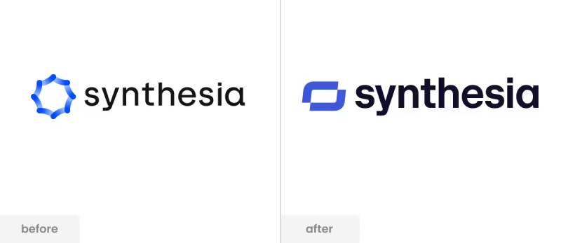
Synthesia’s visual identity has remained relatively consistent since the company gained traction. The brand launched with a simpler wordmark and refined it as the product matured.
Most changes have been subtle. Color adjustments here, spacing tweaks there.
The core identity stayed intact because it worked from the start.
Original Synthesia Logo (2017-2019)
- Years Active: 2017-2019
- Design Description: Simpler wordmark-focused design with minimal iconography
- Color Scheme: Purple tones with white text variations
- Designer: Founding team
- Context: Startup phase, establishing initial brand presence in the emerging AI video market
- Key Changes from Previous: N/A (original version)
- Cultural Significance: Represented the company’s early positioning as an innovative AI startup
Refined Synthesia Logo (2020-Present)
- Years Active: 2020-Present
- Design Description: Polished combination mark with geometric symbol and refined wordmark
- Color Scheme: Deeper purple primary, expanded palette for digital applications
- Designer: In-house team with possible external consultation
- Context: Coincided with Series A funding and enterprise market push
- Key Changes from Previous: Added distinctive icon element, improved typography weight and spacing
- Cultural Significance: Marked transition from startup to established AI platform
What Do the Design Elements of the Synthesia Logo Mean?
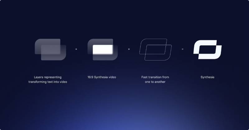
The logo’s geometric symbol suggests connection and transformation. It hints at the process of converting text into video, of bridging human ideas with AI output.
The abstract shape avoids being too literal. Smart choice, actually.
AI companies that use robot imagery tend to age poorly.
Why Did Synthesia Choose These Specific Colors?
Purple dominates the Synthesia palette. It’s not accidental.
This hue sits at the intersection of innovation and creativity. Understanding color psychology explains why so many AI companies gravitate toward purple and blue spectrums.
It feels futuristic without being cold.
- Primary Purple: Approximately #6C5CE7, symbolizes innovation, creativity, and premium positioning. Creates psychological associations with imagination and forward-thinking technology.
- White: #FFFFFF, provides contrast and clarity, represents simplicity and transparency in AI applications.
- Dark variants: Deep navy and charcoal for backgrounds, grounds the vibrant purple and adds sophistication.
What Typography Style Is Used in the Synthesia Logo?
The wordmark uses a clean sans-serif font with geometric characteristics. Letters are evenly weighted with subtle customization.
Readability was clearly a priority. The type works at small sizes, which matters for video watermarks and mobile interfaces.
Nothing fancy. Just solid typography that does its job.
What Are the Hidden Meanings in the Synthesia Logo?
The geometric symbol can be read multiple ways. Some see a play button, referencing video. Others see connected nodes, suggesting AI neural networks.
This ambiguity is probably intentional. It lets viewers project meaning onto the mark.
The name itself, “Synthesia,” references synthesis and the neurological condition synesthesia where senses blend together. The logo’s fluid geometry echoes this concept of merging different elements into something new.
How Does the Synthesia Logo Compare to Competitor Logos?
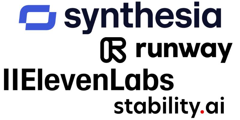
In the AI video generation space, Synthesia’s logo holds its own. It’s more refined than many competitors, less generic than others.
The purple helps it stand apart. Most AI companies default to blue.
That differentiation matters in a crowded market.
Compared to the Runway logo, Synthesia feels more corporate and enterprise-ready. Runway leans artistic and creative.
Against ElevenLabs logo (audio AI), Synthesia appears more established and polished. The DeepMind logo operates in a different tier entirely, with the weight of Google behind it.
The Hugging Face logo takes a friendlier, mascot-based approach that contrasts sharply with Synthesia’s geometric abstraction. Meanwhile, Stability AI logo uses similar color temperatures but different structural approaches.
What Are the Technical Specifications of the Synthesia Logo?
Official Color Codes:
- Primary Purple: Hex: #6C5CE7 (approximate), RGB: (108, 92, 231), CMYK: (53, 60, 0, 9)
- White: Hex: #FFFFFF, RGB: (255, 255, 255), CMYK: (0, 0, 0, 0)
- Dark Background: Hex: #1A1A2E (approximate), RGB: (26, 26, 46)
Dimensions and Proportions:
- Aspect Ratio: The full logo maintains consistent proportions across applications
- Minimum Size: Typically 24px height for digital, 10mm for print to maintain legibility
- Clear Space: Minimum padding equal to the height of the “S” in the wordmark
- File Formats: Available in vector graphics (SVG, EPS, AI) and raster formats (PNG, JPEG)
What Cultural Impact Has the Synthesia Logo Had?
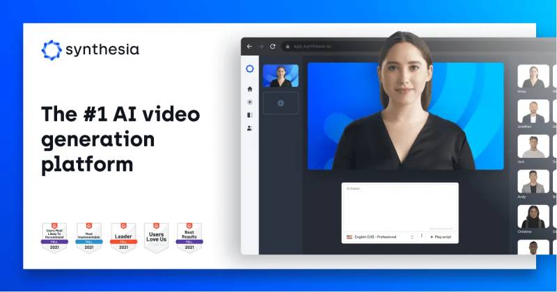
The Synthesia logo has become synonymous with AI-generated video content. When people see it, they immediately think of digital avatars and automated video production.
That’s significant brand recognition for a company barely eight years old.
The logo appears in countless corporate training videos, marketing materials, and educational content worldwide. It’s quietly ubiquitous in enterprise communications.
How Does the Synthesia Logo Fit Into the Overall Brand Identity?
The logo anchors a broader visual system. It connects to the platform’s interface design, marketing materials, and partner presentations through consistent color usage and typography.
Following solid logo design principles, the mark works across contexts. Website headers, video watermarks, conference booths, investor decks.
Everything ties back to that purple and that geometric symbol. The brand guidelines ensure consistency across all touchpoints, which is how you build recognition over time.
How Should the Synthesia Logo Be Used?
Official Usage Guidelines:
- Do: Use official logo files from Synthesia’s media kit
- Do: Maintain minimum clear space around the logo
- Do: Use approved color variations for different backgrounds
- Don’t: Stretch, rotate, or distort the logo
- Don’t: Change the logo colors outside approved variations
- Don’t: Add effects like shadows or gradients to the logo
Where to Access Official Logos:
Synthesia provides brand assets through their official website and media/press section. Partners and customers typically receive logo files through their account management contacts.
Licensing Information:
The Synthesia logo is a registered trademark. Usage requires authorization from Synthesia Ltd. Customers may use the logo in accordance with their service agreements, typically for indicating “Powered by Synthesia” or similar attribution.
Trademark Protection:
Unauthorized commercial use of the Synthesia logo may result in legal action. The company actively protects its brand identity across markets where it operates.
FAQ on The Synthesia Logo
What Does the Synthesia Logo Look Like?
The Synthesia logo features a geometric symbol paired with a clean wordmark. The icon resembles interconnected nodes or an abstract play button.
Purple dominates the color palette. The overall design reflects the company’s position as an AI video generator platform.
What Colors Are in the Synthesia Logo?
Primary purple (approximately #6C5CE7) serves as the main brand color. White provides contrast for text and backgrounds.
Dark navy variations appear in certain applications. The palette aligns with purple logos common among innovative tech brands.
Can I Download the Synthesia Logo for Free?
Synthesia provides official brand assets through their media kit. Partners and press can access logo file formats including PNG and SVG.
Check their official website’s press section. Usage requires following their trademark guidelines.
Who Designed the Synthesia Logo?
The logo was developed in-house by Synthesia’s team. No external agency has been publicly credited for the current design.
Victor Riparbelli, the CEO, oversaw the brand identity development. The London-based company refined it during their growth phase around 2020.
What Font Does Synthesia Use in Its Logo?
The wordmark uses a geometric sans-serif typeface. Letters are evenly weighted with clean lines.
It prioritizes readability at small sizes. Good kerning keeps the text balanced across digital platforms and video watermarks.
Is the Synthesia Logo Trademarked?
Yes. The Synthesia trademark is registered and protected. Unauthorized commercial use can result in legal action.
The company actively enforces its intellectual property rights. Always get permission before using their visual identity in your materials.
What File Formats Is the Synthesia Logo Available In?
Official assets include vector formats like SVG and EPS. Raster versions come in PNG with pixel-perfect clarity.
Transparent background versions exist for flexible placement. High DPI files handle print design needs.
Why Is the Synthesia Logo Purple?
Purple signals innovation and creativity. It differentiates Synthesia from competitors who default to blue in the AI avatar technology space.
The color also suggests premium positioning. Understanding saturation levels helps explain why this particular shade feels both modern and trustworthy.
Has the Synthesia Logo Changed Over Time?
The logo has seen subtle refinements since 2017. The current version solidified around 2020 during their Series A funding period.
Changes were evolutionary, not revolutionary. The brand identity maintained consistency while the geometric symbol gained more definition.
Where Can I Find Synthesia Brand Assets?
Visit Synthesia’s official website and look for their press or media section. The brand style guide materials live there.
Enterprise customers receive assets through account managers. Always use official sources rather than third-party logo databases.
Conclusion
The Synthesia logo works because it keeps things simple. A geometric symbol, a clean wordmark, and a purple palette that sticks in your memory.
It follows solid graphic design principles without overthinking it.
The mark scales well across digital platforms and video watermarks. It represents an AI video platform that turned synthetic media into something businesses actually use.
For a company built on text-to-video technology, the visual identity hits the right notes. Professional enough for enterprise clients, modern enough for the AI space.
Sometimes the best logos are the ones that just get out of the way.

Renowned for his expertise in logo design and visual branding, Bogdan has developed a multitude of logos for various clients.
His skills extend to creating posters, vector illustrations, business cards, and brochures. Additionally, Bogdan's UI kits were featured on marketplaces like Visual Hierarchy and UI8.
He also wrote in the past years on sites like Design Your Way, WebDesignerDepot, WPDean, Designmodo, Speckyboy, Slider Revolution, and more.
- Canva vs PowerPoint: Which Is Better for Presentations? - 22 September 2026
- How to Install Fonts on Mac (Step-by-Step Guide) - 20 September 2026
- From Mockup to Code: How AI-Augmented Development Speeds Up the Design Handoff - 19 September 2026

Bogdan Sandu is a seasoned designer who has been designing websites since 2008. Renowned for his expertise in logo design and visual branding, Bogdan has developed a multitude of logos for various clients. His skills extend to creating posters, vector illustrations, business cards, and brochures. Additionally, Bogdan's UI kits were featured on marketplaces like Visual Hierarchy and UI8. He also wrote in the past years on sites like Design Your Way, WebDesignerDepot, WPDean, Designmodo, Speckyboy, Slider Revolution, and more.
You Might Also Like