

The ElevenLabs logo represents one of the most recognizable marks in voice AI technology. This visual identity belongs to the company that changed how we think about synthetic speech.
Founded in 2022 by Mati Staniszewski and Piotr Dabkowski, ElevenLabs grew from a small startup into a multi-billion dollar company. The logo has remained consistent since launch, building strong brand recognition across the AI industry.
What makes this mark interesting is its dual meaning. The design connects audio playback controls with the company name itself. Few tech companies achieve this level of conceptual density in their branding.
The current version has been in use since the company’s public launch in January 2023. No major redesigns have occurred, which speaks to the strength of the original concept.
What is the ElevenLabs Logo?
The ElevenLabs logo is a combination mark featuring two vertical lines (the “11” icon) integrated with a custom wordmark. Introduced alongside the company’s beta platform in January 2023, it was developed internally by the founding team. The core symbolism connects the number eleven with a pause button, referencing audio playback.
Design Attributes
- Design Type: Combination mark (icon plus wordmark)
- Primary Elements: Two vertical lines forming “11” icon, custom sans-serif wordmark
- Official Introduction: January 2023 (beta launch)
- Designer/Agency: In-house design team
- Trademark Status: Registered trademark, protected intellectual property
- Color Palette: Primary black (#000000), white (#FFFFFF) for inverse applications
- Usage Context: Web platform, mobile apps, API documentation, marketing materials, social media, merchandise
How Has the ElevenLabs Logo Evolved Over Time?
The ElevenLabs logo has shown remarkable stability since its introduction.
Unlike many tech startups that rebrand multiple times, ElevenLabs kept its original visual identity intact.
This consistency helped build trust in a fast-moving industry where companies come and go quickly.
Original ElevenLabs Logo (2022-Present)
- Years Active: 2022 to present
- Design Description: Two thick vertical lines forming the “11” icon, directly connected to a custom wordmark with condensed, slightly squarish letterforms
- Color Scheme: Black on white backgrounds (primary), white on dark backgrounds (secondary)
- Designer: Internal founding team
- Context: Created during the pre-seed funding phase when Mati Staniszewski and Piotr Dabkowski were building the initial platform
- Key Changes from Previous: Not applicable (original version)
- Cultural Significance: Established visual language for the emerging voice AI sector, became associated with high-quality speech synthesis
What Do the Design Elements of the ElevenLabs Logo Mean?
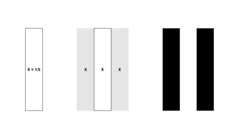
Every part of this logo carries meaning.
The two vertical lines do double duty as both the number eleven and a universal pause symbol.
This connection to audio playback controls makes perfect sense for a voice technology company.
The simplicity allows the mark to work across digital platforms and physical materials equally well.
Why Did ElevenLabs Choose These Specific Colors?
Black and white dominate the ElevenLabs color palette.
This choice reflects the company’s focus on research and engineering excellence.
The stark contrast ensures visibility across all applications, from tiny app icons to large format displays.
- Black (#000000): Represents precision, technology, and professionalism. Creates strong visual impact. Connects to the technical nature of AI development.
- White (#FFFFFF): Provides clean backgrounds, represents clarity and accessibility. Works for inverse applications on dark surfaces.
- Secondary Colors: The brand uses a spectrum of vibrant tints for marketing assets (9 distinct hues with 11 tints each), representing the diversity of human expression enabled by their technology.
What Typography Style Is Used in the ElevenLabs Logo?
The wordmark uses a custom sans-serif font designed specifically for the brand.
The letterforms are subtly condensed with slightly squarish shapes.
This verticality echoes the two parallel lines of the 11 icon, creating visual unity.
Readability stays strong at all sizes, from favicon to billboard.
What Are the Hidden Meanings in the ElevenLabs Logo?
The pause button reference is the most obvious hidden element.
When you see the “11” icon, your brain might register it as a pause symbol before the number.
This subliminal connection to audio playback reinforces what the company does without words.
The founders intentionally built this dual meaning into the design from day one.
How Does the ElevenLabs Logo Compare to Competitor Logos?

Voice AI companies tend toward abstract marks and wordmarks.
The ElevenLabs logo stands apart through its conceptual cleverness.
Most competitors use generic tech aesthetics, while ElevenLabs created something memorable.
The pause button connection gives it an edge in brand recall.
Competitor Comparison
- Murf AI: Uses a simple wordmark with a speech bubble element. More literal approach to voice technology.
- PlayHT: Features a play button icon (triangle). Direct but lacks the clever dual meaning of ElevenLabs.
- Resemble AI: Abstract geometric mark. Technical feel but less memorable connection to audio.
- Synthesia: Wordmark with subtle video-related elements. Focuses on avatar technology rather than pure voice.
- Amazon Polly: Inherits Amazon’s corporate identity. Lacks distinctive voice-specific branding.
- Google Text-to-Speech: Uses Google’s standard design language. No unique identity for the voice product.
ElevenLabs achieves what few tech company logos manage: instant recognition plus meaningful symbolism.
What Are the Technical Specifications of the ElevenLabs Logo?
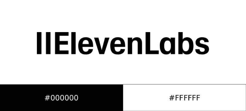
Official Color Codes
- Primary Black: Hex: #000000, RGB: (0, 0, 0), CMYK: (0, 0, 0, 100)
- Primary White: Hex: #FFFFFF, RGB: (255, 255, 255), CMYK: (0, 0, 0, 0)
Dimensions and Proportions
- Aspect Ratio: Horizontal lockup with integrated icon and wordmark
- Minimum Clearance: Equal to the height of the logo on all sides
- Icon Clearance: When used alone, the 11 icon should be centered with generous surrounding space; holding device height should equal three times the icon height
- File Formats Available: SVG (3.37 KB), PNG (18.88 KB black, 19.5 KB white)
Usage Guidelines
- Do not apply drop shadows or effects
- Do not add strokes or outlines
- Do not rotate or angle the logo
- Do not apply colors other than black or white
- Do not stretch or deform
- Do not recreate in other fonts
- Do not stack as “Eleven” over “Labs”
- Never use capital I’s to recreate the 11 icon
What Cultural Impact Has the ElevenLabs Logo Had?
The ElevenLabs logo became synonymous with AI voice technology in a remarkably short time.
When people discuss synthetic speech, this mark often comes to mind first.
The company’s rapid growth (reaching unicorn status by January 2024) amplified the logo’s visibility.
It now appears on content created by thousands of creators worldwide, from podcasts to audiobooks.
How Does the ElevenLabs Logo Fit Into the Overall Brand Identity?
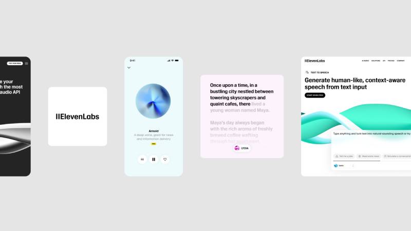
The logo serves as the anchor for a comprehensive brand guidelines system.
ElevenLabs built an entire visual language around the vertical line motif.
UI elements, marketing materials, and product interfaces all reference this core design principle.
The company’s “Sound Flow” feature uses animated gradients that echo the verticality of the 11 icon.
Radius values, card designs, and spacing all follow documented standards, creating consistency across touchpoints.
How Should the ElevenLabs Logo Be Used?

Official Usage Guidelines
- Preferred Application: Full logo (icon plus wordmark) for most communications
- Icon-Only Use: Appropriate for space-limited contexts (social media avatars, app icons) when audience is already familiar with the brand
- Background Requirements: Black logo on white backgrounds preferred; white logo permitted for dark backgrounds
- Clearance Rules: Minimum clear space equal to logo height must surround the mark
Where to Access Official Assets
- Brand page: elevenlabs.io/brand
- Press kit includes SVG and PNG downloads
- Available in black and white versions only
Licensing and Trademark
- ElevenLabs trademarks are protected intellectual property
- Third parties must follow official guidelines when incorporating branding
- Commercial use requires adherence to trademark rules
- Watermark guidelines exist for content created with ElevenLabs technology (uppercase text, left-aligned, positioned above logo in bottom right corner)
Common Mistakes to Avoid
- Writing as “Eleven Labs” (with space)
- Writing as “Elevenlabs” (lowercase L)
- Writing as “elevenlabs” (all lowercase)
- Writing as “ELEVENLABS” (all caps)
- Prefixing with “II” or “11” before the wordmark
FAQ on The Elevenlabs Logo
What Does the ElevenLabs Logo Look Like?
The ElevenLabs logo features two vertical lines forming an “11” icon connected to a custom wordmark. This minimalist design uses black on white backgrounds.
The voice AI company created a combination mark that works across digital platforms and print materials.
Who Designed the ElevenLabs Logo?
The in-house team at ElevenLabs developed the logo during the company’s founding phase in 2022. Co-founders Mati Staniszewski and Piotr Dabkowski oversaw the brand identity creation.
No external design agency was credited for the visual identity work.
What Do the Two Lines in the ElevenLabs Logo Mean?
The two vertical lines serve dual purposes. They represent the number eleven from the company name.
They also reference the universal pause icon seen in audio playback controls. This connects directly to the speech synthesis technology the company builds.
What Colors Are Used in the ElevenLabs Logo?
Black (#000000) and white (#FFFFFF) are the only official logo colors. The company chose this palette to reflect their focus on research and engineering.
Understanding color theory explains why this stark approach works for tech branding.
Can I Download the ElevenLabs Logo?
Yes. Official brand assets are available at elevenlabs.io/brand. The press kit includes vector graphics in SVG format and PNG files.
Both black and white versions come in the download package.
What Font Is Used in the ElevenLabs Logo?
The wordmark uses a custom typeface designed specifically for the brand. The letterforms are subtly condensed with squarish shapes.
This custom typography echoes the verticality of the 11 icon throughout.
Has the ElevenLabs Logo Changed Since Launch?
No. The ElevenLabs brand identity has remained consistent since the January 2023 public beta launch.
This stability helped the AI audio platform build recognition quickly. Most voice technology companies rebrand multiple times, but ElevenLabs kept their original mark.
How Should I Use the ElevenLabs Logo Correctly?
Follow the official brand style guide rules. Never rotate, stretch, or add effects to the logo.
Maintain clear space equal to the logo height on all sides. Only use black or white versions.
What File Formats Is the ElevenLabs Logo Available In?
The official downloads include SVG and PNG formats. SVG files are 3.37 KB. PNG files range from 18-19 KB.
These formats cover most web design and print design applications adequately.
Why Does the ElevenLabs Logo Use Black and White Only?
The monochromatic approach ensures maximum visual hierarchy and visibility. Black and white represent the company’s technical focus on AI voice generation.
Secondary brand colors appear in marketing materials, but the logo stays strictly black or white.
Conclusion
The ElevenLabs logo demonstrates how thoughtful design can communicate complex ideas simply. Two vertical lines manage to reference both the company name and audio playback controls simultaneously.
This visual identity helped a voice cloning startup become a recognized leader in AI audio generation.
The black and white palette keeps things clean. The custom wordmark adds personality without sacrificing readability.
Following solid logo design principles, the mark scales perfectly from app icons to billboards. Smart use of white space in the brand guidelines ensures the icon never feels cramped.
For a text-to-speech platform competing against tech giants, having a memorable symbol matters. ElevenLabs got it right on the first try.

Renowned for his expertise in logo design and visual branding, Bogdan has developed a multitude of logos for various clients.
His skills extend to creating posters, vector illustrations, business cards, and brochures. Additionally, Bogdan's UI kits were featured on marketplaces like Visual Hierarchy and UI8.
He also wrote in the past years on sites like Design Your Way, WebDesignerDepot, WPDean, Designmodo, Speckyboy, Slider Revolution, and more.
- The Windsurf Logo History, Colors, Font, And Meaning - 10 October 2026
- How to Remove Background From Product Photos (No Photoshop) - 10 October 2026
- How Designers can Build a Stronger Online Creative Identity - 9 October 2026

Bogdan Sandu is a seasoned designer who has been designing websites since 2008. Renowned for his expertise in logo design and visual branding, Bogdan has developed a multitude of logos for various clients. His skills extend to creating posters, vector illustrations, business cards, and brochures. Additionally, Bogdan's UI kits were featured on marketplaces like Visual Hierarchy and UI8. He also wrote in the past years on sites like Design Your Way, WebDesignerDepot, WPDean, Designmodo, Speckyboy, Slider Revolution, and more.
You Might Also Like


