


The Citigroup Logo History, Colors, Font, and Meaning
A peek into the soul of a corporate giant, told through the curves and colors of its most recognizable asset: the Citigroup logo.
It’s more than just a design; it’s the silent ambassador of the brand’s ethos. Now, you’re about to unravel the tapestry of meaning woven into this iconic symbol. You’ll walk away knowing why it resonates with millions and how it came to be the bedrock of Citigroup’s visual identity system.
We’re diving deep. From the Citibank emblem’s evolution to the psychology behind the blue wave, this article is your all-access pass. By the close, expect clarity on topics like financial services branding and logo intellectual property.
So let’s gear up. Decode elements packed into logos that speak without uttering a word. Get insider knowledge on crafting symbols that echo through the vast halls of commerce and brand recognition – because who doesn’t crave a slice of that immortality?
The Meaning Behind the Citigroup Logo
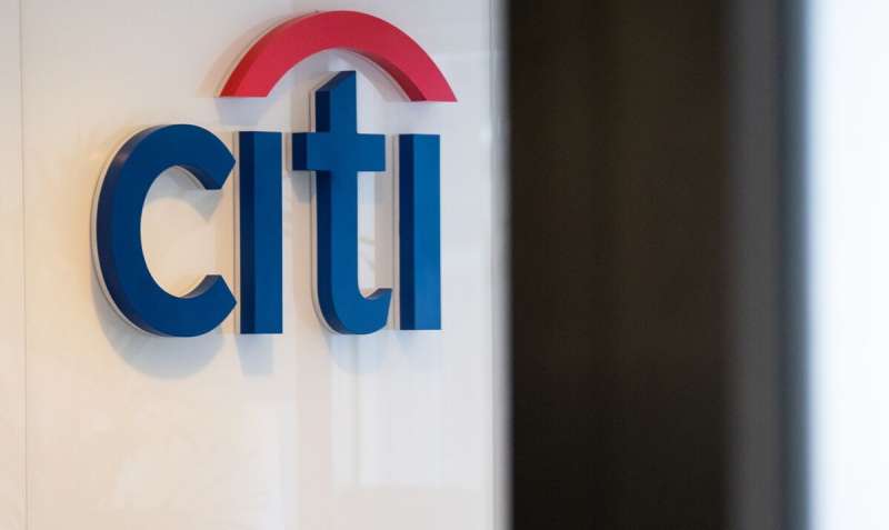
![]()
You know, there’s a whole world contained in logos. They’re like small visual stories, and the Citigroup logo is no different.
The Arc
The logo, right? It’s got this cool arc over the ‘t’. Not just a random doodle, my friend. That arc signifies an umbrella.
Think about what an umbrella does. Protects, right? You got it. That arc is all about protection and coverage. It’s Citigroup’s way of saying, “Hey, we got you covered.”
The Simplicity
Now, look again. Notice how it’s not all flashy? Just a neat, simple design. That simplicity is deliberate. It’s Citigroup’s way of saying they’re straightforward, reliable, no fluff. Just like a good bank should be.
The History of the Citigroup Logo
Logos evolve, just like us. The Citi logo’s had its own journey.
Before the Merge
Before Citigroup was Citigroup, there were two separate entities – Citicorp and Travelers Group. Each had their own logos. Citicorp had a neat textual logo, while Travelers had an umbrella. Two identities, each with their own story.
The Birth of Citigroup
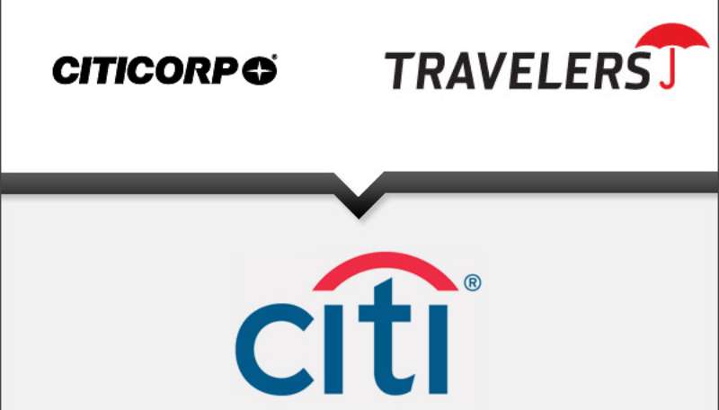
In 1998, Citicorp and Travelers decided to get together and create Citigroup. Boom! A new story needed a new logo. They kept it simple – took the name from Citicorp and the umbrella from Travelers. A perfect blend of their histories.
The Colors of the Citigroup Logo
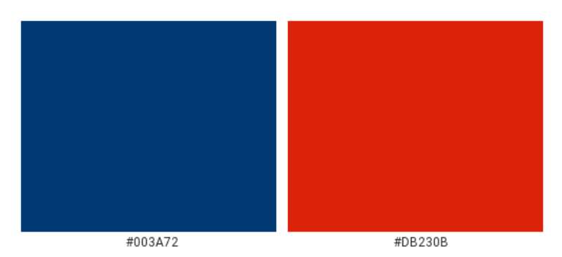
Cracking open the Citigroup color book, you find two core stars: Ateneo Blue and Maximum Red.
Feels sophisticated, right?
Ateneo Blue, or #003B70 for my designer friends, sets a tone of high-class finesse. Think a tailored suit, or a sleek sports car. It’s like a hand-crafted espresso, smooth and robust.
But, what about Maximum Red?
Well, think of a fiery, enthusiastic rally. Or the power-packed first sip of your morning smoothie. This lively, energizing red, coded as #D9261C, spells confidence.
Now, picture these colors, not solo, but together. On a clean, crisp, white canvas. What you get is a logo with a balance – exuding grace and gusto, all at once.
The Font Used in the Citi Logo
Font matters. It can change the way we feel about a word. Citigroup uses a custom typeface, but it’s very similar to a classic font.
Elegance and Stability
The font in the Citi logo is elegant yet stable. It’s their way of saying they’re a solid, stable entity, but with a touch of class. The perfect combo for a financial giant.
The Logo’s Impact on Brand Identity
A logo is a brand’s face to the world. Let’s see how the Citigroup logo impacts its brand identity.
Creating Recognition
A unique logo helps in creating brand recognition. Citigroup’s logo does just that. Its simplicity and unique arc make it easily recognizable.
Communicating Values
A logo is also a way for a brand to communicate its values. Citigroup’s logo, with its protective arc and blue color, communicates values of trust, protection, and reliability.
Citigroup Logo in Popular Culture
Logos often seep into popular culture. Let’s see how the Citigroup logo has done that.
In Movies and TV
You’d be surprised how often you see the Citigroup logo in movies and TV. It’s there in scenes set in cities, subtly reinforcing its presence.
In Sports Sponsorship
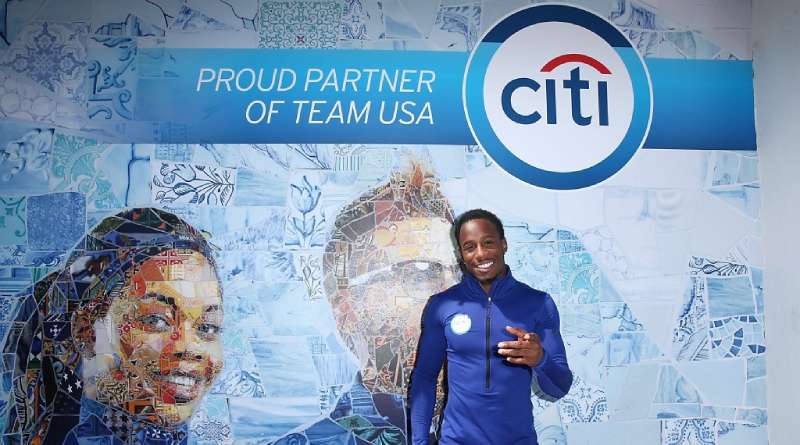
Citigroup has been involved in sports sponsorships, and their logo often gets a place of pride at these events. Another way the logo enters our collective consciousness.
FAQ on the Citigroup Logo
What’s the story behind the Citigroup logo?
The Citigroup logo, you know, it’s like a phoenix rising. After Citicorp and Travelers Group merged, they needed a fresh identity. The red umbrella from Travelers and Citicorp’s blue were remixed to forge this new symbol. It’s both a nod to legacy and a leap into the future.
How has the Citigroup logo evolved over time?
Oh, it’s been a journey. Started with a simplicity that spoke volumes but evolved after the mega-merger. The initial combo was gutsy – a hybrid emblem. Now, it’s this sleek, modern design that stripped back to basics. It’s all about being timeless in an ever-changing financial landscape.
Is the Citigroup logo synonymous with Citibank?
Absolutely, they’re family. While Citigroup is the parent powerhouse, Citibank is where the magic happens for consumers. The logo represents both – a beacon of trust and stability in the rocky seas of money matters. That’s what they’re going for, and it’s, frankly, spot on.
What do the colors in the Citigroup logo signify?
Colors speak, right? The blue is your classic corporate trust and dependability. It’s like a suit that never goes out of fashion. And that red, it’s the energy, the drive, the passion. Together, they’re a balance – power with a punch of dynamism.
How does the logo reflect Citigroup’s brand identity?
It’s like the silent spokesman of the brand identity. That solitary wave, it’s fluid, it’s adaptable – just like Citigroup wants to be seen in the global economy. It’s minimal, sure, but speaks of a world where finance meets innovation. It’s all corporate colors schemes and psychology.
Who designed the Citigroup logo?
Here’s the scoop – it was Paula Scher. A legend from Pentagram, a design consultancy with mad chops. She’s the maestro who took a brief, a chat over lunch reportedly, and doodled history. Now it’s a design that’s both simple and sagely at the same time.
What are the legal considerations around the Citigroup logo?
Oh, it’s draped in legalese. It’s protected by trademarks and copyrights. Copy it, use it without a nod, and you hit legal quicksand. It’s about respecting intellectual property – Citigroup’s crafted image isn’t fair game. It’s law-girded, as it should be.
How does the Citigroup logo influence its marketing and advertising?
It’s the cornerstone, buddy. It anchors all their marketing and advertising strategies. It’s gotta be consistent, powerful, familiar. Every time you see it, you’re supposed to think “Citigroup” without a blink. It’s the linchpin in their visual communication. A strong logo, strong brand.
Can the Citigroup logo be considered iconic in the financial industry?
Iconic? You bet. In the maze of financial services branding, it’s a north star. I’d say, it’s up there with the big boys. A solid image that’s rolled with the punches and stood the test of time. It’s a visual shorthand for the sector.
How does Citigroup protect its brand image and the logo integrity?
It’s all about control. The Citigroup crew is on it with branding guidelines tighter than Fort Knox. Every use of the logo is monitored, standardized – no funny business, no diluting the brand stew. They’re guardians of the brand recognition, ensuring their logo’s integrity, everywhere, every time.
Conclusion
Let’s wrap this up! We’ve journeyed through the essence of the Citigroup logo – that iconic emblem which speaks volumes without uttering a sound.
You’ve seen how it’s stitched from history’s fabric, evolving from a merge to a beacon that now leads the way in the financial sector. It’s more than a pretty picture; it embodies trust, innovation, and the relentless drive of a titan.
Look at it, bold yet fluid, simple but profound, an image that walks the talk of Citigroup’s global narrative. I mean, where do you often find such a harmonious blend?
And remember, those hues? That splash of blue and dash of red? They’re not just colors; they encapsulate values, aspirations – the core spirit of the brand.
So, next time that blue wave catches your eye, know that it’s not just branding. It’s a story. A legacy. A piece of design brilliance waving proudly in the corporate skyline.
If you liked this article about the Citigroup logo, you should check out this article about the Bank of America logo.
there are also similar articles discussing the Wells Fargo logo, the UniCredit logo, the JP Morgan Chase logo, the UBS logo, and the HSBC logo.
And let’s not forget about articles on the Barclays logo, the Deutsche Bank logo, the Societe Generale logo, and the ING logo.
Bogdan Sandu, a seasoned designer with 15 years of diverse experience, has been designing websites since 2008.
Renowned for his expertise in logo design and visual branding, Bogdan has developed a multitude of logos for various clients.
His skills extend to creating posters, vector illustrations, business cards, and brochures. Additionally, Bogdan's UI kits were featured on marketplaces like Visual Hierarchy and UI8.
Latest posts by Bogdan Sandu (see all)
- REM to PX Converter - 5 May 2024
- The Asahi Logo History, Colors, Font, And Meaning - 4 May 2024
- Playtime Perfection: Fun Kids Color Palettes - 4 May 2024