People process visuals 60,000 times faster than text. That single fact explains why infographic design has become one of the most used formats in content marketing, education, and data communication.
But slapping icons onto a chart doesn’t make an infographic. The real practice combines data visualization, design elements, and editorial structure into a single visual that tells a clear story.
This guide breaks down what infographic design actually is, the core principles behind it, the tools professionals use, and what separates an effective infographic from one that just looks busy. Whether you’re a marketer, a designer, or someone trying to communicate complex data, you’ll walk away knowing how to approach the format with purpose.
What Is Infographic Design
Infographic design is the practice of converting data, processes, and concepts into visual formats that communicate faster than plain text. It sits at the crossroads of graphic design, data visualization, and editorial communication.
MIT research confirms the speed gap: the human brain processes visual content within 13 milliseconds, while plain text takes 130 to 150 milliseconds (DemandSage, 2026). That difference matters when you’re trying to hold someone’s attention online.
But it’s not just about making things look nice. Infographic design wraps structured data inside a deliberate layout built on graphic design principles, where every icon, chart, and text block serves one goal: faster understanding.
Think of a typical blog post packed with statistics. Most readers skim it. Now put those same numbers into a well-structured visual with clear visual hierarchy, and suddenly 81% of readers who normally skim are actually absorbing the content (DemandSage).
What separates infographic design from standard graphic work? Scope. A poster might sell a product. A logo represents a brand. An infographic has to take complex information and make it feel simple without dumbing it down.
DemandSage reports that 65% of brands now integrate infographics into their content marketing strategy (2026). That number has been climbing for years, and it tracks with the broader move toward visual content across digital platforms.
Core Elements of an Infographic
Every infographic is built from two layers: the information itself and the visual structure wrapped around it. Get either one wrong and the whole thing falls apart.
Typography and Color in Infographic Layouts
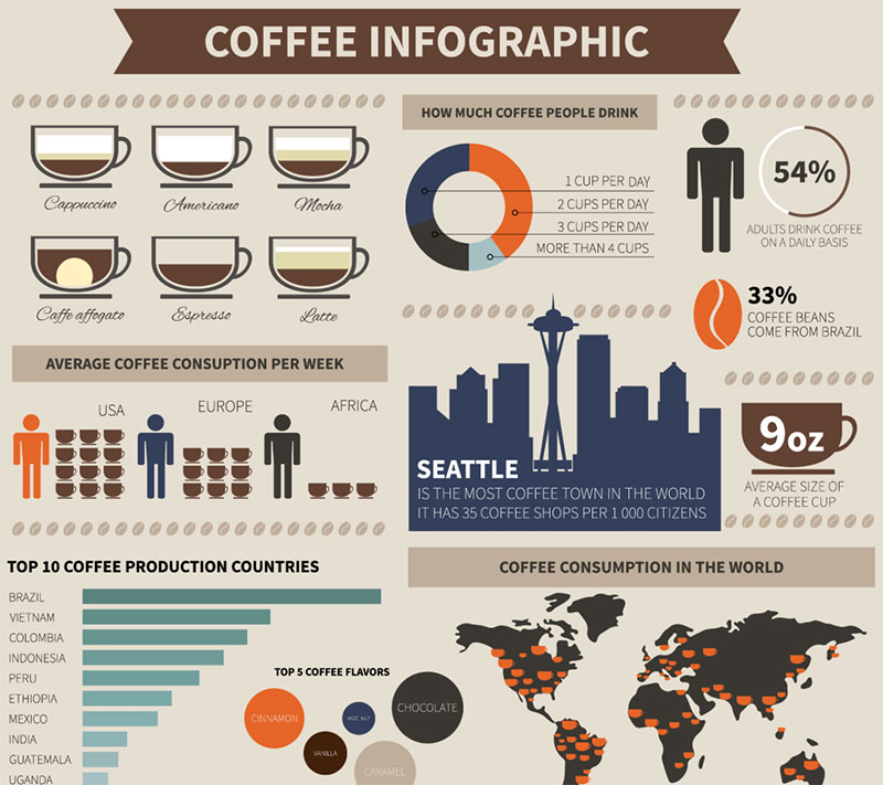
Type choices carry weight. The typography in an infographic has to work harder than in a blog post or article. It needs to guide the eye across data points, separate sections, and stay readable at smaller sizes when shared on mobile.
Most infographic designers reach for a sans-serif font for body text because it stays legible at reduced scale. Headlines often use bolder or display-oriented typefaces to create clear breaks between sections.
Color follows a similar logic. A strong color palette does three things: establishes visual identity, groups related information, and draws focus to key data points. Xerox research found that colored visuals boost a reader’s attention span and comprehension by 82%.
Understanding color theory helps here. You don’t need to go wild. A complementary color scheme with two opposing hues creates strong contrast. Analogous colors keep things calmer and more unified when the data itself is already complex enough.
How Visual Hierarchy Controls Reading Order

An infographic without clear hierarchy is just a decorated wall of text. Readers won’t figure out where to start on their own.
Contrast is the main lever. Large numbers next to small labels. Bold headlines against lighter body copy. Bright data points on muted backgrounds.
Then there’s layout flow. Most infographics follow a top-to-bottom reading pattern, but some use sectioned or narrative paths. The key is that every piece connects to the next through directional cues: arrows, numbered steps, or progressive color shifts.
Proximity matters too. Related data grouped together reads as one unit. Unrelated data spaced apart signals a topic shift. These aren’t artistic preferences. They’re functional decisions backed by Gestalt principles of perception.
Types of Infographics
Not all infographics do the same job. The type you choose depends entirely on the story your data tells. Pick the wrong format and you’re fighting the content instead of supporting it.
| Type | Best For | Key Feature |
|---|---|---|
| Statistical | Survey results, research data | Charts, graphs, percentages |
| Process / Timeline | Step-by-step workflows, history | Sequential flow, numbered steps |
| Comparison | Product evaluations, A vs. B decisions | Side-by-side layout, contrasting sections |
| Geographic | Regional data, location-based trends | Maps, location markers, regional color coding |
| Informational | Topic overviews, educational content | Mixed visuals, icons, sectioned layout |
Statistical vs. Informational Infographics
Statistical infographics are data-heavy. They lean on chart design, pictograms, and percentage-based visuals to present research findings or survey results. Visual Capitalist has built an entire media brand around this format, turning financial and economic data into graphics that regularly go viral.
Informational infographics take a wider approach. They mix icons, short text blocks, and illustrated elements to explain a topic rather than prove a point with numbers. DemandSage data shows that 56% of professionals use infographics for all their marketing purposes (2026), and a big chunk of those are informational formats used for blog content and social media.
The difference comes down to density. Statistical infographics reward close attention. Informational ones reward scanning.
Interactive Infographics and When They Work
Over 28% of marketers now use interactive infographics (DemandSage, 2026). These let users hover, click, or scroll through data at their own pace.
They work best when the dataset is large enough that a static format would feel overwhelming. The New York Times has done this well for years, building interactive graphics for election data, climate change statistics, and economic trends that let readers explore the specific slices they care about.
Interactive formats also perform better on desktop than mobile. If your audience primarily browses on phones (and DemandSage reports that 79% of users leave non-responsive sites), a simpler static or carousel format is usually the safer call.
How Infographic Design Differs from Data Visualization

People use these terms interchangeably. They’re not the same thing.
Data visualization focuses on the accurate representation of datasets. Think Tableau dashboards, D3.js charts, or Google Data Studio reports. The goal is precision. The audience is often analysts, researchers, or internal teams who need to extract specific values from the display.
Infographic design starts with that same data but adds an editorial layer on top. It brings in storytelling, branded visual elements, illustrated icons, and a narrative structure. The audience is broader. The goal shifts from precision to comprehension and engagement.
| Dimension | Data Visualization | Infographic Design |
|---|---|---|
| Primary goal | Accurate data display | Storytelling with data |
| Audience | Analysts, internal teams | General public, marketing audiences |
| Tools | Tableau, D3.js, Power BI | Illustrator, Canva, Figma, Piktochart |
| Branding | Minimal or none | Full brand integration |
| Illustration | Rare | Common (icons, custom graphics) |
Edward Tufte, often called the pioneer of data visualization, introduced concepts like the “data-ink ratio,” which pushes for maximum data display with minimum decorative elements. That philosophy works for analytical tools. But infographic design deliberately bends that rule, because its job isn’t just to display data. It’s to make people care about the data.
Took me a while to fully appreciate that distinction. I used to think a well-made chart in Excel was “an infographic.” It’s not. It’s missing the entire editorial and design layer that makes an infographic shareable and memorable.
The Infographic Design Process

Building an infographic that actually works takes more planning than most people expect. Jumping straight into Adobe Illustrator or Canva before you’ve mapped out the content is the fastest way to waste time. At least in my experience, the process is always longer than the design itself.
Wireframing Before Designing
Wireframing an infographic is like sketching a floor plan before building a house. You figure out how many sections exist, what the reading flow looks like, and where the heaviest data blocks land.
This doesn’t need to be fancy. A rough pencil sketch or a quick layout in Figma gets the job done. The point is to separate structure decisions from style decisions so you’re not rethinking the layout while trying to pick fonts.
Venngage’s visual content survey found that 50.5% of marketers say finding the right layout is their biggest struggle when creating visual content (2024). That’s a wireframing problem, not a design problem.
Fact-Checking and Source Integrity
Every stat needs a source. Infographics get shared widely, and a single wrong number can permanently damage credibility.
This step is easy to skip and expensive to skip. DemandSage reports that articles with infographics generate 178% more inbound links (2026). That backlink value evaporates the moment someone finds a misquoted stat and calls it out publicly.
Best practice: link to original research rather than secondary sources. If the data came from a Pew Research or Statista report, cite that, not the blog post that quoted it.
Tools Used for Infographic Design
The tool you pick depends on your skill level, your budget, and whether you’re working alone or with a team. There’s no single right answer, which is honestly part of why this gets confusing for people just starting out.
Statista data from 2024 shows Adobe Photoshop leads the graphics software market with roughly 42% market share, followed by InDesign at 26% and Illustrator at 12%. But market share doesn’t mean best fit for infographic work specifically.
Adobe Illustrator is the standard for professional infographic design. It handles vector graphics natively, which means your designs scale to any size without losing quality. Pair it with data from Google Sheets or Microsoft Excel and you have a full workflow.
Figma has picked up serious traction among teams that need real-time collaboration. You can share infographic drafts, get comments inline, and hand off final assets without exporting files back and forth.
Template-driven platforms:
- Canva works for non-designers who need something fast. The templates are decent, but they look generic if you don’t customize heavily
- Piktochart and Venngage are built specifically for infographics, with chart generators and icon libraries baked in
- Visme sits between Canva’s simplicity and Illustrator’s depth, with animation features that most template tools lack
DemandSage reports that 39.7% of US marketers use online tools to create infographics and other visual content (2026). That number reflects the shift toward browser-based platforms that don’t require installing heavyweight software.
If you’re producing infographics that need to look sharp in print, pay attention to output formats. Work in CMYK color mode for anything going to a printer. Digital-only work stays in RGB. And check your export resolution. Low DPI files look fine on screen but fall apart on paper.
What Makes an Infographic Effective

An infographic either works in the first few seconds or it doesn’t. There’s no gradual warm-up. People scrolling through a feed or skimming a blog post will decide almost instantly whether to engage or move on.
DemandSage data shows that 84% of companies consider infographic marketing a valuable and effective tool (2026). But “effective” has specific requirements.
Clarity beats decoration. If a viewer can’t understand the main point within 10 to 15 seconds, the design has failed. That means limiting the scope. Trying to cover an entire topic in one graphic leads to clutter and confusion.
Accuracy of the underlying data is non-negotiable. People are 323% more likely to correctly follow instructions when those instructions include visual aids like infographics, according to Digital Web Solutions. Wrong numbers destroy that trust instantly.
What separates good from great:
- One clear focal point that anchors the entire layout
- Readable font choices at every size, especially on mobile
- Enough white space so sections breathe instead of bleed into each other
- Source citations visible at the bottom for credibility
Visual Capitalist, the Vancouver-based data media company generating an estimated $17.4 million annually (DesignRush, 2025), builds every infographic around a single dominant statistic. One number. One story. That focus is why their content consistently goes viral on LinkedIn and gets picked up by outlets like Bloomberg and Business Insider.
Mobile responsiveness matters more than most designers realize. DemandSage reports that 50% of global e-commerce revenue comes from smartphones (2026). If the text shrinks to unreadable levels on a phone screen, half your potential audience bounces.
Common Mistakes in Infographic Design
Most bad infographics aren’t ugly. They’re just confusing. The design might look polished, but the information doesn’t land. And that gap between looking good and working well is where most projects go wrong.
Overloading with Data
DemandSage reports that 43% of marketers say producing consistent quality visual content is their biggest challenge (2026). A lot of that struggle comes from cramming too much into a single graphic.
The instinct to include every stat is understandable. But an infographic with 30 data points reads like a spreadsheet wearing a costume. Cut it down to 5 to 8 key numbers maximum.
Poor Typography and Contrast
Illegible text kills engagement faster than bad data. If you’re using a light gray typeface on a white background, readers won’t fight to read it. They’ll just leave.
Understanding color contrast helps avoid this. Dark text on light backgrounds (or the reverse) with enough saturation difference between foreground and background ensures readability across devices and lighting conditions.
Misleading Chart Scales
Edward Tufte called this the “lie factor.” When a chart’s visual proportions don’t match the actual data proportions, it distorts the message.
| Mistake | What Happens | Fix |
|---|---|---|
| Truncated Y-axis | Small changes look dramatic | Start axis at zero |
| 3D chart effects | Perspective distorts values | Use flat 2D charts |
| Cherry-picked date ranges | Hides broader trends | Show full context window |
| Inconsistent intervals | Misrepresents rate of change | Keep time scales uniform |
Ignoring the Audience
65% of the world’s population are visual learners, according to Digital Web Solutions. But “visual learner” doesn’t mean “everyone processes the same way.”
An infographic for a medical journal audience needs different density and vocabulary than one for a social media marketing campaign. Design without a clear audience in mind and you end up with something that speaks to nobody.
Where Infographic Design Is Used
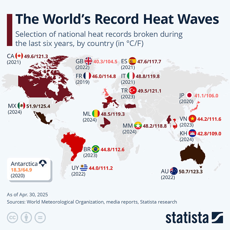
Infographics show up in more places than most people realize. The format has moved well beyond blog posts and marketing campaigns into education, internal communications, journalism, and nonprofit advocacy.
DemandSage data shows that 55% of marketers create social media infographics more than any other type of visual media (2026). But marketing is only part of the picture.
Infographics in Content Marketing
Blog integration: Articles that contain infographics produce 178% more inbound links than those without (DemandSage, 2026). That link-building effect is why so many content teams invest in original graphics.
Social distribution: Infographics get shared on social platforms 3x more than other content types. Instagram carousel formats and LinkedIn document posts are the two highest-performing distribution channels for infographic content right now.
Pinterest is a special case. The platform was practically built for vertical visual content, and infographics tend to perform exceptionally well there. Pinterest has 553 million monthly active users (HubSpot, 2025), and the long-form vertical format that works best on the platform is exactly the shape most infographics already use.
Infographics in Education and Nonprofits
The World Heart Federation uses infographic design to communicate cardiovascular disease risk factors in a format that patients actually understand. People who receive health data as infographics are 2.84 times more likely to understand their condition, according to Search Logistics.
Educational infographics follow slightly different rules than marketing ones. The priority shifts from engagement to comprehension. That means simpler layouts, larger text, and less reliance on decorative elements.
Nonprofit organizations use infographics heavily in advocacy work, where complex policy issues need to be compressed into something a donor or legislator can absorb in under a minute. The visual format bypasses the “wall of text” problem that kills most policy briefs.
Skills Required for Infographic Design

Building infographics that actually perform requires a mix of hard and soft skills. The visual side gets all the attention, but data literacy and editorial thinking carry just as much weight.
The U.S. Bureau of Labor Statistics reports a median annual wage of $61,300 for graphic designers in May 2024, with the top 10% earning over $103,000. Designers who specialize in data-driven visual content (including infographics) tend to sit on the higher end of that range.
| Skill Category | What It Covers | Why It Matters |
|---|---|---|
| Visual design | Layout, color harmony, typographic hierarchy | Drives readability and engagement |
| Data literacy | Interpreting datasets, spotting trends | Prevents misleading visualizations |
| Editorial thinking | Structuring a narrative arc from raw data | Turns numbers into a story |
| Software proficiency | Adobe Illustrator, Figma, Canva, Excel | Execution speed and output quality |
| Platform awareness | Sizing, formatting, responsive export | Ensures reach across devices |
Design fundamentals come first. You need to understand how alignment creates structure, how balance distributes visual weight, and how repetition ties sections together. These aren’t abstract principles. They’re the difference between a layout that guides the eye and one that scatters it.
Understanding scale and proportion directly affects how data points land visually. A percentage shown at the wrong size relative to its neighbors can accidentally mislead, even if the numbers themselves are correct.
Data literacy is the underrated half. You can be a fantastic visual designer and still produce a terrible infographic if you misread the dataset. Knowing how to pull data from Google Sheets, clean it, spot outliers, and identify the actual story inside the numbers. That’s the skill that separates infographic designers from general graphic designers.
Then there’s the editorial layer. Deciding what to include, what to cut, and how to sequence information so it builds toward a conclusion. Took me a long time to realize that the best infographic designers think more like editors than artists.
BLS projects about 20,000 job openings for graphic designers each year through 2034 in the US alone. The ones who also know how to handle data and tell a story with it won’t have trouble finding work.
FAQ on What Is Infographic Design
What is the purpose of infographic design?
Infographic design turns complex data and information into visual formats that people absorb quickly. The goal is faster comprehension. Instead of reading paragraphs of statistics, viewers scan a structured layout with charts, icons, and short text blocks.
What software do professionals use for infographic design?
Adobe Illustrator is the industry standard for professional work because it handles pixel-perfect layouts natively. Figma works well for team collaboration. Canva, Piktochart, and Venngage offer template-driven options for non-designers who need results fast.
How is infographic design different from graphic design?
Graphic design covers a broad range of visual communication, from poster design to packaging. Infographic design is a specific subset focused on presenting data and information visually. It requires data literacy on top of standard design skills.
What makes an infographic effective?
Clarity, accuracy, and a single focal point. The viewer should understand the main message within seconds. Effective infographics limit scope to 5 to 8 data points, use strong visual hierarchy, and cite their sources.
What are the main types of infographics?
The most common types are statistical, process or timeline, comparison, geographic, and informational. Each serves a different purpose. Statistical infographics rely on charts and percentages. Process infographics map step-by-step workflows.
How much does it cost to create a professional infographic?
Costs range from free (using template tools like Visme or Canva) to $2,000 or more for custom work from a professional designer. Complexity, research depth, and illustration style all affect the final price.
Can infographics help with search engine rankings?
Yes. Articles containing infographics generate 178% more inbound links than text-only content, according to DemandSage. Those backlinks signal authority to search engines, which can improve rankings over time.
What file format should infographics be saved in?
PNG works best for web sharing because it preserves quality with transparency support. PDF is ideal for print or downloadable versions. JPEG files compress well but lose some sharpness, so they’re a tradeoff for smaller file sizes.
What size should an infographic be?
Standard width for web infographics sits around 800 to 1100 pixels. Length varies by content, but most fall between 2000 and 5000 pixels tall. Pinterest and social media formats often require specific vertical dimensions per platform.
Do I need design skills to create an infographic?
Not necessarily. Tools like Piktochart and Venngage provide drag-and-drop templates that handle layout decisions for you. But understanding basics like color psychology and font spacing will make any template look significantly better.
Conclusion
Infographic design is a skill that sits at the intersection of visual communication, data literacy, and editorial judgment. Getting good at it takes more than picking the right template.
The tools are accessible. Platforms like Piktochart, Visme, and Figma have lowered the barrier to entry. But the gap between a generic visual and a well-crafted infographic still comes down to understanding grid systems, applying emphasis correctly, and knowing how to structure information for your specific audience.
Start with clear data. Build a wireframe before touching any design software. Keep the scope tight. And always check your facts twice.
The brands and creators producing the best infographics treat every graphic as a piece of social media content, a research asset, and a visual identity touchpoint all at once. That’s the standard worth aiming for.

Renowned for his expertise in logo design and visual branding, Bogdan has developed a multitude of logos for various clients.
His skills extend to creating posters, vector illustrations, business cards, and brochures. Additionally, Bogdan's UI kits were featured on marketplaces like Visual Hierarchy and UI8.
He also wrote in the past years on sites like Design Your Way, WebDesignerDepot, WPDean, Designmodo, Speckyboy, Slider Revolution, and more.
- The Windsurf Logo History, Colors, Font, And Meaning - 10 October 2026
- How to Remove Background From Product Photos (No Photoshop) - 10 October 2026
- How Designers can Build a Stronger Online Creative Identity - 9 October 2026

Bogdan Sandu is a seasoned designer who has been designing websites since 2008. Renowned for his expertise in logo design and visual branding, Bogdan has developed a multitude of logos for various clients. His skills extend to creating posters, vector illustrations, business cards, and brochures. Additionally, Bogdan's UI kits were featured on marketplaces like Visual Hierarchy and UI8. He also wrote in the past years on sites like Design Your Way, WebDesignerDepot, WPDean, Designmodo, Speckyboy, Slider Revolution, and more.
You Might Also Like