


Most people read thousands of words a day without ever noticing what makes text easy or hard to process. But the answer is often hiding in the vertical anatomy of the letters themselves.
Understanding what are ascenders and descenders in typography explains why some typefaces feel spacious and others feel cramped, why all-caps text slows readers down, and why swapping one font for another can quietly break an entire layout.
These two letterform properties sit at the core of type design, line spacing decisions, and how browsers render text on screen.
By the end of this article, you’ll know how ascenders and descenders are measured, how they affect readability and line height, and how to use that knowledge when choosing or setting type.
What Are Ascenders and Descenders

Typography is built on a system of invisible lines. Every letterform sits, rises, or drops in relation to those lines.
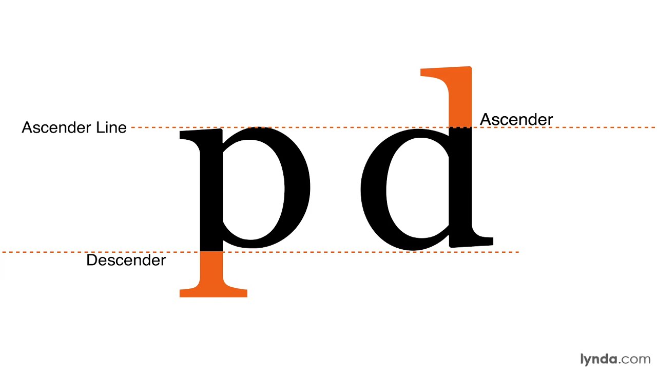
Ascenders are the vertical strokes of lowercase letters that extend above the x-height. You see them in b, d, f, h, k, l, and t.
Descenders are the portions of lowercase letters that drop below the baseline. Common examples include g, j, p, q, and y.
The two are always defined relative to each other and to the same set of reference lines. No baseline, no ascenders or descenders.
| Reference Line | Position | Purpose |
|---|---|---|
| Baseline | Foundation | Where most letters rest |
| X-height | Mid-zone | Top of lowercase body (e.g., x, a, n) |
| Ascender line | Above x-height | Ceiling for tall lowercase letters |
| Descender line | Below baseline | Floor for letters with tails |
| Cap height | Above x-height | Height of uppercase letters |
Capital letters reach up toward cap height, which often sits slightly below the ascender line in well-designed typefaces. That gap is deliberate. It keeps uppercase letters from visually overpowering their lowercase neighbors.
A study by Bart Cooreman found that letters with clear ascenders and descenders are recognized more easily than those without, reinforcing their role in effective letterform design (Zarma Type, 2024).
Some numerals also have descenders. In old-style figures, 3, 4, 5, 7, and 9 dip below the baseline, much like lowercase letters. Most modern typefaces dropped this in favor of uniform uppercase numerals, though old-style figures still appear in more classic serif font designs.
Ascender Height and Descender Depth Measurements
Type designers don’t eyeball these proportions. Everything is calculated in UPM (units per em), a coordinate grid built into every font file.
How measurements work:
- Ascender height: distance from the baseline to the top of the tallest lowercase glyph
- Descender depth: distance from the baseline downward to the lowest point of a descending letter
- UPM grid: typically 1000 units for PostScript fonts, 2048 for TrueType
- Expressed as percentages: ascender and descender values are fractions of the total UPM
These values live inside OpenType tables in the font file itself. The OS/2 table holds sTypoAscender and sTypoDescender values. The hhea table holds a parallel set used specifically by Apple devices.
The difference matters more than most people expect. Two fonts at the same point size can look completely different in line height simply because their UPM values diverge.
Garamond and Helvetica are a good example of this. Garamond’s longer ascenders result in it appearing to have greater leading between lines even at identical font sizes compared to Helvetica’s more compact proportions (Readability Consortium, 2023).
Tools like FontForge, Glyphs App, and RoboFont are where type designers set and adjust these values during the font creation process.
How Ascenders and Descenders Affect Line Height

Line height decisions can’t be made without thinking about vertical font metrics first.
Typefaces with long ascenders and deep descenders need more leading to prevent lines from colliding. A tight line height that works fine with Helvetica will cause Garamond’s descenders to crash into the ascenders of the line below.
According to Smashing Magazine (2024), good spacing can reduce reading fatigue by 25%. That starts with understanding how much vertical space your chosen typeface actually needs.
| Typeface Profile | Ascender/Descender | Suggested Line Height |
|---|---|---|
| Long (e.g., Garamond, Caslon) | Generous | 1.5–1.7× font size |
| Medium (e.g., Times New Roman) | Moderate | 1.4–1.6× font size |
| Short (e.g., Helvetica, Arial) | Compact | 1.3–1.5× font size |
In CSS, a fixed line-height value in pixels is a trap. If the font changes, the spacing breaks. A unitless ratio like line-height: 1.5 scales with the font size and adapts to the ascender/descender proportions of whatever font you’re using.
Google’s 2023 Material Design update used a 1.5 line height ratio for interface elements and saw form completion rates improve by 18% (DeveloperUX, 2025). The connection between spacing and action isn’t subtle.
Ascenders and Descenders in Typeface Design

When type designers are drawing a new typeface, ascender and descender length is one of the first decisions made. It shapes everything that comes after.
Long ascenders and descenders create an elegant, expressive visual rhythm. They’re most common in oldstyle serifs, calligraphic typefaces, and display fonts meant for headlines or packaging.
Short ascenders and descenders produce a more compact, efficient letterform. Typefaces built for text-heavy interfaces, small print, or tight grid systems tend to favor this approach.
Well-proportioned ascenders and descenders can improve letter recognition and overall reading comfort. When the x-height is too large and compresses the ascenders, letters like n and h become harder to distinguish from one another (Zarma Type, 2024).
Cap height and ascender height are almost always different. Most well-designed typefaces keep the ascender line slightly above cap height. If they were the same, capital letters and tall lowercase letters like h or l would look the same height, which creates visual flatness and reduces typographic hierarchy.
Overshoot is worth mentioning here. Round letters like b and d extend fractionally above the ascender line to compensate for the optical illusion that makes curved tops appear shorter than flat ones. Without overshoot, those letters would look undersized even at the correct measurement.
Ascenders, Descenders, and Readability

Word recognition doesn’t happen letter by letter. Readers identify words by their overall silhouette, and ascenders and descenders are the features that give words their distinct shapes.
That’s the core reason why all-caps text is harder to read at speed. No ascenders. No descenders. Every word becomes a uniform rectangle, stripping away the shape cues readers rely on.
Research shows that typefaces with prominent ascenders and descenders are generally considered more readable than those without (EBSCO Research on Typography). This holds especially true for body text at smaller sizes.
Three readability factors tied to ascender/descender proportions:
- Word shape distinctiveness: longer extensions create more varied silhouettes
- Letter confusion: short ascenders increase mix-ups between similar letterforms (like i and l, or n and h)
- Line separation: generous descenders help the eye distinguish one line from the next
A 2024 study published in Educational Sciences found individual students experienced significant boosts in reading speed based on font choice, with differences tied closely to letterform clarity and spacing characteristics.
For readers with low vision, the length and visibility of ascenders and descenders is especially important. Accessibility guidance consistently points to typefaces with clear vertical extension as better choices for inclusive design.
Clipping and Cropping Issues with Ascenders and Descenders

This is where ascenders and descenders stop being a purely typographic concern and become a real production headache.
Descenders get cut off more often than most designers realize. The problem shows up in UI components, text boxes, form fields, and anywhere a container is sized based on x-height or cap height rather than the full font bounding box.
Common places it breaks:
- CSS
overflow: hiddenon a container set too tight - Button labels where descenders in g, p, or y clip against the bottom padding
- Figma and InDesign text boxes set to auto-height (which sometimes ignores descenders)
- Email clients that render line boxes differently from browsers
Fonts with shorter descenders, combined with proper padding, reduce misclicks by 15% in e-commerce apps (DeveloperUX, 2025). That’s a direct UX metric tied back to vertical font metrics.
CSS now offers ascent-override and descent-override properties. These let developers adjust how the browser interprets a font’s vertical metrics, useful for fallback font matching or fixing third-party fonts that ship with unexpected bounding boxes.
A practical test: set background-color on an inline element and check whether the color block clips any part of your descenders. If it does, your line height or padding needs adjusting. The glyph has to breathe.
The NHS app redesign ran into this directly. By switching to Roboto at 18px with 27px leading, the team resolved vertical clipping issues and achieved AAA accessibility compliance in the process (DeveloperUX, 2025).
Ascenders and Descenders Across Different Scripts
Ascender and descender terminology comes from Latin script. Applying it directly to other writing systems gets complicated fast.
| Script | Vertical Extension Concept | Equivalent Terms |
|---|---|---|
| Latin | Ascenders above x-height, descenders below baseline | Standard terminology applies |
| Devanagari | Marks above and below base letters | “Above base” and “below base” marks |
| Arabic | No traditional ascenders/descenders as a concept | Diacritics and above/below forms |
| CJK | Characters fill a uniform square frame | No ascender/descender equivalent |
Latin script is the only major system with consistent ascender and descender heights. Most other scripts vary considerably in their tallest and shortest letterforms, making direct metric matching impossible (Typotheque, 2023).
Devanagari has its own vertical structure. Letters hang from a horizontal headline called the shirorekha, not from a baseline in the Latin sense. Marks extend above and below the base letters, but they’re referred to by their own names, not as ascenders or descenders (Type-Together, Devanagari Type Anatomy).
Arabic works differently still. Traditionally, it has no concept of italics and no consistent ascender/descender structure. Diacritics and below-base forms serve a related function but don’t map neatly to Latin metrics.
CJK characters (Chinese, Japanese, Korean) occupy a uniform square em frame. Every character fills roughly the same vertical space. No ascenders, no descenders. Line height decisions in CJK typography follow different rules entirely.
When mixing scripts in a single layout, the line height must accommodate the most vertically demanding script. Adobe’s multi-script Myriad family solves this by making the cap height of the Latin version equal to the x-height of Myriad Arabic, a quiet but significant proportion decision (Design with FontForge).
Typotheque developed the Density Tool specifically to compare vertical heights across unrelated writing systems. Their November typeface family currently supports 40 writing scripts, each with adjusted proportions rather than forced Latin metrics (Typotheque, 2023).
Ascenders and Descenders in Web Typography
88% of websites now use web fonts, up from 87% in 2024 (HTTP Archive Web Almanac, 2025). That means the browser’s handling of ascender and descender metrics affects nearly every page on the web.
Browsers calculate line boxes using font metrics baked into the font file. The OS/2 table’s sTypoAscender and sTypoDescender values, plus the hhea table values for Apple devices, determine how much vertical space each line of text receives.
Three CSS properties for controlling vertical font metrics:
ascent-override: sets the height above the baseline the browser uses for line box layoutdescent-override: sets the depth below the baseline used for the same purposesize-adjust: scales the entire glyph to match a fallback font’s proportions
These properties matter most when using font-display: swap. When a web font loads and replaces a fallback, mismatched ascender and descender values cause layout shifts. Getting them right keeps the layout stable during and after font loading.
Variable fonts hit 95%+ global browser support in 2024 and are now on 34% of mobile pages (HTTP Archive Web Almanac, 2024). Across weight and width axes, ascender and descender proportions can shift. A condensed variant of the same typeface may have slightly different vertical metrics than the regular width, and that difference needs testing.
The Capsize library handles much of this automatically. It calculates ascent-override, descent-override, and size-adjust values from font metric data so fallback fonts match the primary web font as closely as possible. Tools like Fontaine do the same in a Next.js or Nuxt context.
Google’s 2023 Material Design update demonstrated the downstream effect: a 1.5 line height ratio tied to accurate font metrics improved form completion rates by 18% (DeveloperUX, 2025).
Common Typefaces Grouped by Ascender and Descender Style
Not all fonts can be swapped at equal point sizes and produce the same visual result. Ascender and descender proportions are a big reason why.
Typefaces with long, expressive ascenders/descenders:
- Garamond (and most Garamond revivals): tall ascenders, moderate descenders that allow tight linespacing in some cuts
- Palatino: classic proportions from Hermann Zapf, generous descenders suited to book text
- Caslon: long ascenders give it an elegant, calligraphic rhythm
- Minion Pro: tall ascenders, deep descenders, optical cuts for different sizes
Typefaces with compact, efficient proportions:
- Helvetica: short ascenders, short descenders, high x-height, built for tight spacing
- Arial: similar compact profile to Helvetica
- Univers: uniform and compressed, designed for dense grid layouts
- Verdana: short descenders combined with wide letterforms, optimized for small screen sizes
Choosing between them depends on your layout constraints, not personal preference alone.
| Use Case | Recommended Profile | Example Typefaces |
|---|---|---|
| Book / long-form print | Long ascenders, deep descenders | Garamond, Palatino, Caslon |
| UI / digital interface | Compact, high x-height | Helvetica, Verdana, Inter |
| Display / headline | Exaggerated proportions fine | Most display fonts |
| Dense data / tables | Short extensions, tight spacing | Arial, Univers, Roboto |
Stempel Garamond is a useful case study. Its descenders are shorter than most Garamond revivals, which was a deliberate choice to allow tighter linespacing in book setting (Wikipedia, Garamond). The tradeoff is a slightly less elegant descender curve.
Robert Granjon, a contemporary of Claude Garamond, cut alternate characters with shortened ascenders and descenders specifically for publishers who needed tighter spacing. That same practical tension between elegance and economy still drives font selection decisions today.
Ikea’s 2009 switch from Futura to Verdana generated significant pushback from designers. Part of the objection was aesthetic, but Verdana’s taller x-height and more rounded ascenders created a noticeably different typographic rhythm across all of Ikea’s printed and digital materials (EBSCO Research on Typography).
FAQ on What Are Ascenders and Descenders
What is an ascender in typography?
An ascender is the part of a lowercase letter that extends above the x-height. Letters like b, d, h, k, and l all have ascenders. They sit between the mean line and the ascender line in a typeface’s vertical metric system.
What is a descender in typography?
A descender is the stroke of a lowercase letter that drops below the baseline. The letters g, j, p, q, and y all have descenders. Descender depth varies across typefaces and directly affects how much line spacing a font needs.
Which letters have ascenders?
The ascender letters in the Latin alphabet are b, d, f, h, k, l, and t. The letter i and j have dots above the x-height, but those are tittles, not true ascenders. Some typefaces also give t a shorter ascender than the rest.
Which letters have descenders?
Descender letters are g, j, p, q, and y. The letter j is unique because it has both a tittle above the x-height and a descender below the baseline. In some italic serif designs, the letter f also develops a curved descender.
What is the difference between ascenders, descenders, and cap height?
Cap height marks the top of uppercase letters. The ascender line sits above it in most typefaces, where lowercase ascenders reach. Descenders fall below the baseline. All three are separate vertical metrics, and none of them are the same measurement.
How do ascenders and descenders affect line spacing?
Typefaces with tall ascenders and deep descenders need more generous leading to prevent collisions between lines. Most body text needs leading set between 120% and 145% of the font size. Fonts with shallow descenders allow tighter line spacing without sacrificing readability.
Do ascenders and descenders affect readability?
Yes, significantly. Research confirms that letters with ascenders or descenders are recognized faster than letters without them. The varied word shape created by these extensions lets readers process text more efficiently, which is one reason all-caps text is harder to read at length.
Why do different typefaces have different ascender and descender lengths?
Type designers set these proportions deliberately. A serif font like Garamond uses tall ascenders for elegance. A geometric sans-serif like Futura keeps them short for a clean, compact look. These choices affect legibility, spacing needs, and the overall character of the typeface.
Do uppercase letters have ascenders or descenders?
Generally, no. Uppercase letters sit between the baseline and cap height without extending beyond either. A few exceptions exist: some typefaces give the capital J a slight descender, and decorative or display fonts sometimes add extended strokes to capitals for stylistic effect.
How do ascenders and descenders work in CSS and web design?
CSS line-height must account for a font's ascender and descender depth. Setting line-height: 1 on elements like buttons often clips descenders in browsers like Safari and Firefox. A safe body text line-height is typically between 1.4 and 1.6, adjusted per typeface.
Conclusion
This conclusion is for an article presenting what ascenders and descenders actually do inside a typeface, and why those vertical metric decisions matter far beyond academic type anatomy.
Ascender height, descender depth, and their relationship to cap height and the descender line shape how readable any block of text is, how much leading it needs, and how word shapes register during fast reading.
These are not minor details. They affect font selection, line spacing decisions, and how glyph structure performs across screen and print.
Get the proportions right, and text works without effort. Get them wrong, and readers feel it, even if they can’t name why.

Renowned for his expertise in logo design and visual branding, Bogdan has developed a multitude of logos for various clients.
His skills extend to creating posters, vector illustrations, business cards, and brochures. Additionally, Bogdan's UI kits were featured on marketplaces like Visual Hierarchy and UI8.
He also wrote in the past years on sites like Design Your Way, WebDesignerDepot, WPDean, Designmodo, Speckyboy, Slider Revolution, and more.
- Versatile Work Sans Font Pairing for Every Project - 16 September 2026
- Organize Digital Files Like a Pro Before Your Next Client Handoff - 16 September 2026
- How to Set Up a Digital Menu Board: Hardware to Layout - 15 September 2026

Bogdan Sandu is a seasoned designer who has been designing websites since 2008. Renowned for his expertise in logo design and visual branding, Bogdan has developed a multitude of logos for various clients. His skills extend to creating posters, vector illustrations, business cards, and brochures. Additionally, Bogdan's UI kits were featured on marketplaces like Visual Hierarchy and UI8. He also wrote in the past years on sites like Design Your Way, WebDesignerDepot, WPDean, Designmodo, Speckyboy, Slider Revolution, and more.
You Might Also Like


