Salesforce uses Salesforce Sans as its primary typeface across its CRM platform, marketing materials, and the Lightning Design System (SLDS). Salesforce Sans is a custom humanist sans-serif commissioned by Salesforce and developed in partnership with Monotype and Tolleson Design in San Francisco. The font was created specifically for the Lightning Design System and covers everything from large billboard use down to small UI labels inside the dashboard.
For the Salesforce wordmark (logo), the letterforms closely resemble Aller Regular, a sans-serif typeface designed by Dalton Maag in 2008. Aller is not the exact logo font, but it is the closest publicly available match.
In current SLDS implementations (especially after the Spring ’25 rollout of SLDS 2), Salesforce applications fall back to system UI fonts when Salesforce Sans is not explicitly loaded, using the native typeface of whatever operating system the user is on.
—
What Type of Font Is Salesforce Sans?
Salesforce Sans is a humanist sans-serif typeface. That category sits between geometric sans-serifs (like Futura) and old-style serifs, borrowing warmth from calligraphic letter forms while keeping the clean strokes of a modern interface font.
Key typographic characteristics:
- Optimized x-height for readability in dense data views
- Consistent, open apertures that hold up well at small UI sizes
- Rounded terminals that soften the overall impression without going casual
- Uniform stroke width across weights, keeping visual hierarchy tight
The font ships in four weights: Regular, Medium, Bold, and a display-ready heavier cut. That range covers body copy, UI labels, dashboard headers, and billboard-scale marketing without needing a separate typeface family.
The humanist classification is a deliberate choice. Geometric fonts can feel cold at small sizes, especially across long sessions inside a CRM filled with data rows. A humanist approach keeps things readable without feeling clinical. Good call, honestly.
—
Who Designed Salesforce Sans?

Salesforce Sans was developed through a collaboration between Salesforce’s internal design team, Monotype (the font engineering firm), and Tolleson Design, a San Francisco-based branding agency.
Monotype’s role: Font engineering, technical production, and licensing infrastructure. Salesforce Sans is formally a trademark and licensed asset of Monotype Imaging Inc.
Tolleson Design’s role: Creative direction on how the typeface fit into the broader brand refresh, which also covered color palette, photography style, iconography, and tone of voice.
The font was one of five brand pillars redesigned as part of a comprehensive Salesforce identity overhaul. It was not adapted from an existing commercial font. Salesforce Sans was drawn from scratch to serve the brand specifically. That’s a meaningful distinction from how most SaaS companies handle typography (which is usually just picking something from Adobe Fonts and calling it a day).
—
Is Salesforce Sans Free to Use?
Salesforce Sans is proprietary. It is not available for public download and is not listed on Google Fonts or Adobe Fonts.
| Audience | Access Level | Status (2026) |
| General Public | None | Proprietary. There is no legitimate public download available. |
| Partners / ISVs | Restricted | Available solely for use within the Salesforce Lightning Design System (SLDS). |
| Internal Teams | Full Access | Governed by an exclusive licensing agreement with Monotype. |
The font software is covered under a Monotype license agreement. Using the font outside of Salesforce-sanctioned products or developer programs is a violation of that agreement. Third-party sites that claim to offer a free download of Salesforce Sans are distributing it without authorization.
Partners building apps within the Salesforce ecosystem can access the font through official developer channels, but only for use inside Salesforce-adjacent products. It is not licensed for general branding or external design work. If you need a similar look for your own project, see the alternatives section below.
—
What Font Did Salesforce Use Before?
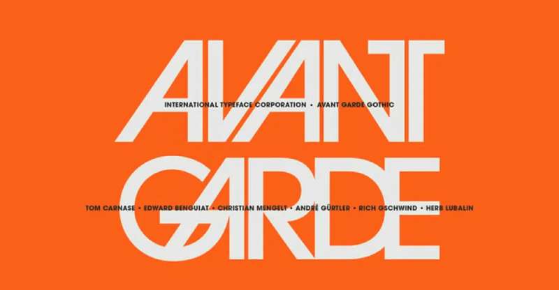
Before Salesforce Sans, the brand used ITC Avant Garde Gothic as a key typographic reference. Avant Garde is a geometric sans-serif designed by Herb Lubalin and Tom Carnase in 1970, originally created for Avant Garde magazine.
The shift away from Avant Garde toward a custom typeface happened as part of a full brand identity refresh. The Lightning Design System launched in 2015, and Salesforce Sans was built to anchor it from the start.
Why the change? Avant Garde is a strong, recognizable font but it carries significant geometric rigidity. At UI scale, across dense CRM data, a strictly geometric sans-serif starts to feel harder to scan. The move to a humanist custom typeface addressed that usability gap directly.
The Salesforce wordmark has always carried letterforms that closely resemble Aller by Dalton Maag. That similarity predates the Salesforce Sans era and still holds in the current logo. The logo font and the UI/brand font are, practically speaking, two separate typographic stories.
—
What Are the Best Free Alternatives to Salesforce Sans?
Since Salesforce Sans is not publicly available, most designers working with Salesforce-inspired layouts or CRM-style interfaces reach for one of these:
| Font | Why It Works | License | Source |
| Inter | Humanist sans-serif, optimized for screen readability at small sizes | Free (OFL) | Google Fonts |
| Open Sans | Open apertures, friendly stroke weight, wide language support | Free (Apache) | Google Fonts |
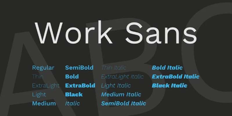
| Work Sans | Optimized for digital screens, clean mid-weight performance | Free (OFL) | Google Fonts |
| DM Sans | Low-contrast humanist design, strong legibility at small text sizes | Free (OFL) | Google Fonts |
| Aller | Closest visual match to the Salesforce logo wordmark | Free (up to 25 users) | Dalton Maag |
Inter is probably the closest match for UI work. It was literally designed for screen interfaces, and its x-height and aperture characteristics are in the same territory as Salesforce Sans. A lot of developers just default to Inter when building Salesforce-adjacent dashboards and internal tools.
For the logo specifically, Aller from Dalton Maag is worth downloading and testing side by side. The resemblance is close enough that most people won’t notice the difference unless they’re actively looking.
—
How to Use Salesforce Sans Alternatives in Your Projects
In Figma or Sketch
Inter is available directly inside Figma as a pre-loaded sans-serif option. No setup required. For Salesforce-style mockups, set body text to Inter Regular at 14px and headers to Inter Semibold at 16–20px.
The SLDS Figma kit from Salesforce uses these proportions as reference, so working with Inter keeps your mockups at least structurally aligned with how the actual Lightning Design System components render.
In Web Projects (CSS)
If you’re building something that needs to mirror the Salesforce platform’s typography elements, use this font stack as a starting point:
“ font-family: 'Inter', 'Salesforce Sans', -apple-system, BlinkMacSystemFont, 'Segoe UI', Roboto, sans-serif; `
That stack loads Inter first if available, falls back to Salesforce Sans for any authenticated Salesforce context, and then cascades through common system fonts. It mirrors the typographic hierarchy approach that SLDS uses internally.
To load Inter via Google Fonts:
` <link href="https://fonts.googleapis.com/css2?family=Inter:wght@400;500;700&display=swap" rel="stylesheet"> `
In Canva
Canva does not include Salesforce Sans natively. Inter is available through the Google Fonts integration inside Canva. You can also upload fonts to Canva directly if you have a licensed version of a similar commercial font.
—
Why Did Salesforce Choose This Font?
Salesforce operates in enterprise software, where most competitors lean on whatever system font is closest to neutral. Commissioning a custom typeface was a clear statement: this is a brand that takes design seriously at the infrastructure level.
The humanist structure of Salesforce Sans matches the brand’s positioning. Salesforce has always marketed itself as user-friendly and approachable despite being a complex enterprise CRM. A geometric font would undercut that. A serif would feel too formal. A humanist sans-serif lands exactly where the brand needed to be.
The practical reasons matter too:
- CRM interfaces show enormous amounts of data, and reading fatigue is real. A font with optimized x-height and open letterforms directly reduces eye strain over long sessions.
- The four-weight range covers all use cases without mixing typefaces, which keeps the visual hierarchy consistent across the entire platform.
- Delivering the font in WOFF and WOFF2 formats supports fast load times across global Salesforce deployments without impacting performance.
The lowercase wordmark reinforces the same idea. Salesforce uses all-lowercase in its logo, which is an unusual choice for an enterprise company. Combined with the rounded, approachable letterforms of the Aller-similar logo font, it sends a consistent message across every brand touchpoint.
Worth noting: SLDS 2, released in Spring ’25 and generally available as of Winter ’26, introduced the Salesforce Cosmos theme with a “reader-friendly typography scale” as a headline feature. That’s not a small thing to call out in release notes. It signals that Salesforce continues to treat typography as a functional design decision rather than a cosmetic one.
Other platforms make similar calls. The Notion font and the Asana font both reflect comparable thinking: clear, humanist, screen-optimized. Salesforce just went further and had one built from scratch. For context on how other productivity tools approach this, the Microsoft Teams font and the Zoom font both rely on licensed typefaces rather than custom-commissioned ones. That distinction matters when you’re thinking about how seriously a company treats its visual identity at the system level.
Understanding font psychology makes the Salesforce choice even clearer. Humanist sans-serifs consistently test as more trustworthy and approachable than geometric alternatives, which aligns directly with what Salesforce needs from its typography in sales and customer-facing contexts.
FAQ on What Font Does Salesforce Use
What is the main font Salesforce uses?
Salesforce uses Salesforce Sans, a custom humanist sans-serif font developed with Monotype and Tolleson Design.
It covers the full platform: dashboards, marketing materials, and the Lightning Design System interface.
What font does the Salesforce logo use?
The Salesforce logo closely resembles Aller Regular, a sans-serif typeface designed by Dalton Maag.
It is not an exact match. Aller is simply the closest publicly available alternative to the actual wordmark letterforms.
Is Salesforce Sans available for free download?
No. Salesforce Sans is proprietary and covered under a font licensing agreement with Monotype Imaging Inc.
It is not on Google Fonts or Adobe Fonts. Any site offering a free download is distributing it without authorization.
What type of font is Salesforce Sans?
Salesforce Sans is a humanist sans-serif. It sits between geometric and old-style classifications, borrowing warmth from calligraphic forms while keeping clean, screen-ready strokes.
That makes it well-suited for dense CRM data environments where readability matters across long sessions.
Who designed Salesforce Sans?
It was created in collaboration between Salesforce’s design team, Monotype, and Tolleson Design in San Francisco.
The font was drawn from scratch as one of five pillars in a broader Salesforce brand identity refresh. It was not adapted from an existing commercial typeface.
What font does Salesforce use in its UI and dashboards?
Salesforce Sans is the intended UI typeface within the Lightning Design System.
In current SLDS 2 implementations, the platform also falls back to system UI fonts depending on how components are configured and what the user’s operating system provides.
What are the best free alternatives to Salesforce Sans?
Inter is the closest match for UI work. Open Sans and DM Sans are solid alternatives too.
All three are available free on Google Fonts and share the humanist structure and optimized x-height that makes Salesforce Sans work well at small sizes.
Can Salesforce partners use Salesforce Sans?
Yes, but only within a restricted scope. Partners and developers in the Salesforce ecosystem can access the font through official channels tied to the Lightning Design System.
Usage is limited to Salesforce-adjacent products. It cannot be used for general branding or external design work outside that context.
What font did Salesforce use before Salesforce Sans?
Before commissioning a custom typeface, Salesforce referenced ITC Avant Garde Gothic, a geometric sans-serif designed by Herb Lubalin and Tom Carnase in 1970.
The switch to a humanist custom typeface came with the Lightning Design System launch in 2015.
How does Salesforce Sans affect the platform’s design system?
Salesforce Sans anchors the typographic hierarchy across the entire Lightning Design System, covering four weights from body copy to billboard-scale headings.
The Salesforce Cosmos theme introduced in SLDS 2 (Spring ’25) expanded this with a refined typography scale built for improved readability and reduced cognitive load.
Conclusion
If you’ve been wondering what font does Salesforce use, the answer splits into two parts: Salesforce Sans for the platform and brand, and Aller Regular as the closest match for the logo wordmark.
Salesforce Sans is a proprietary humanist typeface built with Monotype, sitting at the core of the Lightning Design System’s font stack and UI component library.
For designers who need similar Salesforce CRM typography without access to the licensed font, Inter and Open Sans remain the most practical free alternatives available on Google Fonts.
The SLDS typography scale continues to evolve, most recently with the Salesforce Cosmos theme in SLDS 2, reinforcing that typeface decisions inside enterprise software are rarely just aesthetic.

Renowned for his expertise in logo design and visual branding, Bogdan has developed a multitude of logos for various clients.
His skills extend to creating posters, vector illustrations, business cards, and brochures. Additionally, Bogdan's UI kits were featured on marketplaces like Visual Hierarchy and UI8.
He also wrote in the past years on sites like Design Your Way, WebDesignerDepot, WPDean, Designmodo, Speckyboy, Slider Revolution, and more.
- The Windsurf Logo History, Colors, Font, And Meaning - 10 October 2026
- How to Remove Background From Product Photos (No Photoshop) - 10 October 2026
- How Designers can Build a Stronger Online Creative Identity - 9 October 2026

Bogdan Sandu is a seasoned designer who has been designing websites since 2008. Renowned for his expertise in logo design and visual branding, Bogdan has developed a multitude of logos for various clients. His skills extend to creating posters, vector illustrations, business cards, and brochures. Additionally, Bogdan's UI kits were featured on marketplaces like Visual Hierarchy and UI8. He also wrote in the past years on sites like Design Your Way, WebDesignerDepot, WPDean, Designmodo, Speckyboy, Slider Revolution, and more.
You Might Also Like