Imagine this. Your eyes skim a sea of generic logos, and bam! One snatches your attention, muscles bulging with character-all before a single squat or sprint. That’s the power of a killer fitness logo design. It’s not just about looking fab in fitness tees or topping off your website with eye candy.
It’s your brand’s handshake, high-five, and first rep all in one. And if you think your brand’s face should pulse with the same energy as a heart-thumping workout, you’re spot on. You’re about to dive into the essentials of crafting a visual identity that flexes its presence in the health and wellness world.
By the end of this read, not only will you grasp the design elements that make a logo as memorable as a personal best but also how to tailor one that resonates with every step, lift, and spin.
If you’re ready to transform your visual branding from meh to marathon-worthy, strap in for the ins and outs-from brand recognition to nailing that modern fitness logo vibe. Say goodbye to bland and hello to grand.
Btw, if you’re looking for good graphics for your gymnasium that will grab your customers’ and prospects’ attention, team Fitz Graphics can help you get the best designs and transform your gym.
Fitness logo design tips
Less is more

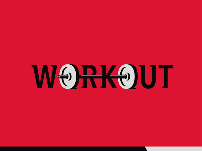
A gym logo should be simple and unobtrusive, and yet convey all important information. To create the perfect piece, you have to think of where that logo is going to appear, including gear, memorabilia, and the compulsory jerseys and uniforms. To ensure the best continuity across all promotional materials, avoid overly detailed sketches.
Make it unique
How do great sports and fitness logos look like? To attract attention, you should first identify the main goals of your marketing strategy, and think of designs your audience would be impressed by. Bold colours, striking contrasts, and strong fonts will help you make this happen.
Make the sport recognizable at first sight
The icon on your logo has one and only purpose – to show people which your sport is. Be it that you’re creating a football logo, basketball logo, golf logo, or a fitness logo, you need to create a piece that will represent your tram and your activities, instead of making viewers wonder who you are.
Choose the appropriate colours
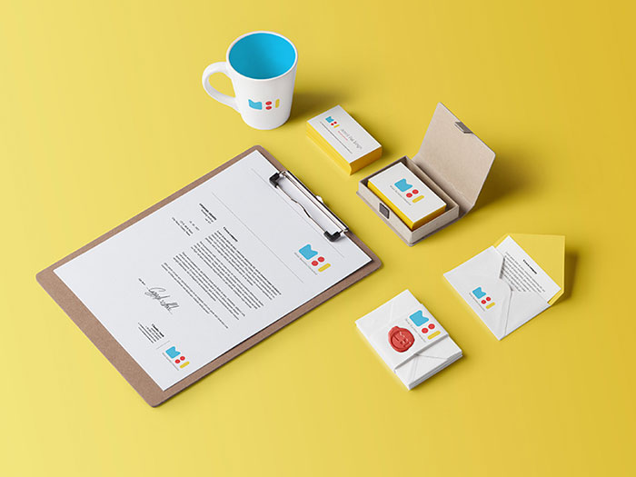
![]()
Choosing a colour for your sports logo will be easy, as all popular disciplines are commonly connected to a particular hue. Swimmers’ logos, for instance, often feature a blue theme.
When creating a gym logo, however, you need to consider several important factors. In such cases, branding is not explicitly related to a colour, and you need to research the market to come up with the ideal branding strategy. Keep in mind that this logo will be the official face of your brand, and help prospective customers identify with your ideas and values.
Familiarize with your target audience
Before you start sketching your fitness logo, identify your prospective visitors and think of ways to attract them to your venue. In order to succeed, a logo has to be directed towards the target audience, which means you should make it specific and memorable. Be it that you’re targeting professional body builders or women aged between 20 and 30, make that visible on your logo.
Convey the right message

Your logo will be the icon of your brand that showcases the values of your business, and shares your message without further explanations.
This is why sports logos are simple and make use of limited visual elements instead of textual explanations. Nike is a great example – they have one of the simplest logos used so far, but yet encourage and inspire users to challenge themselves and to succeed.
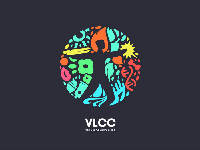
Bring inspiration along the way
![]()
While designing a logo, choose inspirational emoticons that will enable viewers to identify with your brand.
The questions you should ask yourself are: How is your target audience supposed to feel about coming to your gym? How will you create that feeling? Most of the time, people expect a gym logo to inspire them to start exercising.
Different logo colours inspire different emotions. In the fitness logo case, the best way to go is to pick hues that motivate your trainees, and create a sense of belonging to your community.
Keep an eye on your competitors
In order to get the full picture of how your brand will fit on the market, do some research on competitors. This will help you craft a better brand positioning strategy in the competitive fitness industry, as you will communicate clearly what makes you different than other gyms and fitness clubs. A good idea is to use text slogans with distinctive fonts and colours that may motivate people to choose you over other providers.
Make the fitness logo simple, but don’t exclude essential elements
Think of all the iconic logos you know – the thing they all have in common is simplicity, and the fact people recognize them within seconds. In the fitness industry, however, logos should not be deprived of leading indicators that communicate your offer. For instance, these elements help users understand whether you’re dealing with weightlifting or cross-fit, and build up their exact expectations.
Create a result-oriented gym logo
Why do people go to the gym? For most of them, this is a way to make an important change in their lives, be that enhanced appearance, improved health and fitness, or a response to a dangerous disease like diabetes and obesity.
![]()
Despite of the multiple benefits, jumping on the gym bandwagon is a difficult experience for most beginners, and many of them quit before they’ve experienced actual results.
Exercising can be particularly daunting for people trying to lose weight, and they are usually the ones that have the most trouble getting used to the gym.
This is why training and fitness logos need to be just as motivational as appealing, and make people believe that they will genuinely experience the change they’re after.
![]()
If possible, make a logo that promotes and advertises what customers are looking for, ideally the results they wish to achieve.
It could be a thinner body layout in an energetic colour, or even a silhouette drawn inside a larger body. On the safe side, you can always get an image of a barbell-lifting client or high-fiving to the trainer to invoke a sense of community.
Use welcoming colours on a fitness logo
![]()
Most of the newcomers you’re targeting have little to no fitness expertise, and will feel intimidated or even embarrassed upon their first encounter with a personal trainer.
As strange as it sounds, this is the main reason why gyms struggle to attract their first clients.
![]()
This is why we’re repeatedly advising designers on creating a motivational logo, in particular, one whose colors invoke a pleasant, non-judgemental vibe. We recommend pinks, greens, blues, oranges, and other energetic and festive tones.
Do your research before designing
![]()
Logo by www.logopositive.com
Personal trainers may all have the same tasks and goals, but that doesn’t mean that their modus operandi will be the same. Therefore, the distinct style of a trainer is another important element that should be reflected on the logo. When teaching bare fitness, for example, an image of kickboxing won’t make much sense.
Same applies to your individual methods of training – you can always go for a logo where you are cheering up a sweating client, or helping him hold a barbell, and count on the fact that future customers will be ready to rely on you.
What are the most common fonts used on gym logos?
![]()
Branding matters the world to a new fitness studio or even a simple, YouTube-featured training program, as it helps clients wrap up an opinion before they’ve even used your services.
Being completely frank, there won’t be anything more important than the logo to reaffirm the success of your brand.
![]()
This is why designers work side-by-side with fitness professionals to come up with the perfect image and name, but not that many of them give fonts the attention they deserve.
Truth is, typography is a critical element of branding, and you should be extremely careful when making your decision.
Here are the most commonly used fonts:
Modesto
Is your plan to capture the attention of clients even when they’re hundreds of feet away? Will your gym be advertised on signs and billboards? If so, you should look at 2000 Modesto to cater to your exact needs.
Modesto is large and imperative, but manages to attract attention without making viewers feel overwhelmed. It works perfectly with many different colours, and help convey a helpful and friendly message to clients with all types of fitness goals.
Helvetica
Helvetica is a classic font, and its use in fitness logos is self-explanatory. It will be ideal for gyms conveying a message of intensive strength training, including weightlifting and kick-boxing. The best way to use it is in black and white combinations.
Rockwell
For a gym logo that will remind of rugged Americana Olympic logos, Rockwell is the way to go. The bold font is easy to notice and even easier to read, and you can resize it for all types of marketing materials without affecting its impeccable appearance. It will look great with pops of intense red and blue.
Bobber
Bobber is just cut for creative and out-of-the-box gyms, and the preferred font of the ‘hipster’ clientele in large communities’ millennial markets. Online, you can find some perfect examples of it injecting a personal vibe on the logos of personalized cycling studios, dancing clubs, and similar venues.
Custom Typography
If you can afford to do so, the best option will always be to have a one-of-a-kind type crafted in the service of your brand.
This way, the logo will be unique and protected from plagiarism, and customers will know you’re ready to do whatever it takes to be there for them.
Having a font designed exclusively for your brand won’t be a cheap process, but the investment will certainly pay off once you create a product clients will remember. This matters in particular to gyms preparing for online campaigns, as they’re facing an even more competitive market.
FAQ on Fitness Logos
What’s the ideal vibe for a fitness logo?
Imagine your fitness brand as a person. Cool, right? Now, that vibe you’re picturing? That’s what your logo should scream. It’s a balance of energy and approachability, with a dash of your unique flair. Sketch out your gym’s personality: hardcore, zen, or maybe next-gen techy? Crystallize that, and boom, there’s your vibe.
How do I pick the right colors for my fitness logo?
Colors do more than just pretty things up. They’re like the secret sauce in the recipe that is your brand image. Think about what feelings you wanna spark. Want to ignite passion? Red’s your guy. Craving some calm? Hello, blue. It’s all about the mood-setting power of color theory in brand recognition.
Should my fitness logo have a symbol or just text?
You’ve seen symbols that speak without saying a word. The swoosh, the apple, the golden arches, right? Same thing for fitness logos. Symbols can be a power move if they nail your brand’s ethos. But hey, if you’ve got a killer name, a wordmark can sometimes flex just as hard. Trust your gut, then go with it.
Do trends matter when designing a fitness logo?
Ever tried chasing the latest fad diet? Frustrating, eh? Well, logo design trends can be like that, too. Instead, aim for timeless with a side of now. Sure, glance at what’s hot, but trust the tried-and-true: simplicity, clarity, and symbolism that’s fly off the racks like hotcakes on Sunday morning.
How important is typography in a fitness logo?
Typography is your secret handshake with the world. It’s a subtle whisper of who you are. Going for strong and sturdy? Slab it up. Sleek and speed-focused? Sans-serif will race you there. The right typeface is crucial; it’s everything unsaid about your brand’s story.
What if my fitness logo looks like another brand’s?
That’s a no-rep zone. The cardinal sin of design? Copycatting. Your logo should be the face in the crowd that stands out because it’s yours through and through. Unique as a fingerprint; it represents your brand’s DNA. Do your homework, ensure it’s distinctive. Always lift original, never plagiarize.
How much does a professional fitness logo design cost?
Ah, the million-dollar question. But seriously, prices lift as heavy as your dumbbells range. You could find oneself shelling out anywhere from a couple of hundred for a budding freelancer’s spark to thousands for an uppercut punch from a heavyweight design agency. Consider it an investment in your brand’s bench press.
Can I create my own logo with fitness logo design software?
Sure thing! It’s like DIY but without the risk of hammering your thumb. Loads of online tools and design software are up for grabs, flexing templates and graphics at your beck and call. Just remember, while it might save you coin, you always wanna cross the finish line with a logo that doesn’t just blend into the back row of a spin class.
How can I make my fitness logo represent all aspects of my brand?
Picture your brand as a cocktail mix. Every ride, rep, and healthy tip is a different ingredient. Your logo-think of it as the garnish on top-needs to hint at the full flavor. Let your design take a big gulp of your brand’s essence and spit out a visual embodiment that’s instantly recognizable in the health and fitness industry.
What’s the best way to test my fitness logo design’s effectiveness?
Testing your logo is like tracking your gains; you need to see what works. Slap that baby on gear, pop it on social media, bedazzle it on your storefront. Watch how people react. Then, just like with any rigorous fitness program, tweak it. Get feedback, make adjustments, and perfect that visual identity for victory laps.
Ending thoughts
So, we’ve been on quite the journey, right? You now get the whole fitness logo design scene-the shout-your-brand’s-name kind of understanding. It’s like locking in the last piece of a massive, muscled-up puzzle.
- Color pops that bring the zing.
- Symbols that could flex for days.
- Typography whispering sweet nothings about your brand.
You’ve got all the deets to craft a logo that won’t just hang in the background like a shy kid at a dance party.
It’s time… Let those creative juices pump iron and lift your brand with a logo that’s more than just a pretty face. It’s the flag you’ll plant on the mountain of this wellness revolution-a beacon that calls out to every gym newbie and fitness freak.
Remember, a great logo is more than just slapping cool stuff together. It’s about telling your brand’s tale, making it stick-like that last rep you push at the end of a grueling set. Here’s to building a visual vibe that’s as fit as your clientele!
If you liked this article about fitness logo design, you should check out these as well:
- Badge Logo Design Ideas To Use As Inspiration
- Typography Logos That You’ll Enjoy Looking At
- Cool Logos: Design, Ideas, Inspiration, and Examples
- Logos on Pinterest
- Logo Design: Everything you’d want on the subject in one place
Renowned for his expertise in logo design and visual branding, Bogdan has developed a multitude of logos for various clients.
His skills extend to creating posters, vector illustrations, business cards, and brochures. Additionally, Bogdan's UI kits were featured on marketplaces like Visual Hierarchy and UI8.
He also wrote in the past years on sites like Design Your Way, WebDesignerDepot, WPDean, Designmodo, Speckyboy, Slider Revolution, and more.
- The Airtable Logo History, Colors, Font, And Meaning - 12 July 2026
- How to Blur Background in Canva: A Quick Tutorial - 11 July 2026
- Typography Trends - 10 July 2026
Bogdan Sandu is a seasoned designer who has been designing websites since 2008. Renowned for his expertise in logo design and visual branding, Bogdan has developed a multitude of logos for various clients. His skills extend to creating posters, vector illustrations, business cards, and brochures. Additionally, Bogdan's UI kits were featured on marketplaces like Visual Hierarchy and UI8. He also wrote in the past years on sites like Design Your Way, WebDesignerDepot, WPDean, Designmodo, Speckyboy, Slider Revolution, and more.
You Might Also Like