


The New Line Cinema logo is one of those marks you’ve probably seen hundreds of times without really thinking about it. That film strip icon, the black box with perforated squares, the text underneath. It plays before The Lord of the Rings, before A Nightmare on Elm Street, before The Conjuring. And yet most people couldn’t describe it from memory if you asked them to.
That’s actually a sign of good branding. The mark does its job quietly. It tells you who made the film, it sets a tone, and then it gets out of the way. Robert Shaye founded this studio back in 1967 as a small film rental service for college towns, and it took until the early 1970s before the company even had a proper visual mark. Since then, the logo has been through roughly six major versions, each reflecting a different chapter in the studio’s life.
The current version, active since 2024, uses a tweaked version of the 1987 filmbox icon paired with the 2011 sans-serif wordmark. It runs as a subsidiary of Warner Bros. Discovery now, but the logo still carries its own weight. There’s a reason they didn’t just slap a Warner shield on everything and call it a day.
What Is the New Line Cinema Logo?

The New Line Cinema logo is a combination mark featuring a stylized film frame icon with perforated squares alongside the “NEW LINE CINEMA” wordmark. Introduced in its current form in 2024, designed by Devastudios, the mark represents the studio’s roots in independent filmmaking and its connection to the art of cinema through direct film strip imagery.
Design Type: Combination mark (icon plus wordmark). The filmbox graphic sits to the left or above the text, depending on the layout variant being used.
Primary Elements: A black square representing a film frame, with a vertical strip of perforated squares along the left edge and a diagonal strip crossing the upper right corner. The “NEW LINE CINEMA” text appears in uppercase beneath or beside the icon.
Official Introduction Date: The original filmbox concept debuted in 1987. The current refined version, combining a tweaked 1987 icon with the 2011 wordmark, was introduced in 2024 with the film Turtles All the Way Down.
Designer/Agency: The 2024 on-screen animation was created by Devastudios. The original 1994 CGI version was designed by Grant Okita and animated at Picturemill. The 1987 static version’s designer is not publicly credited.
Trademark Status: Registered trademark of New Line Productions, Inc., operating as a subsidiary of Warner Bros. Discovery. The mark is actively protected and used across theatrical releases, streaming, and home entertainment.
Color Palette: The print logo is primarily monochrome, using black (#000000) on white (#FFFFFF). On-screen animated versions have used blue glow (1987-2010), gold/amber tones (2011-2020), and silver with an orange-purple sunset sky (2021-present).
Usage Context: Theatrical film openings, end credits, movie posters, trailers, streaming platforms (HBO Max/Max), home entertainment releases, television series cards, and corporate communications. The logo frequently appears paired with the Warner Bros. Pictures shield in a transition sequence.
How Has the New Line Cinema Logo Evolved Over Time?

The New Line Cinema logo has gone through six distinct versions since 1967. Each redesign tracked a major business shift, from scrappy indie distributor to horror powerhouse to Warner Bros. subsidiary.
The core visual concept, a film frame with perforated edges, has been the foundation since 1987. Everything before that was text-only. Everything after has been a refinement of that same idea.
Original New Line Cinema Logo (1967-1973)
Years Active: 1967 to approximately 1973
The very first logo was a horizontal black rectangle containing the studio name in geometric, vertically elongated capital letters. The characters had a red fill with thin black horizontal lines crossing through them, creating a striped effect that got denser toward the middle.
This created a kind of shimmering gradient look that added some depth to an otherwise flat design. The “W” and “M” were basically inverted copies of each other, which tells you how rigid and geometric the whole thing was.
Context: New Line was basically a one-man operation at this point. Robert Shaye was renting films to colleges and universities. The logo needed to exist on print materials and not much else. There was no on-screen version.
Cultural Significance: This mark represents the studio’s counterculture roots. Shaye was distributing foreign and independent films, not Hollywood blockbusters. The logo matched that scrappy, no-budget energy.
The NL Monogram Logo (1973-1987)
Years Active: 1973 to 1987
This was New Line’s first real attempt at a symbol rather than just a name. The logo featured an uppercase “NL” monogram in a stencil-style sans-serif typeface. The vertical bar of the “L” doubled as the diagonal stroke of the “N,” so the two letters overlapped and shared structural elements.
Solid black on a transparent background. Clean lines, sharp angles. It looked futuristic for the 1970s, honestly.
Key Changes from Previous: Complete departure from the text-heavy rectangle. This was about reduction. Two letters instead of three words. Symbol instead of nameplate.
Context: New Line was starting to produce its own content. The company was growing beyond film rentals, and a more professional, memorable mark was needed. This coincided with their first on-screen logo appearance in 1973.
Cultural Significance: The monogram carried New Line through the early horror era. It was the mark audiences saw before A Nightmare on Elm Street hit screens in 1984, a film that basically saved the company financially.
The First Filmbox Logo (1987-1994)
Years Active: 1987 to 1994
Here’s where the logo identity people recognize today was actually born. A black box with two film strips attached: one running vertically along the left side (with perforated squares), and another crossing diagonally at the upper right corner (also perforated).
The “NEW LINE CINEMA” text appeared below in a medium-weight serif typeface. On screen, the whole thing glowed blue against a black background.
Designer: Not publicly credited for the static version. The on-screen animation was traditional cel animation with a blue ethereal background.
Color Scheme: Black and white for print. Blue glow on black for the animated on-screen version. Some early appearances had a slightly greenish or purplish tint depending on the film and print quality.
Context: New Line was no longer a niche distributor. The Nightmare on Elm Street franchise had turned the company into a legitimate player. The filmbox concept tied the brand directly to the physical medium of cinema itself.
Cultural Significance: This was the logo that played before Teenage Mutant Ninja Turtles, before Dumb and Dumber, before The Mask. The blue glow became something audiences associated with a certain kind of fun, genre-savvy filmmaking.
The CGI Filmbox Logo (1994-2011)
Years Active: 1994 to 2011
Same concept, dramatically upgraded execution. A CGI sequence showed a black box rotating out from an extreme close-up with a blue backlight. Film strips zoomed past and attached to the box to form the familiar filmbox shape. The text “NEW LINE CINEMA” zoomed out from below in ITC Garamond Condensed Book.
Michael Kamen composed the string fanfare that accompanied it. A beautiful descending violin line ending with a quiet chime. If you’ve seen any New Line film from this era, you know the sound.
Designer: Originally designed by R/Greenberg Associates. The 1994 CGI redux was designed by Grant Okita and animated by Fredrik Nilsson.
Key Changes from Previous: The static logo became a full motion graphics sequence. The typography shifted from a generic serif to the specific ITC Garamond Condensed Book. Corporate bylines were added: first “A Turner Company” (1994), then “A Time Warner Company” (1997), then “An AOL Time Warner Company” (2001), then back to “A Time Warner Company” (2003).
Color Scheme: Blue glow on black as the standard. But this is where New Line got creative with film-specific variations. The Blade films got a red tint. The Golden Compass went tan. Little Nicky had the filmstrip covered in hellfire. Each variation respected the base structure while adapting the mood.
Cultural Significance: This is the definitive New Line Cinema logo. It ran before The Lord of the Rings trilogy. Before Se7en. Before Rush Hour. Before Elf. Fifteen years of major films. The Michael Kamen fanfare became as recognizable as the visual itself.
The Warner Bros. Transition Logo (2011-2024)
Years Active: 2011 to 2024
After New Line became a Warner Bros. subsidiary in 2008, the on-screen presentation changed significantly. The sequence now began with the Warner Bros. shield, which then broke apart into gold pieces. Those pieces reformed into the New Line filmbox as the camera panned from a daytime sky to a cloudy night scene.
The “NEW LINE CINEMA” text appeared in a new, lighter sans-serif font, with letters flipping into place. The filmbox corners were now rounded instead of sharp.
Color Scheme: The color shifted from the classic blue to gold (2011-2020), then to silver with an orange-purple sunset sky (2021-2023). Each change reflected updates to the broader Warner Bros. branding system.
Key Changes from Previous: The logo was no longer standalone. It played as a paired sequence with Warner Bros., showing the corporate relationship visually. The serif typeface was dropped entirely in favor of a clean sans-serif. Rounded corners on the filmbox softened the look.
Context: This was about corporate integration. New Line needed to signal that it was still its own brand while also clearly belonging to the Warner family. The transition animation, where the WB shield literally transforms into the New Line filmbox, accomplished both goals simultaneously.
The 2024 Redesign (2024-Present)
Years Active: 2024 to present
The most recent version returned to a tweaked version of the original 1987 filmbox design. Sharp corners replaced the rounded ones from the 2011 era. The 2011 sans-serif wordmark was kept. The on-screen animation is a re-animated version of the 1994 opening, created by Devastudios.
It debuted with Turtles All the Way Down on Max (formerly HBO Max).
Key Changes from Previous: The filmbox icon got sharper edges again. The animation references the classic 1994 sequence rather than the Warner Bros. transition. The Warner Bros. Discovery byline appears beneath.
Cultural Significance: This version signals a return to New Line’s distinct identity. After over a decade of being visually tethered to the Warner Bros. shield, the studio’s logo can once again stand on its own. The sharp corners and classic animation callback suggest the company is reconnecting with its heritage while maintaining modern production values.
What Do the Design Elements of the New Line Cinema Logo Mean?
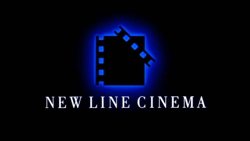
The New Line Cinema logo is built around one central image: a single frame from a film strip. The perforated squares along the edges reference the sprocket holes in physical celluloid film. This is a direct, literal connection to the medium of cinema.
There’s nothing abstract about it. Unlike studio logos that use mountains or globes or mythological figures, New Line chose to represent itself with the actual material of filmmaking. That says something about the company’s identity.
Why Did New Line Cinema Choose These Specific Colors?
The print logo has almost always been black and white. That’s a deliberate choice rooted in monochrome simplicity.
Black (#000000) dominates the filmbox icon and wordmark. In color psychology, black signals authority, sophistication, and power. For a film studio, it also directly references the darkened theater experience itself.
White (#FFFFFF) provides the contrast, filling the perforated squares and serving as the background. This creates high readability and makes the logo versatile across print, digital, and merchandise applications.
The animated on-screen versions introduced additional tones over the years. The blue glow used from 1987 through 2010 gave the logo an ethereal, cinematic quality. Blue often conveys trust and depth. The shift to gold in 2011 brought warmth and prestige, aligning with the premium positioning under Warner Bros. The silver of the 2021 update made the mark feel more contemporary and clean.
What’s interesting is that New Line also let individual films customize the logo’s colors. Blade got red. The Conjuring got green and blue tinting. San Andreas placed it underwater in silver. This flexibility is built into the design because the core structure is so strong that color changes don’t break recognition.
What Typography Style Is Used in the New Line Cinema Logo?
The logo has actually cycled through several typefaces over its history, which is unusual for a major studio.
The most iconic version, used from 1994 through 2010, set the text in ITC Garamond Condensed Book. That’s a classic serif with slightly condensed proportions, designed by Tony Stan. It gave the wordmark an elegant, bookish quality.
The 2011 redesign dropped the serif entirely and went with a lighter sans-serif. This moved the typographic hierarchy in a more modern direction. BBC Reith Sans has been suggested as a close match for this version.
The 2024 update uses a medium-weight sans-serif with vertically elongated, strict letterforms. It’s clean and geometric, matching the sharper edges of the updated filmbox icon.
Earlier versions used fonts resembling Bauer Bodoni Bold and Times New Roman Condensed for various applications. The point is, the typography has always adapted to the era while the filmbox icon stayed largely the same.
What Are the Hidden Meanings in the New Line Cinema Logo?
The film strip perforations aren’t just decorative. They’re a direct reference to 35mm film sprocket holes, tying the logo to the physical process of projecting movies.
The diagonal strip crossing the upper right corner of the box creates a sense of movement. It suggests film being threaded through a projector, a strip being pulled across a frame. This adds energy to what would otherwise be a static geometric shape.
Some have noted that the overall shape resembles a ladder, which earned the logo nicknames like “The Ladder” and “The Filmbox” among logo enthusiasts. Whether the ladder association was intentional or not, it does suggest upward motion and progress.
The relationship between the box and the attached strips also creates an interesting asymmetry. The design isn’t perfectly balanced; it leans to the right, giving it a forward-leaning dynamic quality.
How Does the New Line Cinema Logo Compare to Competitor Logos?

Most major film studio logos use symbolic imagery that’s removed from the actual filmmaking process. Paramount has a mountain. Universal has a globe. MGM has a lion. Lionsgate has its gears and name.
New Line is one of the few studios that directly references film as a physical medium. That’s a very different approach. It positions the studio closer to the craft itself rather than to grand mythology or geography.
Compared to other Warner Bros. subsidiaries, the New Line mark is deliberately restrained. While the Warner shield is bold, colorful, and instantly recognizable at scale, New Line’s filmbox is quieter. It doesn’t compete with its parent company’s branding. It complements it.
A24 takes a similar minimalist approach, using just text. Blumhouse leans into horror aesthetics with its identity. Legendary Pictures goes for an ornate, cinematic feel. New Line sits somewhere in the middle: more visual than A24, less theatrical than Legendary, and more grounded in film craft than almost any of them.
The HBO logo shares a similar minimalist philosophy within the Warner family. Both rely on clean geometry and restrained color palettes rather than flashy illustrations.
What Are the Technical Specifications of the New Line Cinema Logo?
Official Color Codes
Primary Color: Black
Secondary Color: White
- Hex: #FFFFFF
- RGB: (255, 255, 255)
- CMYK: (0, 0, 0, 0)
On-Screen Accent (2021-2023 era): Gold/Amber
- Approximate Hex: #C8952E
- RGB: (200, 149, 46)
- CMYK: (0, 26, 77, 22)
On-Screen Accent (2021+ era): Silver
- Approximate Hex: #C0C0C0
- RGB: (192, 192, 192)
- CMYK: (0, 0, 0, 25)
Dimensions and Proportions
The filmbox icon uses a near-square aspect ratio for the central frame element, with the diagonal strip extending beyond the box boundary at the upper right. The overall mark (icon plus wordmark) follows a roughly 3:1 horizontal aspect ratio in its landscape configuration.
The logo is built as vector graphics, so it scales to any size without losing quality. Theatrical projection demands high DPI specifications, while the same file works cleanly on mobile screens at small sizes. The monochrome print version is particularly flexible since it requires no color matching for reproduction.
Clear space requirements follow standard corporate identity practice: the logo maintains a buffer zone equal to roughly the height of the “N” in “NEW” on all sides. This keeps the mark from feeling crowded by surrounding elements on posters, title cards, and marketing materials.
What Cultural Impact Has the New Line Cinema Logo Had?
The New Line Cinema logo has appeared before some of the most culturally significant films of the past forty years. The blue-glowing filmbox preceded the entirety of The Lord of the Rings trilogy, films that redefined what fantasy epics could look like.
It played before A Nightmare on Elm Street in 1984, launching both Freddy Krueger and New Line itself into mainstream recognition. Before that film, the company was sometimes called “The House That Freddy Built.” That logo meant horror for an entire generation of moviegoers.
The Michael Kamen fanfare that accompanied the 1994 CGI version became iconic in its own right. Film fans recognize those opening violin notes instantly, the same way they’d recognize the Universal theme or the THX deep note.
New Line’s practice of creating film-specific logo variations also influenced how other studios approached their opening idents. The idea that your studio mark could shift tone depending on the movie, turning red for horror, going underwater for disaster films, wasn’t new, but New Line did it consistently and creatively enough that audiences came to look forward to seeing what version they’d get.
How Does the New Line Cinema Logo Fit Into the Overall Brand Identity?
New Line Cinema operates as a genre and mid-budget division of Warner Bros. Discovery. The logo needs to do two things at once: signal independence and signal corporate backing. It handles this through visual hierarchy.
In theatrical releases, the Warner Bros. shield appears first. Then it transitions into the New Line filmbox. This sequence tells the audience: “This is a Warner production, but it has the New Line creative sensibility.” The logos work as a pair, but they remain visually distinct from each other.
The brand guidelines maintain separation between the two marks. New Line’s filmbox doesn’t borrow colors, shapes, or typography from the Warner shield. This keeps the subsidiary identity clean and recognizable on its own.
Across print, digital, and merchandise applications, the monochrome print version provides consistency. Whether it’s on a movie poster, a DVD spine, a streaming thumbnail, or a press release, the same black-and-white filmbox appears. That kind of repetition is what builds lasting recognition.
How Should the New Line Cinema Logo Be Used?
Official Usage Guidelines: The New Line Cinema logo is a registered trademark of New Line Productions, Inc. Any use requires authorization from Warner Bros. Discovery’s legal and brand standards team. Unauthorized reproduction, modification, or distribution of the mark is prohibited under trademark law.
Do’s:
- Use the official vector files provided by the studio for any licensed application
- Maintain the required clear space around the mark
- Reproduce the logo in its complete form (icon and wordmark together)
- Follow the prescribed color specifications for both print and digital use
Don’ts:
- Don’t alter the proportions, colors, or arrangement of logo elements
- Don’t separate the filmbox icon from the wordmark in official communications
- Don’t place the logo on visually busy backgrounds that reduce legibility
- Don’t recreate the logo using approximated fonts or hand-drawn elements
Where to Access Official Logos: Licensed partners and press can obtain official logo files through Warner Bros. Discovery’s media relations and brand portal. These files include vector formats (AI, EPS, SVG) for print and web use, as well as rasterized versions in JPEG and PNG formats at various resolutions.
Licensing Information: The logo may only be used in connection with officially licensed New Line Cinema products, approved co-branding partnerships, or editorial coverage. Fan art and parody uses fall under fair use provisions but cannot imply official endorsement. All trademark rights are enforced actively by Warner Bros. Discovery’s legal department.
FAQ on The New Line Cinema Logo
What does the New Line Cinema logo look like?
The New Line Cinema logo features a black filmbox icon with perforated squares along the left edge and a diagonal film strip crossing the upper right corner. The “NEW LINE CINEMA” wordmark appears beneath in uppercase letters. It’s a contrast-driven monochrome design built for instant recognition.
Who designed the New Line Cinema logo?
The iconic 1994 CGI version was designed by Grant Okita and animated at Picturemill. The current 2024 on-screen animation was created by Devastudios. The original 1987 filmbox concept’s designer remains uncredited publicly.
When was the New Line Cinema logo first introduced?
The company’s first visual mark appeared in 1967 as a simple text-based design. The filmbox icon that people recognize today was introduced in 1987. It became the foundation for every version since, including the current 2024 update.
What font is used in the New Line Cinema logo?
The 1994 version used ITC Garamond Condensed Book, a classic serif design by Tony Stan. The 2011 redesign switched to a sans-serif. The 2024 version uses a medium-weight sans-serif with vertically elongated letterforms that match the geometric filmbox icon.
What do the squares in the New Line Cinema logo represent?
Those squares represent sprocket holes from physical 35mm celluloid film. They’re the perforations that allow film to be threaded through a projector. It’s a direct reference to the mechanical process of cinema, tying the studio’s identity to the craft of filmmaking itself.
Why did New Line Cinema change its logo?
Each redesign followed a major business change. The 1994 update matched the Turner Broadcasting acquisition. The 2011 version reflected the Warner Bros. subsidiary restructuring. The 2024 refresh returned to sharper edges while keeping the modern wordmark.
What colors are in the New Line Cinema logo?
The print version is black (#000000) and white (#FFFFFF). On-screen versions have shifted through blue glow, gold, and silver over the years. The saturation levels change depending on which era and which film-specific variation is being used.
What is the music that plays with the New Line Cinema logo?
The string fanfare was composed by Michael Kamen for the 1994 CGI logo. It starts with a high violin note that descends rapidly through several notes, ending with a quiet chime. Many films replaced it with their own opening scores.
Is New Line Cinema still using its logo today?
Yes. The current version debuted in 2024 with Turtles All the Way Down. It uses a tweaked 1987 filmbox paired with the 2011 sans-serif wordmark and a Warner Bros. Discovery byline. The studio remains active as a film production division.
How is the New Line Cinema logo different from the Warner Bros. logo?
The Warner Bros. shield is bold, colorful, and uses a large “WB” monogram. New Line’s filmbox is quieter and monochrome in print. In theatrical releases, the WB shield transitions into the New Line mark, showing the corporate relationship through a paired animation sequence.
Conclusion
The New Line Cinema logo has lasted nearly six decades because it does something rare. It connects a major Hollywood studio directly to the raw material of filmmaking. No mountains, no mascots. Just a film frame.
From Robert Shaye’s college town rental operation to the studio behind The Lord of the Rings and The Conjuring Universe, that filmbox icon carried the brand through every corporate merger and ownership change.
The logo design principles at work here are straightforward. Strong unity between icon and wordmark keeps it readable. The monochrome palette keeps it flexible across theatrical, streaming, and packaging applications.
It proves that a studio emblem doesn’t need to be loud. It just needs to be unmistakable.

Renowned for his expertise in logo design and visual branding, Bogdan has developed a multitude of logos for various clients.
His skills extend to creating posters, vector illustrations, business cards, and brochures. Additionally, Bogdan's UI kits were featured on marketplaces like Visual Hierarchy and UI8.
He also wrote in the past years on sites like Design Your Way, WebDesignerDepot, WPDean, Designmodo, Speckyboy, Slider Revolution, and more.
- Canva vs PowerPoint: Which Is Better for Presentations? - 22 September 2026
- How to Install Fonts on Mac (Step-by-Step Guide) - 20 September 2026
- From Mockup to Code: How AI-Augmented Development Speeds Up the Design Handoff - 19 September 2026

Bogdan Sandu is a seasoned designer who has been designing websites since 2008. Renowned for his expertise in logo design and visual branding, Bogdan has developed a multitude of logos for various clients. His skills extend to creating posters, vector illustrations, business cards, and brochures. Additionally, Bogdan's UI kits were featured on marketplaces like Visual Hierarchy and UI8. He also wrote in the past years on sites like Design Your Way, WebDesignerDepot, WPDean, Designmodo, Speckyboy, Slider Revolution, and more.
You Might Also Like


