


The Studio Ghibli logo is one of the most recognized marks in animation history. It features a soft blue silhouette of Totoro, the forest spirit from My Neighbor Totoro, paired with the studio’s name in a clean sans-serif font.
Few film company logos carry this kind of emotional weight. The mark sits at the intersection of Japanese animation culture and global brand recognition, quietly doing what most studio emblems fail at: making you feel something before the movie even starts.
The current version has been in use since 1985, the same year Hayao Miyazaki and Isao Takahata founded the studio. It has gone through minor refinements but never a full redesign. That kind of consistency is rare in entertainment branding, where studios tend to overhaul their identity every decade or so.
What Is the Studio Ghibli Logo?
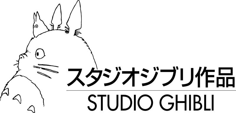
The Studio Ghibli logo is a mascot-based combination mark featuring a blue-toned silhouette of Totoro, the iconic character from the 1988 film My Neighbor Totoro. Designed under the direction of Hayao Miyazaki, it was introduced when the studio launched in 1985. The mark symbolizes childlike wonder and the studio’s commitment to hand-crafted animation.
Here’s a breakdown of its core attributes:
- Design Type: Combination mark (mascot plus wordmark). The Totoro silhouette sits above or beside the studio name depending on the application.
- Primary Elements: A rounded, friendly Totoro figure facing slightly left, with distinctive pointed ears and a round belly. The wordmark reads “STUDIO GHIBLI” in uppercase lettering.
- Official Introduction Date: 1985, coinciding with the founding of the studio in Koganei, Tokyo.
- Designer: The logo concept is attributed to Hayao Miyazaki himself. No external design agency was involved in the original creation.
- Trademark Status: Registered trademark of Studio Ghibli Inc. The Totoro character and studio name are protected intellectual property in Japan and internationally.
- Color Palette: The primary logo uses a muted sky blue (approximately #4BA3C3) for the Totoro silhouette. The wordmark typically appears in dark navy or black. Some film-specific variations use white on dark backgrounds.
- Usage Context: The logo appears at the opening of every Ghibli film, on official merchandise, across the Ghibli Museum signage in Mitaka, on home video releases, streaming platform branding, and all corporate communications.
How Has the Studio Ghibli Logo Evolved Over Time?

The Studio Ghibli logo has stayed remarkably stable since 1985. Unlike most entertainment brands that cycle through major redesigns, Ghibli has only made subtle refinements to its Totoro-based mark.
The core silhouette has never changed. What shifted over the years was mainly the rendering quality and color application as production technology improved.
There are roughly two to three recognizable versions, though “version” is a strong word here. Think of them more as gentle adjustments.
Original Studio Ghibli Logo (1985-Early 1990s)
Years Active: 1985 to approximately 1992
The first version was simple and a little rough around the edges. Which makes sense. The studio was brand new, funded partly through the success of Nausicaa of the Valley of the Wind (technically a pre-Ghibli film, but it paid the bills).
The Totoro silhouette appeared in a flat, single-tone blue. The wordmark used straightforward uppercase letters without much kerning refinement.
Color Scheme: Flat medium blue for the character, black or dark text for the studio name.
Designer: Hayao Miyazaki, internal creation.
Context: The studio needed an identity fast. Miyazaki chose Totoro because the character represented everything Ghibli stood for: innocence, nature, imagination. The fact that My Neighbor Totoro hadn’t even been released yet (that came in 1988) shows how confident Miyazaki was in that character as a brand symbol.
Cultural Significance: It immediately set Ghibli apart from every other Japanese animation studio. No one else was using a soft, friendly creature as their corporate mark. Most anime studios at the time used abstract or typographic logos.
Refined Studio Ghibli Logo (Early 1990s-2000s)
Years Active: Approximately 1992 to the mid-2000s
As Ghibli’s international reputation grew (especially after Princess Mononoke in 1997 and Spirited Away’s Oscar win in 2003), the logo received subtle cleanup work.
The Totoro silhouette got slightly smoother edges. The typography beneath became more consistent across different media formats.
Color Scheme: The blue shifted slightly lighter and more saturated. Some applications introduced a softer, almost pastel quality to the silhouette.
Key Changes from Previous: Cleaner line work on the silhouette. Better spacing in the wordmark. The overall proportions stayed the same, but everything looked more polished. Think of it like going from a pencil sketch to a clean ink drawing.
Cultural Significance: This was the era when Ghibli became a global brand. The logo needed to work on DVD covers, international posters, and eventually websites. The refinements were practical, not aesthetic.
Modern Studio Ghibli Logo (2000s-Present)
Years Active: Mid-2000s to present
The current version is the sharpest iteration yet. It looks crisp at any size, from a tiny favicon to a billboard.
Color Scheme: A clear, slightly desaturated sky blue remains the primary color. The wordmark uses a clean dark tone, sometimes pure black, sometimes a very dark blue depending on the background.
Key Changes from Previous: The silhouette edges are perfectly smooth now. Digital reproduction requirements drove most of the changes. The font spacing in the wordmark is tighter and more deliberate.
Context: With the Ghibli Museum, Netflix streaming deals, and merchandise sold worldwide, the logo had to be bulletproof across every medium. The current version handles everything from embroidered patches to app icons.
Cultural Significance: At this point, the Totoro silhouette alone (without the wordmark) is enough for instant recognition. That’s the kind of brand equity most companies spend millions trying to build.
What Do the Design Elements of the Studio Ghibli Logo Mean?
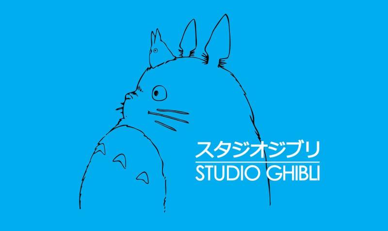
Every piece of the Studio Ghibli logo carries meaning rooted in the studio’s philosophy. The Totoro silhouette represents a connection to nature, childhood, and the kind of quiet magic Miyazaki built his entire career around.
The rounded shape of the character communicates warmth and approachability, which is a deliberate contrast to the sharp, angular marks most media companies use.
Why Does the Logo Use a Totoro Silhouette?
Totoro was chosen because he represents the soul of Studio Ghibli’s storytelling. The character embodies nature, wonder, and the invisible world that children can see but adults have forgotten.
Miyazaki picked this character before the film even released. That decision tells you a lot about his priorities. He wasn’t chasing commercial appeal. He was picking a symbol that matched the studio’s creative mission.
The silhouette format also matters. By reducing Totoro to a flat shape, the logo gains a timeless quality that a detailed illustration would not have. It works as a shadow, a stamp, a watermark. Anywhere.
Why Did Studio Ghibli Choose These Specific Colors?
The primary blue in the Ghibli logo is not accidental. Blue is the hue most associated with sky and water, two elements that appear in nearly every Ghibli film.
Primary Blue (approximately #4BA3C3): This muted sky blue suggests calmness, imagination, and open air. It avoids the corporate coldness of darker blues. The psychological impact is one of trust and gentleness, which perfectly matches the studio’s audience.
Dark Navy/Black Wordmark: The text grounds the logo. It adds just enough weight to keep the mark from feeling too whimsical for a professional studio.
You can see how different this approach is from other studios. Look at brands that use blue in their identity. Most go for authority and professionalism. Ghibli’s blue feels like a summer afternoon. That gap is intentional.
What Typography Style Is Used in the Studio Ghibli Logo?
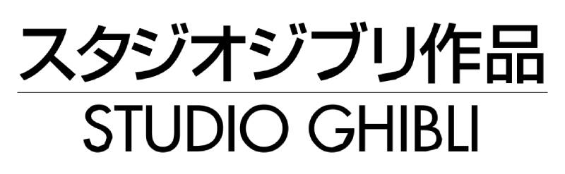
The wordmark uses a custom sans-serif typeface with clean, geometric letterforms. The characters are uppercase, evenly spaced, and unadorned.
There’s nothing flashy about it. The letters don’t compete with the Totoro silhouette. They sit underneath quietly, doing their job.
The leading between the graphic mark and the wordmark is generous, giving each element room to breathe. Over the years, the tracking has been tightened slightly, making the text feel more unified.
What Are the Hidden Meanings in the Studio Ghibli Logo?
Look at Totoro’s posture in the silhouette. He’s standing still, gazing slightly upward and to the left. Some interpret this as looking toward the future or toward the sky, both themes Miyazaki returns to constantly.
The rounded, almost blob-like shape of Totoro also echoes traditional Japanese daruma dolls and nature spirits from Shinto folklore.
Miyazaki has never publicly detailed every symbolic choice. But the simplicity itself is a statement: Ghibli doesn’t need flash. The work speaks for itself, and the logo just needs to remind you of that.
How Does the Studio Ghibli Logo Compare to Competitor Logos?

Most animation and film studio logos lean into power, spectacle, or corporate polish. Ghibli’s mark goes the opposite direction. It’s soft where others are sharp, personal where others are institutional.
That contrast is what makes it stick. In a lineup of entertainment logos, the Totoro silhouette is the one that feels handmade.
Compare it to the Paramount logo with its mountain peak, or the Universal Pictures logo with its spinning globe. These are designed to feel grand and cinematic. Ghibli’s logo feels like a bedtime story.
Even among animation-focused studios, Ghibli stands apart. Pixar uses a hopping desk lamp. DreamWorks has a boy on a crescent moon. Both are playful, but they still carry a certain corporate slickness that Ghibli’s mark avoids entirely.
The A24 logo is an interesting comparison from a different angle. A24 also uses extreme simplicity, but it’s cold and typographic. Ghibli achieves simplicity while remaining warm. That’s the tricky part, and honestly, very few brands pull it off.
Studios like Lionsgate and Legendary Pictures go for bold, dramatic marks that signal action and scale. The Ghibli logo signals something quieter: patience, craft, imagination.
What Are the Technical Specifications of the Studio Ghibli Logo?
Official Color Codes:
- Primary Color: Sky Blue
- Hex: #4BA3C3 (approximate)
- RGB: (75, 163, 195)
- CMYK: (62, 16, 0, 24)
- Pantone: Closest match is approximately Pantone 549 C
- Secondary Color: Dark Navy/Black
- Hex: #1A1A2E (approximate)
- RGB: (26, 26, 46)
- CMYK: (43, 43, 0, 82)
- Accent Color: White
- Used for reversed applications on dark backgrounds
- Hex: #FFFFFF
Dimensions and Proportions:
- Aspect Ratio: The full logo (Totoro silhouette plus wordmark stacked vertically) sits within approximately a 1:1.4 ratio. The horizontal lockup is closer to 3:1.
- Minimum Size: For print, the logo should not be reproduced smaller than 20mm in width to keep the Totoro silhouette readable. Digital applications require at least 80 pixels wide.
- Clear Space: Official guidelines require a minimum clear space equal to the height of the “G” in “GHIBLI” on all sides of the logo.
- Usage Guidelines: The logo should not be stretched, rotated, recolored outside approved palettes, or placed on visually cluttered backgrounds. Ghibli is pretty strict about this.
What Cultural Impact Has the Studio Ghibli Logo Had?
The Totoro silhouette has transcended its role as a corporate mark. It is now a cultural symbol recognized by people who have never watched a single Ghibli film.
You see it on tote bags in Tokyo, tattooed on forearms in Brooklyn, printed on phone cases in Paris. It functions less like a logo and more like a shared cultural shorthand for “I value art, storytelling, and craft.”
The logo helped establish the idea that an animation studio could have its own identity separate from the films it produces. Before Ghibli, most people didn’t follow studios. They followed characters or directors. The Totoro mark changed that, at least for a generation of animation fans.
It also influenced how other Japanese studios thought about branding. Kyoto Animation, Trigger, and MAPPA all developed stronger visual identities in the years following Ghibli’s rise. Whether they were directly inspired by Ghibli’s approach is debatable, but the correlation is hard to ignore.
The Ghibli Museum in Mitaka uses the logo as an architectural motif. The building itself becomes a physical extension of the brand, which is something few companies outside of theme parks manage to do.
How Does the Studio Ghibli Logo Fit Into the Overall Brand Identity?
The logo is just one piece of a larger visual system that includes film title cards, poster design conventions, merchandise aesthetics, and the museum experience. Everything connects back to the same values: hand-crafted quality, warmth, and attention to detail.
Ghibli’s brand guidelines extend far beyond the logo. The studio maintains a consistent color palette across all touchpoints. Earthy greens, sky blues, warm yellows. You can spot a Ghibli product from across a store without seeing the logo.
The storytelling approach runs through everything. Even the merchandise packaging feels like it was designed by someone who cares, not just manufactured. That consistency is what builds the kind of brand loyalty Ghibli enjoys.
The Totoro mark serves as the anchor point. It shows up first in the film opening, on the spine of every Blu-ray, at the museum entrance. It’s the thread that ties together forty years of wildly different films into one cohesive brand.
How Should the Studio Ghibli Logo Be Used?
Official Usage Guidelines:
- Do: Use the logo in its approved color configurations (blue on white, white on dark backgrounds, or single-color black). Always maintain the required clear space. Keep the proportions locked.
- Don’t: Alter the colors, add effects like drop shadows or gradients, separate the Totoro silhouette from the wordmark in official contexts, or place the logo on busy photographic backgrounds where readability suffers.
Where to Access Official Logos:
Official logo assets are not publicly distributed for download. Media outlets and licensed partners receive assets directly from Studio Ghibli’s licensing department or through their distribution partners (GKids in North America, Wild Bunch in Europe).
Licensing Information:
All use of the Studio Ghibli logo, Totoro character, and associated marks requires explicit written permission from Studio Ghibli Inc. Fan art exists in a gray area, but commercial use without a license will get you a cease-and-desist letter. They’re protective of the brand, and honestly, they should be.
Trademark Protection:
The Studio Ghibli name and Totoro silhouette are registered trademarks in Japan, the United States, the European Union, and most major markets. The studio actively monitors and enforces its intellectual property rights, particularly against counterfeit merchandise, which is a constant issue given the brand’s popularity.
FAQ on The Studio Ghibli Logo
What Does the Studio Ghibli Logo Look Like?
The Studio Ghibli logo features a blue silhouette of Totoro, the forest spirit from My Neighbor Totoro. The character sits above the studio’s name, written in clean uppercase letters.
It’s a combination mark. Mascot plus wordmark. Simple as that.
Who Designed the Studio Ghibli Logo?
Hayao Miyazaki created the logo concept when he co-founded the studio with Isao Takahata in 1985. No external agency was involved.
Miyazaki designed it internally, which tracks with how the studio handles most creative decisions. Everything stays in-house.
Why Is Totoro the Studio Ghibli Mascot?
Totoro represents the core of Ghibli’s identity: nature, childhood wonder, and hand-drawn animation. Miyazaki selected this character before My Neighbor Totoro even hit theaters.
He picked a symbol that matched the mission, not one that would sell tickets. The commercial appeal came later on its own.
When Was the Studio Ghibli Logo First Introduced?
The logo debuted in 1985 alongside the studio’s founding in Koganei, Tokyo. Producer Toshio Suzuki helped establish the brand alongside Miyazaki and Takahata.
The mark has stayed largely unchanged since then. Just minor cleanups over four decades.
Has the Studio Ghibli Logo Changed Over the Years?
Barely. The Totoro silhouette and overall layout remain the same since 1985. Refinements happened to the line work and spacing as digital reproduction became standard.
The Ghibli logo evolution is more about polish than redesign. No dramatic overhauls.
What Color Is the Studio Ghibli Logo?
The primary color is a muted sky blue, approximately #4BA3C3. The wordmark appears in dark navy or black.
That blue reflects the skies and water scenes found across the Ghibli film catalog. It feels calm rather than corporate, which is the whole point.
What Font Does the Studio Ghibli Logo Use?
The wordmark uses a custom font with geometric, sans-serif characteristics. Uppercase only. No decorative elements.
The letters don’t try to compete with the Totoro graphic. They support it. Good typographic hierarchy at work here.
Can I Use the Studio Ghibli Logo for Personal Projects?
Not commercially. The logo and Totoro character are registered trademarks of Studio Ghibli Inc. Any commercial use requires written permission from their licensing department.
Fan art floats in a gray area. But selling anything with the mark on it will get noticed fast.
What Does the Studio Ghibli Name Mean?
“Ghibli” comes from the Italian word for a hot Saharan wind. It was also the name of an Italian aircraft used during World War II.
Miyazaki chose it to signal that the studio would blow a new wind through the Japanese animation industry. Bold pick for a startup.
How Does the Studio Ghibli Logo Compare to Other Anime Studio Logos?
Most anime studio logos use abstract shapes or plain text. Ghibli’s mascot-based approach was unusual when it launched and still stands out today.
Studios like Kyoto Animation and MAPPA use cleaner, more corporate marks. Ghibli’s Totoro silhouette carries more emotional resonance than any of them, which is probably why fans get it tattooed and nobody gets a MAPPA tattoo.
Conclusion
The Studio Ghibli logo proves that a great mark doesn’t need to be complicated. A single Totoro silhouette, a muted blue, and a clean wordmark. That’s it. And it’s worked for four decades.
Hayao Miyazaki built a visual identity that reflects everything the studio values: hand-drawn craft, nature, and quiet imagination. No redesigns, no trend-chasing.
From Spirited Away to The Boy and the Heron, that same emblem appears before every film. It connects an entire catalog of work under one recognizable symbol.
Few marks in the animation industry carry this kind of weight. The Ghibli trademark stands as proof that strong logo design principles and honest creative intent outlast every passing trend.

Renowned for his expertise in logo design and visual branding, Bogdan has developed a multitude of logos for various clients.
His skills extend to creating posters, vector illustrations, business cards, and brochures. Additionally, Bogdan's UI kits were featured on marketplaces like Visual Hierarchy and UI8.
He also wrote in the past years on sites like Design Your Way, WebDesignerDepot, WPDean, Designmodo, Speckyboy, Slider Revolution, and more.
- Canva vs PowerPoint: Which Is Better for Presentations? - 22 September 2026
- How to Install Fonts on Mac (Step-by-Step Guide) - 20 September 2026
- From Mockup to Code: How AI-Augmented Development Speeds Up the Design Handoff - 19 September 2026

Bogdan Sandu is a seasoned designer who has been designing websites since 2008. Renowned for his expertise in logo design and visual branding, Bogdan has developed a multitude of logos for various clients. His skills extend to creating posters, vector illustrations, business cards, and brochures. Additionally, Bogdan's UI kits were featured on marketplaces like Visual Hierarchy and UI8. He also wrote in the past years on sites like Design Your Way, WebDesignerDepot, WPDean, Designmodo, Speckyboy, Slider Revolution, and more.
You Might Also Like


