The Vikings TV Series logo is one of the most recognized brand marks in television history. Designed by King and Country (K&C), a Santa Monica production company, the logo debuted in 2013 alongside the premiere of History Channel’s first scripted drama.
The logo centers on a stylized letter “V” packed with Norse symbolism, blades, and runic references. It stayed consistent across all six seasons (2013 to 2020) with only minor refinements for digital platforms.
Art direction came from Omer Avarkan at King and Country in 2012. The design drew from Scandinavian sagas, Viking age artifacts, and medieval craftsmanship to build a mark that would work across broadcast, merchandise, and digital marketing.
What Is the Vikings TV Series Logo?
The Vikings logo is a combination mark built around a stylized “V” icon and custom uppercase lettering. King and Country designed it in 2012 for History Channel. It blends Norse rune imagery with modern television branding to represent both the warrior culture and family values of the show.
- Design Type: Combination mark (symbol plus wordmark)
- Primary Elements: Stylized “V” emblem with embedded Norse symbols, custom sans-serif wordmark with diagonal slash details
- Official Introduction: 2013, revealed in the first exclusive trailer
- Designer/Agency: King and Country (K&C), art directed by Omer Avarkan
- Trademark Status: Protected intellectual property owned by History Channel and MGM Television
- Color Palette: Charcoal black, steel gray, blood red (crimson), weathered bronze
- Usage Context: Broadcast title cards, promotional posters, merchandise, streaming platforms (Amazon Prime Video, Netflix for Vikings: Valhalla), packaging design for DVDs and Blu-rays
How Has the Vikings TV Series Logo Evolved Over Time?
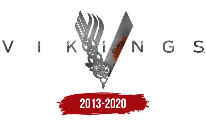
The Vikings logo remained largely unchanged from Season 1 through Season 6. King and Country delivered a design so specific to the show’s identity that major overhauls were never needed.
Minor adjustments happened between seasons, mostly related to contrast and resolution for different screen formats. The core “V” symbol and wordmark stayed the same.
Original Vikings Logo (2013 to 2020)
- Years Active: 2013 to 2020 (6 seasons, 89 episodes)
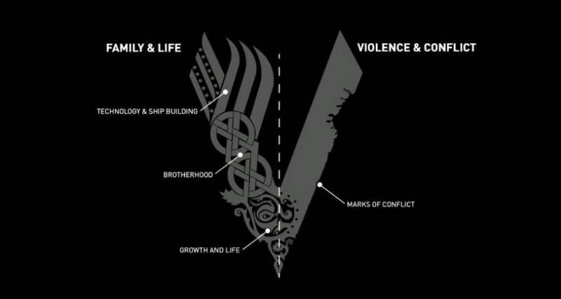
- Design Description: The central “V” splits into two halves. The left side features six forked stripes inspired by real Viking longship imagery, representing family, art, and exploration. The bottom of the left side contains the Tree of Life (Yggdrasil), a core symbol of Scandinavian mythology. The right side is shaped like a sharpened sword blade with crimson staining and visible battle damage, scratches, and nicks.
- Color Scheme: Metallic gray and silver with crimson red accents on black backgrounds
- Designer: King and Country (K&C), led by directors Rick Gledhill and Efrain Montanez, art directed by Omer Avarkan
- Context: History Channel needed branding for its first fully scripted drama series. The logo had to separate Vikings from both fantasy shows and documentary content. Michael Hirst’s series required a mark that could convey historical authenticity.
- Cultural Significance: The logo became a merchandise powerhouse. Metal necklaces, keychains, tattoos, and fan art spread it far beyond the show’s original audience. It set a new standard for historical drama branding.
Vikings: Valhalla Logo (2022 to 2024)
- Years Active: 2022 to 2024 (3 seasons on Netflix)
- Design Description: The spin-off kept the “V” structure but added “VALHALLA” beneath the main title. The textures shifted slightly, pulling from a cleaner digital aesthetic while keeping the metallic sheen.
- Key Changes from Previous: More streamlined for Netflix’s platform guidelines. Less weathered texture, slightly brighter metallic tones.
- Context: Netflix commissioned the spin-off continuing the saga 100 years after the original series. The logo needed to feel connected to the original while signaling something new.
What Do the Design Elements of the Vikings TV Series Logo Mean?
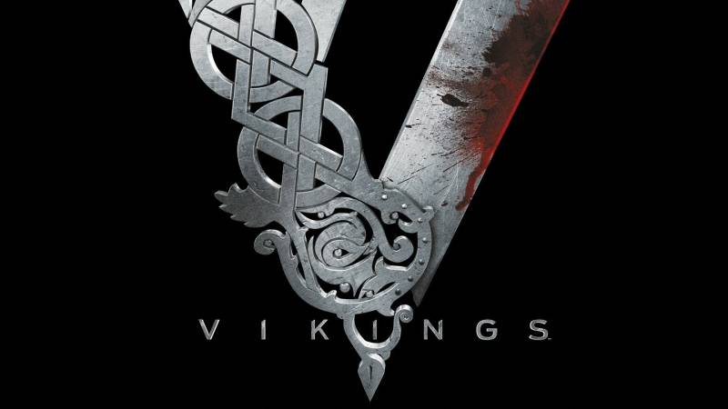
The “V” emblem tells the full story of Viking civilization in a single letter. The left half shows their cultural and spiritual side. The right half shows their capacity for violence. This duality runs through every design element in the mark.
What Does the Left Side of the “V” Represent?
The left side features forked stripes based on the prows of actual Viking longships. These represent exploration, seafaring, and progress.
At the base sits the Tree of Life (Yggdrasil). In Norse mythology, this ash tree held together the past, present, and future. Gods lived on its branches. The world of people surrounded its trunk. Evil forces dwelled between its roots.
This side represents what most people forget about Viking culture: family, craftsmanship, and a deep connection to the spiritual world.
What Does the Right Side of the “V” Represent?
The right side is a sharpened sword blade. Crimson stains run through its center. Chips, scratches, and battle damage mark its surface.
It represents armed conflict, conquest, and the violent customs that defined much of Viking history. The designers painted the blade’s center red specifically so viewers would understand it as a blood-stained weapon, not just decorative metalwork.
Why Did Vikings Choose These Specific Colors?
The color palette is built around four core hues:
- Charcoal Black (approximate Hex: #1A1A1A): Creates depth and a dark backdrop. Black signals authority, power, and the unknown. It roots the logo in the serious, dramatic tone of the series.
- Steel Gray/Silver (approximate Hex: #8A8D8F): The dominant color of both the “V” and the wordmark. Mimics hand-forged steel and iron. The metallic gradient effect gives everything a three-dimensional, cold-weapon quality.
- Blood Red/Crimson (approximate Hex: #8B0000): Used sparingly on the sword blade. Red signifies danger, violence, and sacrifice. Applied to the psychology of color, crimson triggers visceral reactions of alertness and tension.
- Weathered Bronze (approximate Hex: #6B4226): Appears in accent details and weathering effects. Connects to ancient jewelry, armor fittings, and the passage of time.
These colors work as near-monochrome tones broken only by the red accent. The limited palette keeps the brand feeling historical rather than flashy.
What Typography Style Is Used in the Vikings TV Series Logo?
King and Country built the “VIKINGS” typeface from scratch. It’s a custom sans-serif font with three white diagonal slashes cutting across each letter.
The closest matching typefaces include FS Industrie Extended and EFCO Overhold Expanded, but neither is exact. Fan designer RamaelK later recreated the lettering as a downloadable font for personal use.
The oblique cuts at each letter’s endpoints give the text a blade-like quality. Every character looks like it was shaped by a blacksmith, not a typographer.
That roughness is the point. The typography avoids anything smooth or modern. It mirrors the hand-carved quality of runic inscriptions from the Viking age.
What Are the Hidden Meanings in the Vikings TV Series Logo?
The whole “V” functions as a split personality test for Viking culture. Look at it one way and you see art, ships, and mythology. Look again and you see a weapon.
The Tree of Life at the base of the left side sits directly opposite the blood-stained blade on the right. That’s intentional. Life and death, creation and destruction, family and war, all contained in a single letterform.
The weathered textures across the entire mark suggest age and battle history. Nothing looks new. Everything looks like it’s been through something.
How Does the Vikings TV Series Logo Compare to Competitor Logos?

The Vikings logo carved out its own space in television branding by leaning hard into historical accuracy rather than fantasy styling. Most competing historical dramas went either too clean or too generic with their marks.
Game of Thrones used a refined serif font with a metallic three-headed dragon sigil. Very polished, very fantasy-forward. Clean lines, controlled geometry. It said “epic” but not “historical.”
The Walking Dead went with decayed, eroded letterforms to signal horror and collapse. Effective for its genre, but operating in a completely different lane.
Peaky Blinders chose an Art Deco-influenced wordmark with clean symmetry. Period-appropriate for 1920s Birmingham. Elegant, but lacking the raw physical presence of the Vikings mark.
Stranger Things relied on retro 1980s display font nostalgia. Different era, different approach entirely.
What made Vikings stand out: the logo doubled as an actual artifact. It felt like something that could have been carved into a longship’s prow or stamped onto a shield boss. None of the competitors achieved that level of physical authenticity in their branding.
What Are the Technical Specifications of the Vikings TV Series Logo?
Official Color Codes (Approximate)
| Color | Hex | Use |
|---|---|---|
| Charcoal Black | #1A1A1A | Background, outlines |
| Steel Gray | #8A8D8F | Primary “V” and wordmark |
| Blood Red | #8B0000 | Sword blade accent |
| Weathered Bronze | #6B4226 | Aging and texture details |
Note: History Channel has not published official hex values. These are approximate values derived from the logo’s visual appearance across media kits.
Dimensions and Proportions
- Aspect Ratio: The full logo (V emblem plus wordmark) maintains roughly a 16:9 proportion for broadcast compatibility
- Minimum Size: The “V” icon works as a standalone mark at small sizes. The full wordmark requires larger reproduction to preserve the diagonal slash details.
- Clear Space: Standard television branding guidelines apply, requiring a margin equal to the height of one letter around the wordmark
- File Formats: Available as vector graphics for scalable use, high-resolution bitmap files for print design, and web-optimized JPEG and PNG files
What Cultural Impact Has the Vikings TV Series Logo Had?
The logo went way beyond a title card. Merchandise sales across six seasons generated millions, with the “V” emblem appearing on everything from metal pendants to clothing lines to actual tattoos.
Fan communities recreated the logo constantly. The RamaelK fan font alone saw thousands of downloads. Social media turned the “V” into a shorthand for Viking culture among people who had never even watched the show.
It also shifted expectations for historical drama branding across the industry. After Vikings, series like The Last Kingdom and Norsemen had to think harder about how their visual identities connected to actual historical source material. The design proved that period accuracy could drive commercial success in modern entertainment marketing.
How Does the Vikings TV Series Logo Fit Into the Overall Brand Identity?
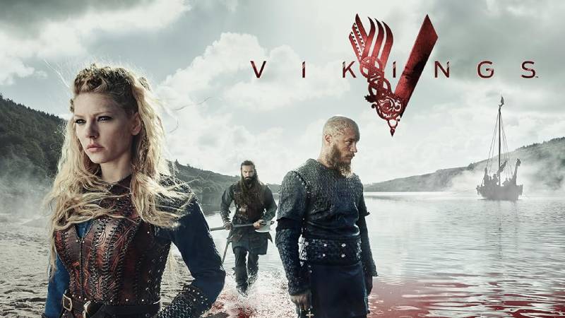
The logo sits at the center of a larger identity system built around Scandinavian aesthetics and Norse mythology. Everything connects back to it.
Title sequences, poster design layouts, motion graphics for promotional spots, and web design for the show’s official pages all pull from the same metallic, battle-worn visual language.
The “V” icon functions as a standalone symbol on merchandise and social media, while the full wordmark handles broadcast and formal marketing. This two-tier system gives the brand flexibility without losing recognition.
Brand guidelines for the series kept the color scheme, textures, and typography consistent across History Channel, Amazon Prime Video, and later Netflix (for Valhalla). That consistency built the kind of recognition that outlasts any single season.
How Should the Vikings TV Series Logo Be Used?
The Vikings logo is protected intellectual property. Here’s what you need to know:
- Do: Use the official logo for editorial coverage, reviews, and educational content about the show
- Don’t: Reproduce the logo on commercial products without licensing from A+E Networks or MGM Television
- Fan Use: RamaelK’s fan-made font recreation is available for personal, non-commercial projects only. The original King and Country font licensing is restricted.
- Official Assets: Press and media kits with approved logo files are available through A+E Networks’ media relations
- Trademark Protection: The logo, “V” emblem, and “VIKINGS” wordmark are all registered trademarks. Unauthorized commercial use violates copyright law.
FAQ About the Vikings TV Series Logo
When Was the Vikings Logo Created?
King and Country designed the logo in 2012 during pre-production. It first appeared publicly in 2013 in an exclusive trailer before the show’s March 3 premiere on History Channel. The design remained consistent through all six seasons until 2020.
Who Designed the Vikings Logo?
King and Country (K&C), a Santa Monica production company, created the logo. Art direction and design came from Omer Avarkan. The studio had an existing relationship with History Channel, having previously designed the Hatfields & McCoys logo.
What Do the Colors in the Vikings Logo Mean?
Steel gray mimics forged weapons and armor. Blood red represents violence and conquest. Charcoal black adds weight and seriousness. Weathered bronze signals age and authenticity. Together they create a palette rooted in the color theory of conflict and history.
How Many Times Has the Vikings Logo Been Redesigned?
Technically, zero times. The core logo stayed the same from 2013 to 2020. Minor saturation and contrast tweaks happened between seasons for digital optimization. The Vikings: Valhalla spin-off (2022) introduced a modified version with added subtitle text.
Where Can I Download the Official Vikings Logo?
Official press assets are available through A+E Networks’ media relations department. For personal projects, the RamaelK fan font can be found on DeviantArt. Commercial use of any Vikings branding requires formal licensing.
Is the Vikings Logo Trademarked?
Yes. The logo is protected intellectual property owned by History Channel and MGM Television. The “V” emblem, wordmark, and overall design are all registered. Unauthorized reproduction for commercial purposes is prohibited.
What Font Is Used in the Vikings Logo?
The font is a custom creation by King and Country. It’s a sans-serif design with three diagonal white slashes per character and oblique-cut endpoints. Close matches include FS Industrie Extended and EFCO Overhold Expanded, but the original is proprietary.
Why Did Vikings Choose a Stylized “V” for Their Logo?
Rick Gledhill, K&C Director and Partner, explained that the “V” needed to function as a standalone icon. It had to work engraved on merchandise, scaled down for social media, and blown up for broadcast. The letter became a symbol able to carry the full weight of Viking culture in a single, recognizable form according to core logo design principles.
Conclusion
The Vikings TV Series logo stands as one of the strongest examples of television branding from the past decade. King and Country’s 2012 design turned a single letter into a complete narrative about Norse civilization, balancing family and warfare, mythology and violence, art and weaponry.
Its limited color palette, custom typography, and layered Norse symbolism created a mark that worked across broadcast, print, digital, and merchandise. The fact that it never needed a major redesign across six seasons and a spin-off says everything about how well the original concept was executed. Few television logos achieve that kind of staying power.

Renowned for his expertise in logo design and visual branding, Bogdan has developed a multitude of logos for various clients.
His skills extend to creating posters, vector illustrations, business cards, and brochures. Additionally, Bogdan's UI kits were featured on marketplaces like Visual Hierarchy and UI8.
He also wrote in the past years on sites like Design Your Way, WebDesignerDepot, WPDean, Designmodo, Speckyboy, Slider Revolution, and more.
- The Windsurf Logo History, Colors, Font, And Meaning - 10 October 2026
- How to Remove Background From Product Photos (No Photoshop) - 10 October 2026
- How Designers can Build a Stronger Online Creative Identity - 9 October 2026

Bogdan Sandu is a seasoned designer who has been designing websites since 2008. Renowned for his expertise in logo design and visual branding, Bogdan has developed a multitude of logos for various clients. His skills extend to creating posters, vector illustrations, business cards, and brochures. Additionally, Bogdan's UI kits were featured on marketplaces like Visual Hierarchy and UI8. He also wrote in the past years on sites like Design Your Way, WebDesignerDepot, WPDean, Designmodo, Speckyboy, Slider Revolution, and more.
You Might Also Like