The Walking Dead logo is one of the most recognized symbols in horror television. It turned a comic book property into a global franchise worth millions in merchandise and licensing alone.
What started as hand-lettered text on the cover of a 2003 Image Comics series became the face of AMC’s biggest show. The logo did something most TV branding never pulls off. It told a story all by itself, decaying season after season alongside the fictional world it represented.
Robert Kirkman and artist Tony Moore launched the comic in October 2003. The TV adaptation hit AMC on October 31, 2010, pulling 5.3 million viewers on premiere night. Across both mediums, the logo went through roughly four major versions, each reflecting a shift in tone or narrative direction.
And the thing is, most people never even noticed the changes happening right in front of them. At least not consciously.
What Is The Walking Dead Logo?

The Walking Dead logo is a bold, condensed wordmark featuring distressed lettering that spells “WALKING DEAD” in large uppercase characters, with “The” placed small above the first letter. First introduced by Image Comics in 2003 and refined for AMC’s television debut in 2010, the logo uses weathered typography to represent decay, survival, and the post-apocalyptic world of the franchise.
Here are the key attributes that define this logo:
- Design Type: Wordmark with distressed texture treatment
- Primary Elements: Bold uppercase lettering with a small “The” positioned above the main text, no graphic symbols or icons
- Official Introduction Date: October 2003 (comic), October 31, 2010 (TV series)
- Designer/Agency: Original comic logo created alongside Robert Kirkman and Tony Moore at Image Comics. TV adaptation refined by AMC Networks in collaboration with Skybound Entertainment and Frank Darabont’s production team
- Trademark Status: Registered trademark held jointly by AMC Networks and Skybound Entertainment (formerly under Image Comics)
- Color Palette: Monochromatic scheme using black (#000000), white (#FFFFFF), and gray tones. Later seasons introduced earthy sandy tones and dark green accents
- Usage Context: Television title cards, streaming platforms, comic book covers, licensed merchandise, poster artwork, apparel, collectible items, video games, and promotional materials
How Has The Walking Dead Logo Evolved Over Time?

The Walking Dead logo went through a gradual decay that matched the show’s storyline, season by season. From clean gray outlines in 2003 to cracked, crumbling letters by season eight, then a surprising renewal in season nine, the branding shifted in ways that were subtle but deliberate.
Took me a while to realize they were actually doing it on purpose. But once you see it, you can’t unsee it.
Original Comic Book Logo (2003-2010)
Years Active: 2003 to 2010
The first version had a hand-lettered quality to it. Bold, heavy strokes. Tight letter spacing. Very much a product of the early 2000s indie comics scene.
The colors were simple: black text, sometimes reversed to white depending on the cover. Tony Moore’s artistic style influenced the rough edges of the lettering, giving it a raw look that felt appropriate for a horror comic.
There was no distress texture yet. Not really. Just a heavy, imposing typeface that sat on the page like a warning.
It worked because it didn’t try too hard. The comic was a slow burn, and the logo matched that energy.
AMC Television Debut Logo (2010-2014)
Years Active: 2010 to 2014
When the show launched on AMC, the team refined the font for broadcast. The lettering became cleaner and more structured. They used a typeface very similar to Tungsten Black, designed by Tobias Frere-Jones and Jonathan Hoefler at Hoefler & Co.
The gray outlines were soft. Subtle dark spots appeared on the letters, but nothing dramatic. Season one and two logos looked fairly pristine compared to what came later.
This version introduced the decay concept that would define the entire brand. Each season, the letters got a little darker. The spots grew bigger. Executive producer Gale Anne Hurd confirmed this was intentional, saying the logo reflected the decaying world and its walkers.
Key Changes from Previous: Tighter, more uniform letter spacing. Added subtle distress textures. Introduced the seasonal decay progression.
Mid-Series Decay Logo (2014-2018)
Years Active: 2014 to 2018 (approximately seasons five through eight)
This is where things got interesting. The comic also got a new logo with issue #127 in 2014, a more modern, smaller treatment that let the cover art breathe. But on TV, the decay kept accelerating.
By season eight, the dark spots had absorbed portions of the letters entirely. Cracks ran through the text like damaged concrete. The monochromatic color scheme shifted to heavier darks, almost oppressive.
It matched the plot perfectly. The show was at its most bleak during this stretch. The Negan arc. The war storylines. Everything felt hopeless, and the logo reflected that.
Cultural Significance: This became the version most fans remember and associate with the franchise at its peak ratings.
Renewal Logo (2018-2022)
Years Active: 2018 to 2022 (seasons nine through eleven)
Season nine brought a six-year time jump. Andrew Lincoln left. Angela Kang took over as showrunner. And the logo did something nobody expected.
It healed.
The letters became solid again. Lighter. Patches of green appeared on the surface, like moss growing over stone. The whole title sequence got a makeover with blossoming trees and flowers.
The production team explained that the greenery represented a new chapter where nature was reclaiming the world and survivors were rebuilding. After years of visual breakdown, the renewal felt earned.
Key Changes from Previous: Lighter stone-like texture replaced dark decay. Green moss accents replaced dark spots. Overall tone shifted from despair to cautious hope.
What Do the Design Elements of The Walking Dead Logo Mean?
Every piece of the logo carries weight, from the size difference between “The” and “WALKING DEAD” to the textures applied across different seasons. The small “The” sitting above massive block letters creates a feeling of something small being overwhelmed by something enormous. Which, well, that’s basically the whole show.
Why Did The Walking Dead Choose These Specific Colors?
The franchise stuck to a deliberately limited color palette across most of its run. The reasoning was straightforward, and honestly it makes a lot of sense when you break it down.
Black (#000000) serves as the primary color. It connects to themes of death, danger, and the unknown. From a color psychology standpoint, black triggers anxiety and a sense of finality. It also prints well on basically everything, which matters when your merchandise line is massive.
White (#FFFFFF) functions as the secondary color, providing the contrast needed for readability on dark backgrounds. It keeps the logo legible across screens, posters, and product packaging.
Gray tones (#808080 range) appear in the textured versions. These mid-tones create the stone-like and weathered appearances that define the TV series variants.
Dark green (#2E4A1E approximate) showed up only in the renewal logo starting in season nine. It symbolized nature’s return and new growth.
The low saturation across every version keeps the mood consistently grim. Even the green accents were muted. Nothing bright. Nothing hopeful in a flashy way. Just life slowly returning.
What Typography Style Is Used in The Walking Dead Logo?
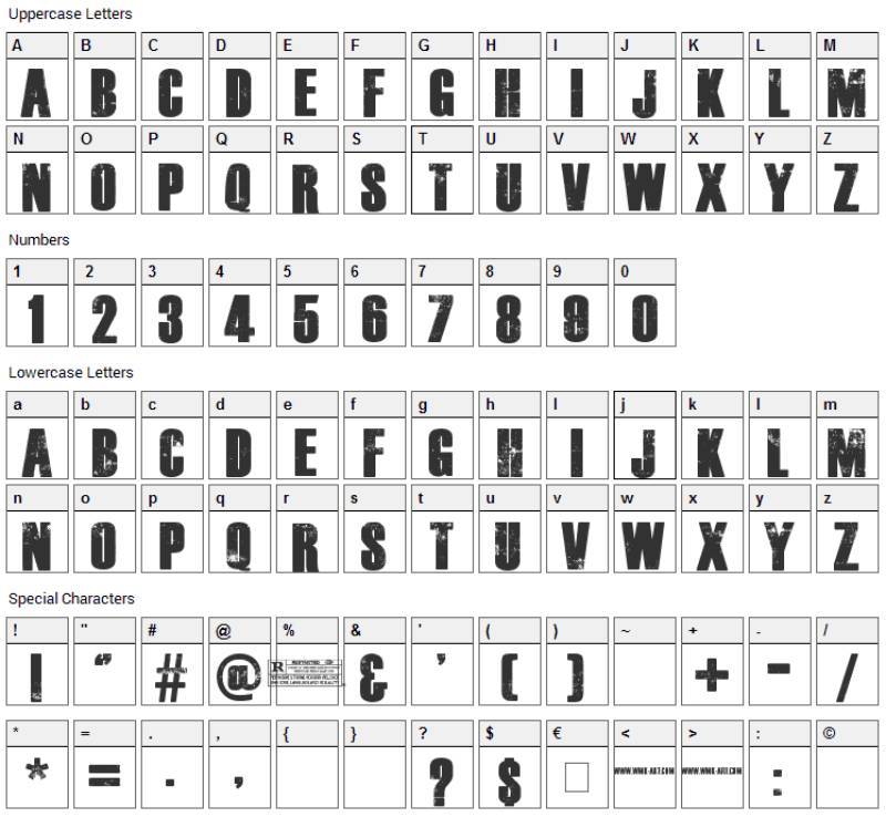
The TV series uses a typeface closely matching Tungsten Black, a condensed sans-serif designed by Tobias Frere-Jones and Jonathan Hoefler. It was first released in 2009 by Hoefler & Co.
The letters are tall and narrow. Heavy weight. Minimal spacing between characters, which creates a claustrophobic feel. Designers then applied custom distress and decay treatments on top of the base letterforms to make each character look naturally deteriorated.
Took me forever to realize the baseline isn’t perfectly uniform on some versions. That irregular positioning adds to the unsettling quality without most viewers ever pinpointing why it feels “off.”
Free alternatives like Dead Kansas replicate the look for personal use, but the official logo uses custom-modified lettering that standard fonts can’t match.
What Are the Hidden Meanings in The Walking Dead Logo?
The size contrast between the tiny “The” and the massive “WALKING DEAD” isn’t just a design choice. It represents the powerlessness of individuals against an overwhelming threat. People are small. The apocalypse is everything.
The tight kerning between letters makes the words feel like they’re pressing together, almost suffocating. There’s no breathing room, which is exactly how the characters live.
And that seasonal decay? Executive producer Gale Anne Hurd confirmed it was an intentional Easter egg, one that most viewers only notice when it’s pointed out directly.
How Does The Walking Dead Logo Compare to Competitor Logos?

Among horror and genre television logos, The Walking Dead sits in a category of its own. While other shows picked a look and stuck with it, TWD’s branding literally evolved over the course of the series.
The Stranger Things logo uses ITC Benguiat in glowing red neon, pulling from 1980s nostalgia and Stephen King book covers. It’s a completely different approach, leaning on retro warmth instead of decay. Static design, though. It doesn’t change between seasons the way TWD’s does.
The Breaking Bad logo is maybe the cleverest of the bunch, incorporating periodic table elements (Br and Ba) into its title. Subtle, smart, and it told you exactly what the show was about before you watched a single episode. But again, it stayed the same throughout the series run.
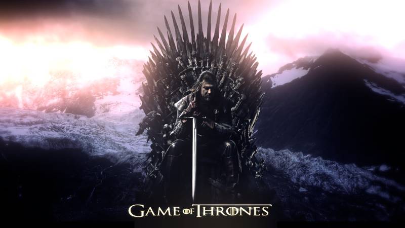
The Game of Thrones logo went for metallic, medieval-style lettering that felt like something stamped into a sword. Beautiful work, but no seasonal evolution.
What sets The Walking Dead apart is that its logo was a storytelling device. Not just a label. Not just branding. An actual narrative element that changed with the plot. I’ve seen plenty of show identities that look great, but very few that function as part of the story itself.
What Are the Technical Specifications of The Walking Dead Logo?
Official Color Codes
- Primary Color: Black – Hex: #000000, RGB: (0, 0, 0), CMYK: (0, 0, 0, 100)
- Secondary Color: White – Hex: #FFFFFF, RGB: (255, 255, 255), CMYK: (0, 0, 0, 0)
- Accent Color: Gray – Hex: #808080, RGB: (128, 128, 128), CMYK: (0, 0, 0, 50)
- Seasonal Accent: Dark Green (Season 9+) – Hex: #2E4A1E (approximate), RGB: (46, 74, 30), CMYK: (38, 0, 59, 71)
Dimensions and Proportions
The logo follows a wide horizontal layout. The aspect ratio is roughly 4.1:1 based on the official SVG file (1,000 x 241 pixels nominal). The “WALKING DEAD” text dominates the composition, with “The” occupying a small area above the left portion of the main text.
For print applications, the logo needs a minimum width of about 2 inches to keep the distressed detail legible at standard DPI for print (300 DPI). Digital use requires at least 200 pixels wide for the text to remain readable.
Clear space around the logo should equal the height of the “The” text on all sides. Brand guidelines set by AMC and Skybound specify that no other graphic elements should intrude into this protective area.
Official files are distributed as vector graphics (SVG, EPS) for scalability and high-resolution bitmap formats (PNG, JPEG) for web and print use.
What Cultural Impact Has The Walking Dead Logo Had?
The Walking Dead logo changed what people expected from television branding. Before TWD, show logos were fixed assets. You designed one, maybe updated it for a reboot, and that was that. The idea of a logo that decays alongside its fictional world was genuinely new for mainstream TV.
It set a template for how franchise branding could work across multiple series. Fear the Walking Dead, Tales of the Walking Dead, The Walking Dead: World Beyond, Daryl Dixon, Dead City. All of them share visual DNA with the original logo while carving out their own identity.
Fan culture picked it up in a big way too. The distressed lettering style became one of the most replicated looks in fan art, custom merchandise, and cosplay signage. It’s the kind of mark that people tattoo on themselves, which tells you something about how deep the connection runs.
How Does The Walking Dead Logo Fit Into the Overall Brand Identity?
The logo sits at the center of a connected web of brand assets. Robert Kirkman’s original Image Comics series feeds into AMC’s television production, which connects to Skybound Entertainment’s publishing and licensing operations. Every piece shares the same visual language.
The distressed wordmark acts as the anchor. From there, the brand style guide extends to episode title cards, promotional posters, packaging for collectibles, web assets, motion graphics in title sequences, and licensed apparel.
The visual hierarchy stays consistent: logo at top, character imagery below, network/publisher marks at the bottom. This structure holds whether you’re looking at a Blu-ray cover, a convention banner, or a mobile game splash screen.
Spinoff logos maintain the condensed sans-serif typographic foundation but adjust textures and color accents to differentiate. It’s a smart system. You know it’s a Walking Dead product the moment you see the lettering style, even before reading the actual words.
How Should The Walking Dead Logo Be Used?
Official usage do’s:
- Always reproduce the logo from official vector or high-resolution source files
- Maintain the specified clear space around all edges
- Use approved color variations only (black on white, white on black, or approved seasonal variants)
- Keep the aspect ratio locked when resizing
Official usage don’ts:
- Don’t stretch, compress, or rotate the logo
- Don’t apply unapproved color treatments or filters
- Don’t place the logo on visually busy backgrounds that compromise legibility
- Don’t recreate or redraw the logo using substitute fonts
- Don’t use the logo for commercial purposes without a license
Where to access official logos: Licensed partners receive logo files through AMC Networks’ brand portal and Skybound Entertainment’s licensing division. The general public can find approved imagery on the official AMC Walking Dead shop and Skybound’s store.
Licensing information: All commercial use of The Walking Dead logo requires licensing from both AMC Networks and Skybound Entertainment. Fan art and personal projects exist in a gray area, but selling products with the logo without authorization is a trademark violation.
Trademark protection: The Walking Dead name, logo, and associated marks are registered trademarks of AMC Film Holdings LLC and Skybound LLC. Both entities actively protect their intellectual property. If you’re thinking about using the logo on anything you plan to sell, get permission first. Otherwise, your mileage may vary, and probably not in a good way.
FAQ on The Walking Dead Logo
What font is used in The Walking Dead logo?
The TV series title card uses Tungsten Black, a condensed display font by Hoefler & Co. Tobias Frere-Jones and Jonathan Hoefler designed it in 2009.
The letters were then custom-distressed to look naturally weathered. Dead Kansas is a popular free alternative for personal projects.
Why does The Walking Dead logo change every season?
The logo decayed gradually from season one through season eight, matching the show’s post-apocalyptic storyline. Executive producer Gale Anne Hurd confirmed this was an intentional Easter egg reflecting the world’s decline.
Season nine reversed the trend. Green moss replaced dark spots, signaling hope and renewal in the narrative.
Who designed The Walking Dead logo?
The original comic book version was created alongside Robert Kirkman and artist Tony Moore for Image Comics in 2003.
AMC Networks and Frank Darabont’s production team refined it for television in 2010. Skybound Entertainment helped establish consistent brand identity across all media.
What colors are in The Walking Dead logo?
The logo primarily uses black, white, and gray tones. It’s a color theory approach built on restricted palettes to create psychological tension.
Later seasons added muted earthy tones and dark green accents. The low saturation keeps everything feeling grim, even during the show’s more hopeful arcs.
Can I use The Walking Dead logo on merchandise?
Not without a license. The logo is a registered trademark held by AMC Film Holdings LLC and Skybound LLC. Both companies actively protect their intellectual property.
Fan art for personal use sits in a gray area. But selling products with the TWD branding without authorization will get you into trouble.
What does The Walking Dead logo symbolize?
The massive “WALKING DEAD” text dwarfing the tiny “The” represents individuals overwhelmed by catastrophe. Tight letter spacing creates a suffocating, claustrophobic feeling.
The distressed texture directly references decay and the zombie apocalypse without showing any graphic imagery. It tells you the genre instantly.
How is The Walking Dead logo different from the comic version?
The 2003 comic logo had a raw, hand-lettered quality typical of indie horror series at Image Comics. Rougher edges. Less polish.
AMC’s television adaptation cleaned up the letter spacing and applied structured distress textures suitable for broadcast. The comic also introduced a third, smaller logo in issue #127 during 2014.
Where can I download The Walking Dead logo?
Official high-resolution files are available through AMC’s licensing portal and Skybound’s brand division for approved partners. PNG versions with transparent backgrounds circulate widely online.
For legitimate commercial use, you need to go through proper print and digital licensing channels. Free downloads are fine for personal reference only.
What makes The Walking Dead logo iconic?
It’s one of the few TV show logos that functioned as a storytelling device. The seasonal decay wasn’t just branding. It was narrative design.
That approach, combined with the franchise spanning comics, television, video games, and massive merchandise lines, gave the logo cultural staying power most game and entertainment brands only dream about.
Do The Walking Dead spinoffs use the same logo?
Each spinoff keeps the condensed sans-serif foundation but adjusts textures and accents. Fear the Walking Dead, Dead City, Daryl Dixon, and World Beyond all share recognizable typographic DNA.
The franchise branding stays cohesive across AMC’s entire TWD universe. You know it’s a Walking Dead property the second you see that lettering style.
Conclusion
The Walking Dead logo did what most television branding never attempts. It became part of the story itself, shifting from clean lettering to crumbling decay across eleven seasons on AMC.
That Tungsten Black typeface, those muted grays and greens, the tight spacing between characters. Every detail served the zombie apocalypse narrative that Robert Kirkman started at Image Comics back in 2003.
Few franchise logos survive a jump from comic books to television to streaming platforms while staying this recognizable. The Walking Dead pulled it off by keeping things simple and letting the design evolve naturally.
Skybound Entertainment and AMC built something that works on a t-shirt just as well as it does on a title card. That kind of versatility across book covers, collectibles, and video game branding is harder to achieve than most people realize.

Renowned for his expertise in logo design and visual branding, Bogdan has developed a multitude of logos for various clients.
His skills extend to creating posters, vector illustrations, business cards, and brochures. Additionally, Bogdan's UI kits were featured on marketplaces like Visual Hierarchy and UI8.
He also wrote in the past years on sites like Design Your Way, WebDesignerDepot, WPDean, Designmodo, Speckyboy, Slider Revolution, and more.
- The Windsurf Logo History, Colors, Font, And Meaning - 10 October 2026
- How to Remove Background From Product Photos (No Photoshop) - 10 October 2026
- How Designers can Build a Stronger Online Creative Identity - 9 October 2026

Bogdan Sandu is a seasoned designer who has been designing websites since 2008. Renowned for his expertise in logo design and visual branding, Bogdan has developed a multitude of logos for various clients. His skills extend to creating posters, vector illustrations, business cards, and brochures. Additionally, Bogdan's UI kits were featured on marketplaces like Visual Hierarchy and UI8. He also wrote in the past years on sites like Design Your Way, WebDesignerDepot, WPDean, Designmodo, Speckyboy, Slider Revolution, and more.
You Might Also Like