


The Peaky Blinders logo is one of those TV marks that just sticks with you. It’s bold, it’s rough around the edges, and it looks like something you’d find stamped on a crate in 1920s Birmingham. The whole thing works because it doesn’t try too hard. The design leans on period-accurate letterpress printing and a stark black-and-white palette that mirrors the show’s gritty tone.
Created by Momoco, a BAFTA and Emmy award-winning design studio based in London, the logo was physically produced at East End Letterpress Studio using actual wood type. That’s not something you see often with TV branding. Most shows go straight to digital, but this one started with ink on paper. The result carries a texture and weight that digital-first approaches rarely achieve.
Steven Knight’s BBC crime drama premiered on September 12, 2013, and ran for six series through April 2022. Across 36 episodes and a growing global audience (thanks in large part to Netflix picking it up in 2014), the logo became shorthand for a specific kind of prestige television. It sits alongside marks from shows like Game of Thrones and Breaking Bad as a piece of TV branding that transcended the screen and ended up on tattoos, merchandise, and fan art everywhere.
What Is the Peaky Blinders Logo?

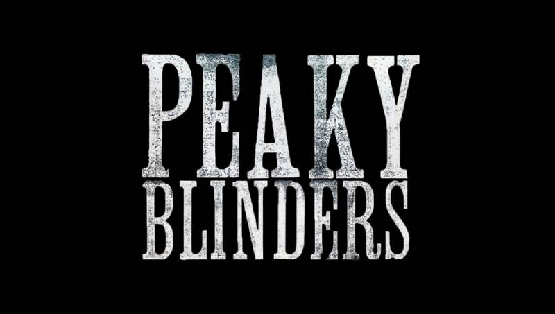
The Peaky Blinders logo is a typographic wordmark set in Clarendon Condensed wood type, created by design studio Momoco in 2013 for the BBC crime drama. Its stacked two-line layout, distressed texture, and high-contrast black-and-white palette communicate the show’s themes of industrial-era power and street-level danger.
Here’s a breakdown of the key attributes:
- Design Type: Typographic wordmark. No icon, no mascot. Just letters doing all the heavy lifting.
- Primary Elements: Stacked “PEAKY” over “BLINDERS” in uppercase Clarendon Condensed, with weathered ink texture and sharp serifs. Supplementary branding sometimes includes razor blade imagery and flat cap silhouettes.
- Official Introduction Date: September 2013, coinciding with the Series 1 premiere on BBC Two.
- Designer/Agency: Momoco, a London-based motion design and branding studio. The physical type was set at East End Letterpress Studio.
- Trademark Status: The Peaky Blinders brand is owned by Caryn Mandabach Productions and Tiger Aspect Productions (a Banijay UK company).
- Color Palette: Primarily black (#000000) and white (#FFFFFF). Extended brand palette includes Concealment (a near-black dark tone), Light Cipollino (light beige), Bronze Olive (muted olive green), and Rattan Basket (warm brown). The logo’s default presentation is stark monochrome.
- Usage Context: Title cards, opening sequence, BBC and Netflix promotional materials, official merchandise, social media assets, and licensed products ranging from clothing to playing cards.
How Has the Peaky Blinders Logo Evolved Over Time?
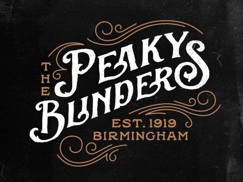
The Peaky Blinders logo has stayed remarkably consistent since 2013. Unlike many TV brands that get a full redesign every couple of seasons, this one barely changed. The core wordmark held steady across all six series.
What did shift was how the logo was used and what surrounded it. Background treatments, promotional context, and supplementary graphic elements adapted as the show grew from a BBC Two niche drama into a global phenomenon.
Original Peaky Blinders Logo (2013-2014)
Years Active: 2013-2014 (Series 1 and 2)
The original mark was created using physical wood letterpress type at East End Letterpress Studio in London. Momoco chose Clarendon Condensed, a slab serif style with roots in 19th-century British commercial printing.
The color scheme was black and white. Full stop. No gradients, no color accents. Just ink on paper, then photographed and digitized.
The choice was deliberate. Clarendon Condensed was everywhere in Birmingham during the 1910s and 1920s, on shop windows, pub signs, and printed broadsides. Using it grounded the show’s branding in the same visual world as the story itself.
Culturally, it signaled that this wasn’t going to be a glossy, over-produced period drama. The rough letterpress texture said “working class” before you even read the words.
Netflix Global Expansion Era (2014-2017)
Years Active: 2014-2017 (Series 2 through 4)
When Netflix acquired US distribution rights in September 2014, the logo needed to work in new contexts. Streaming thumbnails, mobile screens, social media cards.
The wordmark itself didn’t change. But the production team developed cleaner digital versions that maintained the distressed texture while reproducing well at smaller sizes.
Key change: promotional materials started pairing the logo with character photography and more elaborate background treatments. The cobblestone street texture became a recurring motif. Crown imagery started appearing in variations, hinting at the Shelby family’s growing ambitions.
The mark transitioned from BBC Two’s relatively modest promotional ecosystem to Netflix’s global reach, and it held up well. That’s the advantage of starting with something physically printed rather than born digital.
BBC One and Peak Cultural Impact (2019-2022)
Years Active: 2019-2022 (Series 5 and 6)
The show moved from BBC Two to BBC One for Series 5, which was a big deal. Bigger platform, bigger promotional budget, bigger audience expectations.
The logo continued in its original form but appeared alongside increasingly cinematic marketing campaigns. The Series 6 promotional materials, which premiered February 27, 2022, featured the wordmark set against darker, more atmospheric backgrounds.
By this point, the Peaky Blinders brand had become recognizable enough that the typography alone could carry the message. You didn’t need a character image or a tagline. The letters did the work.
Fan-made designs and unofficial merchandise had also pushed the brand in new directions, with razor blade and flat cap iconography becoming almost as recognizable as the wordmark itself.
What Do the Design Elements of the Peaky Blinders Logo Mean?
Every piece of the Peaky Blinders logo serves the show’s narrative. The condensed letterforms suggest confinement, the narrow streets and cramped row houses of industrial Birmingham. The distressed texture references age and wear.
The stacked layout creates a visual block, almost like a stamp or a brand mark you’d see on factory equipment. It’s authoritative without being decorative.
Why Did Peaky Blinders Use These Specific Colors?
The primary color palette is black and white. That’s it for the core logo.
Black (#000000) carries associations with power, danger, and formality. For a show about organized crime in post-war Britain, it’s the obvious pick. White (#FFFFFF) provides the contrast needed for the letterpress texture to read properly.
The extended brand colors tell a different story. Concealment (a deep, almost-black shade) shows up in background treatments. Light Cipollino (beige) connects to the aged-paper quality of period documents. Bronze Olive and Rattan Basket bring in the earthy, muted tones of 1920s Birmingham, the soot-stained brickwork and worn leather.
The psychology behind keeping the logo itself strictly black and white is worth noting. It makes the mark timeless. It photographs well. And it reproduces cleanly on everything from a t-shirt to a billboard. Color psychology here works through restraint, not saturation.
What Typography Style Is Used in the Peaky Blinders Logo?

The original logo uses Clarendon Condensed wood type. The closest digital match is Roman Wood Type JNL, designed by Jeff Levine, though it’s not identical to the physical letterpress original.
Clarendon is a serif typeface with thick, bracketed serifs and strong vertical stress. The condensed version squeezes the letterforms narrower, which is why the stacked layout works so well. Both words fill the same width despite having different character counts.
The typeface originated in 1845 at the Fann Street Foundry in London. By the early 1900s, condensed variants were standard in British commercial printing. Shop signs, boxing posters, newspaper headlines. Choosing it for the show was less a creative leap and more a historically accurate decision.
Readability was a real consideration. The bold weight and sharp serifs remain legible even at small sizes, which matters when your logo appears as a streaming thumbnail on someone’s phone.
What Are the Hidden Meanings in the Peaky Blinders Logo?
The distressed, weathered texture isn’t just aesthetic. It comes from the actual mechanical process of pressing carved wood type into paper. Every imperfection, every inconsistency in ink coverage, is a real artifact of how things were printed a century ago.
Look at the way the letter edges break apart slightly. That’s not a Photoshop filter. It’s what happens when wooden letterforms meet paper under pressure.
There’s also the matter of the two-line stacking. “PEAKY” sits on top of “BLINDERS” with both words stretched to equal width. This creates a visual solidarity, a closed block. It mirrors the Shelby family’s tight-knit structure, though whether that was intentional or just good alignment practice is up for debate.
How Does the Peaky Blinders Logo Compare to Competitor Logos?
TV drama logos tend to fall into two camps: heavily illustrated or purely typographic. Peaky Blinders sits firmly in the second camp, along with shows like Stranger Things and Better Call Saul.
But where Stranger Things uses a custom neon-style display face to signal 1980s nostalgia, and Better Call Saul leans on clean, modern lettering, Peaky Blinders goes for raw, physical authenticity. It’s the only major TV logo I can think of that was actually created with physical letterpress equipment.
Period dramas like The Vikings use runic-inspired custom lettering. The Walking Dead goes with a decayed, horror-influenced treatment. The Boys uses a deliberately crude, graffiti-like approach.
Peaky Blinders stands apart because it didn’t try to invent a new visual language. It borrowed one that already existed in the right time period and used it straight. That’s a harder thing to pull off than it sounds. Most designers reach for novelty. Momoco reached for accuracy.
What Are the Technical Specifications of the Peaky Blinders Logo?
Official Color Codes
- Primary – Black: Hex: #000000 | RGB: (0, 0, 0) | CMYK: (0, 0, 0, 100)
- Primary – White: Hex: #FFFFFF | RGB: (255, 255, 255) | CMYK: (0, 0, 0, 0)
- Extended – Concealment: A near-black dark tone used in background treatments
- Extended – Light Cipollino: A light beige used in aged-paper style promotional materials
- Extended – Bronze Olive: Muted olive green found in supplementary brand materials
- Extended – Rattan Basket: Warm brown tone used across merchandise and promotional art
Dimensions and Proportions
The logo uses a stacked two-line format where both “PEAKY” and “BLINDERS” are scaled to equal width. The system calculates precise font sizing ratios so that both lines carry identical visual weight despite different character counts.
The aspect ratio is roughly 2:1 (width to height) in its standard presentation. For digital use, vector formats (SVG, AI, EPS) are available to maintain sharp edges at any scale. Pixel-based versions in PNG format are commonly distributed at 2000x1482px for high-resolution applications.
Clear space requirements follow standard practice: maintain breathing room equal to roughly the height of one letter around all sides of the mark. The distressed texture makes minimum size more of a practical concern than a strict guideline. Below about 120 pixels wide, the finer details of the letterpress texture start to blur, and the mark reads more like a clean wordmark.
What Cultural Impact Has the Peaky Blinders Logo Had?
The Peaky Blinders brand pushed well beyond television. According to the UK Office for National Statistics, the show had a measurable cultural impact: the name Arthur surged into the top 10 boys’ names in 2018 for the first time since the 1920s. Ada jumped into the girls’ top 100 for the first time in a century.
The logo became one of the most requested designs in tattoo shops across the UK and beyond. Fan-made versions flooded platforms like Etsy, Behance, and Dribbble, with creators remixing the typography and adding razor blade, horseshoe, and flat cap elements.
Licensed merchandise turned the wordmark into a lifestyle brand. T-shirts, playing cards, mugs, phone cases. The logo worked on all of it because of its simplicity and strong emphasis on clean, bold lettering.
A Rambert Dance production, video games (including Peaky Blinders: Mastermind and a VR title), and now a feature film and sequel TV series all carry the brand forward. The mark has outlived the original show’s run and keeps finding new surfaces to land on.
How Does the Peaky Blinders Logo Fit Into the Overall Brand Identity?
The logo doesn’t exist in isolation. It sits at the center of a visual system that includes character photography, period-specific color grading, the show’s anachronistic soundtrack choices, and a consistent tone across all touchpoints.
Caryn Mandabach Productions and Tiger Aspect Productions control the brand. BBC and Netflix each apply it within their own promotional frameworks, but the core mark stays consistent.
The storytelling embedded in the design connects directly to the show’s themes. Working-class roots, industrial Birmingham, the tension between old-world tradition and new-world ambition. The letterpress process itself tells that story, a 19th-century printing method used to brand a 21st-century streaming hit.
Steven Knight’s vision for the show always included the visual identity as a character in itself. The logo needed to feel like something Tommy Shelby might have seen on a wall in Small Heath, not something cooked up in a modern branding agency.
How Should the Peaky Blinders Logo Be Used?
Official usage falls under the licensing agreements managed by Caryn Mandabach Productions and Tiger Aspect Productions (now part of Banijay UK). You can’t just slap the logo on merchandise and sell it.
Do:
- Use official assets from licensed distributors
- Maintain the black-and-white palette for the core wordmark
- Preserve the distressed texture (don’t smooth it out or “clean up” the edges)
- Keep the stacked two-line layout intact
- Respect clear space around the mark
Don’t:
- Alter the proportions or stretch the wordmark
- Add colors to the core logo that aren’t part of the official palette
- Place the logo on busy backgrounds that compromise legibility
- Recreate it with a different typeface and call it official
- Use it commercially without proper licensing
For fan art and personal use, the community has been pretty active. But if you’re thinking about selling anything with the Peaky Blinders name or logo on it, you need a license. Trademark protection covers the name and associated visual elements across multiple jurisdictions.
Official vector files and PNG assets are available through licensed channels. The fan community commonly uses Roman Wood Type JNL by Jeff Levine or the free alternative Alycidon Condensed by Kitch22 to create similar-looking designs for personal projects. Neither is the actual typeface used in the original logo, but they get close enough for non-commercial work.
FAQ on The Peaky Blinders Logo
What font is used in the Peaky Blinders logo?
The original logo uses Clarendon Condensed wood type, physically set at London’s East End Letterpress Studio. The closest digital match is Roman Wood Type JNL by Jeff Levine. A free alternative called Alycidon Condensed by Kitch22 works for personal projects.
Who designed the Peaky Blinders logo?
Momoco, a London-based design studio known for TV title sequences, created it. They produced the mark using actual wood letterpress type rather than digital tools. That physical process gave the logo its distinctive distressed texture and period-authentic feel.
What do the Peaky Blinders logo colors mean?
The core logo sticks to black and white. Black signals power and danger. White provides contrast for the letterpress texture to read clearly.
Extended brand colors include warm browns and muted olive tones that connect to 1920s Birmingham’s industrial landscape.
Can I use the Peaky Blinders logo on merchandise?
Not without a license. Caryn Mandabach Productions and Tiger Aspect Productions own the brand. Fan art for personal use is common, but selling products with the logo or name requires proper licensing agreements through official channels.
What does the Peaky Blinders logo represent?
It represents the Shelby family’s gritty rise to power in post-war Birmingham. The condensed letterforms and rough ink texture mirror the show’s themes of working-class ambition, gang warfare, and the industrial English Midlands during the 1920s.
Where can I download the Peaky Blinders logo?
Official vector files in SVG, AI, and EPS formats exist through licensed sources. PNG versions at 2000x1482px are widely available. For fan projects, generators on sites like FontBolt and MockoFun let you create similar-looking text treatments for free.
Is the Peaky Blinders logo based on a real gang symbol?
No. The real Peaky Blinders gang from the 1880s to 1920s didn’t have a logo. Steven Knight’s BBC series created the branding from scratch. The flat cap and razor blade imagery became associated with the show, not the historical Birmingham gang.
How has the Peaky Blinders logo changed over the years?
It barely changed. The core wordmark stayed consistent across all six series from 2013 to 2022.
What shifted was context. Background treatments got darker and more cinematic as the show moved from BBC Two to BBC One and grew its Netflix audience globally.
Why does the Peaky Blinders logo look distressed?
Because it was made with real letterpress equipment. Wood type pressed into paper creates natural ink irregularities, uneven edges, and texture that digital fonts can’t fully replicate. Those imperfections aren’t a filter. They’re artifacts of a 19th-century printing method.
What makes the Peaky Blinders logo different from other TV show logos?
It was physically printed, not digitally designed. Most TV logos start in Illustrator or Photoshop. This one started with carved wood type and ink.
That production choice gave it an authenticity that sets it apart from shows like The Mandalorian or Squid Game, which use entirely digital approaches to their title branding.
Conclusion
The Peaky Blinders logo works because it was built on truth, not trends. Clarendon Condensed wood type, real ink, real paper. Momoco made a branding decision in 2013 that still holds up across Netflix thumbnails, tattoo parlors, and licensed merchandise worldwide.
Few film company logos or TV marks manage that kind of staying power. The Shelby family’s rise from Small Heath streets to global pop culture icon mirrors the logo’s own journey, from a London letterpress studio to one of the most recognized symbols in modern television.
Good logo design principles don’t expire. Neither does this one.

Renowned for his expertise in logo design and visual branding, Bogdan has developed a multitude of logos for various clients.
His skills extend to creating posters, vector illustrations, business cards, and brochures. Additionally, Bogdan's UI kits were featured on marketplaces like Visual Hierarchy and UI8.
He also wrote in the past years on sites like Design Your Way, WebDesignerDepot, WPDean, Designmodo, Speckyboy, Slider Revolution, and more.
- The Windsurf Logo History, Colors, Font, And Meaning - 10 October 2026
- How to Remove Background From Product Photos (No Photoshop) - 10 October 2026
- How Designers can Build a Stronger Online Creative Identity - 9 October 2026

Bogdan Sandu is a seasoned designer who has been designing websites since 2008. Renowned for his expertise in logo design and visual branding, Bogdan has developed a multitude of logos for various clients. His skills extend to creating posters, vector illustrations, business cards, and brochures. Additionally, Bogdan's UI kits were featured on marketplaces like Visual Hierarchy and UI8. He also wrote in the past years on sites like Design Your Way, WebDesignerDepot, WPDean, Designmodo, Speckyboy, Slider Revolution, and more.
You Might Also Like


