


The Mandalorian logo is one of those designs that hits you before you even read the title. It showed up on Disney+ in November 2019 and immediately set itself apart from every other Star Wars property. The wordmark blends custom lettering with embedded character imagery, and the whole thing sits on a black background like a title card from a space western (which, well, it is).
Created for Jon Favreau’s first live-action Star Wars series, the logo serves as both a brand identifier for the show and a visual bridge to decades of Mandalorian lore within the franchise. Lucasfilm positioned it carefully. Not too close to the classic Star Wars look, not too far from it. The result is a mark that works on a streaming thumbnail just as well as it does on a t-shirt.
The current version of the logo has gone through multiple color iterations across three seasons and a feature film announcement. The core structure, though, hasn’t really changed since 2019. It was built in-house at Lucasfilm under the creative direction of Dave Filoni and Jon Favreau, drawing on visual language already established in The Clone Wars animated series.
The show itself premiered on November 12, 2019, as Disney+’s flagship original. Since then, the logo has appeared across four distinct versions, each tied to a new chapter of the story.
What Is The Mandalorian Logo?
The Mandalorian logo is a stylized wordmark featuring the series title in custom uppercase lettering, with a silhouette of the main character (Din Djarin) built into the central letter “A.” It was officially introduced on November 12, 2019, alongside the Disney+ launch, and was designed by Lucasfilm’s internal creative team.
Design Type: Combination mark (wordmark with integrated graphic element). The main component is the text “THE MANDALORIAN” arranged in two lines, with a small figurative silhouette placed inside one of the letterforms.
Primary Elements: The word “THE” appears in small capitals at the top, flanked by two horizontal lines extending outward on each side. Below it, “MANDALORIAN” is set in large, condensed uppercase letters. The middle “A” contains a triangular silhouette of Din Djarin (and later Grogu). Two of the three letter “A”s have their horizontal crossbars removed.
Official Introduction Date: November 12, 2019, with the premiere of The Mandalorian Season 1 on Disney+.
Designer/Agency: Lucasfilm’s in-house design team, working under the creative direction of Jon Favreau and Dave Filoni. No external agency has been publicly credited.
Trademark Status: “THE MANDALORIAN” is a registered trademark (Registration #6153932) owned by Lucasfilm Ltd. LLC, filed on October 10, 2018, and registered on September 15, 2020, with the USPTO. The mark covers digital media, entertainment services, and merchandise categories.
Color Palette: Varies by season. Season 1 uses warm sunset tones (pinks, oranges, yellows). Season 2 shifts to cool blue and purple gradients. Season 3 features green tones. The upcoming movie logo uses purple-to-gold transitions.
Usage Context: Disney+ streaming platform, promotional posters, merchandise, social media assets, physical media packaging, and theatrical marketing materials for The Mandalorian & Grogu (2026).
How Has The Mandalorian Logo Evolved Over Time?
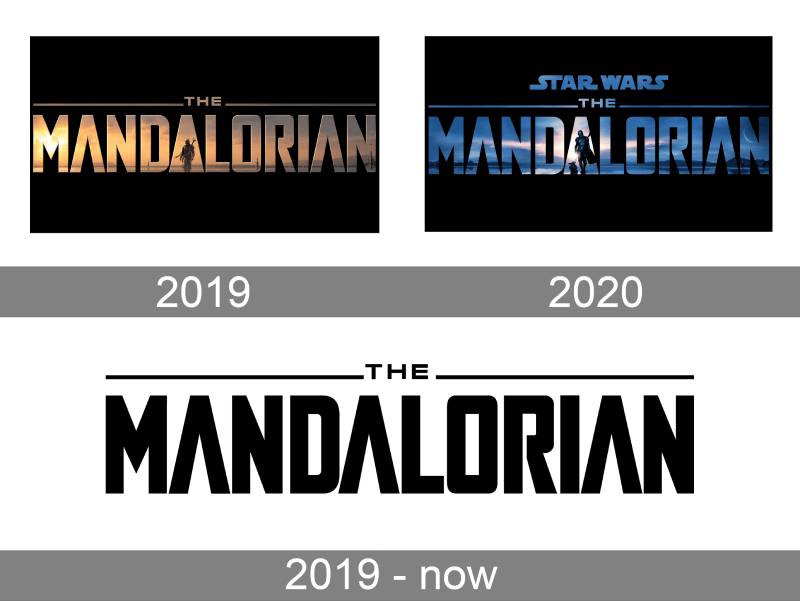
The Mandalorian logo has gone through four main versions since 2019, each tied to a new season or the upcoming feature film.
Every iteration keeps the same basic wordmark structure but changes the color palette and, in some cases, the silhouette details inside the lettering.
The progression mirrors the show’s narrative arc, moving from warm desert tones to cooler, more intense palettes as the story darkens and expands.
Original Mandalorian Logo (2019)
Years Active: 2019-2020 (Season 1)
“MANDALORIAN” in stylized, slightly narrowed sans-serif capitals. “THE” sits above in small caps between two horizontal lines. The middle “A” is rendered as a solid triangle containing the silhouette of Din Djarin, a lone figure with a weapon on his back.
The whole thing uses sunset-colored gradients. Pinks, oranges, yellows. Very much a Western vibe. Think desert horizon at dusk. That was the point. The show was pitched as a space western, and the logo sold that idea immediately.
Set against a solid black background, you could see faint landscape imagery bleeding through the letterforms. Rays of sunlight visible inside the “M.” It gave the text a “window into another world” quality that most TV show logos just don’t attempt.
No external designer has been credited. This was a Lucasfilm production through and through, built to match the visual tone that Favreau and Filoni had established for the series.
The warmth of this first version made it feel approachable. Inviting, even. Which is a tricky thing to pull off for a show about a masked bounty hunter. But it worked.
Season Two Mandalorian Logo (2020)
Years Active: 2020-2023 (Season 2)
The redesign for Season 2 kept the structural layout identical. Same letterforms, same horizontal rules flanking “THE,” same silhouette placement in the central “A.”
What changed was the color scheme. Completely. The warm sunset palette got replaced by blue and purple gradients. Cooler. Darker. A nighttime feel, like dusk turning into full dark.
The “STAR WARS” wordmark was added to the top of the composition for the first time, positioned with center alignment above the main title. This was a clear signal: Lucasfilm wanted to reinforce the franchise connection more directly.
Through the word “MANDALORIAN,” you can see a dark blue landscape. A crescent moon. The first hints of morning rays. And the silhouette changed too. Din Djarin is no longer alone. Grogu (Baby Yoda) stands beside him.
That small addition told fans everything they needed to know about the season’s story before a single episode aired. Good storytelling through design does that.
Season Three Mandalorian Logo (2023)
Years Active: 2023 (Season 3)
Green. That’s the headline change for Season 3. The entire palette shifted to green tones, pulling from the damaged atmosphere of the planet Mandalore as depicted in the show’s storyline.
The structural layout stayed consistent. Same wordmark, same two-line arrangement, same “STAR WARS” text above. Lucasfilm clearly decided early on that the logo’s skeleton would remain fixed while the color and mood did the seasonal differentiation.
The green carried a sense of something new growing out of destruction. A sunrise over a ruined world. Which tracked with the plot, where Din Djarin and fellow Mandalorians are reclaiming their home planet.
The silhouette in the “A” continued to show both Din and Grogu together, reinforcing their bond as the show’s emotional center.
The Mandalorian & Grogu Movie Logo (2024-Present)
Years Active: 2024-present (feature film)
Here’s where things got really different. The movie logo introduced a curved, swooping wave shape to the text. This was a first for any Star Wars title treatment. Most Star Wars logos use bold, straight-across type. Always have.
The title reads “THE MANDALORIAN & GROGU” with a purple-to-gold color progression. Purple for “The Mandalorian,” gold for “and Grogu.” The silhouettes of both characters are built into the lettering, but the placement shifted. Din and Grogu now appear in the “O” of “Mandalorian” rather than the second “A.”
That shift wasn’t random. It moves the characters further through the word, literally. A visual way of saying they’ve progressed from where they started. Which they have, from a small-screen Disney+ show to a big-budget theatrical release.
The only Star Wars film that ever used a similar tilted logo treatment was The Empire Strikes Back. So there’s a quiet callback happening here too, whether intentional or not.
What Do the Design Elements of The Mandalorian Logo Mean?
Every piece of The Mandalorian logo carries purpose. The silhouette inside the letterform isn’t decoration. It’s narrative. The color shifts aren’t random. They track the emotional arc of each season.
The stripped crossbars on the “A” letters create a visual tension that feels both futuristic and ancient. Like something carved into beskar steel armor.
Took me a while to notice, but the horizontal lines flanking “THE” at the top serve as a framing device, drawing the eye downward into the main title. They act almost like a cinematic widescreen bar.
Why Did The Mandalorian Use These Specific Colors?
Season 1’s warm sunset tones weren’t just pretty. Pink, orange, and yellow are the hues of a desert horizon, and this series was modeled after classic Westerns. Sergio Leone stuff. Those colors tell your brain “frontier” before you even process the Star Wars connection.
The approximate hex values for the Season 1 palette cluster around warm tones: crimsons near #C83444, light salmons around #F7AD90, and earthy browns like #AE7652.
Season 2’s shift to blue and purple dropped the temperature entirely. Blues carry associations with reliability and mystery. Purples suggest wisdom and creativity. Combined, they made the logo feel colder, more dangerous. The psychology behind those color choices is straightforward: the stakes went up, and the palette reflected that.
Season 3’s green connects to Mandalorian culture directly. In Mando’a tradition, green represents duty, which is the core theme of that season as Din Djarin returns to reclaim Mandalore.
The movie’s purple-to-gold shift is interesting. Gold in Mandalorian armor tradition symbolizes vengeance. Purple adds a regal quality. Together, they suggest a bigger, more cinematic scope than the TV show ever had.
What Typography Style Is Used in The Mandalorian Logo?
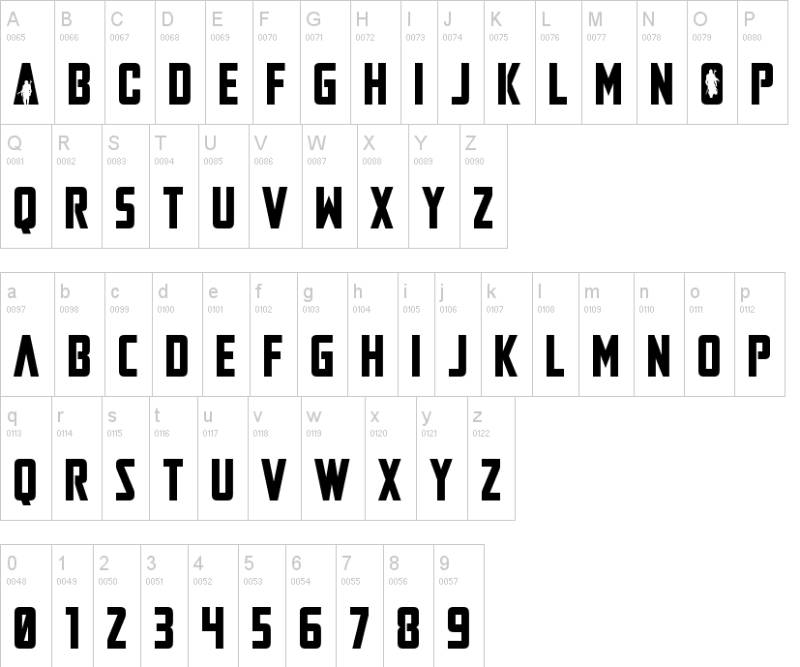
The typeface is custom. But it’s clearly built on a foundation similar to Font Bureau’s Agency Black Condensed. Massive, slightly narrowed letterforms with clean borders and sharp corners.
Dan Zadorozny of Iconian Fonts created a free recreation called “Mandalore” that gets close to the original. It’s available for non-commercial use.
The most distinctive typographic choice is the removal of horizontal crossbars from the “A” letters. This gives them a triangular, almost runic quality. The spacing between characters is tight but not cramped, and the vertical proportions of each letter run tall and narrow.
It reads well at small sizes, which matters more than people think for a streaming platform logo. You need it to work as a tiny thumbnail on a phone screen and as a massive theatrical poster element. The condensed proportions help with both.
What Are the Hidden Meanings in The Mandalorian Logo?
The way the letterforms function as windows is the biggest “hidden” element. You’re not just reading a title. You’re looking through it into the world of the show. Landscape imagery, character silhouettes, celestial elements, all visible inside the text.
The central dividing line between “STAR WARS” and “THE MANDALORIAN” in the Season 2+ versions works as more than a separator. It positions the show as both connected to and distinct from the larger franchise. Dual identity, expressed through a single rule line.
And there’s the “A” placement progression in the movie logo. Moving Din and Grogu from the second “A” to the “O” literally advances their position through the word. It’s the kind of detail most people won’t consciously notice but will feel. That’s what good design does.
How Does The Mandalorian Logo Compare to Competitor Logos?
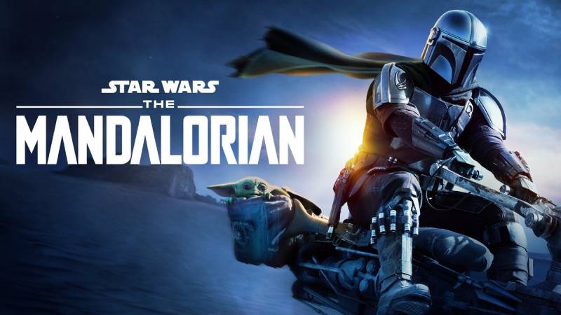
Most sci-fi TV show logos play it safe. Clean type, maybe a glow effect, done. The Mandalorian took a different approach by embedding actual narrative imagery inside the letterforms.
Compare it to the Stranger Things logo, which relies on an iconic retro font and red neon glow for its identity. Effective, but purely typographic. No embedded imagery, no seasonal color shifts.
The Game of Thrones logo used a metallic serif treatment that communicated medieval grandeur. Strong, but static across the series run. It never really evolved the way The Mandalorian’s does.
The Boys logo goes full aggressive with its blood-splattered type. Different tone entirely, obviously, but it shows how a title treatment can carry a show’s personality. The Mandalorian achieves something similar through subtler means.
Within the Star Wars franchise itself, The Mandalorian stands out because it broke away from the Helvetica-derived tradition that Suzy Rice established back in 1977. That took some guts. Other Disney+ Star Wars shows like Andor and Ahsoka followed suit with their own custom type treatments, but The Mandalorian did it first.
The seasonal color rotation is the real differentiator though. Most entertainment production logos stay locked to one palette. Changing it per season lets each chapter feel distinct while keeping the brand cohesive. I’ve seen that strategy pop up more in streaming-era shows since The Mandalorian proved it could work.
What Are the Technical Specifications of The Mandalorian Logo?
Official Color Codes
Lucasfilm hasn’t published an official public brand standards document for The Mandalorian logo. But based on promotional materials and extracted palette data, here are the approximate values:
Season 1 (Sunset Palette)
- Crimson: Hex #C83444, RGB (200, 52, 68)
- Light Salmon: Hex #F7AD90, RGB (247, 173, 144)
- Dark Olive: Hex #62542A, RGB (98, 84, 42)
- Peru/Bronze: Hex #AE7652, RGB (174, 118, 82)
Season 2 (Dusk Palette)
- Deep Blue: approximate Hex #1C2A68, RGB (28, 42, 104)
- Cool Slate: approximate Hex #4C9F79, RGB (76, 159, 121)
- Lavender Mist: approximate Hex #C0BCFA, RGB (192, 188, 250)
Season 3 (Mandalore Palette)
- Primary green tones representing Mandalore’s atmosphere
- Muted sage and emerald variations
Background: Solid black (#000000) across all versions.
Dimensions and Proportions
The logo uses a roughly 3:1 width-to-height aspect ratio when including “THE” and “MANDALORIAN” together. The word “MANDALORIAN” dominates about 75% of the vertical space.
Clear space requirements follow standard Lucasfilm brand practices, though specific measurements haven’t been made public. On Disney+ thumbnails, the logo consistently appears with generous padding on all sides, suggesting a minimum clear space equal to the height of the “THE” text block.
For printed materials, the logo is distributed in vector format to licensees through Lucasfilm’s brand portal. The gradient effects require careful reproduction at small sizes to avoid banding, which is probably why some merchandise uses simplified flat-color versions instead.
What Cultural Impact Has The Mandalorian Logo Had?
The Mandalorian logo became instantly recognizable outside of Star Wars fandom, which is something most TV show title cards never achieve.
Part of that was timing. It launched alongside Disney+ itself, so the logo was everywhere during that initial marketing push. But it stuck around because the design is genuinely strong.
You see it on tattoos constantly. The Mythosaur skull and the wordmark both show up in tattoo parlors regularly, and that’s a pretty solid test of whether a logo design has actual cultural staying power. People don’t permanently ink mediocre branding onto their bodies.
The show also popularized the Mythosaur skull symbol far beyond the niche Star Wars fan community that already knew it from Clone Wars and expanded universe material. Before 2019, you’d mostly see it at conventions. Now it’s on coffee mugs at Target.
The seasonal color-shifting approach influenced how other streaming originals think about their visual branding. It proved that a logo doesn’t have to be frozen in amber to build recognition. You can evolve it, season by season, and people will follow along, maybe even look forward to seeing what the next version looks like.
How Does The Mandalorian Logo Fit Into the Overall Brand Identity?

The Mandalorian logo sits in a tricky spot within the Star Wars brand architecture. It needs to feel like Star Wars without looking exactly like Star Wars. And it pulls that off.
The addition of the “STAR WARS” text above the main title from Season 2 onward was a hierarchy decision. The franchise name acts as an endorser brand, while “THE MANDALORIAN” carries the primary identity. It’s the same structure you see with something like “Marvel Studios’ Avengers” or similar franchise sub-brands.
Across merchandise, the logo adapts. Sometimes it’s the full wordmark with gradient colors. Sometimes it’s a simplified flat version in white or silver on black backgrounds. The Mythosaur skull often appears alongside or as an alternative mark on products where the full wordmark won’t fit.
The font treatment and structural choices connect to Disney+’s broader design language for its Star Wars slate. Ahsoka, The Book of Boba Fett, and Andor all use custom title typography with similar principles: condensed forms, dark backgrounds, atmospheric color palettes.
But The Mandalorian came first. It established the template that those other shows then followed. So within the Disney+ Star Wars ecosystem, this is the logo that defined the visual standard everyone else had to work around.
How Should The Mandalorian Logo Be Used?
Short answer: very carefully, and only if you have permission.
Lucasfilm (owned by The Walt Disney Company) maintains strict control over all Star Wars visual assets, including The Mandalorian wordmark and the Mythosaur skull symbol. The trademark covers digital media, entertainment services, merchandise, and more across multiple Nice classes.
Official Usage Guidelines: Lucasfilm provides brand assets to licensed partners through its internal portal. Licensees receive specific files, placement rules, and color specifications. Unauthorized use of the logo on merchandise, fan products for sale, or commercial materials can and will trigger legal action. Lucasfilm has over 1,077 individual trademark applications in its portfolio and they are known to enforce aggressively.
Where to Access Official Logos: Licensed partners receive assets directly from Lucasfilm. Press and media outlets can access logos and key art through the Disney+ press site (press.disneyplus.com). There is no public download page for commercial use.
Fan Use: Fan art and non-commercial projects exist in a gray area. Lucasfilm generally tolerates fan-created content that doesn’t generate revenue, but this tolerance isn’t a legal guarantee. If you want to use the Mandalore display typeface created by Iconian Fonts for personal projects, that’s available as a free download. Just don’t confuse it with an officially licensed product.
What Not to Do: Don’t modify the official logo. Don’t place it on a busy background that obscures the gradient effects. Don’t remove the “STAR WARS” endorser text if you’re using the Season 2+ version. And definitely don’t slap it on products you’re selling without a licensing agreement. Disney’s legal team is, at this point, almost as well-known as their characters.
FAQ on The Mandalorian Logo
What font is used in The Mandalorian logo?
The Mandalorian title design uses a custom typeface based on Font Bureau’s Agency Black Condensed. Dan Zadorozny of Iconian Fonts created a free recreation called “Mandalore” for personal projects.
It’s not an exact match. The official version has modified letter “A” forms and sharper terminals that set it apart from any commercial download.
What does the Mythosaur skull symbol mean?
The Mythosaur skull is the traditional emblem of Mandalorian warrior culture. It traces back to the ancient Keldau clan and represents the mythosaur, a creature tied to the planet Mandalore itself.
Over thousands of years, the skull became a shared identity marker across all Mandalorian clans and factions.
Why does The Mandalorian logo change colors each season?
Each season’s color intensity reflects its narrative tone. Season 1 uses warm sunset shades for the space western feel. Season 2 shifts to blue and purple. Season 3 goes green, matching Mandalore’s damaged atmosphere.
It’s a design principle that keeps the brand fresh without breaking recognition.
Who designed The Mandalorian logo?
Lucasfilm’s in-house creative team built it. No external agency has been publicly credited. The work happened under Jon Favreau and Dave Filoni’s creative direction during the show’s development phase for Disney+.
The visual language pulls heavily from Filoni’s earlier work on The Clone Wars animated series.
Is The Mandalorian logo trademarked?
“THE MANDALORIAN” is a registered trademark (Registration #6153932) held by Lucasfilm Ltd. LLC. Filed October 2018, registered September 2020 with the USPTO. It covers digital media, merchandise, and entertainment services.
Disney enforces these rights aggressively. Unauthorized commercial use will get you noticed, and not in a good way.
What is the silhouette inside the letter A?
The middle “A” in “MANDALORIAN” contains a triangular silhouette of Din Djarin, the show’s main character played by Pedro Pascal. Starting from Season 2, Grogu appears beside him.
In the 2026 movie logo, the silhouette moved to the “O,” signaling the characters’ progression through the story.
Can I download The Mandalorian logo for free?
You can download the Mandalore fan-made typeface for non-commercial use from sites like dafont.com. But the official Mandalorian logo itself is not publicly available for download.
Licensed partners receive assets through Lucasfilm’s brand portal. Everyone else is out of luck, at least legally.
How does The Mandalorian movie logo differ from the TV show version?
The Mandalorian & Grogu movie logo introduced a curved, swooping wave shape to the lettering. That’s a first for any Star Wars title treatment. The sense of motion in the text sets it apart completely.
It also uses a purple-to-gold color transition, a departure from the single-palette approach of the series.
What do the colors in the Mandalorian logo represent?
Season 1’s pinks and oranges reference classic Western cinematography. Season 2’s blues suggest mystery and reliability. Season 3’s green connects to the Mando’a tradition where green means duty.
The movie’s blended color scheme of purple and gold adds vengeance and royalty to the mix.
Where can I use The Mandalorian logo legally?
Personal fan art is generally tolerated by Lucasfilm, but that’s not a legal guarantee. Any commercial use requires a licensing agreement directly through Disney and Lucasfilm’s brand team.
Selling merchandise with the logo or Mythosaur skull without permission? That’s how you get a cease-and-desist letter from one of the most litigious IP holders on the planet.
Conclusion
The Mandalorian logo did something most TV show wordmarks never manage. It became a cultural symbol on its own, separate from the Star Wars franchise that birthed it.
From the custom lettering proportions to the embedded character silhouettes, every detail serves the narrative. The seasonal color shifts proved that a Mandalorian visual identity could evolve without losing recognition.
Whether you’re studying it for logo design fundamentals or just admire the Mythosaur skull on your coffee mug, the craftsmanship holds up. Lucasfilm and Disney+ set a new bar for streaming-era branding with this one.
And with The Mandalorian & Grogu heading to theaters, the logo’s next chapter is already here.

Renowned for his expertise in logo design and visual branding, Bogdan has developed a multitude of logos for various clients.
His skills extend to creating posters, vector illustrations, business cards, and brochures. Additionally, Bogdan's UI kits were featured on marketplaces like Visual Hierarchy and UI8.
He also wrote in the past years on sites like Design Your Way, WebDesignerDepot, WPDean, Designmodo, Speckyboy, Slider Revolution, and more.
- The Cursor Logo History, Colors, Font, And Meaning - 24 September 2026
- Top 7 Web Design Subscription Services That Replace Full-Time Hires - 24 September 2026
- Canva vs PowerPoint: Which Is Better for Presentations? - 22 September 2026

Bogdan Sandu is a seasoned designer who has been designing websites since 2008. Renowned for his expertise in logo design and visual branding, Bogdan has developed a multitude of logos for various clients. His skills extend to creating posters, vector illustrations, business cards, and brochures. Additionally, Bogdan's UI kits were featured on marketplaces like Visual Hierarchy and UI8. He also wrote in the past years on sites like Design Your Way, WebDesignerDepot, WPDean, Designmodo, Speckyboy, Slider Revolution, and more.
You Might Also Like


