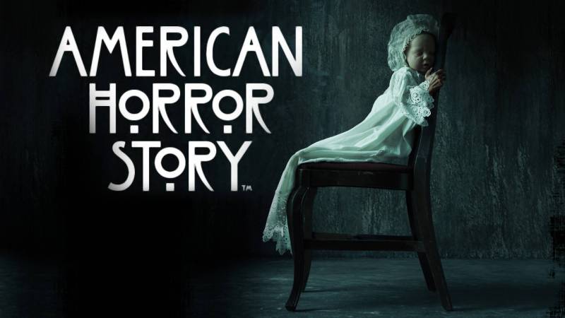
The American Horror Story logo is one of those rare television marks that people recognize even if they’ve never watched a single episode. It sits at the crossroads of Gothic tradition and modern TV branding, built from a modified version of a typeface that started its life on a tea room sign in Glasgow. That’s not a detail you’d expect for one of the scariest shows on cable.
Ryan Murphy and Brad Falchuk launched American Horror Story on FX in 2011. The logo has gone through subtle seasonal shifts since then, but the core identity has stayed remarkably consistent across 12 seasons. Title designer Kyle Cooper of Prologue Films shaped the visual language of the opening sequence, while the wordmark itself pulls from ITC Willow, a typeface rooted in Art Nouveau design. The result? A mark that feels ancient and modern at the same time. Few film and television production logos have achieved that kind of lasting visual weight.
What Is the American Horror Story Logo?
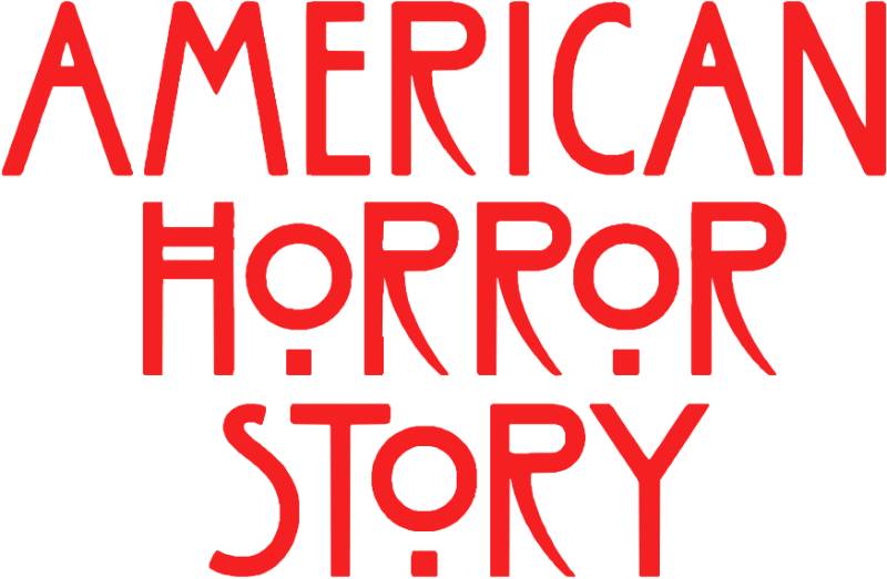
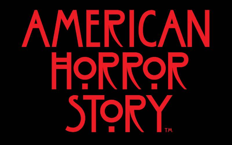
The American Horror Story logo is a custom wordmark based on a modified version of ITC Willow, first used when the series premiered on FX in October 2011. Designed under the creative direction of Kyle Cooper at Prologue Films, it features elongated, condensed letterforms with Gothic characteristics rendered primarily in blood red against black backgrounds, symbolizing horror, decay, and psychological unease.
Key Attributes
- Design Type: Custom wordmark (combination of modified existing font and hand-adjusted letterforms)
- Primary Elements: Stacked text arrangement with “AMERICAN” above “HORROR STORY,” elongated vertical strokes, distinctive double-crossbar A and H, raised O glyph with sub-bowl dots
- Official Introduction Date: October 5, 2011 (series premiere on FX)
- Designer/Agency: Kyle Cooper, Prologue Films (title sequence and visual identity); wordmark based on ITC Willow by Tony Forster (1990), itself inspired by Charles Rennie Mackintosh’s lettering
- Trademark Status: Owned by FX Networks (now under Walt Disney Television Studios/20th Television). Available for licensed merchandise through the official FX Shop
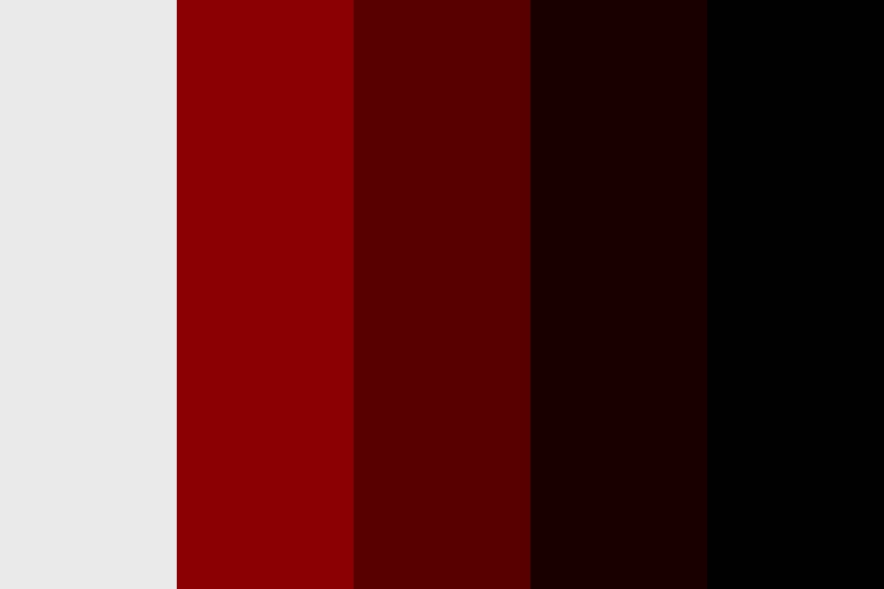
- Color Palette: Blood Red (#8B0101), Deep Crimson (#580000), Near Black (#180000), Pure Black (#000000), Off-White (#EAEAEA)
- Usage Context: Title cards, opening sequences, promotional materials, licensed merchandise (apparel, mugs, stickers, ornaments), streaming platform thumbnails on Hulu and Disney+, social media branding
How Has the American Horror Story Logo Changed Over Time?

The American Horror Story logo has maintained its core ITC Willow-based wordmark since 2011, but each anthology season introduced visual variations to the title cards and promotional materials.
These changes typically affected color intensity, texture overlays, and subtitle treatments rather than the base letterforms themselves.
Original American Horror Story Logo (2011-2012): Murder House
- Years Active: 2011-2012 (Season 1)
- Design Description: The debut wordmark featured the ITC Willow-derived letterforms in deep red with distressed, blood-like textures. Letters appeared weathered and slightly degraded. The stacked layout placed “AMERICAN” in a smaller size above the larger “HORROR STORY”
- Color Scheme: Dark blood reds against pure black, with subtle off-white accents in the title sequence
- Designer: Kyle Cooper, Prologue Films (title sequence); wordmark adapted from the Charles Rennie Mackintosh Font, a commercial version of ITC Willow purchased specifically for the show
- Context: Ryan Murphy wanted something dark and grounded for his new anthology horror series on FX. Cooper, famous for his Se7en title sequence, was brought in after Murphy specifically requested the designer behind that film’s opening
- Cultural Significance: The logo immediately set a new standard for horror television branding. It proved that a TV series could carry cinematic-level identity design, drawing from Victorian horror literature and cemetery engravings for its Gothic tone
Asylum Era Logo (2012-2013)
- Years Active: 2012-2013 (Season 2)
- Design Description: The core wordmark remained unchanged, but the subtitle “Asylum” was added beneath. Title sequence visuals shifted to institutional horror imagery. Promotional materials leaned into colder, more clinical tones
- Color Scheme: Similar blood reds with slightly desaturated, cooler undertones to match the institutional setting
- Key Changes from Previous: Addition of seasonal subtitle system that would become the show’s standard format. Title sequence entirely reimagined with new footage shot on the Paramount set over two days
- Cultural Significance: Established the pattern of refreshing the title sequence per season while keeping the Rennie Mackintosh typography and original score intact
Coven Through Hotel Logos (2013-2016)
- Years Active: 2013-2016 (Seasons 3-5)
- Design Description: Each season pushed the promotional artwork in different directions while preserving the wordmark. Coven introduced lighter tones and witch-themed imagery. Freak Show leaned into vintage carnival aesthetics. Hotel brought Art Deco-inspired metallic textures
- Color Scheme: Coven used lighter reds and white. Freak Show incorporated yellows and rusted tones. Hotel introduced golds and cool silvers
- Key Changes from Previous: The seasonal subtitle grew more prominent in marketing. Each season’s promotional logo became a distinct identity piece while the core wordmark stayed locked
- Cultural Significance: These seasons cemented the show’s status as a pop culture force. The logo appeared on licensed merchandise at scale for the first time, from t-shirts to home goods
Roanoke Through Apocalypse Logos (2016-2018)
- Years Active: 2016-2018 (Seasons 6-8)
- Design Description: Roanoke took a different approach to the entire marketing strategy, initially hiding the season’s theme. The logo appeared in more stripped-down forms. Cult and Apocalypse returned to heavily textured promotional logos
- Color Scheme: Roanoke used earthy, desaturated tones. Cult went bold with patriotic reds and blues. Apocalypse returned to deep crimson and black
- Key Changes from Previous: Roanoke was the biggest departure, using a deliberately minimal approach that left fans guessing about the season’s theme until the premiere
1984 Logo (2019): The Big Exception
- Years Active: 2019 (Season 9)
- Design Description: This was the only season to significantly alter the base letterforms. The logo adopted a scratchier, hand-drawn look inspired by 1980s slasher film posters. Rougher edges and a camp-style treatment replaced the clean Willow letterforms
- Color Scheme: Neon-tinged colors, woodsy greens and oranges alongside the trademark red
- Designer: Prologue Films, with conceptual input from fan editor Corey Vega, whose “cursed VHS tape” concept caught Ryan Murphy’s attention
- Key Changes from Previous: The most dramatic visual departure in the show’s history. But even here, the underlying structure still traced back to that Glasgow tea shop lettering
- Cultural Significance: Showed the brand was confident enough to play with its own identity while trusting audiences to follow
Double Feature Through Delicate Logos (2021-2024)
- Years Active: 2021-2024 (Seasons 10-12)
- Design Description: A return to the classic Willow-based wordmark. Double Feature split its identity between two visual themes. NYC went dark and gritty. Delicate used softer, more unsettling pastels in some marketing while keeping the red logo for primary branding
- Key Changes from Previous: After 1984’s experiment, these seasons restored the core wordmark with confidence. Digital optimization for streaming platforms became a bigger concern as the show moved to Hulu and Disney+
What Do the Design Elements of the American Horror Story Logo Mean?
Every piece of the American Horror Story logo works toward one goal: making you uncomfortable before a single scene plays.
The elongated letterforms suggest something stretched beyond its natural state. The distressed textures imply decay. And that raised “O” with its two dots underneath? It looks like a face staring back at you, or maybe a keyhole. The whole thing feels like it was pulled from a headstone.
Why Did American Horror Story Choose These Specific Colors?
The primary red (#8B0101) lands squarely in the territory of dried blood. It’s not a bright, fresh red. It’s darker. More unsettling.
That deep crimson (#580000) sits underneath as a supporting hue, pushing the palette further into shadow. The near-black (#180000) is actually a very dark red, not pure black. This matters. It means even the darkest parts of the logo carry a blood-soaked quality.
Pure black (#000000) serves as the ground for everything. It’s total darkness. The stage where the horror plays out.
The off-white (#EAEAEA) appears in secondary uses. It’s not bright white. More like bone. Or old paper. The kind you’d find in an abandoned patient file.
From a color psychology standpoint, this palette triggers primal responses. Red in branding connects to danger, passion, and violence. Black connects to death, mystery, and the unknown. Together, they create an instant shorthand for horror.
What Typography Style Is Used in the American Horror Story Logo?
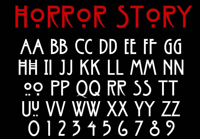
The wordmark is based on ITC Willow, designed by Tony Forster in 1990. But the show’s team didn’t use it straight out of the box.
They purchased the Charles Rennie Mackintosh Font and modified it. The R’s were adjusted to match Mackintosh’s original “sickle-like” design rather than the straighter versions in the standard ITC Willow release. Character spacing was tightened.
What makes ITC Willow so unusual for horror? It was originally inspired by the signage for The Willow Tea Rooms in Glasgow, designed by architect Charles Rennie Mackintosh around 1903. The display typeface has roots in the Art Nouveau and Arts and Crafts movements. Its double-crossbar A and H, along with that floating O, give it a look that reads as both elegant and deeply strange.
Took me a while to realize why this font works so well for horror. It’s because it feels formal and wrong at the same time. Like a dinner invitation from someone who shouldn’t be trusted.
What Are the Hidden Meanings in the American Horror Story Logo?
The stacked layout places “AMERICAN” above “HORROR STORY” in a smaller weight. This creates a reading order that suggests horror lives beneath the surface of America. It’s not an accident.
That distinctive O glyph, raised above the baseline with two dots beneath it, has been interpreted multiple ways. Some see eyes. Others see a face. The original Mackintosh design was purely decorative, but in the context of a horror series, it takes on an entirely new, voyeuristic quality.
Kyle Cooper has talked about preferring practical, tactile approaches in his horror work. The weathered texture on the letterforms wasn’t created purely in software. It connects to a design philosophy where imperfection creates believability. Clean type wouldn’t feel dangerous. This does.
How Does the American Horror Story Logo Compare to Competitor Logos?
Look at other major horror TV brands from the same era. The Walking Dead logo uses a decayed, crumbling sans-serif that’s more literal about its zombie apocalypse premise.
The Stranger Things logo goes for 1980s nostalgia with its ITC Benguiat lettering, a completely different emotional register.
The AHS logo sits in its own space. It’s Gothic without being medieval. Elegant without being safe. Most horror show branding either goes full grunge or full vintage. AHS found something in between.
Compare it to broader entertainment branding and the difference gets sharper. HBO’s logo is clean corporate modernism. The Hulu logo (now one of AHS’s streaming homes) is friendly and approachable. AHS does something completely different with its identity, rejecting the sanitized look that most streaming content adopts.
Even within the horror production world, it stands apart. Blumhouse’s logo is utilitarian and minimal. A24’s mark is clean and typographic. The AHS wordmark is the only one that feels like the design itself could hurt you.
What Are the Technical Specifications of the American Horror Story Logo?
Official Color Codes
- Primary Color: Blood Red – Hex: #8B0101, RGB: (139, 1, 1), CMYK: (0, 99, 99, 45)
- Secondary Color: Deep Crimson – Hex: #580000, RGB: (88, 0, 0), CMYK: (0, 100, 100, 65)
- Accent Color: Near Black – Hex: #180000, RGB: (24, 0, 0), CMYK: (0, 100, 100, 91)
- Background: Pure Black – Hex: #000000, RGB: (0, 0, 0), CMYK: (0, 0, 0, 100)
- Alternate Text: Off-White – Hex: #EAEAEA, RGB: (234, 234, 234), CMYK: (0, 0, 0, 8)
Dimensions and Proportions
The logo uses a stacked two-line format with a roughly 3:2 width-to-height ratio in its standard configuration. “AMERICAN” runs at approximately 60-65% of the width of “HORROR STORY” beneath it, creating a deliberate visual hierarchy where the phrase “HORROR STORY” carries the most visual weight.
The condensed nature of the ITC Willow letterforms means the logo reproduces well at smaller sizes, though the distinctive details of the O glyph and double-crossbar characters can be lost below certain thresholds. For digital use, the logo appears as an SVG vector file on official platforms, making sure it scales cleanly across different screen sizes.
Clear space specifications follow standard broadcast branding practices, maintaining breathing room around the wordmark equal to roughly the height of the letter “H” on all sides. The FX Networks brand guidelines govern official usage across licensed products and promotional materials.
What Cultural Impact Has the American Horror Story Logo Had?
The AHS logo crossed over from television branding into broader pop culture in ways that few TV marks ever manage. Fans get it tattooed. They recreate it in fan art. They make their own title sequences every year before the new season drops.
It helped popularize Gothic serif-style type in horror entertainment branding during the 2010s. Before AHS, most horror TV shows leaned on distressed sans-serifs or hand-drawn lettering. The show proved that a more refined, architectural approach to horror type could work just as well.
The logo also brought renewed attention to ITC Willow and Charles Rennie Mackintosh’s lettering legacy. A typeface designed for a Scottish tea room in 1903 ended up becoming synonymous with 21st-century American horror television. You really can’t predict where design influence will come from.
The merchandise impact is significant too. FX’s official shop sells everything from embroidered beanies to laser-engraved wine glasses featuring the AHS wordmark. The logo functions as a brand identity system that works just as well on a die-cut sticker as it does on a 60-second title sequence.
How Does the American Horror Story Logo Fit Into the Overall Brand Identity?
The logo is just one piece of a larger system. There’s the title sequence (Kyle Cooper, Prologue Films). There’s the music (Cesar Davila-Irizarry’s original theme, recreated and expanded by Charlie Clouser). There’s the seasonal marketing, the merchandise, the social media presence.
All of these pieces share the same DNA. The psychology behind the typeface choice carries through to every touchpoint. Dark backgrounds. Red accents. Gothic letterforms. Distressed textures. Monochromatic color treatments with red as the only real departure.
The anthology format actually made the logo more important, not less. Because the cast, setting, and plot change every season, the wordmark is the one constant. It’s the thread that ties Murder House to Asylum to Coven to everything that came after. Without that consistent mark, the show might feel like 12 different series instead of one franchise.
The storytelling built into the design extends to how the logo interacts with each season’s subtitle. “American Horror Story: Coven” reads differently than “American Horror Story: 1984.” The base wordmark stays put while the subtitle shifts the entire mood. That’s smart brand architecture.
How Should the American Horror Story Logo Be Used?
FX Networks owns the trademark. That’s the bottom line. If you want to use the logo for anything commercial, you need authorization.
Official logo files are available through FX press materials for approved media use. Journalists, reviewers, and media outlets can access these for editorial purposes. The FX Networks Shop (shop.fxnetworks.com) is the authorized source for licensed merchandise carrying the AHS branding.
For fan use, there are free replica fonts like “American Horror Story Regular” by KELGE Fonts that closely mimic the official wordmark, including the distinctive O design. These are labeled as free for personal use, not commercial projects. If you’re thinking about using the look for a party invitation or a personal project, one of those replicas will get you close. For anything beyond that, look into proper licensing.
A few practical notes. The logo works best on dark backgrounds. Putting it on a white or light background kills the mood immediately. Minimum size matters too. Those double crossbars and the O glyph details disappear at small sizes, so if you’re working with the wordmark at thumbnail scale, keep an eye on whether the character details are still readable.
Don’t stretch it. Don’t recolor it neon green. Don’t add a drop shadow. The design team spent years getting this thing right. Respect the work.
FAQ on The American Horror Story Logo
What Font Is Used in the American Horror Story Logo?
The AHS logo uses a modified version of ITC Willow, a typeface designed by Tony Forster in 1990. The show’s team purchased the Charles Rennie Mackintosh Font and adjusted the letterforms, including the distinctive sickle-like R’s and tighter spacing.
Who Designed the American Horror Story Title Sequence?
Kyle Cooper of Prologue Films directed the title sequence starting with Season 1 in 2011. Ryan Murphy specifically wanted the designer behind Se7en’s opening credits.
Cooper has since created new title sequences for every season of the FX horror series.
What Do the Colors in the American Horror Story Logo Mean?
The blood red (#8B0101) connects directly to violence, death, and passion. These are recurring themes across all AHS anthology seasons.
Pure black backgrounds represent darkness and the unknown. The deep crimson and near-black supporting tones keep the entire color scheme rooted in dread.
Does the American Horror Story Logo Change Every Season?
The core wordmark stays consistent. What changes is the seasonal subtitle, promotional artwork, and title sequence visuals.
Season 9 (1984) was the only installment to dramatically alter the base letter spacing and forms, adopting a scratchier 1980s slasher aesthetic.
What Is the Origin of the AHS Logo Typeface?
ITC Willow traces back to Charles Rennie Mackintosh’s signage for The Willow Tea Rooms in Glasgow, built around 1903. The Scottish architect’s Art Nouveau-era lettering featured double-crossbar characters and a raised O glyph that now define the show’s Gothic visual identity.
Can I Use the American Horror Story Logo for Personal Projects?
FX Networks owns the trademark. Commercial use requires authorization.
For personal projects, free replica fonts like “American Horror Story Regular” by KELGE Fonts closely mimic the official wordmark. These are labeled free for personal use only, not for merchandise or commercial branding.
What Makes the American Horror Story Logo Different from Other Horror TV Logos?
Most horror television branding leans on either distressed sans-serif lettering or hand-drawn grunge styles. The AHS logo pulls from Art Nouveau architecture instead.
That’s a weird source for a horror show. And it works precisely because it feels elegant and wrong at the same time.
Where Can I Download the Official American Horror Story Logo?
Official logo files are available through FX press materials for approved media outlets. The logo appears as an SVG vector on official platforms for clean scaling across devices.
Fan-made replicas exist on free font sites, but they carry personal-use-only restrictions.
What Is the Meaning Behind the Raised O in the AHS Logo?
The raised O with two dots beneath it comes directly from Mackintosh’s original 1903 design. It was purely decorative in its tea room context.
In the psychological context of shape design, viewers read it as eyes, a face, or a keyhole. The horror framing gave an old ornamental detail a completely new, unsettling meaning.
How Has the American Horror Story Logo Influenced TV Branding?
The AHS logo proved that horror series identity design could carry cinematic weight on the small screen. It pushed other FX network shows and streaming platforms to invest more heavily in title design and animated title sequences.
Kyle Cooper’s work on the series helped keep the art of television opening credits relevant in the age of skip buttons.
Conclusion
The American Horror Story logo turned a tea room typeface into one of the most recognized marks in horror television. That’s a sentence nobody expected to write back in 2011.
Kyle Cooper and Prologue Films built a high-contrast visual identity system that survives seasonal reinvention. The modified ITC Willow letterforms, the blood-red saturated palette, the Gothic texture work. All of it holds together across 12 anthology seasons on FX.
Few entertainment franchise logos manage to feel both timeless and unsettling. This one does. And it started with Charles Rennie Mackintosh painting a sign for a place that served tea and scones.

Renowned for his expertise in logo design and visual branding, Bogdan has developed a multitude of logos for various clients.
His skills extend to creating posters, vector illustrations, business cards, and brochures. Additionally, Bogdan's UI kits were featured on marketplaces like Visual Hierarchy and UI8.
He also wrote in the past years on sites like Design Your Way, WebDesignerDepot, WPDean, Designmodo, Speckyboy, Slider Revolution, and more.
- The Windsurf Logo History, Colors, Font, And Meaning - 10 October 2026
- How to Remove Background From Product Photos (No Photoshop) - 10 October 2026
- How Designers can Build a Stronger Online Creative Identity - 9 October 2026

Bogdan Sandu is a seasoned designer who has been designing websites since 2008. Renowned for his expertise in logo design and visual branding, Bogdan has developed a multitude of logos for various clients. His skills extend to creating posters, vector illustrations, business cards, and brochures. Additionally, Bogdan's UI kits were featured on marketplaces like Visual Hierarchy and UI8. He also wrote in the past years on sites like Design Your Way, WebDesignerDepot, WPDean, Designmodo, Speckyboy, Slider Revolution, and more.
You Might Also Like