

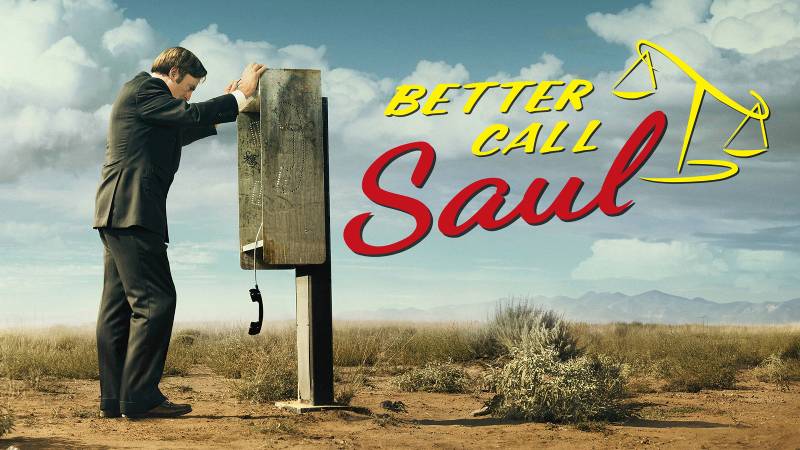
The Better Call Saul logo is one of those TV branding moments that just sticks. It looks cheap on purpose, like something a shady lawyer would slap on a bench ad in downtown Albuquerque. And that’s exactly the point.
Created for AMC’s critically acclaimed prequel to Breaking Bad, this logo first appeared in 2015 when the series premiered on February 8th. Graphic designer Alan Chao, working within the show’s art department, designed the mark during production. The series ran for six seasons through 2022, and the logo stayed consistent the entire time. It went through two main versions total: a busier pre-production concept and the streamlined final version audiences know today.
The logo sits at an interesting crossover between fictional character branding and real television identity. Most TV show logos exist only to identify the program. This one does double duty. It represents both the AMC series itself and the in-universe advertising style of Saul Goodman’s law practice.
What Is the Better Call Saul Logo?

The Better Call Saul logo is a combination wordmark featuring “Better Call” in yellow uppercase letters above “Saul” in red cursive script, paired with a tilted yellow scales of justice symbol. Designed by Alan Chao for AMC’s art department, it debuted with the series premiere in February 2015 and draws from retro attorney advertising styles of the American Southwest.
Here’s what you need to know about its core attributes:
- Design Type: Combination mark (wordmark plus graphic symbol)
- Primary Elements: Two-line text arrangement with Femida scales of justice icon; the text sits on a diagonal rise from left to right
- Official Introduction Date: February 8, 2015 (series premiere on AMC)
- Designer: Alan Chao, graphic designer in the Better Call Saul art department, Albuquerque, New Mexico
- Trademark Status: Owned by Sony Pictures Television and AMC Networks; protected under entertainment IP licensing
- Color Palette: Red (primary text), Yellow/Gold (secondary text and scales icon), Black (background option), with subtle olive and maroon accent tones
- Usage Context: Television broadcast, AMC promotional materials, streaming platforms (Netflix), official merchandise, poster artwork, social media, and in-show prop designs including billboards, business cards, and bus bench advertisements
How Has the Better Call Saul Logo Evolved Over Time?

The Better Call Saul logo went through two main phases. A detailed pre-production version came first during development, followed by a cleaner, simplified version that launched with the show in 2015 and stayed unchanged through the series finale in 2022.
Not a huge number of changes, honestly. But the differences between the two versions tell you a lot about how the show’s visual identity got tightened up.
Pre-Production Logo (2013-2015)
Years Active: Approximately 2013 to early 2015, used during development and early promotional materials.
This first version was busy. The red inscription “Better call Saul!” sat at the center, broken across three lines and slanted diagonally. All the lettering was done in a casual, handwritten font with connected characters, except for the capital “B” and “S.”
Above the show name sat a black polygon with the yellow phrase “In legal trouble?” Around the edges were small graphic elements showing the types of cases this fictional lawyer handles: traffic accidents with colliding car icons, various legal scenarios. In the lower right corner, Saul Goodman’s catchphrase “Sue ‘Em now” appeared inside a black circle.
The whole thing sat on a large orange background. It looked exactly like a tacky late-night TV ad for personal injury lawyers. Which, again, was the whole point.
Color Scheme: Red lettering, yellow accents, black detail elements, orange background
Designer: Alan Chao, working with the production design team
Context: Vince Gilligan and Peter Gould had been developing the spin-off concept since 2009, and this logo reflected the full-blown tackiness of Saul Goodman’s advertising personality from Breaking Bad.
Cultural Significance: It established that the show would lean into the character’s cheap, attention-grabbing marketing style rather than shy away from it.
Official Series Logo (2015-2022)
Years Active: February 2015 through August 2022 (all six seasons).
The production team stripped away most of the clutter. Gone were the extra taglines, the small icons, the “Sue ‘Em now” badge. What remained was just the name.
“Better Call” appears in yellow uppercase printed letters. “Saul” sits below in a much larger red cursive script. The scales of justice replaced the exclamation mark, rendered in yellow with a slight tilt to the right. That tilt matters. It suggests imbalance, something off-kilter about the justice being promised.
Color Scheme: Yellow (“Better Call” text and scales), Red (“Saul” text), available on both black and white backgrounds
Key Changes from Previous: Removed all secondary text and graphic elements. Smoothed out the hand-lettered glyphs. Shifted “Better Call” from red to yellow. Added the scales of justice as an integrated symbol. Kept the diagonal rise.
Context: Though it debuted in 2015, the design intentionally mimics a 1990s advertising look because the show’s timeline begins around 2002. Computer-heavy design wasn’t as common then, so the retro feel makes sense for the story.
Cultural Significance: This version became the definitive visual identity for the series. It showed up on everything from Netflix thumbnails to fan merchandise, and it stayed exactly the same for seven years. That kind of consistency is rare for TV branding.
What Do the Design Elements of the Better Call Saul Logo Mean?

Every piece of this logo tells you something about who Saul Goodman is and what kind of show you’re watching. The scales of justice tip to one side, the colors scream for attention, and the typography looks like it was pulled from a discount sign shop.
None of that is accidental.
The tilted scales are the most loaded symbol in the whole design. They reference Lady Justice (Femida), but with a catch. Traditional legal imagery shows balanced scales. These lean right, suggesting that justice in Saul Goodman’s world is always a little crooked. It works as both a legal reference and a character statement.
The diagonal text rise reinforces that instability. Nothing in this logo sits perfectly level. That visual asymmetry mirrors the moral gray areas Jimmy McGill constantly walks through across the series.
Why Did Better Call Saul Use These Specific Colors?
The show’s creators, especially Vince Gilligan, are famous for their deliberate use of color. Fans of both Breaking Bad and Better Call Saul developed what they call the “Fire and Ice Theory,” where warm colors mark dangerous or criminal characters and cool colors represent innocence.
The logo sits entirely in warm territory.
Red (primary text color, approximately #C8102E) signals urgency, danger, and intensity. In the Breaking Bad universe, red consistently marks characters tied to criminal activity. Putting the name “Saul” in red tells you exactly what kind of lawyer this is.
Red also creates a sense of speed and immediacy. For an attorney ad, that’s smart. It says: call now, don’t wait.
Yellow/Gold (secondary text and scales, approximately #FFD700) grabs attention fast. This hue was chosen because it’s the color of caution and boldness at the same time. In the show’s color language, yellow signals caution. The logo’s yellow essentially warns you: proceed carefully with this guy.
The combination of red and yellow together is not subtle. Think fast food signs, clearance sales, warning labels. That’s Saul Goodman’s whole branding strategy within the show. He wants maximum visibility, minimum sophistication.
Black (#000000) serves as the background option that makes both colors pop hard. It also carries the darker themes of the series, the criminal underworld that Jimmy McGill keeps getting pulled into.
The color palette overall reads as a kind of complementary arrangement between warm tones. There’s no blue, no green, no calming presence anywhere. The logo’s saturation levels are cranked up high, which makes it readable on billboards and TV screens alike.
What Typography Style Is Used in the Better Call Saul Logo?
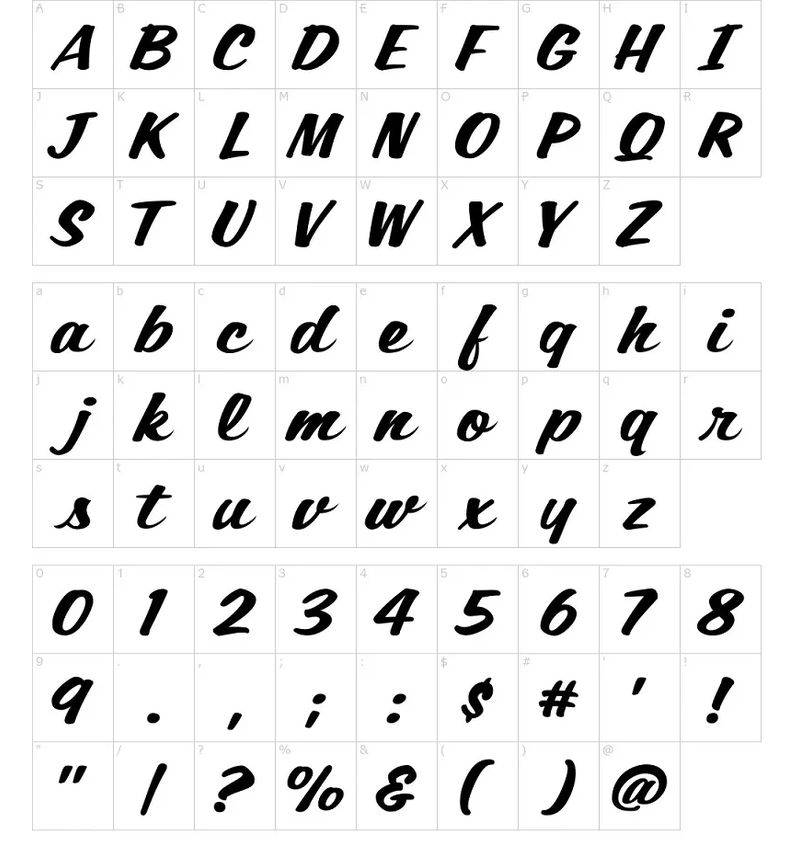
Two different typefaces work together here, and they were chosen for a specific reason.
“Better Call” uses a casual script font close to Script1 Script Casual, designed by Mans Greback. It looks like something a sign painter would brush onto a wall in a hurry. All uppercase, printed letters. Direct and no-nonsense.
“Saul” uses a style similar to Dancing Script by Pablo Impallari. It’s looser, more flowing, with connected lowercase letters except for the capital “S.” This part has more personality, more flair.
The weight difference between the two creates a clear typographic hierarchy. “Saul” is much larger and heavier, pulling your eye down to the name. That’s the focal point, and it’s where brand recognition lives. Both fonts share a retro quality that fits the show’s early-2000s timeline.
What Are the Hidden Meanings in the Better Call Saul Logo?
The scales of justice tilting rightward aren’t just decorative. They’re a quiet statement about how the legal system works (or doesn’t) for the show’s characters. Justice is available, but it’s always leaning toward whoever can tip the balance.
Alan Chao mentioned in interviews that the logo went through many hand-lettered drafts trying to capture a “fun and whimsical feel.” The final version keeps that energy but polishes it just enough to work as a real television brand. It’s supposed to look slightly cheap, like a logo Saul himself would have made.
The diagonal orientation of the entire wordmark is another intentional choice. Nothing in this logo is straight or grounded. Everything leans, rises, and tips. For a show about a man whose moral compass never quite points north, that visual instability says more than any tagline could.
How Does the Better Call Saul Logo Compare to Competitor Logos?

TV drama logos tend to play it safe. Dark backgrounds, clean serif fonts, maybe a subtle texture. Better Call Saul went the opposite direction, and that’s what makes it stand out in a crowded field of prestige television branding.
Look at the Breaking Bad logo, its direct predecessor. That design uses a clean, modern typeface with periodic table element styling. It’s clever and restrained. Better Call Saul’s logo is loud and messy by comparison, and it should be, because the characters are different people.
The Stranger Things logo goes heavy on 1980s nostalgia with its red neon-style lettering. Similar era-specific approach, but much more polished. Game of Thrones used metallic textures and a regal serif to signal fantasy grandeur. The Boys goes for gritty, distressed type that says “superheroes, but wrong.”
Better Call Saul sits in its own category because the logo doubles as an in-world prop. Most TV logos are purely external branding. This one actually exists within the story as something the character would create. That’s a tricky thing to pull off.
Among legal drama branding specifically, most shows choose serious, authoritative looks. Dark blues, black, gold. Suits, The Good Wife, How to Get Away with Murder. They all look like actual law firm logos. Better Call Saul’s logo looks like the worst law firm ad you’ve ever seen on a bus stop. And that tells you more about the show than any sophisticated design ever could.
What Are the Technical Specifications of the Better Call Saul Logo?
Official Color Codes
- Primary Color: Red
- Hex: #C8102E (approximate)
- RGB: (200, 16, 46)
- CMYK: (0, 92, 77, 22)
- Secondary Color: Yellow/Gold
- Hex: #FFD700 (approximate)
- RGB: (255, 215, 0)
- CMYK: (0, 16, 100, 0)
- Background Color: Black
- Hex: #000000
- RGB: (0, 0, 0)
- CMYK: (0, 0, 0, 100)
- Accent Tone: Metallic Bronze
- Hex: #473618
- RGB: (71, 54, 24)
- CMYK: (0, 24, 66, 72)
Dimensions and Proportions
The logo uses approximately a 2:1 width-to-height ratio, with “Saul” taking up roughly 60% of the total height. The scales of justice sit at the upper-right intersection where the exclamation mark would naturally fall.
The design was built to work across wildly different formats: TV title cards, highway billboards, business card props, and bus bench advertisements within the show itself. That range demands careful scaling and proportion planning.
The logo is available in vector graphics formats (SVG, AI) for unlimited scaling without quality loss. Raster versions exist in PNG with transparent backgrounds for digital use. The production team built it to hold up at both billboard scale and small-screen streaming thumbnails, which means the line weights and letter spacing were tested at multiple sizes.
Clear space requirements follow standard practice: roughly the height of the capital letters in “BETTER CALL” should be maintained around all edges of the logo mark.
What Cultural Impact Has the Better Call Saul Logo Had?
This logo crossed over from television branding into real pop culture recognition. Fans have tattooed it. People make real business cards with it as a joke. It shows up on homemade Halloween costumes every October.
Part of why it works so well culturally is that it’s easy to replicate. Both Script1 Script Casual and Dancing Script are freely available fonts. So fans can recreate something pretty close to the real thing without any design skills. That kind of accessibility turned it into a meme template and a fan art staple.
The show’s art department, led by designers like Alan Chao, created dozens of additional fictional brands within the Better Call Saul universe: law firms, restaurants, stores, warehouses. But the main logo remained the anchor for all of it. It became shorthand for the entire Breaking Bad extended universe’s brand of dark humor and moral complexity.
The series premiere drew 6.9 million viewers, making it the biggest cable debut at that time. The logo was everywhere in the marketing push. And because it looks intentionally low-budget, it stood out against the slick advertising for other prestige dramas. That contrast was free marketing in itself.
How Does the Better Call Saul Logo Fit Into the Overall Brand Identity?
The logo connects to a larger web of visual storytelling that runs through the entire Breaking Bad franchise. It’s not a standalone mark. It exists in relationship with Breaking Bad’s branding, El Camino’s film identity, and dozens of in-universe fictional brands.
Within the show itself, the logo appears on Saul’s billboards, his business cards, his TV commercials. It functions as both the show’s identifier and a plot device. When you see it on screen, you’re watching a character build his brand in real time. That collapse of fiction and real branding is something most TV shows never attempt.
The psychological impact of its colors ties directly into the show’s broader color coding system. Warm colors mean danger and moral compromise throughout the franchise. The logo wearing those colors tells audiences exactly where this character lands on the moral spectrum before a single line of dialogue.
AMC’s marketing team used the retro aesthetic of the logo as a springboard for all promotional materials. Print campaigns, digital ads, motion graphics for trailers, and merchandise all carried the same yellow-red-black palette and hand-lettered energy. The brand guidelines clearly kept everything anchored to that central identity.
How Should the Better Call Saul Logo Be Used?
The Better Call Saul logo is owned by Sony Pictures Television in association with AMC Networks. You can’t just grab it and put it on a t-shirt to sell. At least not legally.
Official usage guidelines include:
- The logo should appear on either a solid black or solid white background. Patterned or photographic backgrounds can reduce readability
- The red and yellow colors should not be swapped or altered
- The scales of justice icon should not be separated from the wordmark
- Minimum clear space around the mark should be maintained to prevent crowding from other design elements
Where to find official versions: AMC’s press site has approved assets for media use. Vector and PNG files circulate on logo archive sites like Seeklogo and Brandfetch, though quality and accuracy vary.
Licensing: Any commercial use of the logo requires licensing through Sony Pictures Television’s brand partnerships division. Fan art and personal use exist in a gray area, as it often does with entertainment properties. AMC has generally been tolerant of fan-created content using the logo, but selling merchandise with it is a different story.
Trademark protection: The mark is protected under entertainment industry intellectual property law. Both the wordmark and the combined logo with scales are covered. Reproducing it for commercial purposes without authorization would be infringement.
For designers looking to study the logo or recreate something inspired by it, the font licensing side is simpler. Script1 Script Casual and Dancing Script are both available as free downloads, so you can experiment with the typographic style without legal issues. Just don’t call your version the official thing.
FAQ on The Better Call Saul Logo
What font is used in the Better Call Saul logo?
Two retro display fonts make up the logo. “Better Call” uses Script1 Script Casual by Mans Greback. “Saul” uses a style close to Dancing Script by Pablo Impallari. Both are free to download.
Who designed the Better Call Saul logo?
Graphic designer Alan Chao created the logo while working in the art department during Season 1 production in Albuquerque, New Mexico. He presented hand-lettered drafts to the production designer before settling on adapted typefaces.
What do the colors in the Better Call Saul logo mean?
Red signals danger and urgency. Yellow grabs attention and implies caution. Together they mirror the color theory system Vince Gilligan built across Breaking Bad, where warm tones mark morally compromised characters.
What do the scales of justice represent in the logo?
The yellow Femida scales replace the original exclamation mark. They tilt to the right, showing imbalance. That visual choice reflects the show’s core theme: justice in Saul Goodman’s world is never straight.
Has the Better Call Saul logo changed over the years?
It went through two versions. The pre-production version (2013-2015) was cluttered with taglines and small icons on an orange background. The official 2015 version stripped everything back to just the name and scales. It stayed the same through Season 6.
Can I download the Better Call Saul logo for free?
PNG and SVG versions are available on logo archive sites like Seeklogo and Brandfetch. These work for personal projects. Any commercial use requires licensing through Sony Pictures Television and AMC Networks.
Why does the Better Call Saul logo look intentionally cheap?
It mimics real attorney advertisements from the American Southwest. The production team studied actual lawyer billboard and TV ad branding to capture that low-budget emphasis Saul Goodman would use. The tackiness is a character choice, not a design flaw.
What is the connection between the Better Call Saul logo and Breaking Bad?
Saul Goodman’s branding first appeared during Breaking Bad’s fourth season. The standalone series logo refined that earlier visual identity. Both share the same red-and-yellow analogous color energy and retro advertising feel, keeping the character consistent across shows.
What file formats is the Better Call Saul logo available in?
The logo exists in vector formats (SVG, AI, EPS) for clean scaling at any size. Pixel-based versions come in PNG with transparent backgrounds. CDR files are also out there for CorelDRAW users.
Is the Better Call Saul logo trademarked?
Yes. Sony Pictures Television and AMC Networks hold the trademark. The wordmark and the combined logo with scales are both protected. Fan art typically gets a pass, but selling merchandise using the mark without authorization is infringement.
Conclusion
The Better Call Saul logo proves that great television branding doesn’t need to look expensive. It needs to look right. Alan Chao and the AMC production team built a visual hierarchy that works as both a fictional attorney ad and a real series identifier, something most film and TV company logos never pull off.
Its red-and-yellow retro style, tilted scales of justice, and deliberately rough kerning all serve the character of Saul Goodman. Every design element tells you who this lawyer is before a single scene plays.
That’s the mark of branding done well. It doesn’t just identify. It communicates.

Renowned for his expertise in logo design and visual branding, Bogdan has developed a multitude of logos for various clients.
His skills extend to creating posters, vector illustrations, business cards, and brochures. Additionally, Bogdan's UI kits were featured on marketplaces like Visual Hierarchy and UI8.
He also wrote in the past years on sites like Design Your Way, WebDesignerDepot, WPDean, Designmodo, Speckyboy, Slider Revolution, and more.
- The Windsurf Logo History, Colors, Font, And Meaning - 10 October 2026
- How to Remove Background From Product Photos (No Photoshop) - 10 October 2026
- How Designers can Build a Stronger Online Creative Identity - 9 October 2026

Bogdan Sandu is a seasoned designer who has been designing websites since 2008. Renowned for his expertise in logo design and visual branding, Bogdan has developed a multitude of logos for various clients. His skills extend to creating posters, vector illustrations, business cards, and brochures. Additionally, Bogdan's UI kits were featured on marketplaces like Visual Hierarchy and UI8. He also wrote in the past years on sites like Design Your Way, WebDesignerDepot, WPDean, Designmodo, Speckyboy, Slider Revolution, and more.
You Might Also Like


