


The Cobra Kai logo is one of the most recognized symbols in television history. It started as a fictional karate dojo patch in the 1984 film The Karate Kid and grew into a full-blown pop culture brand after the Netflix series took off.
What makes it stick? A coiled cobra with an expanded hood, bold yellow and black coloring, and the words “Strike First, Strike Hard, No Mercy” running around the outer edge. The whole thing screams aggression, and that’s exactly the point.
Sony Pictures Television owns the trademark. The series, created by Josh Heald, Jon Hurwitz, and Hayden Schlossberg, first aired on YouTube Red in May 2018 before Netflix picked it up. The logo has gone through subtle changes across six seasons, but the core snake emblem has stayed mostly the same since the original movie. Geronimo Giovanni is credited with designing the modern version used across promotional materials and merchandise.
What Is the Cobra Kai Logo?

The Cobra Kai logo is a circular emblem featuring a hooded cobra in a striking position, surrounded by the dojo’s motto and rendered in yellow, black, and red. It was designed by Geronimo Giovanni for the television series and draws directly from the fictional dojo created for the 1984 Karate Kid film by Sony Pictures Television.
Here’s what breaks down inside the design:
- Design Type: Combination mark (emblem with integrated text and graphic). The roundel version functions as a badge, while the title wordmark works as a standalone logotype.
- Primary Elements: A hooded cobra with bared fangs and a red forked tongue sits at the center. The words “COBRA” and “KAI” flank the snake, and the motto circles the outer ring. The wordmark version uses a brush script font separately.
- Official Introduction Date: The dojo emblem first appeared in The Karate Kid (1984). The modern series wordmark debuted May 2, 2018 with Season 1 on YouTube Red.
- Designer: Geronimo Giovanni created the vector logo used across promotional materials. The original 1984 movie prop was developed by Sony Pictures’ production design team. BLKBK Fonts designed the Dead Stock typeface used for the title.
- Trademark Status: Sony Pictures Television Inc. holds multiple USPTO registrations. Registration No. 6,003,343 (wordmark) and No. 6,003,344 (stylized cobra with text) were both registered in March 2020, with first use dates of May 2, 2018.
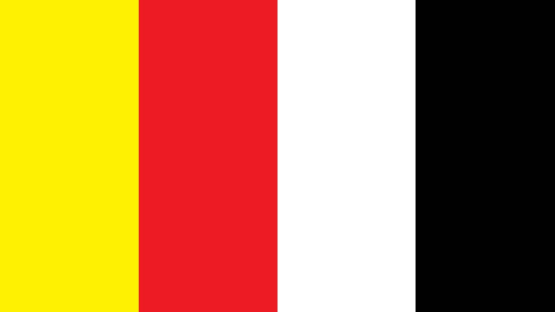
- Color Palette: Primary yellow (#DDA314, Gamboge), accent yellow (#E9E567, Confetti), red (#CB2027, Cardinal), and black. Some versions use muted reds and brighter yellows depending on the season.
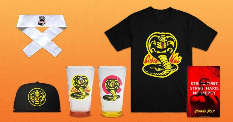
- Usage Context: The logo appears across the TV series title cards, official merchandise (t-shirts, patches, decals, phone cases), social media branding, packaging, and licensed collectibles through the Cobra Kai Store and retail partners.
How Has the Cobra Kai Logo Evolved Over Time?

The Cobra Kai logo has changed in small but meaningful ways since its first appearance in The Karate Kid (1984). The dojo roundel stayed mostly consistent, while the series wordmark shifted colors and modified the letter “I” to indicate season numbers across the first four seasons.
Each version kept the same DNA. But the details tell a bigger story about how the franchise grew.
Original Karate Kid Dojo Emblem (1984-2017)
Years Active: 1984 through 2017, spanning the original film trilogy.
The first version was a gi patch. A hooded cobra in yellow with black outlines, red forked tongue, set inside a circular border. The words “COBRA KAI” appeared on either side of the snake, with “STRIKE FIRST. STRIKE HARD. NO MERCY.” running around the perimeter.
It was designed by Sony Pictures’ production team for the original Karate Kid film. The color palette leaned into yellow and black, the same combination you see on warning signs and wasps. Subconscious danger signals, basically.
This version appeared on tournament uniforms worn by Johnny Lawrence, Bobby Brown, and the rest of John Kreese’s students. It became a piece of 80s movie culture that people still recognized decades later.
Took me a while to realize that whole yellow-and-black thing wasn’t random at all. It’s the same pattern nature uses to say “stay away.”
Series Wordmark, Season 1 (2018)
Years Active: May 2018, YouTube Red premiere.
When the TV series launched, it needed a title treatment separate from the dojo emblem. Geronimo Giovanni designed a brush script wordmark in muted red.
The letters were hand-brushed, sans-serif in style, set in italics. The “I” in “Kai” was elongated to resemble the Roman numeral I, subtly marking it as the first season.
The typeface closely matches Dead Stock by BLKBK Fonts, a Canadian foundry. Sony TV specifically chose it because it captured an 80s pulp signage look, the kind of thing you’d see on a martial arts movie poster from that era.
The design team faced one tricky problem. The logo wasn’t supposed to include any pictorial element. Just type. So everything had to communicate mood and meaning through letterforms alone.
Season 2 Wordmark (2019)
Years Active: April 2019, YouTube Premium.
The color shifted to a darker shade of red. The biggest change? The “I” became “II” in the Roman numeral style, marking the second season.
Other than that, the structure stayed the same. Same brush strokes, same weight, same overall feel. It was a minor update that most people probably didn’t even notice unless they looked closely.
This version was short-lived. The Roman numeral approach worked fine for two seasons, but things got more complicated after that.
Season 3 Wordmark (2021)
Years Active: January 2021, first season on Netflix.
The red got brighter. The “I” turned into “III” for season three. And this was the moment where the Roman numeral trick started feeling crowded.
Netflix purchasing the streaming rights changed everything about the show’s reach. Suddenly the logo needed to work on different platforms, in different sizes, and across way more merchandise categories than before.
The series became the number one streamed show in the United States after the Netflix move. That kind of exposure puts pressure on every visual asset, especially the logo.
Season 4 Onward (2021-Present)
Years Active: December 2021 through the final season.
The Roman numeral trick was retired after Season 3. Going forward, the wordmark returned to a standard “I” and season numbers were handled separately.
Typography became bolder. Readability improved for digital screens and smaller merchandise applications. The overall look got cleaned up while keeping that hand-brushed texture intact.
The roundel emblem also saw subtle refinements for better clarity at smaller sizes. Black outlines got sharper. The cobra’s details were simplified just enough to reproduce well on everything from phone cases to car decals.
What Do the Design Elements of the Cobra Kai Logo Mean?
Every piece of the Cobra Kai logo ties back to the dojo’s philosophy. The hooded cobra represents readiness to strike. The circular format echoes traditional martial arts tournament badges. And the color combination signals danger before you even read the text.
It’s a logo that tells you everything about the brand in about half a second. Which is exactly what a good emblem should do.
Why Did Cobra Kai Choose These Specific Colors?
The main colors are yellow, black, and red. Each one pulls weight in a different direction.
Yellow (#DDA314, Gamboge) is the dominant color. It grabs attention immediately. In terms of color psychology, yellow signals caution and energy. Paired with black, it mimics warning patterns found in nature, think wasps and venomous snakes. That’s not accidental.
Black (#000000) provides the outlines and background in certain versions. It adds weight, authority, and a sense of threat. The high contrast between black and yellow creates maximum visibility, which matters for merchandise and on-screen legibility.
Red (#CB2027, Cardinal) appears in the wordmark and the cobra’s tongue. Red means aggression, passion, and blood. In the context of a martial arts dojo built on the motto “No Mercy,” that tracks perfectly. Looking at collections of red logos across industries, red consistently communicates intensity and power.
Some versions use a secondary yellow (#E9E567, Confetti) for lighter accents. The whole palette leans into high saturation levels across the board.
What Typography Style Is Used in the Cobra Kai Logo?
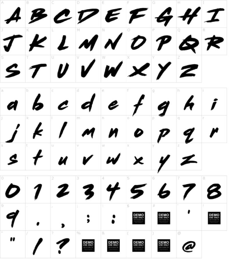
The series title uses a brush script style that closely matches Dead Stock by BLKBK Fonts. It’s hand-brushed with ink, mimicking the look of Japanese calligraphy while keeping a Western edge.
The letterforms are semi-connected. Some characters link up while others break apart, like between the “O” and “B” or the “B” and “R.” That inconsistency is intentional. It makes the type feel alive, like someone actually wrote it with a brush in one take.
The strokes are sharp and jagged with protruding edges. If you think about font psychology, angular and rough typefaces suggest rebellion and raw energy. Smooth, rounded fonts would have killed the mood entirely.
Inside the roundel emblem, the type switches to a generic serif style for the motto text. That’s a deliberate choice to create a sense of tradition and authority, like something you’d see stamped on a military unit patch.
What Are the Hidden Meanings in the Cobra Kai Logo?
The cobra’s expanded hood is the most loaded element. In nature, a cobra only spreads its hood when it’s about to attack or feels threatened. That dual meaning fits the show perfectly, where Cobra Kai students are both aggressors and defenders depending on the season.
The name itself carries meaning most people miss. “Cobra” is straightforward. “Kai” translates from Japanese as “organization” or “group.” So the full name literally means “Grand Snake Organization.” There’s also a claim it was inspired by a real martial arts school called Cobra Kai that existed in 1971.
The circular format of the roundel version reflects completion, unity, and containment. It’s a closed system, just like Kreese’s philosophy. You’re either inside the circle or you’re the enemy. Looking at how shapes influence perception in design, circles create feelings of community and protection, which is ironic given how toxic the dojo actually is.
How Does the Cobra Kai Logo Compare to Competitor Logos?
Within the show, Cobra Kai’s biggest rival is Miyagi-Do Karate. And the contrast between their logos could not be sharper. Miyagi-Do uses a bonsai tree, soft curves, and natural greens. Cobra Kai uses a coiled predator, hard angles, and warning colors.
That visual tension mirrors the show’s entire narrative arc.
Outside the show, when you compare the Cobra Kai emblem to other TV series logos, it holds its own against some heavy hitters. The Stranger Things logo goes for eerie nostalgia with a glowing red wordmark. The Breaking Bad logo uses periodic table elements for intellectual menace. The Game Of Thrones logo leans into medieval heraldry.
Cobra Kai sits in a unique spot. It’s one of the few TV logos that also works as an actual in-universe emblem. Most show logos exist purely as title cards. But the Cobra Kai roundel is something characters physically wear on their uniforms. That double function is rare and gives it an edge in merchandise applications that logos like the The Boys logo or the Peaky Blinders logo don’t have.
It also shares DNA with real martial arts dojo branding. The circular badge format, the aggressive animal mascot, the motto around the perimeter. These are conventions you’ll see in actual karate and jiu-jitsu schools. That authenticity is part of why fans connect with it so strongly.
What Are the Technical Specifications of the Cobra Kai Logo?
Official Color Codes
- Primary Yellow (Gamboge): Hex #DDA314 | RGB (221, 163, 20) | CMYK (0, 26, 91, 13) | HSL (43, 83, 47)
- Secondary Yellow (Confetti): Hex #E9E567 | RGB (233, 229, 103) | CMYK (0, 2, 56, 9) | HSL (58, 75, 66)
- Red (Cardinal): Hex #CB2027 | RGB (203, 32, 39) | CMYK (0, 84, 81, 20) | HSL (358, 73, 46)
- Black: Hex #000000 | RGB (0, 0, 0) | CMYK (0, 0, 0, 100)
- White (used in cobra head details): Hex #FFFFFF | RGB (255, 255, 255)
Dimensions and Proportions
The roundel emblem sits within a roughly 1:1 aspect ratio. It’s a circle, so width and height are equal. The cobra fills about 60% of the interior space, with the motto text occupying the outer band.
For the wordmark, the aspect ratio is closer to 4:1 (width to height). The brush script extends horizontally with significant variation in letter height due to the hand-drawn style.
The original vector graphic was produced in Encapsulated PostScript (EPS) format, which allows for infinite scaling without loss. Digital versions are distributed in SVG, PNG, and JPEG formats depending on the use case.
Clear space requirements follow standard brand guidelines practice. The emblem needs breathing room equal to at least the height of the “K” in “KAI” on all sides. Minimum reproduction size keeps the motto text legible, which typically means no smaller than about 1 inch in diameter for print applications.
What Cultural Impact Has the Cobra Kai Logo Had?
The Cobra Kai logo crossed over from fictional prop to genuine cultural symbol. After the Netflix launch, merchandise sales exploded. T-shirts, patches, decals, phone cases, Halloween costumes, you name it.
Meme culture adopted the “Strike First” mentality as motivational content. People who have never watched the show share the logo on social media because it looks cool and carries an attitude.
Tournament replica patches became collector items. Martial arts practitioners wear them unironically at actual dojos. The design bridges generations. Parents who grew up watching The Karate Kid buy Cobra Kai gear alongside their teenagers. That kind of multi-generational pull is something most brands would kill for.
And here’s the interesting part. Johnny Lawrence’s character arc shifted how people see the logo entirely. In 1984, it was the bad guy’s symbol. By 2024, it represents second chances and redemption. Same design, completely different emotional weight. That transformation happened because of storytelling, not a redesign.
How Does the Cobra Kai Logo Fit Into the Overall Brand Identity?
The Cobra Kai logo sits at the center of a bigger brand ecosystem that includes the Karate Kid franchise, Sony Pictures Television, Netflix, and the official Cobra Kai Store. Each piece connects back to the emblem in some way.
The series itself functions as the anchor. Every promotional poster, social media post, and episode title card reinforces the logo. But it extends further. Eagle Fang Karate and Miyagi-Do each have their own visual identities within the show, and all three logos play off each other to represent different philosophies.
Merchandise categories range from apparel and accessories to home goods and collectibles. The logo adapts to each product category while maintaining consistency through its brand style guide. Licensed partners follow strict guidelines around color accuracy, minimum sizes, and clear space.
The sound design even matters here. The show’s soundtrack blends 80s rock with original scores, and visual branding follows that same nostalgic-but-modern approach. The logo’s brush script display font captures that perfectly, vintage enough to feel authentic, clean enough to work on a modern streaming platform.
How Should the Cobra Kai Logo Be Used?
Sony Pictures Television controls all official usage. You can’t just slap the Cobra Kai emblem on your own merchandise and sell it. That’s trademark infringement, and Sony has actively pursued cases in the USPTO to protect their rights.
For official use, the guidelines are straightforward:
- Do maintain the original color values when reproducing the emblem. The yellow, red, and black all have specific codes listed in the brand assets.
- Do respect the clear space around the logo. Crowding it with other elements kills the visual hierarchy.
- Don’t stretch, rotate, or distort the emblem. The proportions matter.
- Don’t change the colors to match your own branding. The Cobra Kai palette is specific and intentional.
- Don’t separate the cobra from the text in the roundel version. They’re designed as a single unit.
Official logo files can be accessed through Sony’s licensing partners and the Cobra Kai Store for authorized merchandise producers. Fan art exists everywhere, obviously, but commercial use requires proper licensing.
The trademark registrations cover a wide range of categories including clothing, toys, games, digital media, and entertainment services. Sony filed across multiple international trademark offices, including the USPTO and EUIPO, starting in June 2018.
If you’re a designer looking to understand how the Cobra Kai logo works from a technical standpoint, studying its construction is worthwhile. It follows solid logo design principles: simple enough to recognize at small sizes, distinctive enough to stand out in a crowded market, and meaningful enough to carry emotional weight across multiple contexts.
FAQ on The Cobra Kai Logo
What Does the Cobra Kai Logo Represent?
The Cobra Kai emblem represents the dojo’s aggressive martial arts philosophy. The hooded cobra signals readiness to strike, while the motto “Strike First, Strike Hard, No Mercy” reinforces the ruthless training style taught by John Kreese in the Karate Kid franchise.
Who Designed the Cobra Kai Logo?
Geronimo Giovanni designed the modern vector version used across the TV series and merchandise.
The original 1984 dojo patch was created by Sony Pictures Television’s production design team for The Karate Kid film. BLKBK Fonts provided the Dead Stock brush script used in the title wordmark.
What Font Is Used in the Cobra Kai Logo?
The series title uses a bold brush script closely matching Dead Stock by BLKBK Fonts. It mimics Japanese calligraphy with sharp, jagged strokes.
The roundel emblem uses a separate slab serif style for the motto text, giving it a military badge feel.
What Are the Official Cobra Kai Logo Colors?
The primary palette includes yellow (#DDA314), red (#CB2027), and black. Some versions feature a secondary yellow (#E9E567).
That yellow and black combination mimics natural warning patterns. Red accents add aggression to the snake symbol and wordmark lettering.
What Does “Cobra Kai” Mean in Japanese?
“Cobra” refers to the venomous snake species. “Kai” is a Japanese word meaning organization or group.
Combined, it translates to Grand Snake Organization. Some sources suggest the name was inspired by a real martial arts school from 1971.
How Has the Cobra Kai Logo Changed Across Seasons?
The dojo roundel stayed consistent. The wordmark changed more noticeably.
Season 1 used muted red with the “I” resembling a Roman numeral. Season 2 darkened the red and doubled the numeral. Season 3 brightened everything for the Netflix debut. Season 4 onward dropped the numeral trick entirely and refined the design elements for better digital clarity.
Is the Cobra Kai Logo Trademarked?
Yes. Sony Pictures Television holds multiple USPTO registrations filed in June 2018.
Registration numbers 6,003,343 and 6,003,344 were granted in March 2020. The trademark covers entertainment services, apparel, toys, digital media, and merchandise across the Cobra Kai brand identity.
Where Can You Buy Official Cobra Kai Logo Merchandise?
The official Cobra Kai Store (cobrakaistore.com) carries the widest selection. T-shirts, patches, decals, hoodies, and collectibles all feature the cobra snake graphic.
Licensed products also appear through major retailers. The dojo emblem design works across everything from gi patches to car stickers.
How Does the Cobra Kai Logo Compare to the Miyagi-Do Logo?
They’re polar opposites. Cobra Kai uses a coiled predator in high-intensity hues with angular shapes. Miyagi-Do features a bonsai tree with soft curves and natural greens.
That visual tension is intentional. It mirrors the rivalry between Johnny Lawrence and Daniel LaRusso throughout the Netflix series and the original All Valley Karate Tournament storyline.
Can You Use the Cobra Kai Logo for Fan Art or Personal Projects?
Fan art for personal, non-commercial use is generally tolerated. But selling anything with the Cobra Kai logo without a license is trademark infringement.
Sony has actively pursued unauthorized commercial use through the USPTO. If you want to create Cobra Kai fan art or sticker designs, keep it personal. Commercial projects require proper licensing.
Conclusion
The Cobra Kai logo proves that a well-built emblem can outlive its original purpose. What started as a karate dojo patch in a 1984 movie became a global merchandise empire and a piece of pop culture that spans generations.
The cobra snake symbol, the brush script lettering, the yellow and black circular emblem. Every piece works together because the graphic design principles behind it are solid.
Johnny Lawrence’s redemption arc gave the logo new meaning without changing a single pixel. That’s the real lesson here.
Good design doesn’t just look right. It carries narrative weight that grows over time, from the All Valley Karate Tournament to Netflix screens worldwide.

Renowned for his expertise in logo design and visual branding, Bogdan has developed a multitude of logos for various clients.
His skills extend to creating posters, vector illustrations, business cards, and brochures. Additionally, Bogdan's UI kits were featured on marketplaces like Visual Hierarchy and UI8.
He also wrote in the past years on sites like Design Your Way, WebDesignerDepot, WPDean, Designmodo, Speckyboy, Slider Revolution, and more.
- The Windsurf Logo History, Colors, Font, And Meaning - 10 October 2026
- How to Remove Background From Product Photos (No Photoshop) - 10 October 2026
- How Designers can Build a Stronger Online Creative Identity - 9 October 2026

Bogdan Sandu is a seasoned designer who has been designing websites since 2008. Renowned for his expertise in logo design and visual branding, Bogdan has developed a multitude of logos for various clients. His skills extend to creating posters, vector illustrations, business cards, and brochures. Additionally, Bogdan's UI kits were featured on marketplaces like Visual Hierarchy and UI8. He also wrote in the past years on sites like Design Your Way, WebDesignerDepot, WPDean, Designmodo, Speckyboy, Slider Revolution, and more.
You Might Also Like


