


In a world where clutter is the norm, Swiss design emerges as the Zen master of visual aesthetics. Imagine the crisp air of the Alps distilled into form and function — that’s the essence we’re diving into. It’s not just a style; it’s a philosophy where simplicity meets precision, and every line serves a purpose.
As we unpack this iconic movement, you’ll see how it’s far more than typography and the iconic Helvetica.
From modular grids to functional design, Swiss principles have permeated creative spheres, guiding my hand as a web designer shaping pixels with purpose.
By journey’s end, expect clarity, like the Lake Geneva on a serene morning.
We’ll navigate the clean, timeless lines of International Typographic Style, explore how Josef Müller-Brockmann‘s legacy lives on in modern web layouts, and reveal how Swiss graphic design can elevate your digital presence — all woven into the fabric of this article.
What is Swiss Design?
Swiss Design, also known as the International Typographic Style, is a graphic design approach developed in Switzerland in the 1950s that emphasizes cleanliness, readability, and objectivity. Characterized by sans-serif typefaces, grids, and asymmetrical layouts, it focuses on simplicity and functionality in design.
Historical Development and Influences
Origins and Early Influences
Imagine stepping back in time, right to the moment when Swiss Design started shaping up.
It’s a reaction, you know, to the fancy curves of the Arts and Crafts movement, German Jugendstil, and French Art Nouveau.
Swiss designers looked around, saw all these intricate designs, and thought, “Let’s keep it simple.”
They were all about stripping down to the basics. But why? Well, the Industrial Revolution was changing everything.
Craftsmanship was evolving, and design had to keep up.
Influences from Russian Constructivism, Bauhaus School, and International Style
Swiss Design? Not in isolation, friends. Picture this—constructivist visions from Russia, Bauhaus’ minimalist genius, and the sleek International Style.
They’re threads woven into the fabric of Swiss aesthetics. The narrative they join? Shaping spaces and forms to serve function, no excess baggage.
They push the plot from art to design ideology, where utility is the protagonist.
Origins and Early Influences
Imagine stepping back in time, right to the moment when Swiss Design started shaping up. It’s a reaction, you know, to the fancy curves of the Arts and Crafts movement, German Jugendstil, and French Art Nouveau.
Swiss designers looked around, saw all these intricate designs, and thought, “Let’s keep it simple.”
They were all about stripping down to the basics. But why? Well, the Industrial Revolution was changing everything.
Craftsmanship was evolving, and design had to keep up. Swiss Design became this cool blend of function and form, where every line meant something.
The Role of Educational Reforms in Shaping Swiss Design
Ernst Keller, at the School of Applied Sciences in Zürich, he’s the mentor in our tale, fostering that spirit of innovation.
Training in design becomes a full-blown movement. Enter the Schule für Gestaltung Basel and Julius de Pretere’s influence.
They’re not just schools. They’re crucibles where design met educational reforms—molding minds to shape form with function.
Key Early Developments
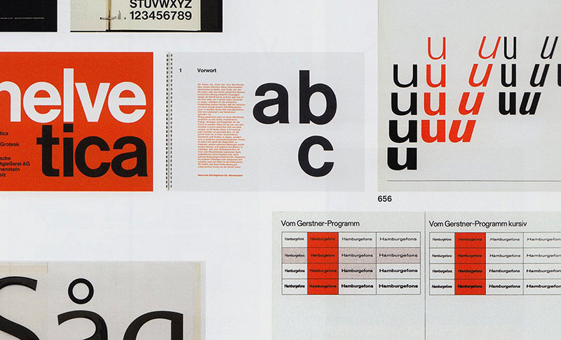
Creation of Akzidenz Grotesk and its Influence on Swiss Typography
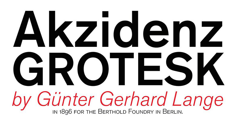

Now, here’s where things get interesting. Enter Akzidenz Grotesk – the font that changed it all. You’ve probably seen it and didn’t even know.
This font wasn’t just letters on a page; it was a statement – clear, readable, no frills. It laid the groundwork for the famous Helvetica and many others.
It’s like Swiss Design’s way of saying, “Hey, we’re here, and we’re all about clarity and precision.”
From Akzidenz Grotesk to Helvetica: Evolution of Typography
Fonts. They’re not just type; they’re the voice on the page. Akzidenz Grotesk kicks it off. Boom, we have clarity.
Pave way for Helvetica, and who’s behind this game-changer? Max Miedinger and Eduard Hoffmann. Heroes of typography, masters of the sans-serif.
They deliver fonts that don’t just speak; they resonate through decades.
The Role of Modernist Styles from Russia, the Netherlands, and Germany
Swiss Design didn’t just pop up in a vacuum. It borrowed a bit from everywhere – the boldness of Russian Constructivism, the practicality of Dutch De Stijl, and the innovation of German Bauhaus.
Imagine taking bits and pieces from all these cool styles and mixing them into something new. That’s Swiss Design for you – a global cocktail of creativity.
Key Principles of Swiss Design
Swiss Design isn’t just about looking cool; it’s a mindset, a way of solving problems through design.
It’s like a secret sauce that makes everything more appealing, functional, and timeless. Let’s break down what makes Swiss Design tick.
Grid System

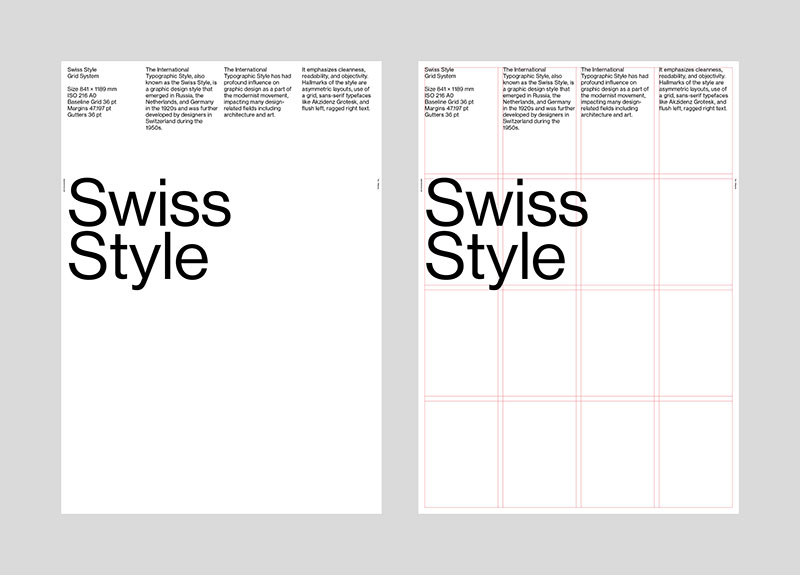
The grid system is like the backbone of Swiss Design. It’s all about using mathematical grids to put everything in the right place, like a game of Tetris but with design elements.
This isn’t just about making things look neat; it’s about creating a visual rhythm that guides the eye.
- Structuring Information: The grid is like a map for placing text, images, everything. It’s about balance, you know, making sure everything on the page has its own space without stepping on each other’s toes.
- Visual Hierarchy and Balance: Grids help in prioritizing content. It’s like when you walk into a room and instantly know where to look. The most important stuff pops, and the rest complements it, creating a visual harmony.
Incorporating White Space and Left Alignment for Clarity
Whitespace, folks—it’s the breath in a conversation. Punctuates content. And left alignment? It’s like the steady beat in a song, setting pace and direction.
It’s all about making designs breathe, giving words the spotlight without crowding the stage.
Typography

In Swiss Design, words aren’t just words; they’re design elements. The focus is on sans serif typefaces – clean, simple, no extra fluff. It’s like the design version of that friend who’s always straight to the point.
- Emphasis on Sans Serif Typefaces: Helvetica, Univers, Akzidenz-Grotesk – these aren’t just fonts; they’re the heroes of Swiss typography. They’re legible, versatile, and have that timeless vibe.
- Legibility and Clarity in Communication: Every letter, every spacing, is all about making sure the message isn’t just seen, but also understood. It’s like making sure everyone in the room not only hears you but gets you.
Minimalism and Clarity
Swiss Design is like that minimalist friend who lives by “less is more.” It’s about boiling down to the essentials, making sure every element has a purpose.
- Reduction of Design Elements: This isn’t about being bare-bones; it’s about being smart. Cutting the clutter so the important stuff gets the spotlight.
- Use of Photographs Over Illustrations: Photographs bring a touch of reality, a snippet of the real world. It’s like choosing to show a real apple instead of a drawing. It’s more relatable, more… real.
Notable Figures in Swiss Design
Diving into Swiss Design is like exploring a hall of fame of brilliant minds.
These guys didn’t just make pretty things; they redefined design.
Their work is like the DNA of what we see in modern graphics and typography.
Ernst Keller

His Role as the “Father of Swiss Design”
Ernst Keller, man, where do we even start? He’s often called the “Father of Swiss Design,” and for good reason. Keller was all about breaking norms, pushing boundaries, and thinking outside the box. He was the cool teacher at the Zurich School of Arts and Crafts who told his students to experiment and innovate.
- Influence on Future Generations of Designers: Keller was like a design superhero, inspiring legions of designers. He was the one who planted the seeds for the minimalist, function-over-form ethos that Swiss Design is famous for.
Armin Hofmann and Josef Müller-Brockmann
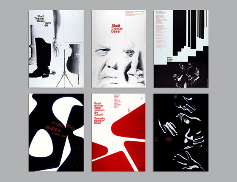

Contributions to the Development and Spread of Swiss Style
Armin Hofmann and Josef Müller-Brockmann – these guys were like the dynamic duo of Swiss Design. They took Keller’s teachings and ran with them, each in their own unique way.
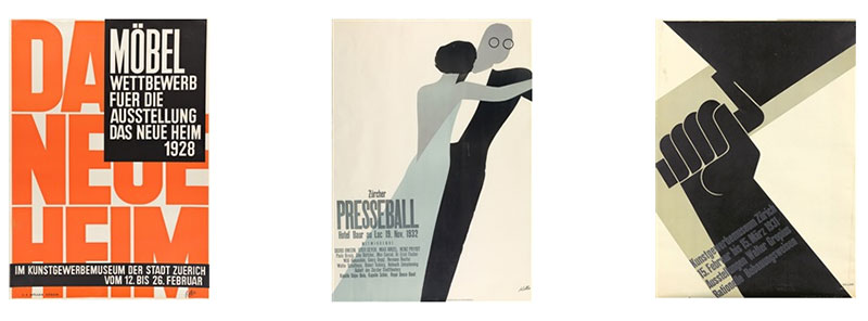
- Armin Hofmann: Hofmann was all about intuition in design. He liked to play with visuals, create contrasts, and make designs that weren’t just seen but felt. His work, especially in poster design, is like poetry in visual form.
- Josef Müller-Brockmann: Now, Müller-Brockmann was the grid guy. He loved structure, order, and precision. His designs are like visual symphonies, every element in perfect harmony with each other. If Swiss Design had a rulebook, Müller-Brockmann probably wrote half of it.
Development of Curriculum and Design Methodologies
These guys weren’t just designers; they were educators, shaping the minds of future generations.
They developed curricula that weren’t just about teaching design but about living it. It’s like they were handing down a secret recipe, making sure that Swiss Design’s legacy continued.
Emil Ruder’s Contribution to Swiss Design
Emil Ruder—here’s an influencer before it was cool. He teaches that typography is not just about reading; it’s about understanding, feeling the message.
His mantra? Type interacts with design, and together, they dance to the rhythm of clarity and precision.
Characteristics and Techniques
Swiss Design is like a puzzle, with each piece playing a crucial role in creating a masterpiece.
Let’s dive into the characteristics and techniques that make Swiss Design so iconic. It’s a blend of precision, simplicity, and genius.
Asymmetry and White Space
Use of Asymmetrical Layouts for Dynamic Composition

Asymmetry in Swiss Design is like adding a twist to a classic tale. It breaks away from the usual, making designs feel more dynamic and alive.
It’s not just about throwing things randomly on a page, though. It’s a calculated move to make designs pop, to make them more engaging.
- Strategic Use of White Space for Visual Impact: White space in Swiss Design is like the silence between musical notes. It’s not empty space; it’s breathing room. It lets the design speak without shouting. White space isn’t just absence; it’s an active element that shapes how we perceive the design.
Photography and Visual Elements
Incorporation of High-contrast, Black and White Photography
Swiss Design loves playing with photography, especially the high-contrast, black and white kind. It’s like adding a dose of reality to the mix.
These photos aren’t just pictures; they’re storytellers. They add depth, emotion, and a touch of drama.
Use of Minimal Shapes and Clean Lines in Design: Minimal shapes and clean lines are the bread and butter of Swiss Design. Think of it like minimalist art. Each shape, each line is there for a reason. It’s not about being fancy; it’s about being effective, about communicating with the least clutter.
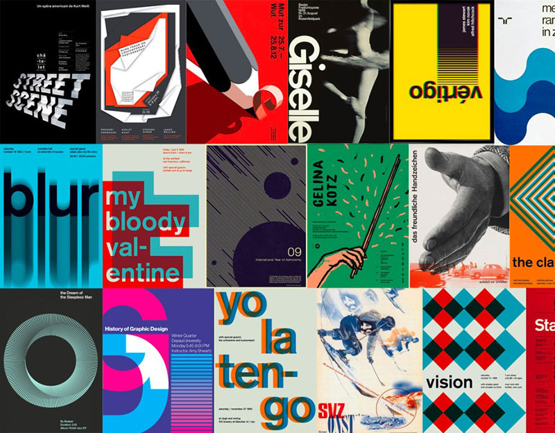
Swiss Design as the International Typographic Style
Swiss Design isn’t just a national treasure; it’s a global phenomenon. It’s like watching a local indie band go platinum worldwide.
Swiss Design evolved, grew wings, and became something bigger – the International Typographic Style. Let’s break down this incredible journey.
Global Spread and Influence
Transition from Swiss Design to International Typographic Style

It all started in Switzerland, but the influence of Swiss Design spread like wildfire. Think of it as a design language that everyone wanted to speak. From posters to corporate branding, its principles became a global standard.
- Influence on Various Design Disciplines: Swiss Design’s reach went beyond just graphic design. It seeped into art, architecture, and even digital design. It’s like a Swiss army knife for the design world – versatile, functional, and always on point.
Swiss Design in the Digital Age: From Print to Pixels
Metamorphosis, that’s what’s happening. Swiss Design principles leap from paper to pixels, shaping web design, interface aesthetics—every pixel with a purpose.
It’s like watching evolution in real-time, with grid systems and typography precision making the digital realm nothing short of extraordinary.
Legacy and Modern Relevance
Enduring Principles of Clarity, Precision, and Minimalism
The cool thing about Swiss Design is its timelessness. Its principles of clarity, precision, and minimalism are like the golden rules of good design.
They’re not just trends; they’re the foundations that have stood the test of time.
- Continued Influence in Contemporary Design and Branding: Even today, Swiss Design principles are everywhere. From the sleek layout of your favorite website to the branding of top-notch companies, its influence is unmistakable. It’s like the DNA of modern design – invisible but ever-present.
Swiss Design and Its Impact on Modern Minimalism
Swiss Design principles, they’re like the north star for contemporary minimalism.
The design universe orbits around principles of clarity, precision, and stripping down to the bare essentials.
It’s not just a style; it’s a standard bearer for minimalist, functional design across all creative fronts.
FAQ On Swiss Design
Why is Swiss design so influential in graphic design?
Well, it’s like Swiss design wrote the rulebook. It brought the grid system into play, emphasizing simplicity, readability, and objectivity in layouts.
We can thank Swiss design for making minimalism a must-have in graphic design—every pixel and font choice intentional.
Can Swiss design principles be applied to digital media?
Absolutely. Swiss design may have ink-and-paper roots, but its principles are timeless.
Whether you’re crafting a sleek website or an easy-to-use app, Swiss principles like functional design and typographic harmony remain central—digital worlds included.
Who are the key figures associated with Swiss design?
Let’s tip our hats to the masters—Josef Müller-Brockmann and Armin Hofmann. As pioneers, they set this style’s clean lines and visual communication standards. Their influence extends far beyond Switzerland, echoing through design studios and schools the world over.
Are there specific colors associated with Swiss design?
While Swiss design doesn’t handcuff you to specific hues, it’s known for using color strategically, not decoratively.
You’ll often find bold contrasts, like black on white, using color to guide the viewer’s eye efficiently and effectively.
What role does Swiss design play in branding?
When brands crave that no-fuss, high-impact vibe, they often turn to Swiss design. It leverages minimalistic elements and strong <strong>typography to build unforgettable identities. It’s not just a logo; it’s a statement.
How has Swiss design evolved with modern trends?
Like the Alps themselves, Swiss design remains steadfast yet adaptable. It’s evolved by embracing technology, yet grid systems and typographic precision remain at its core. You’ll see its influence in today’s UX/UI, where simplicity and user-friendliness reign supreme.
Can Swiss design be considered eco-friendly?
Interestingly, it can. Its minimalist essence means less visual clutter and often less physical material used in print.
Swiss design’s clean lines and functional design principles can translate to sustainability in design—less is more here too.
How do Swiss design and Bauhaus compare?
While both celebrate form following function, Swiss design is more rigid in its grid-based layouts and sans-serif fonts.
Bauhaus dances more with experimental angles and shapes but, hey, they both aim for practicality and timelessness.
What industries benefit most from using Swiss design?
From publishing to tech, any industry aiming for that uncluttered, purpose-driven aesthetic hits the jackpot with Swiss design. It’s a win for making complex information feel like a breeze, so think finance, healthcare, and—you guessed it—high-precision Swiss watches.
Conclusion
Wrapping up, the journey through the clean, purposeful universe of Swiss design has been quite the odyssey. Imagine taking that sheer minimalism, the reverence for typography, and the unspoken rule of ‘form follows function,’ then applying it all to everything visual—yeah, that’s the power we’re tapping into.
- Precision? Check.
- Grid systems that would make a mathematician nod in respect? Double-check.
- Helvetica reigning supreme? You bet.
Our deep dive into this philosophy has revealed it’s not just a style but a way of thinking, a methodology steeped in the traditions of Swiss graphic design, that can amplify one’s approach to creating digital experiences that click effortlessly with users.
Let’s take these insights, the harmonious balance of form, function, and clarity, and construct digital landscapes that resonate with the simplicity and elegance of a Swiss chronograph. Now, go forth and design with the poise of the Swiss—less but better, always.
If you liked this article about Swiss design, you should check out this article about what is color theory.
There are also similar articles discussing visual hierarchy, graphic design movements, Bauhaus graphic design, and Brutalist graphic design.
And let’s not forget about articles on postmodern graphic design, grid systems in graphic design, Gestalt principles of design, and the golden ratio in design.