


Ever gaze at a complex design and marvel at its simplicity? It’s an intriguing paradox at the heart of the Gestalt principles of design—a psychological masterpiece that unpacks the human mind’s inclination to perceive a unified whole.
Embarking on this visual odyssey, we’ll decode the cognitive whispers of these design elements; the silent but potent rules guiding our perception. Visual hierarchy, user experience, and harmony in design find their roots here, and, soon, at the tips of your creative fingers.
By article’s end, you’ll grasp the iconic laws of proximity, similarity, continuity, and closure; essentials in the lexicon of any designer worth their salt. Unraveling these themes, expect to gain a robust toolkit enabling aesthetic usability—elevating your work from passable to perceptually magnetic.
Dive deep into the Gestalt waters, and arise with the ability to sculpt designs that communicate, connect, and compel—effortlessly.
Core Gestalt Principles
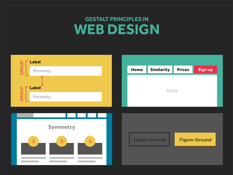
Principle of Figure-Ground
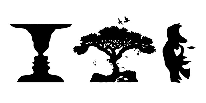

Ever looked at an image and seen two pictures in one? That’s the Principle of Figure-Ground in action. It’s a big deal in the world of Gestalt principles of design.
This principle tells us that our eyes can flip between focusing on the foreground (the figure) and noticing what’s in the background (the ground). It’s like those cool optical illusions where a vase suddenly becomes two faces!
Think of a simple webpage design. When you see a bold call-to-action button, that’s the ‘figure’, and everything else fades into the ‘ground’. This principle isn’t just a fancy trick; it’s key in guiding viewers’ attention. Designers use it to make you look where they want you to.
Clever, right?
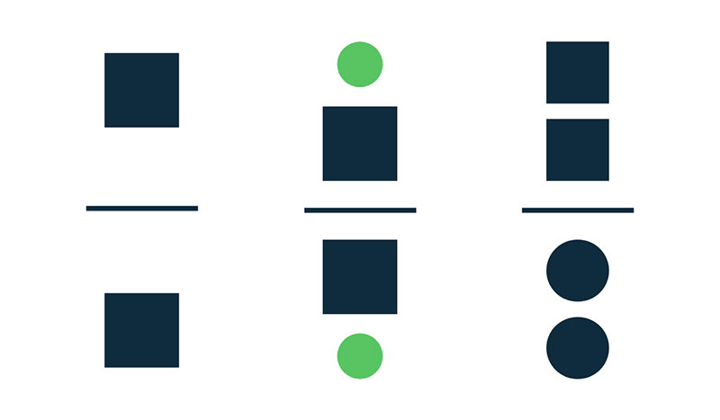
Principle of Proximity

Ever noticed how things grouped together seem related? That’s the Principle of Proximity at work, another star player in Gestalt principles of design.
This principle is all about closeness creating connection. Elements that are near each other appear as part of a group, making the overall design cleaner and more organized.
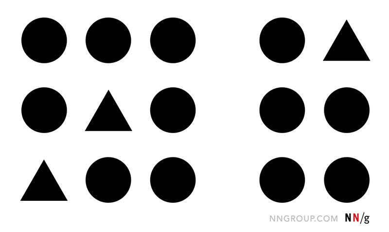
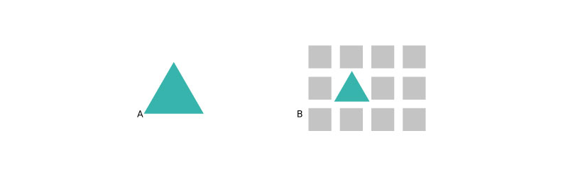
Principle of Similarity
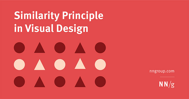

Let’s talk about the Principle of Similarity, a game-changer in Gestalt principles of design. This principle is all about how we naturally group things that look alike.
It’s like when you automatically pair socks of the same color. Same idea, but in design.
Imagine scrolling through a website. When you see buttons with the same style, your brain tells you, “Hey, these must do similar stuff.”
This principle helps create a vibe of uniformity and order. It’s not just making things look pretty; it’s about making them make sense. This principle is super handy in user interface design, where consistency is key.
Think of it like a band where each instrument plays a different tune, but together, they create harmony. That’s what similarity does in design – it creates harmony.
Principle of Continuity

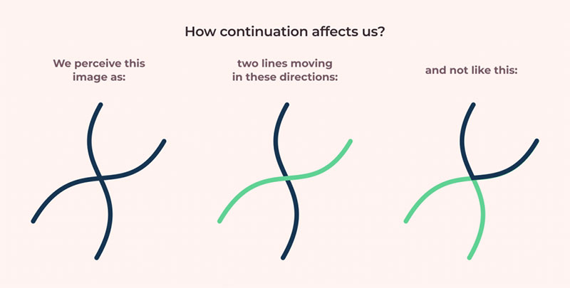
Next up, the Principle of Continuity. This one’s a biggie in the Gestalt principles of design. It’s all about guiding the viewer’s eye along a path.
This principle says that we prefer to see things as continuous lines or patterns, rather than disjointed ones.
In the web design world, this principle is like the GPS guiding you through a website. It’s what makes your eyes glide smoothly from one element to the next, without getting lost. It’s the reason you can follow a text or design elements easily, without even realizing why it feels so natural.
Principle of Closure
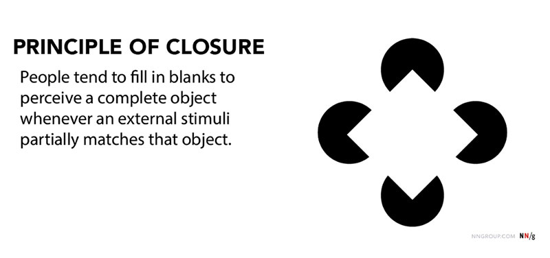

Alright, let’s dive into the Principle of Closure. This one’s a real brain teaser in the world of Gestalt principles of design.
Ever seen one of those images where there’s just a bunch of lines, but your brain magically sees a cat? That’s closure! It’s all about our mind’s ability to fill in the gaps and see a complete picture, even when parts are missing.
In design, this principle plays a huge role. It’s like when a logo looks like it’s got a missing piece, but you still recognize it. It’s not about tricking the eye; it’s about engaging the brain. This principle taps into our natural love for solving puzzles. It makes designs intriguing and memorable.
Let’s take the classic example of the WWF logo. You know, the panda one? It doesn’t show every detail of a panda, but you still get it, right? That’s closure doing its thing.
This principle isn’t just a cool trick. It’s a powerful tool in brand identity. It makes logos and designs stick in your mind. It’s about creating an interactive experience where the viewer gets to play a part in the design by mentally filling in the blanks.
In user interface design, the Principle of Closure helps in creating icons that are simple yet effective. It’s about cutting the clutter and keeping it minimal, yet totally functional.
Additional Gestalt Principles
Principle of Symmetry

Let’s jump into the Principle of Symmetry. It’s one of those Gestalt principles of design that’s super satisfying.
It’s about balance, harmony, and that feel-good vibe you get when things just… align. Think of it like your favorite symmetrical photo on Instagram, where everything lines up perfectly, and it just feels right.
In design, symmetry is a big deal. It brings a sense of order and stability. Whether it’s a website or a graphic, when elements mirror each other, it’s pleasing to the eye.
It’s like a visual comfort food. Symmetry isn’t just about looks; it’s about making content approachable and digestible. It’s a silent guide that leads the viewer’s eye across the design in a balanced, harmonious way.
Principle of Uniform Connectedness

Next up, the Principle of Uniform Connectedness. This principle is all about connecting the dots in design. It tells us that elements linked together visually are seen as related.
This principle is like the buddy system; it groups things together to create a sense of unity and cohesion.
Imagine a bunch of random shapes on a page. If they’re connected by a line or a color scheme, your brain says, “Hey, these guys belong together!” It’s a powerful tool in creating organized, easy-to-navigate designs. Especially in web design, this principle helps in guiding users through content in a way that feels natural and intuitive.
Principle of Parallelism
And now, let’s talk about the Principle of Parallelism. This one’s a bit of a hidden gem in the Gestalt principles of design.
Parallelism is all about alignment and direction. When elements in a design follow the same direction, they’re seen as part of a group. It’s like birds flying in formation – there’s a sense of unity and direction.
In the digital world, this principle is crucial for creating a flow. It’s used in everything from text alignment to the way icons are arranged.
It’s not just about making things look neat; it’s about creating a path for the eye to follow. Parallelism in design isn’t just visually appealing; it’s a subtle guide that leads the viewer through the content, making sure they see what’s important without getting lost in the chaos.
Principle of Common Fate

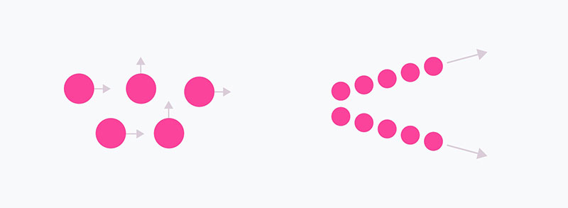
Diving into the Principle of Common Fate, it’s like the cool, underrated band member of the Gestalt principles of design family.
This principle is all about movement and direction. It says elements moving in the same direction are perceived as related. Imagine leaves floating down a stream, all going the same way – that’s common fate in action.
In digital design, this principle shines when creating dynamic content. Think animations or interactive elements on a website.
When stuff moves together, it feels like a coordinated dance. This principle isn’t just about making things move; it’s about creating a sense of unity and direction. It’s about guiding the user’s eye and attention in a smooth, cohesive flow.
Principle of Focal Points

Now, let’s talk about the Principle of Focal Points. This principle is the spotlight of the Gestalt principles of design show.
It’s about creating a center of attention, the star of the stage. Elements that stand out due to size, color, or texture become the focal points. It’s like when you walk into a room, and a bright red painting catches your eye immediately.
In web and graphic design, this principle is key in highlighting important info. It’s not just about what’s big or bold; it’s about what grabs attention and keeps it.
Focal points guide the user’s journey through the content, making sure they don’t miss the important stuff. It’s about making the important things pop and the rest complement.
Principle of Past Experience
Lastly, the Principle of Past Experience is like the wise sage of the Gestalt principles of design. It’s all about how our past experiences influence what we see and understand.
This principle says that we perceive things based on what we’ve seen or known before. It’s like when you see a green and red light, and you think ‘go’ and ‘stop’ without even realizing it.
In design, this principle plays a massive role in user expectations. It’s about tapping into familiar patterns or layouts so users feel right at home.
It’s not about reinventing the wheel; it’s about using what works to create comfortable, intuitive experiences. It’s about speaking the user’s language before they even know they’re listening.
Application of Gestalt Principles in Design
Web and UI Design

When we talk about Gestalt principles of design, web and UI design is where they truly shine. It’s like having a secret toolkit to make websites and apps not just look good, but feel intuitive. These principles are the unsung heroes behind those sleek, user-friendly sites that we love to browse.
Using Gestalt principles, we create interfaces that guide users naturally. It’s about using visual cues to lead them right where they need to go.
Think of a website where everything just flows – that’s Gestalt in action. It’s more than just aesthetics; it’s about creating a seamless user experience, reducing cognitive load, and making digital interactions feel like second nature.
Logo and Brand Identity
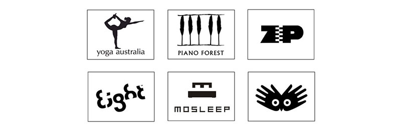

Now, let’s talk branding. In the world of logos and brand identity, Gestalt principles of design are like the magic wand that turns simple shapes and colors into memorable brands.
It’s all about creating a visual identity that sticks in people’s minds.
Using principles like closure and figure-ground, designers create logos that are simple yet profound.
It’s about crafting an image that tells a story, conveys a message, and resonates with the audience on a deeper level. It’s not just a logo; it’s an emblem of the brand’s identity, its ethos, and its promise to the consumer.
Advertising and Visual Communication
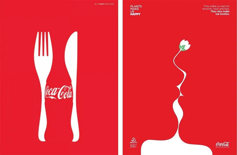

In advertising and visual communication, Gestalt principles of design are the key to catching and keeping attention.
It’s about using visual strategies to make an impact, convey a message, and leave a lasting impression.
These principles help in creating ads that are not just seen but remembered. It’s about tapping into the viewer’s perception, using visual tricks to create compelling and persuasive imagery.
Whether it’s a billboard, a social media ad, or a marketing brochure, Gestalt principles help in crafting messages that cut through the noise and speak directly to the audience.
FAQ On Gestalt Principles Of Design
What Are The Gestalt Principles?
Imagine your mind as an artist— not just scanning a scene—but weaving connections, crafting a coherent visual story.
Gestalt principles are like unwritten laws your mind follows, making sense of chaotic elements. These deep-seated rules help us create designs that flow, engaging our visual perception seamlessly.
How Do Gestalt Principles Improve Design?
Gestalt’s toolkit is your secret sauce to user experience design. Use these tricks, and watch your creations “click” for folks.
They’re not just pretty pictures; they communicate—loudly, clearly. Think about how grouping elements can suggest organization, or how similarity can unify disparate bits.
Can You Break Down the Principle of Proximity?
Here’s the lowdown—proximity is our visual cue for relatedness. Place elements close together, and bam, viewers’ brains bunch them into one group.
It’s a silent whisper in our minds saying, “Hey, these bits, they’re a family.” It’s all about crafting that visual hierarchy with ease.
What’s the Deal with Gestalt and Figure-Ground?
Picture a face/vase illusion. Now, your mind’s doing the tango—front? Back? Which is which? That’s figure-ground at play.
It teases out elements in focus from the blurry backdrop, making designs pop. It’s a visual Gestalt game of peekaboo, revealing what ought to stand out.
How Does the Principle of Continuity Guide the Eye?
Continuity is our perception’s dance—it glides our gaze along curves, jumps, and lines. Your design? It’s a story.
This principle keeps eyes moving along the plotline, from start to finish, no detours. It’s about leading the viewer smoothly—a visual cognitive perception tour guide.
What’s the Role of Closure in Design?
Trust me, our noggins love solving puzzles. Closure? It’s that satisfying click of pieces fitting together.
Design with gaps, and watch people’s brains race to complete the picture. It’s what turns the abstract into a holistic design approach—making incomplete stuff feel… whole.
How Does Symmetry Factor into Gestalt Principles?
Symmetry? It’s visual comfort food. Adds balance, stability to any design. It’s that pleasing harmony in design—a mirror that doubles the delight.
Symmetry leverages our love for order, making designs feel structured, and trustworthy. It’s a silent reassurance that whispers, “All’s right here.”
How Are Gestalt Principles Used in Web Design?
Surf any slick website; it’s a Gestalt playground. User experience design gobbling up these principles left, right, and center. Aligning elements? Grouping related content? It’s all about intuitive spatial relationships in design. Nailing this means users navigate with ease, almost instinctively, through your digital realm.
How Do Gestalt Principles Relate to Human Psychology?
Rooted in behavioral psychology, these principles clue us into our own heads. Gestalt’s not just about pretty pictures—it’s about tapping into universal cognitive perceptions. Design with Gestalt, and you’re whispering straight to the subconscious, in a lingo all brains speak fluently.
How Can Learning About Gestalt Principles Benefit a Designer?
Soak these in, and you’re not just another designer; you’re a psychology-savvy visual chef. Whip up designs that talk the brain’s language, gaining nods from users and peers alike. It’s that leap from creating visuals to crafting experiences that stick. It’s a cognitive load easer, making your work innately graspable.
Conclusion
Wrapping up our deep dive into the Gestalt principles of design, these aren’t just clinical rules. Far from it. They are the essence of our visual perception—hardwired into our cognitive circuitry. As if our brains had in-built graphic design software, finessed over eons, just awaiting our use.
We’ve journeyed through the cognitive landscape, teasing out the proximity and continuity that glue our visual world together.
We’ve played with closure, toying with the brain’s love for solving visual riddles. Our designs have danced with symmetry and balanced on the tightrope of figure-ground differentiation.
- Visual hierarchy? Solidified.
- User experience? Revolutionized.
- Harmony and aesthetics? Achieved with finesse.
Adopting these principles goes beyond mere design—it’s nurturing a silent conversation with the viewer’s subconscious, saying, “this feels right.” Harness these principles, and watch designs morph from the mundane to the magnetic. That’s the power we wield; that’s the Gestalt magic.
If you liked this article about Gestalt principles of design, you should check out this article about what is color theory.
There are also similar articles discussing visual hierarchy, Swiss design, graphic design movements, and Bauhaus graphic design.
And let’s not forget about articles on Brutalist graphic design, postmodern graphic design, grid systems in graphic design, and the golden ratio in design.