


Imagine a world painted with geometric shapes, where minimalist aesthetics and vibrant primary colors collide to create something truly timeless. That’s the essence of Bauhaus graphic design, a movement that revolutionized our visual landscape and continues to inspire modernism in design to this day.
Here, we’ll dive deep into the Bauhaus’s influential philosophies and their enduring impact on typography, industrial design, and beyond.
Expect to unravel the fabric of design education through the lens of the iconic Bauhaus school, appreciating how a blend of abstract art and functionalism birthed a legacy that shapes the contours of our digital world.
By article’s end, gain invaluable insights that could transform your visual acumen and design prowess, whether you’re crafting graphic posters or architecting user interfaces.
Ready to explore how the visionaries like Walter Gropius and Johannes Itten forged a radical approach in art school, birthing innovative designers and a universally revered design manifesto? Let’s decode the Bauhaus code together.
What is Bauhaus Design?
Bauhaus Design is a revolutionary movement born in 1919, marked by a blend of fine arts with industrial craftsmanship. It emphasizes functionality, simplicity, and geometric clarity in design, rejecting unnecessary flourishes to focus on unifying art and technology, which profoundly influenced modern architecture and design.
Key Characteristics of Bauhaus Design
Design Elements
Geometric Shapes and Streamlined Design
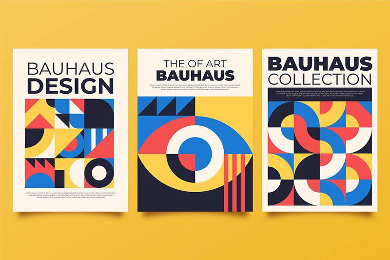

Let’s start with the shapes. Ever noticed how some designs just feel right? That’s probably the Bauhaus influence. It’s all about clean, geometric shapes.
Think squares, circles, triangles – you name it. These shapes weren’t just for show; they had a purpose. The idea was to create something functional yet beautiful.
Now, about the streamlined design – it’s like the minimalist vibe you see in modern websites. Bauhaus was all about cutting the clutter.
No fancy frills, just the essentials, but making those essentials look amazing.
Simple Color Schemes and Minimalism
Color schemes in Bauhaus graphic design were straightforward yet bold. Primary colors like red, blue, and yellow were big hits.
They weren’t just splashes of color; they communicated ideas, emotions. Minimalism? It’s like that clean, uncluttered look of your favorite app.
Material and Composition
Use of Industrial Materials
This part is cool. Bauhaus loved experimenting with industrial materials. Think steel, glass, concrete.
These weren’t just building materials; they were a way to bridge the gap between art and technology. In graphic design, this translated into a preference for simplicity and functionality.
Focus on Functionality and Utility
Functionality was the heart of Bauhaus graphic design. Every element in a design had to have a purpose.
It’s like the user-friendly interface of a website. If it doesn’t help the user, it doesn’t belong there. Utility over decoration – that was the Bauhaus motto.
Bauhaus Design Principles
Fundamental Concepts
Integration of Art and Industry
So, here’s the scoop on Bauhaus graphic design: it’s not just about making things look cool. It’s a blend, a mash-up of art and industry.
Picture this: artists and industrialists, chilling and brainstorming. That was Bauhaus. They were all about breaking down the walls between art, craft, and industry.
It’s like when you see a super sleek phone or a laptop. They’re not just gadgets; they’re art pieces. That’s the Bauhaus vibe – where functionality meets creativity.
The Importance of Basic Design Principles
Now, let’s talk basics.
Bauhaus was big on the fundamentals – line, shape, color, texture. It’s like the ABCs of design.
They believed that mastering these basics was key to creating something extraordinary. Think about it. Even the most complex website starts with a simple sketch.
Educational Approach
Connection Between Theory and Practice
Alright, here’s something cool about the Bauhaus approach. They didn’t just stick to textbooks. Nope. It was all about getting your hands dirty.
They were big on workshops, where you’d actually create stuff while learning the theory.
It’s like learning to code by building a website. You get the theory, sure, but you also get the real-world experience. That’s how Bauhaus rolled.
Syllabus and Curriculum at the Bauhaus School
The syllabus at the Bauhaus School? It was revolutionary. They started with a preliminary course, kinda like a crash course in design basics.
Then, students would dive into specialized workshops – metalworking, carpentry, weaving, you name it.
It was all about exploring different materials and techniques. It’s similar to how we explore different tools and software in web design today.
Always experimenting, always learning.
Influential Figures of the Bauhaus Movement
Key Instructors and Their Contributions
Paul Klee and Color Theory

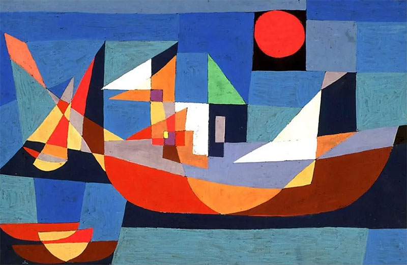
Picture this: Paul Klee, a master of color. In the world of Bauhaus graphic design, he’s like a wizard. His approach?
Think less about matching and more about feeling. Klee’s color theory wasn’t just about what looks good; it was about how colors interact, how they make you feel.
It’s like picking the perfect palette for a website, ensuring each color evokes the right emotion.
Josef Albers’ Material Studies

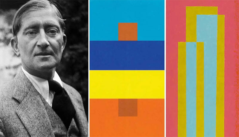
Then there’s Josef Albers. This guy was all about materials. He’d take something ordinary, like paper or glass, and turn it into a design masterpiece.
In Albers’ hands, materials spoke. His teachings? They’re like the guidelines we follow in web design for choosing the right elements to make a site not just look good, but feel right.
Wassily Kandinsky’s Form Theory

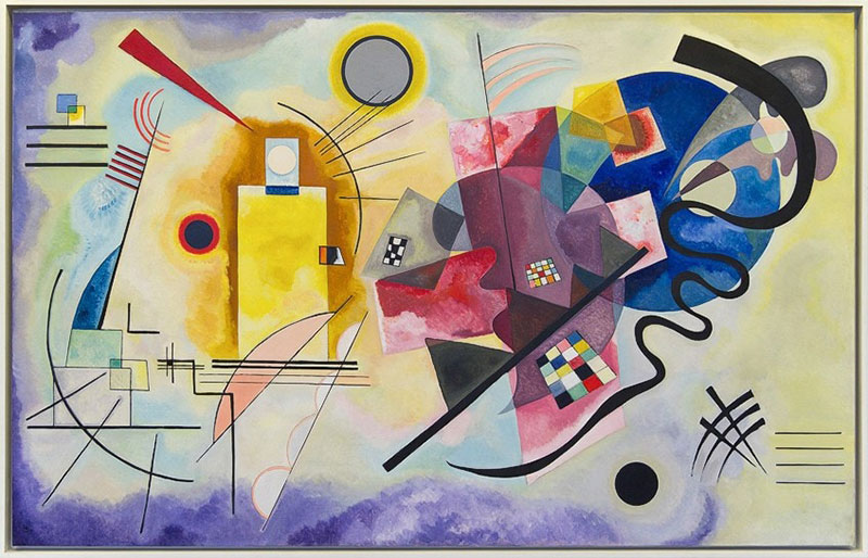
Wassily Kandinsky – ever heard of him? He was like the DJ of shapes in the Bauhaus graphic design scene.
His form theory was all about how shapes and lines can create a rhythm, a flow. It’s like designing a layout that guides the eye, making the user’s journey through a website smooth and intuitive.
László Moholy-Nagy’s Modern Expression
László Moholy-Nagy was the futurist among them. He pushed boundaries, blending technology and art.
Think of the most innovative website you know. That’s the kind of forward-thinking approach Moholy-Nagy brought to the table.
Herbert Bayer and Typography
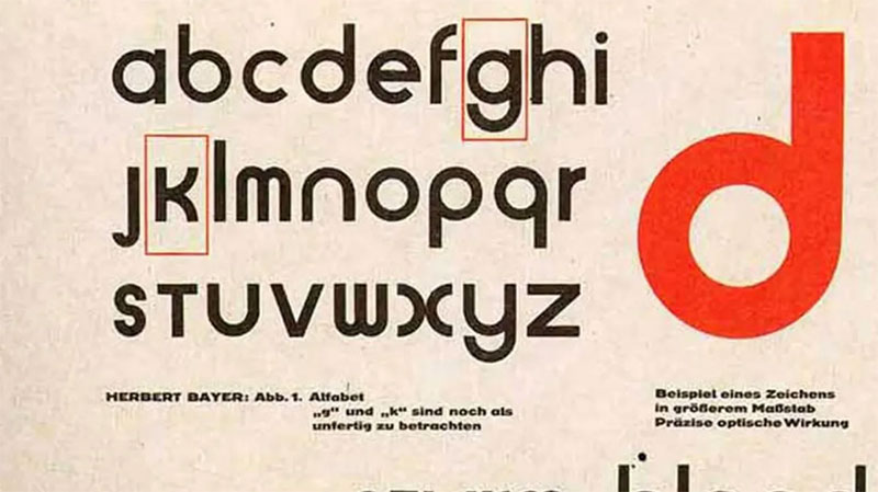

Herbert Bayer, the typography guru. In the Bauhaus world, he reimagined how we see letters and words.
He made typography not just readable but visually stunning. It’s like the font choice for a website – it’s not just about the words, it’s about how those words look and feel.
Legacy and Influence
Lasting Impact on Various Design Fields
The legacy of these giants? Huge. They shaped not just Bauhaus graphic design but the whole design world.
From architecture to furniture, and yes, to web design too. Their principles, their vision, it’s everywhere.
Blurring the Lines Between Art and Craft
And the most beautiful part – they blurred the lines between art and craft. Design wasn’t just about making things pretty; it was about making them meaningful, functional.
It’s like building a website that’s not just a site but an experience.
Bauhaus Influence on Modern Graphic Design
Modern Applications
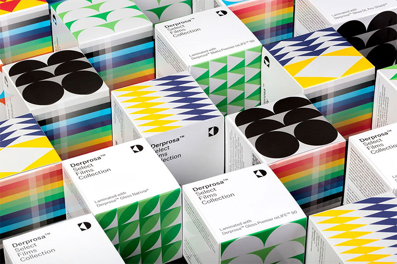
Branding, Packaging, and Web Design

So, let’s talk about how Bauhaus graphic design isn’t just a chapter in a history book. It’s alive, right here, right now.
Think about the last time you saw a super sleek logo or a website that just clicked. That’s Bauhaus in action.
In branding, it’s all about making a mark with minimalism. Simple logos, no-nonsense color schemes.
And packaging?
It’s not just a box or a bag; it’s a statement. Bauhaus taught us that less is more, and this principle is gold in today’s crowded markets.
Now, web design – that’s where Bauhaus really plays out. Clean lines, functional layouts, user-friendly interfaces.
It’s not just about looking good; it’s about making sense. It’s about creating a digital space where users feel right.
Social Media and Digital Design

And hey, let’s not forget social media. Those crisp, minimalistic posts you love? Bauhaus vibes, right there.
Digital design has taken Bauhaus principles and run with them. It’s about communicating a lot with a little – a picture, a few words, and boom, the message hits home.
Bauhaus in Contemporary Projects
Integration in Modern Brands and Agencies
Look around – Bauhaus graphic design is everywhere. From startups to big-time brands, Bauhaus is like the secret sauce.
It’s in the typography of a headline, the layout of a brochure, the architecture of a website.
Many modern agencies owe a nod to Bauhaus. They mix art, technology, and simplicity to create stuff that’s not just visually appealing but also functionally brilliant.
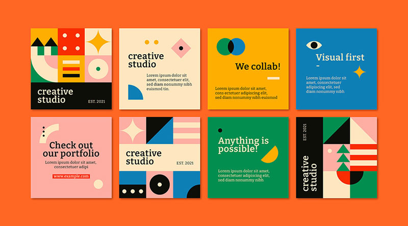
Bauhaus Elements in Current Design Trends
And it’s not just about mimicry. It’s about evolution. Today’s designers take Bauhaus elements – the geometric shapes, the bold colors, the emphasis on functionality – and remix them.
They blend these with modern trends, technologies, and materials.
It’s like Bauhaus 2.0 – the same foundational principles but adapted for the digital age. Where technology meets art, where function meets form, where the past meets the future.
FAQ On Bauhaus Graphic Design
Who were the main figures in the Bauhaus design movement?
People often chat about folks like Wassily Kandinsky, Paul Klee, and László Moholy-Nagy.
They were real pioneers, you know, pushing boundaries by combining crafts and fine arts to shape this whole new modernist design thinking.
How did Bauhaus influence modern graphic design?
Big time! Bauhaus shook up the scene with its sans-serif typography and clean visual composition.
It’s like an invisible thread woven into the fabric of modern architecture and design. Much of what we consider minimalist aesthetics today? That’s pure Bauhaus legacy – sticking to basics but making it bold.
What are the key principles of Bauhaus design?
Well, it’s all about function over form – making things simple yet striking. Bauhaus design champions typographic clarity, unity of form, and a practical approach where industrial fabrication meets sheer artistry.
Think rationality and geometric elements in perfect synergy.
Can you give an example of Bauhaus graphic design work?
For sure! Take a look at Herbert Bayer’s typography designs or marketing materials for the Bauhaus school itself.
Clear, clutter-free, and aimed to communicate fast – that is, without all that ornamental fluff. Almost like the visual equivalent of a clean, crisp morning breeze.
What was the social and cultural impact of the Bauhaus movement?
Bauhaus broke down barriers between artists and artisans, crafting a new cultural ethos around industrial design. It was more than pretty pictures; it was about shaping a society that values artistic innovation and applies it to everyday life.
Why did Bauhaus emphasize typography and geometric shapes?
Words and shapes are the bare-bones of visual communication, right? Bauhaus highlighted these elements to strip away excess and focus on functionalism.
It’s like the design equivalent of getting straight to the point but doing it with style.
How did Bauhaus designers approach color theory?
Color’s not just for kicks in Bauhaus; it’s about visual psychology. Bauhaus designers, like Kandinsky, they experimented with how colors can influence moods and messages.
It’s precise, with primary colors often leading the charge to evoke strong emotional responses.
What is the legacy of Bauhaus in today’s digital design?
Ever seen a sleek app interface? That’s Bauhaus for you. Its principles, like usability and minimalist aesthetics, practically drafted the playbook for modernist design in our digital world.
Just think about how you navigate your smartphone – Bauhaus fingerprints all over that.
How is the Bauhaus school of thought reflected in contemporary design education?
Today’s design education? It’s basically standing on the shoulders of the Bauhaus giants.
Schools are preaching that very same cross-disciplinary approach, blending practical skills with theory – designers coming out aren’t just artists, they’re problem-solvers, schooled in the art of functional beauty.
Conclusion
So, we’ve wrapped around the block, coming full circle back to where we kicked things off – right at the bold, brave heart of Bauhaus graphic design. It’s like we’ve been on this whirlwind tour, glimpsing at how the past shapes the now. And not just any past, but one where minimalist aesthetics, functionalism, and those geometric shapes crafted the mother of all design mashups.
- Clarity in the chaos of creativity
- Unity strapped tight with utility
- Colors popping – life into lines
That Bauhaus vibe, it’s like a handshake across time. Design today? It’s texting Bauhaus thanks on the daily. Digital interfaces, clever ad campaigns, the sleek swish of a page turn in an ebook – Bauhaus’s fingerprints, smudged all over them.
Consider this the mic drop moment where we realize: Bauhaus isn’t a whisper from history; it’s the very air that contemporary design breathes. Whenever you next spot a sans-serif headline or an industrial design that just makes sense, tip your hat to Bauhaus. It’s the enduring beat in the dynamo of modernist design.
If you liked this article about Bauhaus graphic design, you should check out this article about what is color theory.
There are also similar articles discussing visual hierarchy, Swiss design, graphic design movements, and Brutalist graphic design.
And let’s not forget about articles on postmodern graphic design, grid systems in graphic design, Gestalt principles of design, and the golden ratio in design.