

Ever stared at a jigsaw puzzle? All those pieces, waiting to click into place—grid systems in graphic design are just like that. Hidden beneath every eye-catching layout and streamlined interface is a grid, the unsung architect of order within creative chaos.
In a moment, you’re about to embark on a captivating exploration—fathoming the bones beneath the artistic flesh of design. Ever thought about why certain designs just feel right? It’s because they’re mapped out on an invisible grid, ensuring every element sings in perfect harmony.
We’ll journey together, dissecting the modular grids that empower text to breathe and images to pop. You’ll learn how to wield the might of baseline grids and why a typography grid can elevate your work from mundane to magnificent.
And it’s not just about rules and alignment; it’s about crafting a silent rhythm that resonates with every visitor you host in this digital space we call the internet.
Prepare to intertwine function with beauty, as we unravel the secrets that grid systems hold.
Types of Grid Systems
Rule of Thirds

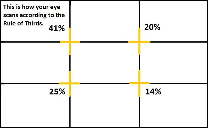
Ever seen a design and thought, “Wow, this just looks right“? That’s often the Rule of Thirds at work. It’s like the secret sauce in grid systems in graphic design.
Picture your canvas – whether it’s a screen or a page – divided into nine equal parts by two horizontal and two vertical lines.
The magic happens when you place the key elements of your design along these lines or their intersections.
Why does this matter? It’s all about natural balance and visual appeal. This technique isn’t just random; it’s rooted in how our eyes naturally scan a page.
It’s used everywhere – from web layouts to your favorite photographs. It brings a sense of harmony that’s just pleasing to the eye.
Golden Section (Golden Ratio)

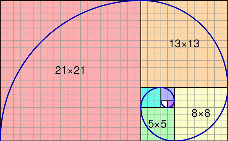
Here’s where math meets art. The Golden Section, or the Golden Ratio, has been around since, well, forever. Think of it as the DNA of good design.
This mathematical ratio (approximately 1:1.618) is found in nature, art, and architecture. It’s like a hidden rhythm that guides the aesthetics of your design.
Applying this to grid systems in graphic design is like having a secret weapon. It’s not just about making things look good; it’s about creating a natural flow that feels intuitive and right.
When you design according to the Golden Ratio, your work resonates with a certain unspoken elegance. This ratio is a fundamental element in creating layouts that feel both dynamic and serene.
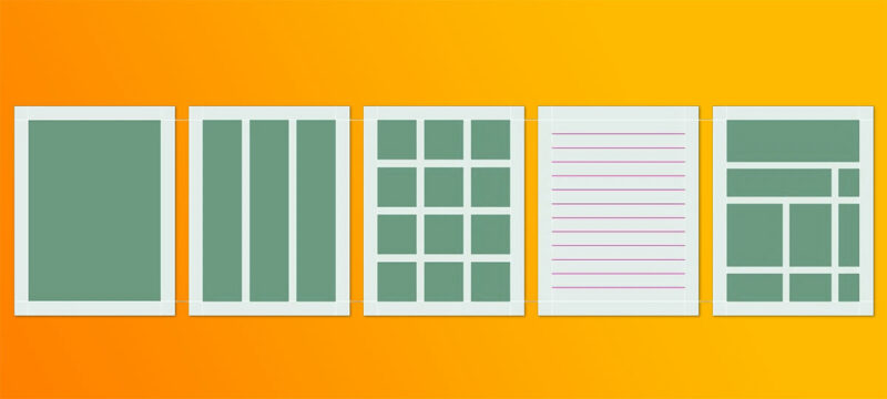
Single-Column Grid

Simplicity is key, and the Single-Column Grid is proof of that. In the world of grid systems in graphic design, this is your go-to for clear, straightforward communication.
Think of a classic novel or your favorite blog. That’s the single-column grid in action.
It’s a powerhouse in delivering content without distractions. With a single column, you guide your reader’s eye in a straight, undeviating line.
This is particularly effective in contexts like books or lengthy articles, where uninterrupted reading is the goal. It’s about giving your content the stage it deserves, without the frills.
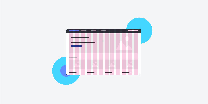
Multi-Column Grid
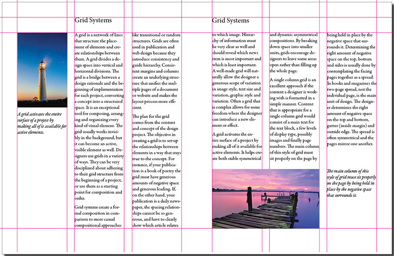

Imagine opening a magazine or a website and seeing everything perfectly aligned, like it’s meant to be there.
That’s the multi-column grid for you – a staple in grid systems in graphic design. It’s like the Swiss army knife for designers, super versatile and ready for anything.
Why is it so cool? It lets you play with complex layouts without making a mess. Picture columns of text, images, and ads all living together in harmony.
This grid is perfect for publications where you need to mix text with visuals. It’s like playing Tetris, but with design elements. You can create a rhythm that guides the reader’s eye across the page, making the experience both enjoyable and efficient.
Modular Grid
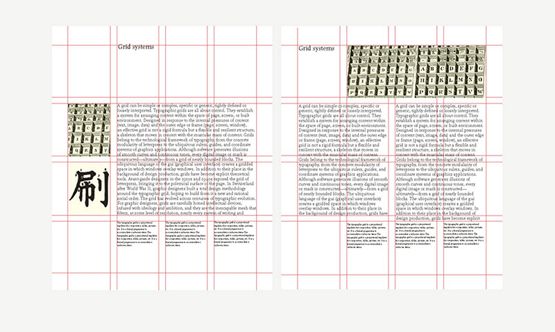

Now, let’s talk about the modular grid. Think of it as a checkerboard. Each square is a module, and you can use these to organize all sorts of content.
It’s like having a map for your design; you know exactly where to put things.
Modular grids are awesome for projects that need a lot of structure but also demand flexibility. They’re like the building blocks of grid systems in graphic design.
You can create a layout that’s both cohesive and dynamic. It’s perfect for designing complex websites or interactive interfaces where user experience is key.
Baseline Grid

Ever noticed how in a well-designed article, all the text lines up perfectly across columns? That’s the baseline grid doing its magic.
It’s all about vertical rhythm and readability. Think of it as the rhythm guitarist in a band – not always in the spotlight but super important.
Baseline grids are crucial for text-heavy designs. They keep your lines of text in sync, making your content easier to read and visually appealing.
It’s like having a secret formula for making your text layouts look professional and polished.
Grid Systems in the 20th Century and Beyond
Avant-Garde Influences

Let’s time travel a bit, back to when grid systems in graphic design started getting really cool.
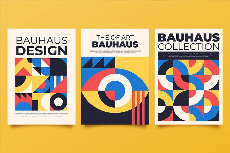
Picture this: early 20th century, a bunch of radical artists and designers are shaking things up. They’re part of what we call the Avant-Garde movement. Think Bauhaus, De Stijl – these guys were all about breaking norms and getting creative with design.
Their influence on grid systems? Huge. They started seeing the grid not just as a tool, but as an art form.
It’s like they were composing music but with shapes and lines. Design legends like Jan Tschichold and Josef Müller-Brockmann, they took these ideas and ran with them. They were like the rockstars of grid design, turning these concepts into masterpieces that still inspire designers today.
Digital Revolution and Grids

Fast forward a bit, and here comes the digital revolution. Computers enter the scene, and everything changes.
Graphic design software starts popping up, and suddenly, designing with grids isn’t just for the pros. It’s like everyone has the tools to be a designer now.
But here’s the kicker: with digital tools, grid systems in graphic design get a whole new playground. Designers start experimenting like crazy.
Grids become more flexible, more dynamic. We’re not just talking print anymore; we’re talking web design, UI layouts, all that cool stuff. It’s a game changer.
FAQ On Grid Systems In Graphic Design
What’s the deal with grid systems in graphic design?
Think of it as the secret sauce that brings order to chaos. Grids help arrange elements harmoniously on a page—whether it’s for web, apps, or print.
They’re not just about keeping things straight; they orchestrate a visual balance between all those design elements clamoring for attention.
How do grid systems aid with layout consistency?
Consistency is king in design, and grid systems are the throne it sits on.
They’re the framework—a repeatable pattern that makes sure everything from text to images aligns beautifully across pages. This kind of visual consistency is what makes a design feel professional and easy to digest.
Are grid systems really necessary in digital design?
Absolutely, try building a house without a blueprint. Grid systems are the blueprints for digital design.
They’re key for responsive design too, allowing content to flow seamlessly across different screen sizes. Without grids, designs can end up a haphazard mess rather than a polished product.
Can I be creative while using grid systems?
Sure thing! Grids are like the lines on the road—they guide but don’t limit where you can go. Think of them as a tool to enhance creativity, not hinder it.
They provide structure so you can innovate without turning your design into a wild goose chase for the eye.
What are the main types of grid systems?
You’ve got your single-column grids for simple layouts, then multicolumn for more complex ones.
Hierarchical grids mix it up for dynamic content. Don’t forget modular and baseline grids for detailed control—perfect for balancing text and media. Each has its place, its use, its moment to shine.
How do I choose the right grid for my project?
Eyeball your content first. Got lots of text and images? A multicolumn grid might do the trick. Just a few key images?
Modular grids could be your jam. Remember, the grid should serve your content, not the other way around. It’s about making the info easy on the eyes.
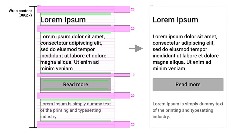
How do I make a grid responsive for all devices?
It’s like making a stretchy glove—it fits all hands. Start with a flexible grid system based on percentages, not pixels.
Consider your breakpoints—where the layout needs to change for different screen sizes. Then, let your content breathe. Test, tweak, and ensure that beauty remains at every turn and tap.
Can grid systems enhance the user experience?
Absolutely! They’re the unseen heroes that make websites intuitive to navigate. Good grid design leads the eye smoothly, making even complex information accessible. It’s all about that invisible guide rail that leads users exactly where you want them, without them even noticing the guide.
Do print and digital grids differ?
Yep, they speak the same language but with different accents. Print grids are static—the size is set. But digital grids? They shift and adapt.
Think of print grids as a photograph, digital as a video. One captures a moment, the other evolves with the viewer’s perspective.
What are the most common mistakes when using grids?
Overthinking it or not thinking enough. Ignoring margins and gutters can leave your design gasping for air. Being too rigid can kill creativity. Remember, breaks from the grid should be intentional, not accidental. Balance, proportion, rhythm—it’s a delicate dance that can quickly step on its own toes if not careful.
Conclusion
Diving headfirst into the grid, we’ve untangled the interplay of lines and intersections that map the landscapes of visuals and content. It’s like uncovering the secret passages that lead to aesthetic balance and user-centric harmony.
The journey’s shown us that grid systems in graphic design are far more than rigid confines—they’re the foundations of creative freedom.
So, we’ve danced around modular grids, flirted with golden ratios, and tweaked our margins and gutters to frame our masterpieces just right. We’ve stretched our responsive grids to embrace a multitude of screens and devices.
Every typography, spacer, and image—carefully plotted in this invisible scaffold—promises to guide the observer’s eye with certainty and subtlety.
This exploration is an invitation—a call to recognize the grid’s power to elevate designs, to speak in visual syntax that’s both fluent and bold.
Grasping the grid’s secret handshake opens up a world where every pixel, every whitespace, every user interface element, plays its part with precision. Here’s to creating with purpose, designing with clarity, and crafting experiences that stick.
If you liked this article about grid systems in graphic design, you should check out this article about what is color theory.
There are also similar articles discussing visual hierarchy, Swiss design, graphic design movements, and Bauhaus graphic design.
And let’s not forget about articles on Brutalist graphic design, postmodern graphic design, Gestalt principles of design, and the golden ratio in design.