


Ever caught yourself staring at a website, utterly captivated but can’t pinpoint why? It’s not magic; it’s the power of visual hierarchy at play, steering your focus effortlessly across the screen. Art, but not just for art’s sake – this principle taps into our cognitive wiring, turning visual chaos into cohesive narratives.
Within these lines, a journey awaits. We’ll decode the subconscious signals that rocket-launch engagement and user retention skywards.
Expect to unravel the tapestry of layout, typography, and color contrast, each thread woven with intent to guide the eye.
By article’s end, a toolkit of design principles – once shrouded in mystery – will stand demystified.
We venture beyond mere appearance into the psychology of visual cues and their hefty role in user experience.
Dive into the architecture of seeing: information hierarchy remodeled. From fleeting glances to meaningful interactions, ready to sculpt digital experiences with the finesse of a UX maestro.
What is Visual Hierarchy?
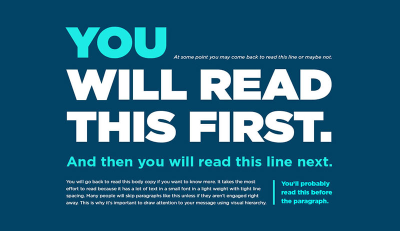
Visual hierarchy is the design principle that organizes elements in a way that reflects their relative significance. By manipulating size, color, contrast, and placement, it guides the viewer’s attention through a piece of content, ensuring key messages are absorbed quickly and efficiently. It’s essential for clear, effective communication.
Theoretical Foundations
Gestalt Psychological Theory
Imagine this: you’re looking at a bunch of dots on a screen, but somehow, your brain sees a shape, a pattern.
That’s the Gestalt Psychological Theory at work. It’s all about how our minds piece together visual elements to form a cohesive whole. In the realm of visual hierarchy, this theory is a cornerstone.
The brain’s organizing tendencies in visual perception play a huge role. We don’t just see things; we see patterns and relationships.
This is where visual hierarchy wields its power. By arranging elements in a certain way, designers can guide your eye to what’s important.
Think of it like visual storytelling. Each element on a page – from a bold title to a subtle background – contributes to this narrative.
Then, there’s the Von Restorff effect. Ever noticed how one brightly colored button on a website immediately draws your attention?
That’s the Von Restorff effect in action. It tells us that items which stand out are more likely to be remembered.
In visual hierarchy, using contrasting colors, different sizes, or unique shapes makes key information pop.
Principles of Visual Hierarchy
Size and Scale

Let’s talk about size, but not just any size. We’re diving into how size matters in visual hierarchy. It’s like being at a concert; the main act is front and center, unmissable, right?
That’s what size does in design. Bigger elements grab attention first, they’re the headliners on your webpage.
This is the impact of size on visibility and emphasis. A giant headline, a large image, these are your attention-grabbers.
But wait, there’s more. It’s not just about being big.
The concept of scale in relation to other elements is about balance. Imagine a giant tree next to a small bush.
Your eye knows instantly which is more important, right? That’s scale doing its thing. It’s about making sure everything on your page has a size that tells its story, its importance.
Perspective and Depth

Ever felt like you could walk into a painting? That’s perspective and depth doing their magic. In visual hierarchy, this is about giving your designs a sense of the real world.
Creating illusions of depth through perspective means playing with shadows, layering, maybe even some 3D effects.
It’s about tricking the eye into seeing more than just a flat screen.
And how about making things look like they’re in the right place? Use of scale and proportion in perspective helps here.
It’s like setting a table; you want everything in the right spot for the right impact.
This is where you play with different sizes to create a visual journey, leading the viewer’s eye from point A to B seamlessly.
Color and Contrast

Alright, let’s add some color to this conversation. Color and contrast in visual hierarchy are like spices in cooking; they can completely change the flavor.
Bright colors, stark contrasts, they’re your tools to highlight what’s important. They’re like visual exclamation marks.
But it’s not just about being loud. Color schemes and their impact on design coherence is about harmony.
Like a well-coordinated outfit, colors in your design should complement each other, creating a unified look.
This helps in making your design not just visually appealing but also coherent and easy on the eyes.
Typography and Fonts

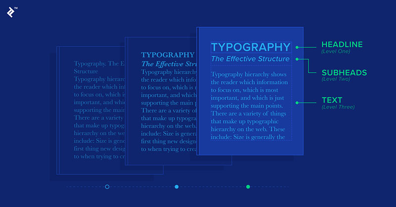
Last but certainly not least, let’s talk type. Typography and fonts are your voice in design. They can shout, whisper, and everything in between.
Organizing content with varied fonts and sizes is like choosing the right tone of voice for the right occasion.
It’s about making sure your message gets across not just through words, but how those words look.
Design Elements Influencing Visual Hierarchy
Space and Emphasis

When it comes to visual hierarchy, space is like the silent hero. It’s all about utilizing negative space for emphasis.
Think of a crowded room versus an open field; in which scenario does a single tree stand out more? Exactly, in the open field. That’s the power of space in design.
It’s about giving your elements room to breathe, making the important stuff pop.
And then there’s the Rule of Space in design composition. It’s not just about leaving blank areas; it’s about using that space smartly.
It’s like setting up a stage; where you leave space can guide the eye, create balance, and tell a story, all without saying a word.
Proximity and Relationships

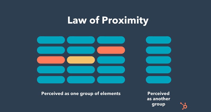
Ever notice how things that are close together seem related? That’s proximity working its magic in visual hierarchy.
Grouping elements to suggest connections is a subtle but powerful way to tell your viewer, “Hey, these things go together.”
It’s like seeing a bunch of musicians close together; you instantly know they’re a band.
Use of proximity in map design and user interfaces is a great example.
It’s about placing related items near each other to suggest a relationship, like putting all the navigation buttons in one area.
It helps the user make sense of the information quickly and intuitively.
Alignment and Structure

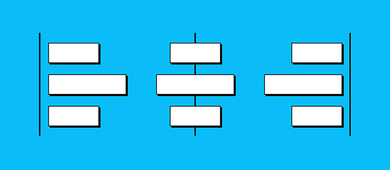
Alignment is like the unsung hero of visual hierarchy. Directing the viewer’s eye through alignment means lining up your elements in a way that’s pleasing to the eye and makes logical sense.
It’s like reading a well-organized book; everything flows naturally from one thing to the next.
The importance of alignment in F-pattern and Z-pattern designs can’t be overstated.
These patterns mimic the natural reading habits of the eye in different cultures. Using them wisely means you’re guiding your viewer’s gaze through your content in a natural, comfortable way.
Repetition and Unity
Repetition in design is like the chorus in your favorite song. It’s familiar, it brings everything together, and it’s satisfying.
Using repetition to create a unified composition is about bringing harmony to your design. It’s like having a recurring theme or color that ties everything together.
Advanced Techniques in Visual Hierarchy
Odd-Numbered Grouping
Ever noticed how things grouped in threes or fives just feel more appealing? That’s where The Rule of Odds in emphasizing key elements kicks in.
It’s a nifty trick in visual hierarchy that makes your design more dynamic and naturally attractive.
It’s like when you’re plating food; arranging in odd numbers just looks better. This technique catches the eye and makes your design feel more organic.
Lines and Movement
Now, let’s talk about lines. They’re like the roads of your design, guiding the viewer’s eye.
Suggesting motion and direction with lines is a powerful way to control how someone looks at your design.
It’s like a visual journey, where lines lead you from one element to the next. Straight lines, curvy lines, zig-zag lines – each tells a different story and guides the eye differently.
Grid Systems

Grids are the backbone of solid design. Think of them like the invisible lines that hold everything in place.
Organizing designs with various grid types helps in structurally organizing the elements, making sure everything is tidy and aligned.
It’s like using a ruler to draw; it keeps things straight and in order.
Application of Visual Hierarchy
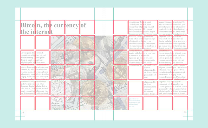
In Graphic Design

Think of visual hierarchy as the secret sauce in graphic design. It’s all about guiding the eye in graphic compositions. Imagine you’re creating a poster.
The first thing you want people to see is the main message, right? That’s where you play with size, color, and contrast to make it stand out.
It’s like making sure the headline of a newspaper is the first thing you read.
But there’s more. Visual hierarchy in graphic design isn’t just about grabbing attention; it’s about keeping it.
It’s like telling a story where each element leads to the next, creating a smooth, enjoyable experience.
This includes playing with typography, using grid systems, and balancing space and emphasis.
In Cartography


Maps are a perfect example of visual hierarchy at play. Here, it’s about emphasizing features on maps.
You want the most important things, like major cities or rivers, to stand out. This could mean making them larger, bolder, or a different color.
But visual hierarchy in maps goes deeper. It’s about matching visual hierarchy with conceptual hierarchy.
This means the most important information is the most visible. It’s not just about what’s big and bold; it’s about what’s relevant.
Like in a city map, bus routes might be more prominent than minor streets, guiding the viewer’s understanding of the city’s layout.
In User Experience and Web Design

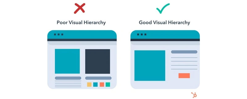
Ah, the digital realm. Here, visual hierarchy is king. Prioritizing navigational structures and content is crucial.
It’s about making sure users find what they need without getting lost or overwhelmed.
Think of a website menu; it should be easy to find and use, leading users exactly where they want to go.
Testing and Refining Visual Hierarchy
Methods for Testing Effectiveness
So, you’ve designed something, and it looks cool, but how do you know it’s really working? Testing, my friends.
It’s like cooking; you gotta taste it to know if it needs more salt.
In design, there are a few neat ways to test the effectiveness of your visual hierarchy.
First up, the squint test. Sounds funny, but it’s super simple and effective. Just squint at your design. What stands out? What fades into the background?
This test helps you quickly see if your main elements are catching the eye. It’s like a reality check for your design.
Then, there’s the blur test. Similar vibe to squinting, but here, you literally blur your design. There are tools for this, or you can just take off your glasses if you’re short-sighted like me.
The idea is to see what pops when the details get fuzzy. It’s all about making sure your key elements are still noticeable even without the finer details.
FAQ On Visual Hierarchy
Why Does Visual Hierarchy Matter in Design?
Imagine a crowd, all shouting for your glance. Visual hierarchy is the megaphone that amplifies the crucial bits. It’s key because without it, users drown in information overload.
Good design isn’t just seen; it’s understood, and hierarchy makes sure of that, leading eyes like a tour guide through content prioritization.
How Do You Create Visual Hierarchy?
Start with the end in mind. What’s the takeaway? Let that guide your use of size, color, spacing—the tools of the trade.
Think of them like instruments in a band, each adding a unique layer to the melody, from typography to color contrast, all syncing up to direct the user’s journey.
Can Visual Hierarchy Impact User Experience?
Absolutely. It’s like airflow in architecture; invisible, yet critical. User experience hinges on navigation, clarity, and emphasis—all offspring of hierarchy.
It’s the unseen hand guiding users comfortably from A to B, turning user interface design into a rhythmic dance rather than a chaotic stumble.
How Does Color Influence Visual Hierarchy?
Color’s the emotion in the art, the tone in the voice. It can shout or whisper, and where it’s placed can make or break the hierarchy.
It speaks in volume and mood, using color contrast to set apart or blend in, sparking interest or signaling action with its hue’s command.
What Role Does Typography Play in Visual Hierarchy?
Typography is the suit and tie of text—it presents your words with a certain gravity.
Large fonts are the billboards of the page, small ones the fine print. Toying with typefaces, weight, and spacing, designers can nudge your attention or shout directions, steering that precious focus.
Is White Space Important in Visual Hierarchy?
White space isn’t merely empty; it’s the canvas of possibility. In visual hierarchy, it’s the breath between paragraphs, the rest between notes playing a crucial role.
It stops content from yelling over itself, providing a visual rest, a moment of clarity amid the clutter.
How Can Visual Hierarchy Be Implemented in Web Design?
Think of web design as a stage—with hierarchy as the spotlight. Headers grab you; navigation design subtly cues you where to go next.
Visual hierarchy here is a careful mix of responsive design elements, orchestrated with breakpoints, multimedia integration, and a purposeful grid system.
What’s the Connection Between Visual Hierarchy and Branding?
Visual hierarchy doesn’t just guide—it also defines. It aligns with branding consistency, shaping how a brand is perceived.
Big, bold, and brash? Soft, subtle, and sensible? How you stack visual elements crafts your brand’s visual story, carving its niche in the mental shelf.
How Do You Test the Effectiveness of Visual Hierarchy?
Testing is more exploration than quiz. Heat maps, eye tracking, and A/B testing whisper the truths of user engagement.
They show where eyes linger, where fingers falter. Testing peels back the curtain on whether your visual hierarchy is hitting the mark or needs tuning to achieve that harmonious user flow.
Conclusion
So we’ve journeyed through the terrain of visual hierarchy, uncovering its pivotal role in design. Take a moment. Let’s wrap our minds around the essence here:
- It’s about crafting the silent conductor that orchestrates a user’s eyes across the digital stage.
- We’ve delved into methods that ensure typography doesn’t just speak but sings to the rhythm of user needs.
- Explored the symphony created by color contrast, and the strategic pauses offered by white spaces that aren’t just gaps but breathing points for the eyes.
Clarity came not just through understanding but mastering the art of directing focus, of crafting paths that users follow instinctively—like a river effortlessly winding to the sea. Leveraging layout, proximity, and alignment we’ve given our content a voice that doesn’t shout but resonates, ensuring the core message lands not just loudly, but clearly and memorably.
Armed with this knowledge, go forth and mold experiences that don’t just capture attention but command it, leaving users not just satisfied but enchanted.
If you liked this article about visual hierarchy, you should check out this article about what is color theory.
There are also similar articles discussing Swiss design, graphic design movements, Bauhaus graphic design, and Brutalist graphic design.
And let’s not forget about articles on postmodern graphic design, grid systems in graphic design, Gestalt principles of design, and the golden ratio in design.