


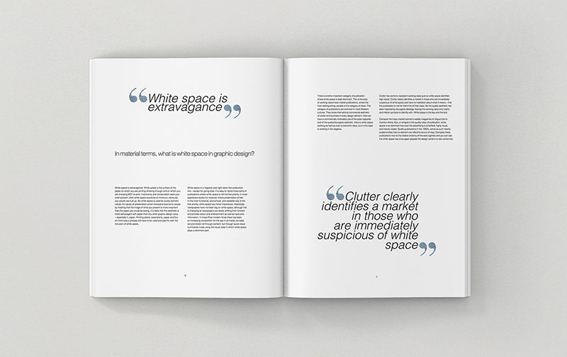
Ever stared at a painting and felt a sense of serenity just by noticing the unfilled corners? That sensation mirrors the punch that white space in design delivers. It’s the silence between the notes that makes a melody flourish.
Think of your favorite minimalist logo. It’s no accident it caught your eye. The power of unoccupied territory on a canvas – digital or otherwise – speaks louder than the busiest of graphics. White space, or as some like to call it, negative space, isn’t merely an absence; it’s a design element in its own right.
Here, we’ll untangle the role aesthetic spacing plays in crafting visual clarity within user interfaces. From page layouts to typography, it’s about orchestrating content and breathing life into a design, giving each element its due stage.
By article’s end, you’ll wield white space with finesse. You’ll know how to employ Gestalt principles and design harmony for optimal readability and user experience.
Ready for an unexpected journey? Let’s delve deep into design’s open secret – the might of the might-not-be-there.
Types of White Space
Active vs. Passive White Space

Imagine a room. In one corner, a potted plant—its vivid green leaves reaching outward—demands your gaze. The space around that plant?
That’s active white space in design. It’s got intention. Now, peek at the empty spot by the wall. It just kind of exists without much fuss, right?
Well, that’s your passive white space. It’s not screaming for attention, but it’s critical for a sense of balance.
- Active white space takes you on a visual journey. It frames your focus, leading you exactly where you should look next. Like the spacing between menu items on a website that says, “Hey, click me.”
- Passive white space? It’s the unsung hero. The padding around blocks of text or the margins bordering a website. It might not be loud, but without it, everything feels cramped.
Watch and see. Slap on a minimalist design vibe, throw in some whitespace voodoo, and bam—an interface that’s tidy and intuitively navigable.
Micro vs. Macro White Space

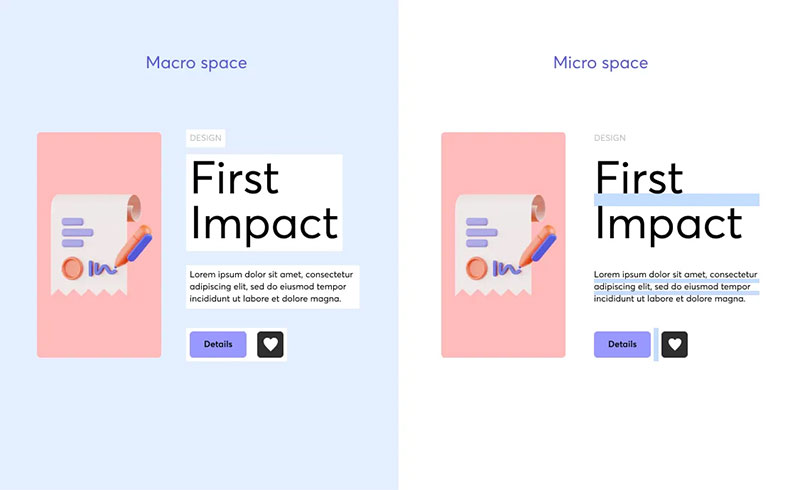
Now, let’s shift gears and talk about the cousins micro and macro white space. They may share a family name, but they operate in different realms.
- Micro white space, that’s all about the gaps between smaller elements. Think letters in a word, items in a list, or the padding around an icon. It’s subtle but tweaks the readability like a pro.
- Macro? That’s the big picture. Space between larger elements, like the distance from your headline to the content block beneath it, or the expansive padding on a landing page that gives a luxe feel.
Both kinds, my friend, contribute to the overall design harmony. They’re like salt and pepper—a little here, a tad there, and you’ve got yourself a dish with layers of flavor that sing. Dialing in the right balance between micro and macro spaces can transform a decent layout into a visual symphony.
Importance of White Space in Design
Structuring Content

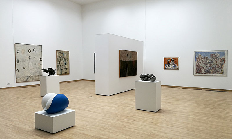
Peek at a gallery wall. Notice how the space around each piece of art makes you appreciate each one more? It’s like that with white space in design too.
Here’s the deal: white space isn’t just about what it’s not; it’s about what it enables. It arranges our stuff—images, buttons, texts—so everything feels like it’s got a comfy home.
No squishing. No squashing.
It’s the difference between a space that makes sense and one that’s just a hot mess. And that’s a big deal in the user interface domain, where making users play a guessing game is a no-no.
- Gotta love how white space sets up a clean, logical flow—turns out, brains dig that. It breaks down info into chunks so users can breeze through without breaking a sweat.
Enhancing Readability and Legibility

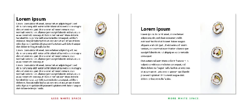
It’s lit when text is a cinch to scan. That’s white space working its backstage magic.
Dropping ample space around words and lines is like giving your text a chill pill—it relaxes, opens up, becomes approachable. No one likes grappling with a text brick wall, right?
- Whitespace isn’t being shy—it’s strategic. More room around your words, and boom, they stick. They’re understood. Honestly, that’s pretty boss when you want folks to actually get what you’re saying.
Increasing User Interaction
So, you’ve got this brilliant button or a call to action that’s just dying for a click. White space in design? That’s your wingman, setting the stage.
By paring back the clutter, white space whispers to users, “Hey, this way.” It’s low-key but persuasive, turning visitors into participants on the regular.
- Think storefront window, but online. White space clears the glass, lending the goods inside—the stuff that matters—your undivided attention.
Drawing Focus on Important Elements

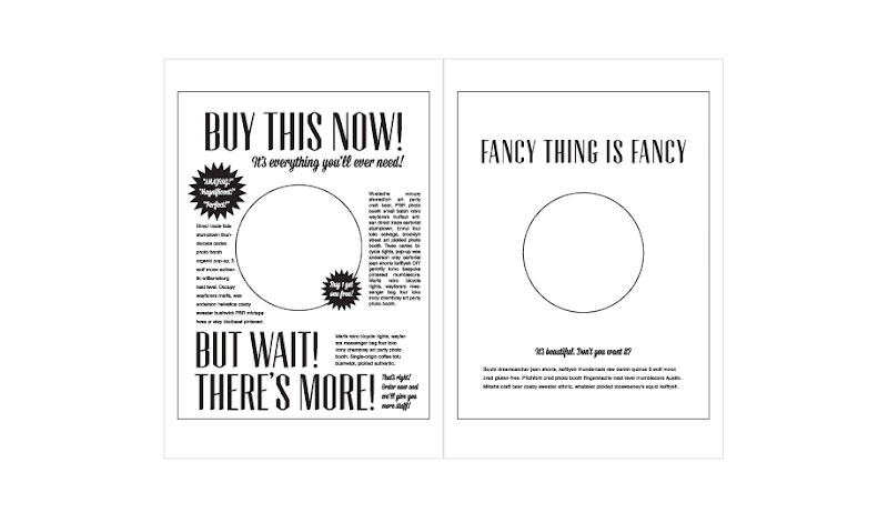
White space is stealthy. Want to scream without raising your voice? That’s white space.
It zones in on what’s key—like that “Buy Now” button or your killer headline—and it does that by playing the quiet game. Design elements with space to breathe get the spotlight, no squabbling for attention needed.
- Boom, where there’s white space, eyes follow. It’s your content going full Jedi mind trick, guiding the gaze like it’s on rails.
Promoting Balance and Visual Order
Ever walked into a room where everything just feels right? White space in design is that feeling’s virtual twin.
It deals in calm, in cool collectedness—like a visual sorbet that cleanses the eye palate. It’s about that harmony that makes users stay because, well, it just feels good.
- White space isn’t lounging—it’s out there getting stuff done. It’s nudging your design into a place that’s got rhythm, where elements aren’t stepping on each other’s toes, and your message comes through crystal.
Best Practices for Applying White Space in Designs
Considerations for Effective Use
When you’re juggling white space in design, it’s like mixing a killer track—too much bass and you’ll drown out the vocals.
But hit that sweet spot, and the crowd goes wild. It’s about feeling the rhythm of your visuals and knowing when to give ’em space to take a breath.
Visual Hierarchy and Its Significance
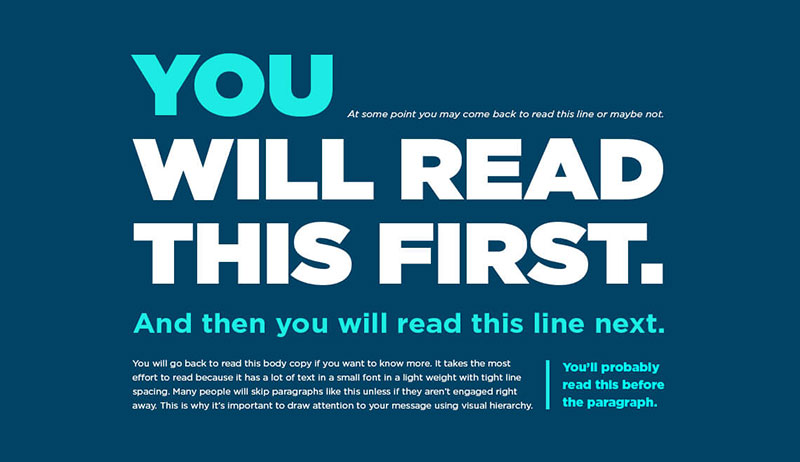
Here’s the low-down: visual hierarchy is the boss; it tells your eyeballs where the party’s at. You want to lead your viewer on a journey, right?
White space is your trusty guide. It emphasizes the headliners, like your main message, while giving the opening act—those small details—a chance to shine in their own time.
Proper Text Formatting Techniques
Ever squint at a phone screen trying to read a teeny-tiny text? Not cool. That’s why nailing text formatting is like acing the first impression.
We’re doling out enough white space to let those letters stretch out. Line height, letter spacing—you tweak those, and reading becomes a walk in the park instead of a maze run.
Logical Grouping of Objects and Content
Craft your content like you’d set a dinner table—everything in its place. Grouping with purpose, using white space as borders, organizes your plate—er, page.
It’s inviting users to dig in without fretting over where the next bite is.
Designing with User Experience in Mind
Now, imagine walking through a gallery where every piece begs for your attention. Overwhelming, right? Same with screens.
This is where user experience steps in. It says, “Let’s make this a space folks want to hang out in.” That means enough elbow room—white space—around the stuff users want to interact with.
Tips and Tricks for Maximizing White Space
Sometimes, white space feels like the wild card to play when you want your design to sing without hitting the high notes.
Keep it balanced, though. Design elements shine when there’s enough white space to serve as their stage. It’s all about equilibrium, about hitting just the right note. Think breathing room, not empty voids.
Balancing White Space with Other Design Elements
Like a skateboarder nailing a backside air—there’s that moment of sweet harmony in the halfpipe.
White space in design is that moment. It’s balancing content with nothingness, so everything feels purposeful. It’s not about add-ons. It’s about creating an experience that’s full without the puff-up.
Adjusting White Space According to the Medium and Context

Flip through a magazine. Eye a flyer. Swipe on a smartphone. The canvas changes, and so does your white space strategy.
What works in print might not be a hit on digital. It adapts—shapeshifts—with your medium, context, and audience in mind. It’s designing with a sixth sense for the space.
FAQ On White Space In Design
Why is white space important in design?
White space, that silence between elements, amps up visual communication. It’s not empty; it’s full of purpose. Balances content, directs focus, ups readability. Think of it as the unsung hero, ensuring user experience isn’t a crowded party, but a zen garden where every design element can breathe.
How does white space improve usability?
Ever had a moment where everything just clicks? That’s white space working its magic in user interface design.
It groups related items, aiding Gestalt principles like proximity, making interfaces intuitive. Aesthetic spacing isn’t just about looks; it’s about making users’ journey seamless. Simplicity is key.
Can white space be overused?
Totally. Like in any masterpiece, negative space must jive with the rest. Too much, and your design could wander into blah territory.
Balance is the game. It’s about striking that harmony between minimalist design and providing enough context to keep the user tethered and engaged.
Does white space impact the attention span of users?
For sure, white space around text acts like a spotlight on a stage. It frames and focuses attention, nudging users toward what matters.
Typography with breathing room invites eyes to linger, engaging users with the story you’re telling. Remember, the visual hierarchy is key to holding attention.
Is white space a waste of space?
Oh, far from it. White space isn’t wasted; it’s invested. In the land of web page design, negative space can up branding potency by drawing attention to the right spots.
It makes your message pop, transforming potential skim-readers into absorbed audiences.
How does white space influence mood and brand perception?
It’s like a first handshake – silent but telling. White space conveys an air of confidence, sophistication.
Brands harness it to project a certain aesthetic – think luxury, calmness, efficiency. It’s all about the vibe. Balanced composition whispers before words ever need to shout.
What role does white space play in mobile design?
In the pocket-sized theatrics of mobile design, white space is the ultimate ninja. It navigates users through less real estate without cramping style.
Think thumb-friendly interfaces; think clarity in narrow spaces. It’s about ensuring a smooth user sail no matter the screen size.
How does white space contribute to content hierarchy?
Structure, my friend, that’s where white space flexes. It carves out a ladder for eyes to climb, prioritizing the paramount, subtly ushering the secondary. It’s crafting a visual narrative, where the typography and layout play along, guiding eyes in a delicate dance of notice-me-not.
What’s the connection between white space and conversion rates?
Ever been in a cluttered store, clueless about where to look? User interface simplicity with white space is like a clean, well-lit shop.
It’s creating focus areas that shout, “Hey, look here!” That clarity can nudge users gently toward the action – be it a sign-up or a sale.
In what way does white space impact reading comprehension?
Ever tried reading a page sans pauses? Exhausting. Introducing white space is like strategic pit stops in a race. It segments text into digestible chunks, improving readability and comprehension. It’s respecting the reader’s need to pause, digest, and continue with zest. Reading becomes less of a sprint, more of a stroll.
Conclusion
Unraveling the enigma of white space in design uncovers a landscape where less is exponentially more. Charting through the cosmos of content, we’ve seen how masterful use of aesthetic spacing and visual clarity sets the stage for compelling user experiences and robust brand identities.
- Revel in the tranquility that breathability in design bestows upon your creations.
- Embrace minimalism; let simplicity be your muse.
- Value the unspoken eloquence of negative space.
The takeaway? With each pixel of white space, you’re not just crafting a design; you’re curating an experience.
One where every glance lingers, and every click feels destined.
As you step back from the canvas of your screen, remember that the power of white space lies in its unspoken promise – to transform the ordinary into extraordinary without uttering a single word.