


Ever paused to admire the seamless beauty of a butterfly’s wings? That’s symmetry in action, and it’s everywhere in graphic design.
Picture this: designs that mirror each other, creating a dance of visual harmony and balance. As a web designer, I’ve seen how symmetry shapes our perception, adding structure and appeal to everything from logos to websites.
In this deep dive, you’ll unlock the secrets of symmetry in graphic design. It’s more than just a pretty face; it’s a fundamental principle that holds the power to transform good designs into great ones.
Expect to explore everything from the calming effect of balanced visuals to the dynamic energy of rotational symmetry.
And if you think symmetry is just about mirror images, get ready to expand your horizons. We’ll delve into geometric patterns, the Gestalt principles, and even how asymmetry plays a crucial role.
Types of Symmetry in Graphic Design
When you think about symmetry in graphic design, it’s like opening a door to a world where balance and harmony rule.
It’s not just about making things look pretty; it’s about crafting a visual language that speaks volumes without saying a word. Let’s dive into the different types of symmetry that make our designs stand out.
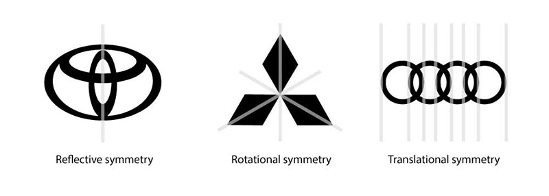
Reflectional Symmetry

Ever looked at a design and noticed how one side mirrors the other? That’s reflectional symmetry. It’s like when you split an apple in half and both sides match perfectly.
In graphic design, this isn’t just about duplicating elements. It’s about creating a sense of harmony and balance.
When we talk about reflectional symmetry in logos and branding, it’s like giving a brand a face that’s both memorable and balanced. It’s not just aesthetics; it’s about making a statement.
Concept and Examples in Design
In the world of design, reflectional symmetry is like the rhythm in music. It creates a flow that guides the viewer’s eye across the design.
Think of the classic butterfly logo. It’s simple yet powerful, using reflectional symmetry to create an icon that’s instantly recognizable.
Application in Logos and Branding
When it comes to branding, reflectional symmetry is about making a bold impact. It’s not just about looking good; it’s about creating a visual identity that sticks.
From Apple to Adidas, brands use this symmetry to convey stability and reliability.
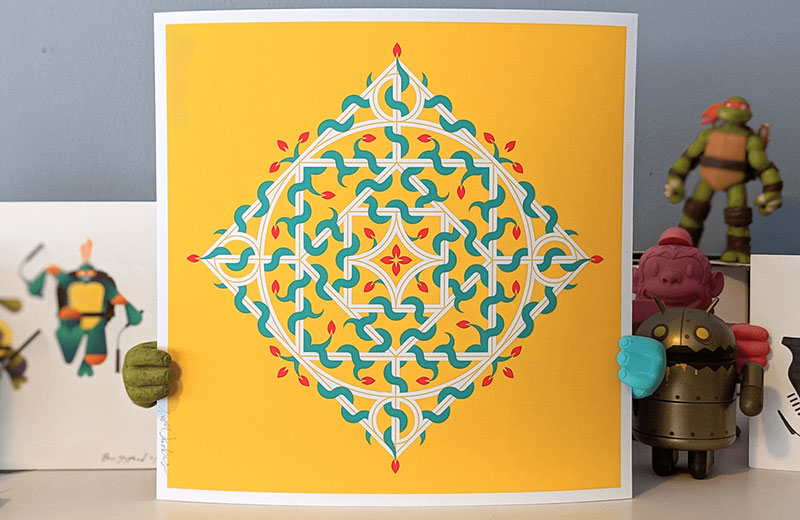
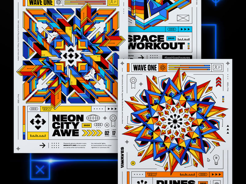
Rotational Symmetry

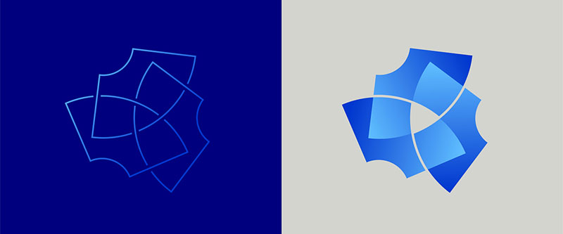
Now, imagine a design that spins around a central point.
That’s rotational symmetry for you. It’s like a kaleidoscope of colors and shapes, each part rotating to form a dynamic and cohesive whole.
This type of symmetry brings an element of motion and energy to designs.
Definition and Visual Impact
Rotational symmetry in graphic design is all about movement. It’s like a dance of elements around a central axis, each part contributing to a dynamic and lively composition.
It’s not just about spinning shapes; it’s about creating a visual experience that’s both engaging and dynamic.
Use in Dynamic and Motion-Oriented Designs
In designs that need to convey motion or energy, rotational symmetry is your go-to tool. It’s perfect for projects that need a sense of dynamism, like event posters or animated logos.
It’s about making the design come alive.
Translational Symmetry
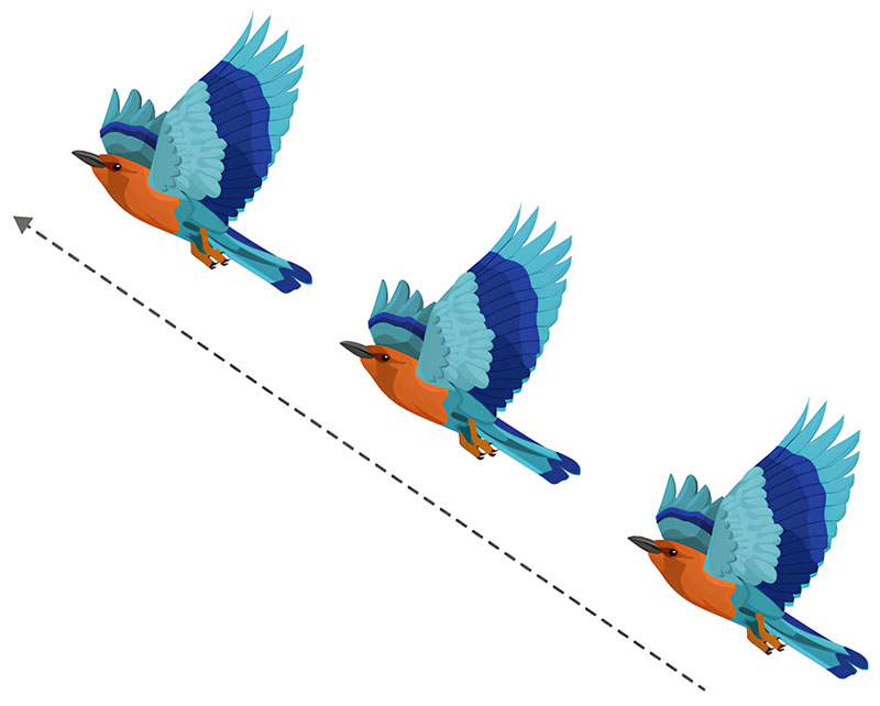

Picture a pattern that repeats over and over, like the tiles on a floor. That’s translational symmetry.
It’s about taking an element and repeating it across a design. This type of symmetry is all about creating rhythm and consistency.
Repeating Elements in Design
In translational symmetry, repetition is key. It’s like a beat in a song that keeps the tune going.
This symmetry is used to create backgrounds, textures, and patterns that add depth and interest to a design.
Application in Background Patterns and Layouts
Think of a website background or a fabric pattern. Translational symmetry works wonders in these areas, creating a cohesive backdrop that supports the overall design without overpowering it.
Glide Reflectional Symmetry
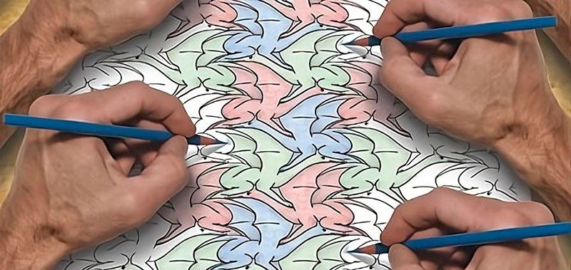

Ever seen a design that combines mirroring and movement? That’s glide reflectional symmetry.
It’s a bit like magic, blending reflection and translation to create something truly unique.
Combination of Reflection and Translation
Glide reflectional symmetry is like a dance between two types of symmetry.
It takes the mirror image and gives it a twist, creating patterns that are both familiar and surprising.
Use in Infinite Patterns and Complex Designs
This type of symmetry is perfect for designs that need a touch of complexity and intrigue. It’s great for intricate patterns and designs that require a more sophisticated approach.
Symmetry vs. Asymmetry

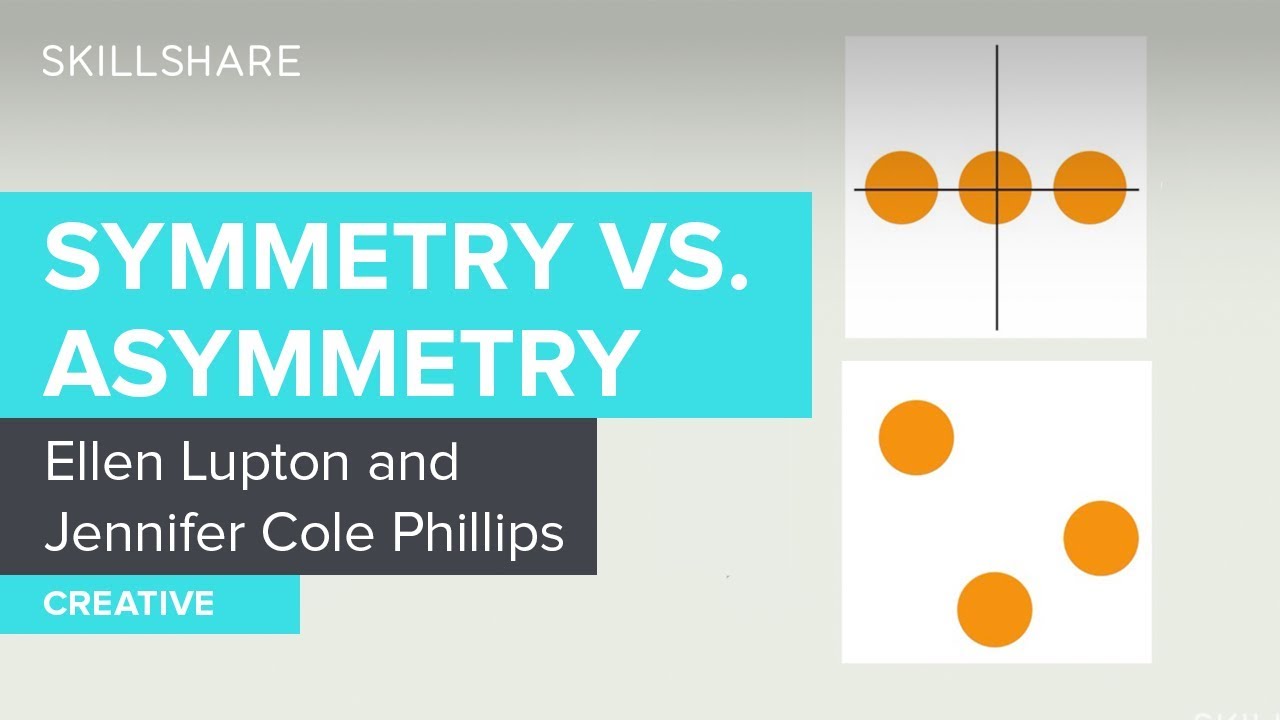
Diving into the world of design, there’s this cool ongoing debate: Symmetry in graphic design versus its rebellious cousin, asymmetry.
It’s like the classic battle of order vs. chaos, each with its own flair and secrets to unveil.
Contrasting Approaches in Design
You know how sometimes things just feel right when they line up? That’s symmetry doing its magic – creating a sense of calm, order, and predictability.
But then, there’s asymmetry, the wild child, breaking all the rules, creating tension, excitement, and interest in unexpected ways.
Balancing Visual Weight in Asymmetrical Designs

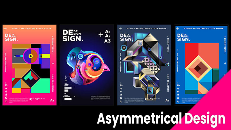
Asymmetry isn’t just throwing stuff randomly on a page.
It’s an art – balancing elements so that, even though they don’t mirror each other, they still feel like they belong together.
The Role of Symmetry in Creating Formality and Structure
On the flip side, symmetry brings this sense of formality and structure. It’s like the classic architecture of old museums or the way a well-tailored suit fits just right.
Symmetry in graphic design gives a feeling of stability and trust, making it a go-to for brands that want to convey reliability and professionalism.
Choosing Between Symmetry and Asymmetry
So, how do you choose between these two? It’s like picking the right outfit for an occasion. It all depends on what you want to communicate and who you’re talking to.
Considerations Based on Design Purpose and Audience
Think about your audience and your message. Are you aiming for something bold and energetic? Maybe asymmetry is your ally.
Going for something more traditional and trustworthy? Symmetry might be your best bet. It’s all about the vibe you want to create and the people you want to reach.
Emotional and Cultural Implications
And don’t forget about emotions and culture. Different cultures perceive symmetry and asymmetry in unique ways.
What feels balanced and harmonious in one culture might feel totally different in another. It’s a bit like traveling the world through design – each place has its own language of visuals.
Principles and Importance of Visual Balance
Alright, let’s chat about something that’s kind of the secret sauce in design: visual balance. It’s like the gravity of design – invisible, but oh-so crucial.
And when it comes to symmetry in graphic design, it’s like the heart of the matter.
Main Principles of Symmetry
When we think about symmetry, it’s not just about mirroring images. It’s a whole set of principles that guide us to create designs that feel just right.
Balance, Rhythm, Emphasis, Proportion, Scale, and Harmony
These are the MVPs of design principles. Balance is about distributing visual weight evenly. Rhythm is the flow that guides the eye through the design.
Emphasis?
That’s the spotlight, highlighting what’s important.
Proportion and scale ensure everything is in the right size and relationship. Harmony is when all these elements sing together in a design.
The Gestalt Law of Symmetry
Ever heard of Gestalt psychology? It’s this cool theory that our brains love to see things as whole, unified forms.
The Gestalt Law of Symmetry taps into this by using symmetrical forms that our brains find super pleasing. It’s like creating a visual comfort zone.
The Role of Visual Balance in User Experience
Now, let’s talk about why all this matters in the real world, especially in user experience.
Navigation and Interaction in Digital Products
In digital design, balance is key to guiding users through a site or app. It’s like setting up signposts and paths in a digital landscape.
Symmetry in graphic design helps in creating intuitive navigation and interactions. It’s all about making the user’s journey smooth and enjoyable.
Symmetry in Conveying Trust and Stability
Symmetry has this superpower of conveying trust and stability. When a design is balanced, it feels reliable and secure.
This is especially important in fields like finance or healthcare, where trust is everything. It’s like wearing a well-tailored suit to a job interview – it just makes you feel more confident.
Practical Applications and Tips
So, we’ve been talking about symmetry in graphic design, right? Let’s get real about how this stuff actually plays out in the wild.
It’s like having a toolbox and now figuring out what each tool does best.
Strategic Use of Symmetry in Design
Symmetry isn’t just a concept to admire; it’s a strategy to apply. It’s like having a secret weapon in your design arsenal.
Symmetry in Layout Structure

Ever seen a poster and felt like everything just clicked? That’s symmetry doing its thing. It’s about arranging elements so they balance out.
Think of it like a seesaw. You want both sides to be equally fun, right? Same with design. A symmetrical layout can make a poster feel more structured and easy on the eyes.
Conveying Movement and Action with Rotational Symmetry
Now, this is where it gets exciting. Rotational symmetry is like the swirl in a galaxy, adding motion and energy to your design.
Use it when you want to create a sense of action or dynamism. It’s perfect for things like sports logos or animation, where you want to convey movement.
Examples of Effective Symmetrical Design
Let’s look at some real-world champs who’ve nailed symmetry in graphic design.
Iconic Logos and Branding

Logos are like the face of a brand. Symmetrical logos often feel more balanced and memorable.
Think of the classic Apple logo or the symmetry in the Adidas stripes. They’re simple, but they stick in your mind, right?
Album Covers and Advertising
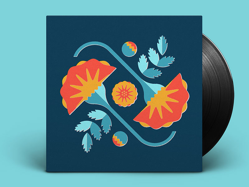
Album covers and ads are another playground for symmetry.
They use symmetry to catch your eye and convey a message quickly and effectively.
It’s like that album cover you can’t stop staring at or the ad that makes you go, “Wow, that’s clever.”
FAQ On Symmetry In Graphic Design
What Exactly is Symmetry in Graphic Design?
Symmetry in design is like a visual seesaw. It’s all about balance and harmony. When elements in a design mirror each other, either directly or with a twist, that’s symmetry.
It’s not just shapes lining up; it’s about creating a sense of order and appeal. It’s like graphic design’s way of making everything feel just right.
How Does Symmetry Impact a Viewer’s Perception?
Symmetry in design is like a visual handshake; it’s welcoming and comforting. It creates a sense of order and predictability.
When viewers see a symmetrical design, they often feel a sense of calm and balance. It’s a subtle cue that tells them everything is in its right place.
Can Symmetry in Design Boost Brand Recognition?
Absolutely! Think of some iconic logos – symmetry makes them unforgettable. It’s like a visual hook that sticks in your mind.
Symmetrical designs are easy to recognize and remember, making them a powerful tool for branding. They convey stability and professionalism, which resonates with audiences.
What’s the Difference Between Symmetry and Asymmetry in Design?
Symmetry is like a well-organized desk, while asymmetry is more like an artist’s studio – creative and dynamic.
Symmetry offers balance and harmony, whereas asymmetry provides excitement and interest.
Asymmetry breaks away from predictability, using an uneven distribution of elements to create a more dynamic and engaging design.
When Should I Use Symmetry in My Designs?
Use symmetry when you want to convey stability, balance, or formality. It’s great for designs where you need to establish trust and reliability, like corporate branding or official documents.
Symmetry is also a win for designs that need to be straightforward and easy to navigate, like a website or an infographic.
Can Symmetry in Design Be Overused?
Sure, it can. Like too much salt in a dish, too much symmetry can make a design bland. Overusing symmetry can lead to designs that feel static and uninteresting.
It’s all about balance. Mix in some asymmetrical elements to add energy and keep things fresh.
What Role Does Color Play in Symmetrical Design?
Color in symmetrical design is like seasoning in cooking – it enhances everything. It can reinforce symmetry, creating a stronger visual impact.
Contrasting colors can highlight symmetrical elements, while harmonious colors can enhance the sense of balance and unity. It’s about using color to support the overall symmetrical structure.
How Do I Create a Symmetrical Design That Isn’t Boring?
Spice it up! Add a twist to your symmetry. Maybe it’s an unexpected color splash, an unusual texture, or a quirky graphic element. Symmetry doesn’t have to be rigid.
Play with different levels of symmetry, combine it with asymmetrical elements, and experiment with different types of symmetry like rotational or translational.
Are There Tools to Help Achieve Symmetry in Design?
Definitely! Most graphic design software has tools for aligning and mirroring elements, which are super helpful for creating symmetry. Grids and guides can be lifesavers, ensuring everything lines up perfectly.
Don’t forget online resources and templates; they can give you a head start on symmetrical design layouts.
What Are Common Mistakes in Implementing Symmetry?
One biggie is assuming symmetry is just about slapping two identical halves together. It’s more nuanced than that. Over-simplifying can lead to dull designs.
Also, neglecting the balance between symmetry and the content can make a design feel forced. Remember, symmetry should enhance the message, not overpower it.
Conclusion On Symmetry In Graphic Design
Wrapping this up, symmetry in graphic design isn’t just a fancy term; it’s a core element that brings a sense of balance and harmony to our visual experiences.
It’s like the secret ingredient in a recipe that makes a dish come alive. Through this exploration, we’ve seen how symmetry can be a game-changer, from creating iconic logos that stick in our minds to crafting web layouts that are both pleasing and easy to navigate.
But remember, symmetry is a tool, not a rule. It’s about using it creatively to enhance your designs, not restrict them.
Whether you’re balancing elements in a logo, adding rhythm to a webpage, or playing with colors and textures in an ad, symmetry can elevate your work from good to unforgettable.
So next time you’re brainstorming for a project, think about how symmetry can play a role.
It’s about finding that sweet spot where your design feels just right – balanced, engaging, and speaking volumes without saying a word.
Symmetry in graphic design is more than aesthetics; it’s about crafting experiences that resonate and leave a lasting impression.
If you liked this article about symmetry in graphic design, you should check out this article about logo design principles.
There are also similar articles discussing typography elements, the psychology of shapes, famous graphic designers, and the difference between art and design.
And let’s not forget about articles on the Gestalt principles of design, visual hierarchy, graphic design movements, and Bauhaus graphic design.