

Picture this. You’re scrolling through an ocean of brands, and one just leaps out, clutching your attention. Ever wonder what sorcery is that? It’s not magic; it’s the mastery of logo design principles in action, my friends.
In the bustling alleyways of the web, a logo more than just a pretty sketch; it’s the handshake of a brand, the first ‘hello’.
It’s where color theory cozies up with typography, where visual identity elements find their balance on the tightrope of creativity. Get this: your logo is chatting with the world about who you are while you’re sipping that coffee.
By the time you reach the final period in this piece, you’ll be privy to the behind-the-scenes on crafting logos that speak.
I’ll break it down from scalable logos to the power of negative space, right through to ensuring brand consistency.
The slate’s brimming with insights—effective logo guidelines, how to rock minimalist design, even dishing out the innovative logo ideas simmering in the pot.
Get ready; it’s time to transform those curious glances at your brand into lasting gazes.
Core Principles of Effective Logo Design
Simplicity

Ever noticed how the most memorable logos often seem so… uncomplicated? That’s the magic of Simplicity in logo design principles.
It’s like when you hear a tune, and it just sticks – simple, yet powerful.
In the realm of visual branding guidelines, simplicity isn’t about being plain. It’s about being crystal clear.
Think of it as the art of delivering a message, minus the clutter. You want your logo to shout your brand’s story, loud and clear, without having to scream.
Clarity and Visibility
Picture this: you’re scrolling through a website, and a logo catches your eye. Why? Because it’s clear and visible.
It’s like that one friend who’s always effortlessly understood. In the bustling digital space, clarity in logos is your golden ticket to instant recognition.
Avoiding Overcrowding
Less is often more. A logo crammed with too many elements is like a crowded party where you can’t hear anyone.
Keeping it simple means making sure your logo can breathe. It’s about finding that sweet spot between too much and just enough.
Memorability
A great logo sticks in your mind like a catchy jingle. That’s Memorability – a key ingredient in the logo design principles cookbook.
It’s the difference between ‘just another logo’ and ‘Oh, I know that brand!’.
Creating Lasting Impressions
Think of memorable logos as those memorable moments in life – the ones you just don’t forget.
It’s about creating a visual hook that latches onto the viewer’s memory. Every time they see your logo, it should spark a little ‘aha!’ moment.
Use of Timeless Elements
Ever wonder why some logos seem ageless? They use timeless elements. It’s like that classic little black dress that never goes out of style.
A timeless logo transcends trends and keeps your brand relevant, year after year.
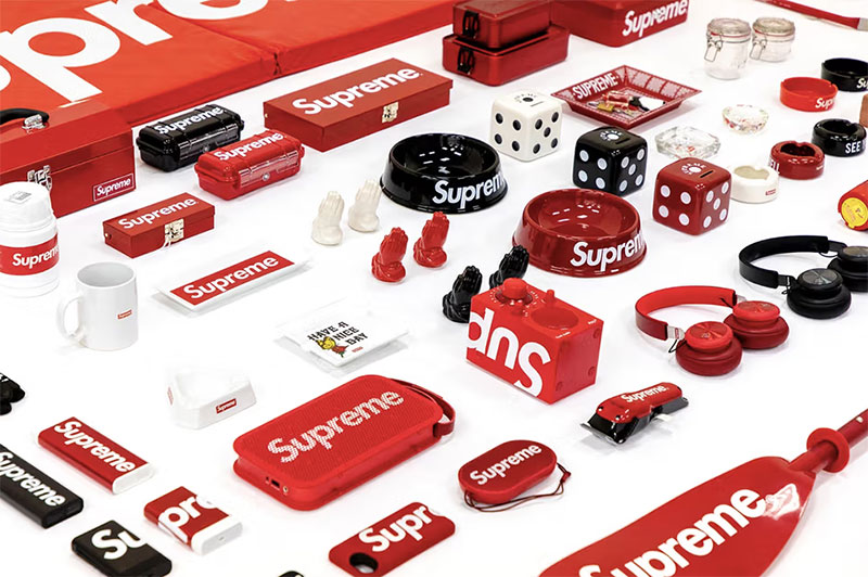
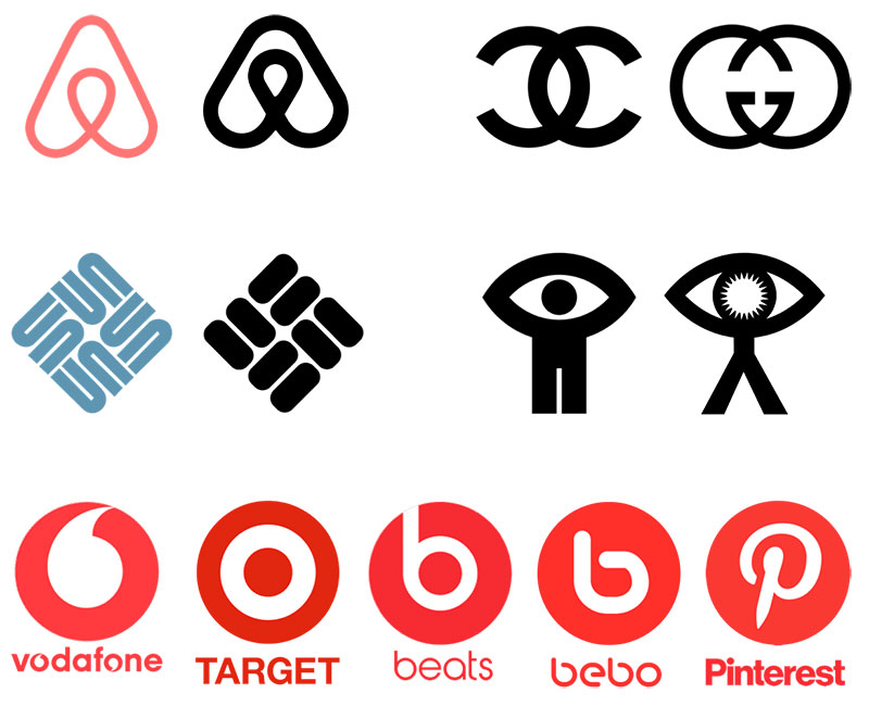
Originality
In the sea of logos, Originality is your lifeboat. It’s what sets your brand apart in the crowded marketplace.
Originality in logo design principles is like adding your secret ingredient to a recipe – it makes your brand uniquely delicious.
Avoiding Clichés
It’s easy to fall into the trap of clichés. But remember, clichés are like fast food – convenient but forgettable.
Carving out a niche for your brand means steering clear of the overdone and the obvious.
Unique Concept Development
This is where the fun begins. Developing a unique concept is like going on a treasure hunt – it’s all about discovering that gem that’s perfect for your brand.
It’s a mix of creativity, strategy, and a dash of boldness.
Technical Aspects of Logo Design
Diving into the nitty-gritty, the technical side of things.
Here’s where we roll up our sleeves and get into the how-tos of crafting logos that not just look good but work effectively across various platforms.
Remember, a great logo isn’t just about being pretty; it’s about being smart and flexible too.
Scalability

Think about seeing a logo on a giant billboard and then on a tiny smartphone screen.
It should look equally crisp and impactful, right? That’s what Scalability is all about.
Legibility in Various Sizes
Whether it’s the size of a postage stamp or the side of a building, your logo needs to be legible.
Every element, from the font to the icon, should be clear and recognizable. This is where graphic design elements play a huge role.
Adaptability Across Mediums
From print to digital, your logo should transition smoothly. This means considering how colors translate on different screens and materials.
It’s like making sure your outfit works both for a day at the beach and a night out – versatile and adaptable.
Versatility

Versatility in logo design is like being a chameleon – seamlessly fitting into various environments.
Application in Diverse Contexts
Your logo should be a team player. It needs to look good on your website, your business card, your product packaging – everywhere.
Think of brand consistency in logos; it’s about creating a visual identity that’s recognizable in every context.
Creating Multiple Logo Variations
Sometimes, one size doesn’t fit all. Having variations of your logo, like a simplified version for small sizes or a monochrome version for single-color applications, is like having different versions of a song – each perfect for a specific mood or setting.
Visual Elements in Logo Design
Alright, let’s talk about what makes a logo not just good, but great. It’s like dressing up a character in a video game – the right outfit makes all the difference.
In logo design, it’s all about the visual elements. They’re the secret ingredients that make your logo pop and sizzle.
Color Psychology
Colors aren’t just pretty; they’re powerful. They have this cool ability to evoke feelings and set moods.
That’s Color Psychology for you – a pivotal part of logo design principles.
Emotional and Cultural Connotations
Each color has its vibe. Red screams energy and passion, while blue is all about trust and calmness.
It’s like they’re speaking their own language, and we’re just tuning in. Colors can also have different meanings in different cultures, so it’s like walking a tightrope – thrilling but tricky.
Strategic Use of Colors
Choosing the right colors for your logo is like picking the right music for a party – it sets the tone.
It’s a strategic move that can make your logo go from ‘meh’ to ‘wow’. Think about the big brands; their colors are part of their identity, like a signature.
Typography

Fonts are the unsung heroes of logo design principles. They can shout, whisper, and everything in between.
Font Selection and Brand Personality
Picking a font is like choosing the right voice for your brand. A playful brand might go for a quirky font, while a more serious brand might stick to something sleek and polished.
It’s all about matching the font’s vibe with your brand’s personality.
Readability and Style
But hey, it’s not just about looking good. Your logo’s font needs to be legible across different sizes and mediums.
It’s like making sure your message is heard clearly in a noisy room.
Use of Shapes and Icons
Shapes and icons are like the secret handshakes of the logo world. They can convey a lot without saying a word.
Enhancing Message Through Shapes
Shapes have their own language too. Circles speak of unity and harmony, while squares shout stability and reliability.
It’s about using these shapes to subtly reinforce your brand message.
Icon Selection and Brand Representation
Choosing the right icon for your logo is like picking the perfect emoji for a text – it needs to fit the mood and message.
The icon should be a visual echo of what your brand stands for.
Advanced Design Techniques
So, we’ve covered the basics, but let’s kick it up a notch. When you dive into advanced design techniques, it’s like unlocking a new level in a game.
These techniques can really set your logo apart, making it not just functional, but also a piece of art.
Let’s get into the cool, less-talked-about stuff in logo design principles.
Negative Space
Negative space is like the quiet person at a party who turns out to be the most interesting once you get to know them.
It’s all about the space that isn’t there.
Creative Use for Unique Designs
Using negative space creatively can turn a logo into a brain teaser, making people look twice and remember longer.
It’s like hiding a secret message in plain sight. The FedEx logo and its hidden arrow between the ‘E’ and ‘x’ is a classic example. Sneaky, right?
Three-Dimensional (3D) Effects

3D effects in logos are like adding a pinch of spice to your favorite dish – it just brings everything to life.
Adding Depth and Interest
Adding depth to your logo can make it pop off the page (or screen).
It’s a way to add a wow factor, but it’s like walking a tightrope – too much, and it can look gaudy; too little, and it’s lost.
Relevance and Timelessness
This is the Holy Grail of logo design principles. Your logo needs to stand the test of time, yet stay relevant.
It’s like writing a song that becomes a classic.
Aligning with Brand Story
Your logo should tell your brand’s story at a glance. This means understanding your brand’s heart and soul and translating that into visual form.
It’s like capturing your brand’s personality in a picture.
Longevity in Design
Designing for longevity means your logo will still look fresh and relevant years from now.
It’s like choosing a style that ages well – think classic, not trendy.
Research and Conceptualization
Alright, let’s dive into the brains behind the beauty. Before even sketching that first line, there’s a world of research and conceptualization.
It’s like being a detective and an artist at the same time. We’re not just creating a logo; we’re crafting a story, a personality.
That’s where the heart of logo design principles truly beats.
Understanding the Target Audience
Audience Demographics and Preferences
First up, know your crowd. It’s like planning a party – you gotta know who’s coming to set the right vibe.
Are we talking teens, busy professionals, or health enthusiasts? Each group has its own likes, dislikes, and style.
This step is crucial for creating a logo that resonates and connects.
Analyzing Competitors
Differentiating from Competitors’ Logos

Next, check out the competition. It’s like knowing the other players in a game. What are they doing? How can we be different, better?
It’s not just about standing out; it’s about finding that sweet spot where your logo becomes the one they remember.
Value Proposition and Brand Uniqueness
Visualizing Brand’s Unique Factors
Now, let’s dig deep into what makes your brand unique. This is where the soul-searching happens.
What’s your brand’s heartbeat? Is it innovation, tradition, fun? This becomes the compass for your design journey.
Testing and Refinement
So, we’ve got our concept. Time to bring it into the real world. This stage is like test-driving a car – you gotta make sure it runs smoothly on all roads.
Feedback and Iterations
Gathering Responses and Making Adjustments
First, get some eyes on your design. Feedback is gold. It’s like getting directions when you’re a bit lost. Listen, adapt, and tweak.
This process is a dance – two steps forward, one step back, until it feels just right.
Mockups and Real-world Applications
Testing Logo in Various Scenarios
Finally, let’s see how your logo performs in the wild. Put it on everything – websites, business cards, billboards.
It’s like seeing your creation come to life in different environments. This step ensures your logo isn’t just good on paper; it’s great in action.
FAQ On Logo Design Principles
What really makes a logo design effective?
When a logo hits that sweet spot, it’s because it nails simplicity and memorability. Think of it—simplicity ensures it’s recognized in a flash, physical proof that less is often more.
Memorability? That’s your hook. It leaves a mark in the mind, quietly whispering your brand’s essence long after the first glance.
How important is color in logo design?
Color’s like the secret sauce, my friends. It’s not only about looking good—it’s psychology, baby.
Colors trigger emotions, feelings. Choose wisely based on your brand’s vibe. Go red for excitement, blue for trust. It sets the whole mood for how folks perceive your brand, without them saying a word.
Can a great logo improve brand recognition?
Absolutely. A banging logo, that’s your brand’s flag waving high. Gets your name stuck in people’s heads.
It’s repeated exposure, the visual cue that keeps telling your brand’s story every time it pops up. Nail that, and folks will spot you in the wild, no sweat.
What’s the deal with simplicity in logo design?
Alright, dial everything back. Simplicity is key; it’s the golden rule. Clutter? That’s your enemy.
A simple design slaps harder because it’s easy to read, easy to remember. No fuss. It’s gotta work small as a bee or big as a billboard. Overcomplicate it, and you’ve lost the game.
How does a logo affect a customer’s first impression?
First impressions, folks, they’re everything. Your logo’s the welcoming committee—it’s gotta be dressed to impress.
It sets the stage for every interaction that follows. Botch this up, and it’s a steep hill to climb back. Nail it, and you’ve got one foot in their door already.
Why is versatility important in logo design?
Versatility’s your ticket to the everywhere show. From teensy-weensy favicons to that monstrous billboard downtown.
It has to look crisp on all of them. That’s why responsive logos are the new rockstars. Changing their tune, adapting to wherever they need to be.
A chameleon in the branding jungle.
How to balance uniqueness and familiarity in a logo?
Here’s a tightrope walk for you. Swing too familiar, and you’re just another face in the crowd. But get too out there?
Might just fly over folks’ heads. Sweet spot incoming: Distinctive, sure, but with a whiff of comfort. Innovative yet relatable—that’s your ticket to logo stardom.
What does scalability mean in terms of logo design?
Scalable is your logo’s superpower to shrink or grow without turning into a hot mess.
It’s gotta hold its own whether it’s on a stamp or a spaceship. Lose the details when tiny, keep the integrity when huge—that’s your vector magic at work. Keep it sharp, at any size.
Should a logo reflect current trends?
Trends, they’re like shooting stars—mesmerizing but fleeting. If your logo is wearing today’s hottest fashion, will it stand the test of time?
Question is, do you want to be the flavor of the month or a classic vintage wine? Aim for timeless with a smidge of now.
How do I make my logo tell my brand’s story?
Your logo’s not just a pretty face. It’s a chapter in your brand’s autobiography.
Think symbols with meaning, colors that speak your values, and type that tells your tone. What’s your saga? A whiff of nostalgia? Cutting-edge futurism? Get that in your emblem, and you’re narrating without a single word.
Conclusion
Let’s swing the spotlight back for a moment to where we kicked things off: logo design principles. We ventured through the labyrinth of color psychology, danced with the simplicity, and embraced the finesse of memorable yet straightforward aesthetics.
Wrapping this rodeo up, remember these are not just fancy tricks up the sleeve; they’re the blueprint for branding swagger. Your takeaways?
- Keep it bold and bare. The simpler, the stickier.
- Colors whisper tales—choose the ones that tell yours.
- Flexibility is queen. Make your logo nail its Vogue pose on any platform.
- Timelessness over trendiness—unless you’re all about that pop culture life.
Take these principles, mix ’em with your unique brand spice, and watch that logo of yours spark conversations without uttering a word. Keep it clever, make it matter, and above all, dare to let your brand’s heart beat loud and clear through that deceptively simple emblem.
If you liked this article about logo design principles, you should check out this article about typography elements.
There are also similar articles discussing the psychology of shapes, symmetry in graphic design, famous graphic designers, and the difference between art and design.
And let’s not forget about articles on the Gestalt principles of design, visual hierarchy, graphic design movements, and Bauhaus graphic design.