

Imagine the pulse of technology at your fingertips, the thrum of innovation coursing through your veins. Now, visualize a symbol that encapsulates all that power: the Microsoft logo.
It’s more than just a trademark; it’s a beacon of modern corporate identity, a window into the soul of tech giant Microsoft Corporation.
Dive into the DNA of this iconic emblem. Witness its evolution, understand its design philosophy, and grasp its pivotal role in brand recognition.
As a web connoisseur, I’ve seen firsthand how a visual identity shapes user experience and interfaces.
By the end of this article, you’ll have unraveled the fabric of this ubiquitous symbol. The insights offered here will transcend mere aesthetics and delve into the intricate ballet of graphics, branding strategies, and the resultant digital footprint.
Explore with me:
- The storied past of Microsoft’s visual saga.
- Insights into its emblematic prowess in the corporate world.
- How the logo mirrors technological growth and user engagement.
Step inside the circle; let’s decode the mysteries of those four colorful squares.
The Meaning Behind the Microsoft Logo

You’ve seen it, you know it. That iconic symbol pops up on your computer screen. Let’s delve deep into what the Microsoft Logo means, yeah?
Windows to the World
The logo, mate, it’s a window! Not just any window – it’s the window to the universe of Microsoft. A world packed full of technology, innovation, and ambition. It’s your doorway into their universe, and all you gotta do is open it!
Simplicity & Approachability
A rectangle split into four smaller ones. That’s it! This simplicity screams accessibility and approachability. The logo isn’t just for tech gurus, it’s for everyone – you, me, your grandma, everyone.
Unity in Diversity
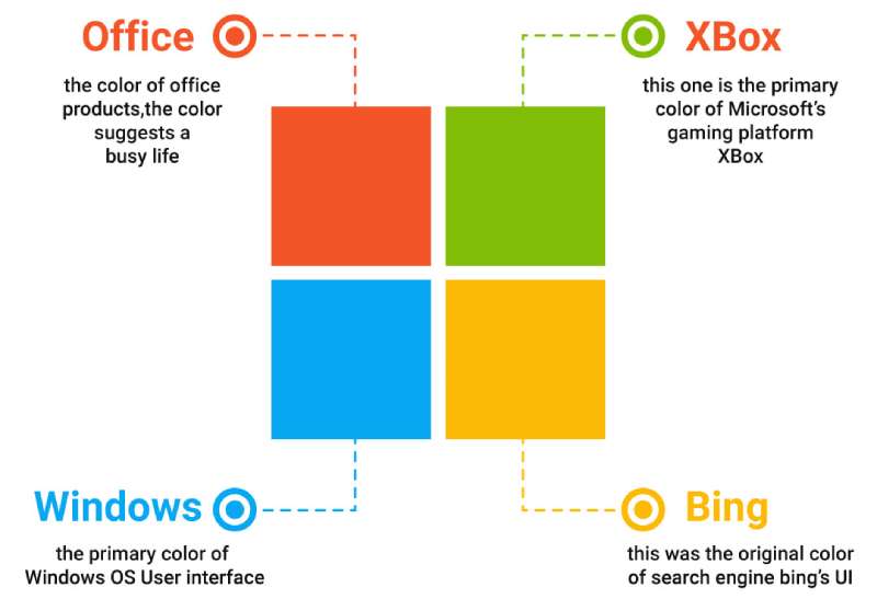
Each color, right, represents a different product. The blue for Windows, the red for Office, green for Xbox, and yellow for Bing. Despite the diversity, they’re brought together, symbolizing unity. Ain’t that neat?
The History of the Microsoft Logo
![]()

Let’s take a trip down memory lane and see how the Microsoft logo has evolved.
The Early Days
First off, Microsoft wasn’t always about windows. It started off with a funky logo with a disco-era vibe. This was in the ’70s, mate, a wild time indeed!
Window of Opportunity
Fast forward to the ’80s, the introduction of Windows called for a logo upgrade. They introduced a window logo to match the product name. That’s where the sleek, minimalist approach started.
The Modern Day
A blast of color! They decided to color up the logo in 2012, adding the vibrant colors we know and love today. It’s not just a logo, it’s a symbol of evolution, adaptation, and growth.
The Colors of the Microsoft Logo
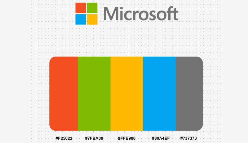

Four squares, four colors. Let’s break ’em down.
Blue: The Steady Rock
Blue stands for trust, reliability, and security. It’s the core color of the Microsoft Logo and represents Windows, their OG product.
Red: The Power Player
Red symbolizes energy and passion. It’s the color of Office, their suite of productivity tools that are indispensable to the world.
Green: The Fun Side
Green stands for freshness, creativity, and fun. No wonder it’s Xbox’s color, their gaming console.
Yellow: The Bright Spark
Finally, yellow, representing Bing. The spark of curiosity, knowledge, and brightness. It’s your guide in the vast world of internet information.
The Font Used in the Microsoft Logo

Let’s talk about the typeface, the letters that spell out ‘Microsoft’. It’s all in the font, man!
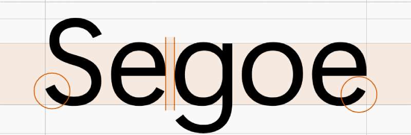
The Magic of Segoe
The font is Segoe, and let’s just say, it’s pretty cool. It’s got a modern, clean vibe, a look that says “We’re all about progress and innovation here.”
Expressive Minimalism
It’s minimalist but not lacking personality, expressing a sense of precision and elegance. It’s not just letters, it’s a statement.
The Impact of the Microsoft Logo
Why is it important, you ask? Let’s find out.
Recognition
This logo is recognizable all around the globe. It carries the weight of Microsoft’s reputation. That’s some heavy lifting for a logo!
A Mark of Trust
Every time you see it, you’re reminded of the brand’s promise – delivering top-notch, reliable technology. It’s not just a logo, it’s a badge of trust.
The Future of the Microsoft Logo
Is it going to stay the same or morph into something new? Let’s speculate!
Consistency is Key
Microsoft has kept its logo pretty consistent in the last few years. With the brand’s strong global presence, a sudden shift might be too risky. So chances are, they’ll keep it as it is.
Adapting to Changes
On the other hand, they’ve been known to change it up to match their product evolutions. So if they launch something groundbreaking, we might just see a new logo in town!
The Legacy of the Microsoft Logo
![]()

Finally, what legacy does this logo leave behind?
A Journey of Innovation
The logo’s evolution tells a story of continual innovation. It’s a reminder of the brand’s journey from a small start-up to a global tech giant.
Setting a Design Standard
The design has set a standard in the industry, demonstrating how simplicity can pack a punch. It’s not just a logo, it’s a design masterpiece!
And there you go! Now when you look at the Microsoft Logo, you’re not just seeing a bunch of colored squares, you’re seeing a world of meaning, a story of evolution, a statement of trust, a legacy of innovation. You’re seeing Microsoft!
FAQ On The Microsoft Logo
What does the Microsoft logo symbolize?
The four colorful squares represent a window—literal and figurative—onto the world, conveying Microsoft’s diverse suite of products and services. It’s a nod to Windows, but it also implies openness, innovation, and possibilities within the tech landscape.
Has the Microsoft logo always been the same?
Far from it. It’s evolved numerous times since Microsoft’s inception in 1975. What started as a groovy, disco-era design has morphed into the sleek, simplified tiles we recognize today.
Each iteration kept pace with its era’s essence, integrating contemporary design trends and company growth.
Why did Microsoft choose the colors in their logo?
Each hue has purpose—blue for Windows, green for Xbox, red for Office, and yellow to evoke a sense of energy and optimism. Collectively, they paint a picture of Microsoft’s diverse ecosystem, underpinning its spectrum of technologies.
How often has the Microsoft logo been redesigned?
It’s gone through significant overhauls about five times. While minor tweaks have occurred intermittently, the major redesigns reflect pivotal shifts in Microsoft’s branding strategy and its adaptation to the evolving tech industry’s demands.
Who designed the current Microsoft logo?
The 2012 incarnation, boasting a clean and straightforward look, was born from Microsoft’s internal design team. It heralded a new era, introducing a modern interface across Microsoft 365, signaling unity across their product range, from Surface to Bing.
What are the guidelines for using the Microsoft logo?
As with all hallowed tech symbols, rules abound—Microsoft mandates clear space, size specifications, and prohibits alterations or distortions. Basically, you respect the logo’s integrity to preserve brand recognition and consistency.
Is Microsoft’s logo a registered trademark?
Absolutely, and fiercely protected at that. The logo is a legal emblem of Microsoft Corporation and using it conflictingly could land you in hot legal water. Trademark icon, indeed.
What significance does the font in the Microsoft logo have?
Simplicity rules—not a single serif in sight. The Microsoft logo’s font, Segoe, mirrors the straightforward, user-friendly nature inherent in the brand’s philosophy. It’s tailored, accessible, without the fuss.
Can the Microsoft logo be used in personal projects?
Tread carefully. Personal projects can use it only with explicit permission and in alignment with Microsoft’s guidelines. Always best to check with the big guns before you find yourself a logo outlaw.
In what ways has the Microsoft logo influenced corporate branding?
This logo’s transforms set a benchmark for companies far and wide. A masterclass in versatility, it has inspired rebrands galore—showing that a logo can remain recognizable and yet adapt with the times, effectively leveraging the power of visual identity in the corporate sector.
Conclusion
As we’ve unpacked the essence of the Microsoft logo, witnessed its transformation across decades, delved into the rationale behind its hues, and navigated the do’s and don’ts of wielding it in the wild—there’s an undeniable takeaway.
This isn’t just a tech company’s stamp—it’s a banner under which innovation thrives and beckons users worldwide with its promise of:
- Tech synergy,
- Digital empowerment, and
- A universe of services at our fingertips.
Beyond pixels, it’s a symbol stitched into the very fabric of our digital lives. From the vibrant tiles on your Windows start screen to the soft glow of an Xbox powering on—each is a testament to Microsoft Corporation’s saga, its influence on user interface design, brand recognition, and how these shapes and shades can so deeply etch themselves into our collective consciousness.
So here we stand, at the tale’s end, acknowledging a legacy that will continue to evolve, just as we do, alongside the technology that shapes our world.
If you liked this article about the Microsoft logo, you should check out this article about the new Patreon logo.
There are also similar articles discussing the Facebook logo, the Amazon logo, the Apple logo, and the Twitter logo.
And let’s not forget about articles on the Netflix logo, the Samsung logo, the Airbnb logo, and the IBM logo.