
Ever gaze at a symbol and feel a zing of recognition? That’s the power of a potent logo. The Samsung logo—a simple, distinctive mark—sparks a connection with millions globally. It’s more than a combo of letters and color; it’s the silent ambassador of the brand’s heritage.
In this write-up, you’re about to dive deep into the essence of this iconic emblem. From its design roots to the strategic branding that catapults Samsung into daily life, we’ll unravel the fabric of its visual identity.
Imagine opening a treasure chest and finding the keys to consumer electronics branding—well, consider this that chest.
By the end, you’ll grasp not just the story behind the logo but how Samsung’s blue sweeps through all facets of visual communication, from products to digital billboards.
We’re talking brand positioning, marketing mastery, and the rich tapestry of graphic design that supports global recognition. Buckle up; we’re about to decode one of the tech world’s most recognizable symbols.
The world is faster and faster and we see this because of the fast improvement in technology.
In order to keep up with the changing needs and trends that our world has brands have to reinvent themselves in order to survive.
Samsung is one of the biggest electronic producers in the world. The Samsung Logo appears on millions of devices and is recognized in the entire world. Even though it was launched a century ago it is quite obvious that probably they didn’t think so big when they first started so let’s discover more about them.

In Korean, the word Samsung translates as “three stars” and the name was picked by its founder Lee Byung-Chul. At the beginning of the company, the idea was that one day it is going to become so powerful, that is going to be strong and everlasting like all the stars that we can see in the night on the skies.
But why is three the lucky number, what does it have to do with its success? The Samsung Logo has its secret in the Korean language because the number three is used as a symbol that shows something big and powerful.
Samsung is a big South Korean multinational corporation that has its headquarters in Seoul, also known as the Samsung Town. It was created in 1938 by Lee Byung-Chul as a trading company. In present days Samsung is one of the largest electronic device manufacturers.
The Samsung logo

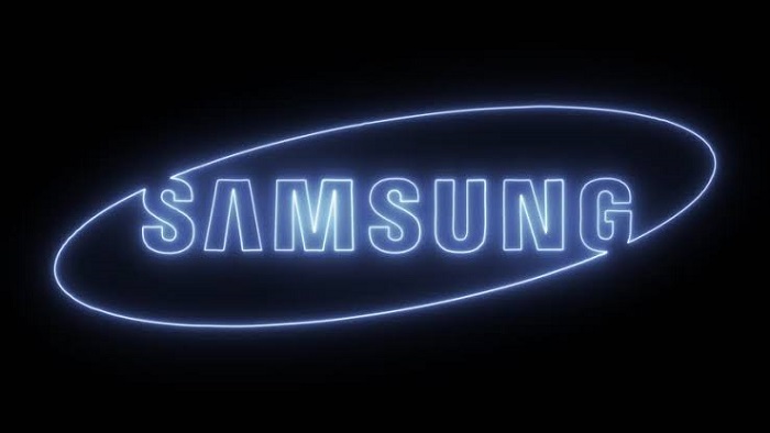
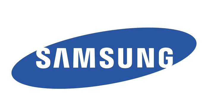
The Samsung Logo is a basic logotype together with the shape and both offer a simple and recognizable logo. The base is an elliptical blue oval that is a bit slanted in order to make the oval’s right side higher compared with the left. Within the oval, we can find a wordmark that says “Samsung”.
The lettering is positioned at the top of the first S and the bottom of the G intersect together with the edge of its oval.
Colors of the Samsung Logo
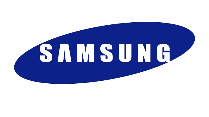

The use of blue color in the Samsung logo represents reliability and commitment and the white color stands for purity and elegance. So, we can say that they did some great choices for their Samsung Logo.
Font

The font is a basic Helvetica Black that can be seen on the basis of the logo and is written in white. Still, the crossbar of the A has been removed because it adds some visual focal point on the otherwise simple logo.
Inspiration

The Samsung logo might look simple but each design element has been carefully planned. The ellipse was actually added in order to give the logo a more international air. Also, the removing of the crossbar in the A is a move that was intended to look more dynamic and to show the innovation of the company and what they are striving for in the future.
They also decided to keep in the Samsung name the small part of the S and G open in order to show open-mindedness.
The Samsung logo Meaning

If you are wondering what Samsung means well first of all you need to know that it got its name from the Korean language that means three stars. The word three stands for something big and powerful so the first version of the Samsung Logo had three stars in it.
The elliptical shape of the Samsung Logo also shows the world that is moving in space showing the fact that we are changing and bringing innovations. This is how Samsung reflects its core values.
Also, if you check closer the logo you will see that the S and G letter go out of the oval in order to connect the interior with the exterior. The idea behind this Samsung meaning is that they are trying to find a balance between the world and be of service to society.
If we check, even more, the blue color used shows trust and reliability that Samsung was to fulfil always in their service and products.
Samsung logo history and evolution
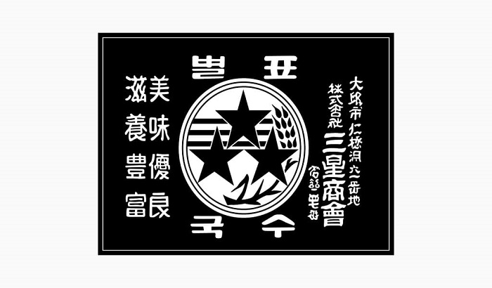

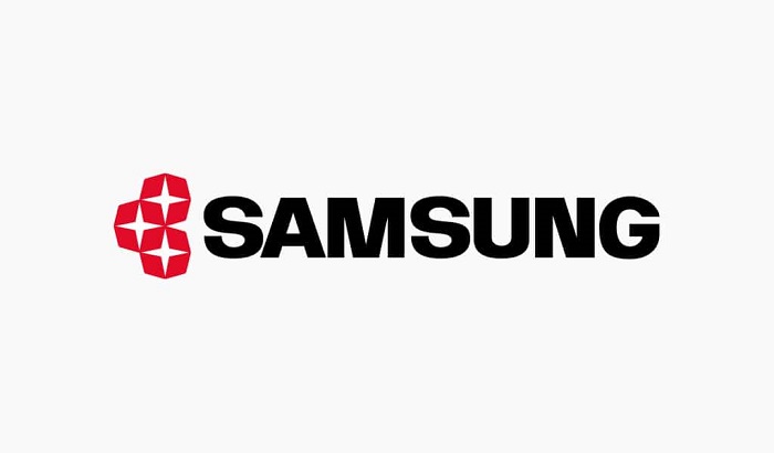
If we check the Samsung Logo history, we will find that the brand was created in 1938 and the logo actually appeared in 1958. The first logo had 3 stars, 3 stripes and some plants that went all together in a circle shape. The stars were connected with the Samsung name and the plants focused on their agricultural origins.
1969
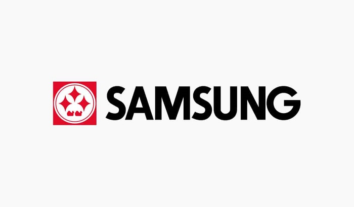
In 1969 the founder created Samsung-Sanyo Electronics. The first product that they did was a black and white television and the company went for a rebrand so they show the new direction they are heading to.
They went for a rectangular box in order to show that they wanted to dominate the television market which now can be seen in the corporate identity as well.
1985
By 1985 Samsung managed to launch that year the SC-1000 a mobile unit that could be used in-car. This moment marked a new chapter for the company and also the Samsung Logo.
Their designers searched for a simpler idea removing the outside circle and chancing it for the three stars there were made of a diamond shape. So, what they did was basically to go to a more technical-oriented identity.
1993
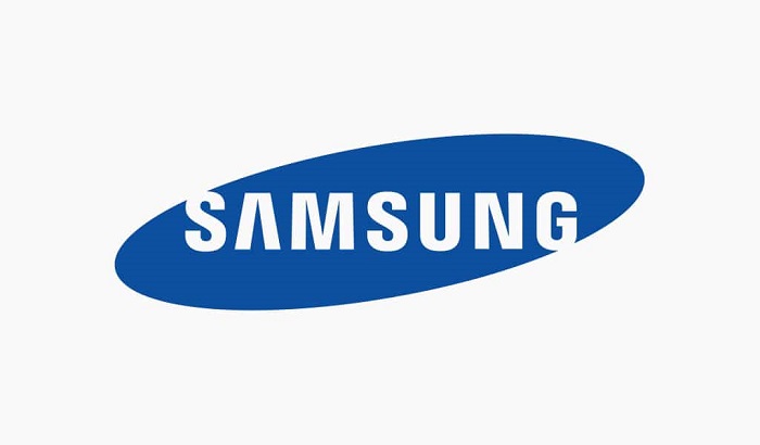
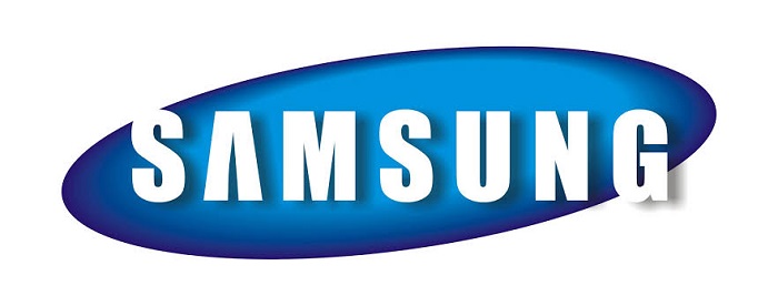
Samsung decided to bring a new corporate identity because they were celebrating 55 years of activity. The new blue Samsung logo has become one of the most popular logos in the electronics market. It features the company’s name is a basic oval shape.
2005
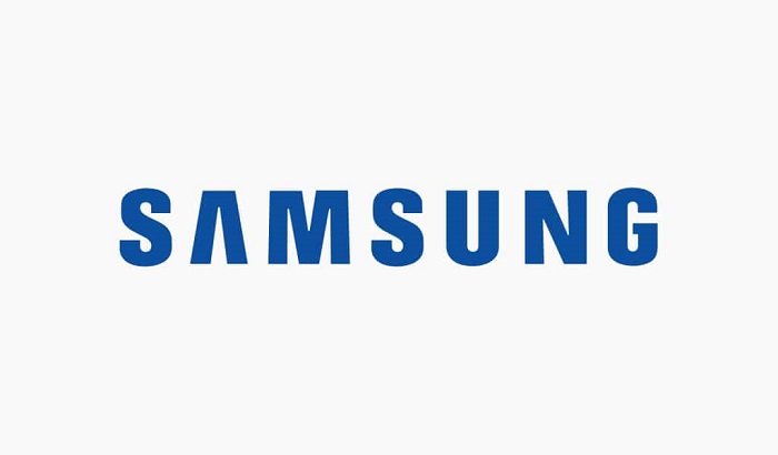
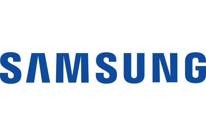
After more than two decades the logo is changed again and they eliminate the blue ellipse and focus just on the wordmark. The Samsung Logo really went for a more simple and modern approach and it looks like they did a great job with their choice.
FAQ On The Samsung Logo
What’s the Story Behind the Samsung Logo?
It’s a tale of evolution. The current Samsung logo was introduced in 1993, symbolizing the company’s leap into the global market.
It ditched complicated symbols for sleek, bold letters and that striking elliptical blue hue. It’s about simplicity, global appeal, and cutting-edge brand identity.
How Often Has the Samsung Logo Changed?
Not as often as you’d think. There have been a few iterations since 1938, but the major shift happened in ’93. That’s when they landed on the current, iconic company logo design.
It’s stood the test of time, barely changing since, which speaks to its timeless visual branding components.
What Does the Blue Color in the Samsung Logo Represent?
Oh, the blue—it’s all about reliability and commitment. Samsung’s blue is meant to inspire trust and stability, two core values of the brand. It’s not just any blue, it’s a unique shade that’s now synonymous with the technology industry—you see it, you think Samsung.
Is the Samsung Logo a Wordmark or a Symbol?
It’s a wordmark, no doubt. That graphic design decision stripped away any visual fluff, leaving clean, sans-serif letters. It’s a strategic move in the world of digital branding. The emphasis is on the name, ensuring it sticks with you, no fancy symbols needed.
Meaning Behind the Samsung Logo?
In the layers of that design, there’s an echo of the company’s roots and brand positioning. Samsung in Korean means “three stars,” which once symbolized something “big, numerous, and powerful.”
The logo today, with its simple elegance, is a nod to their commitment to leadership and innovation in the consumer electronics realm.
Why Did Samsung Choose a Wordmark Over a Symbol for Their Logo?
Words have clout. Samsung went for a wordmark to keep things classic and keep the focus on the company’s name.
It aligns with their branding strategy, prioritizes brand recognition, and ensures legibility—vital in an era where logos pop up everywhere, from smartphones to skyscrapers.
What Role Does the Samsung Logo Play in Its Branding Strategy?
It’s the cornerstone, really. Every brand dreams of an instantly recognizable logo. Samsung nailed it—balancing trademark authenticity with widespread appeal.
It’s visual identity 101: a powerful logo speaks volumes, transcending language and culture in the digital marketing landscape.
Has the Samsung Logo Been Involved in Any Trademark Disputes?
Well, it’s a tight ship they run. Samsung is keenly aware of trademark laws and its Intellectual property rights. Sure, in a competitive tech world, legal scuffles aren’t rare.
But by and large, Samsung’s emblem sails clear of disputes, a testament to their proactive intellectual property management.
How Has the Samsung Logo Adapted to Digital Media?
Like a pro. See, as the tech world went digital, Samsung’s logo kept pace. Its simplicity means it translates beautifully across digital platforms.
It’s always crisp, whether on tiny mobile screens or flashy web ads, keeping its corporate identity strong in a sea of online advertising.
Can Companies Use the Samsung Logo in Their Advertising?
Easy there, cowboy. That’s a clear no-go unless you’ve snagged a partnership or express permission. Samsung guards their trademark fiercely—just as any company would.
Collaboration’s one thing, but using it sans consent could have you paddling in trademark infringement waters. Not a good look.
Conclusion
So, we’ve unraveled the threads of this iconic emblem, the Samsung logo. It’s clear, right? It’s more than just a name in a fancy font splashed with a distinct blue. It stands as a beacon of innovation, reliability, and trust—a visual handshake between the brand and the consumer.
We’ve navigated through the principles of logo evolution, swooped into the importance of color in branding, and grasped the subtleties of trademark tangles. It’s been a journey across the digital branding landscape, where clean design meets strategic marketing.
- Simplicity reigns supreme,
- Blue whispers of dependability,
- And every curve of the letters is a meticulous crafting of brand identity.
From the physical products clustered on shelves to the digital displays adorning our lives, the logo stitches itself into our world fabric seamlessly. It’s a silent storyteller, charting the tale of a worldwide technology leader. As the screen dims, it’s that familiar blue swish that lingers—a visual identity inked into the collective consciousness.
If you liked this article about the Samsung logo, you should check out this article about the new Patreon logo.
There are also similar articles discussing the Facebook logo, the Amazon logo, the Apple logo, and the Twitter logo.
And let’s not forget about articles on the Netflix logo, the Microsoft logo, the Airbnb logo, and the IBM logo.