

Every great story has its symbols, and in the digital nomad’s tale, few are as instantly recognizable as the Airbnb logo. It’s not just a symbol. It’s a portal to stories of wanderlust, a badge worn by adventurers and hosts alike.
Here, we’re not merely observers; we’re a part of the narrative, woven into the fabric of memories crafted within the eclectic abodes listed on this peer-to-peer powerhouse.
In this exploration, uncover the strokes and strategies that shaped Airbnb’s visual identity: from a simple idea to a trademark registration that speaks comfort in any language.
The purpose? To unveil how symbolism, branding elements, and user experience design converge to create a global icon, ensuring you understand the artistry and intent behind this ubiquitous emblem.
Prepare to delve into the evolution, the impact, and the unmistakable brand message that Airbnb’s logo imparts in mere milliseconds, and how it encapsulates an accommodation marketplace redefining the very essence of travel.
The Meaning Behind the Airbnb Logo

The Emblem We All Know
Boom! There it is—the Airbnb logo. An emblem that shouts belonging. Something that echoes home. Why? Because that’s what it’s designed to do. But wait, there’s more to it. Let’s delve deeper.
It’s not just a Logo, it’s a Symbol
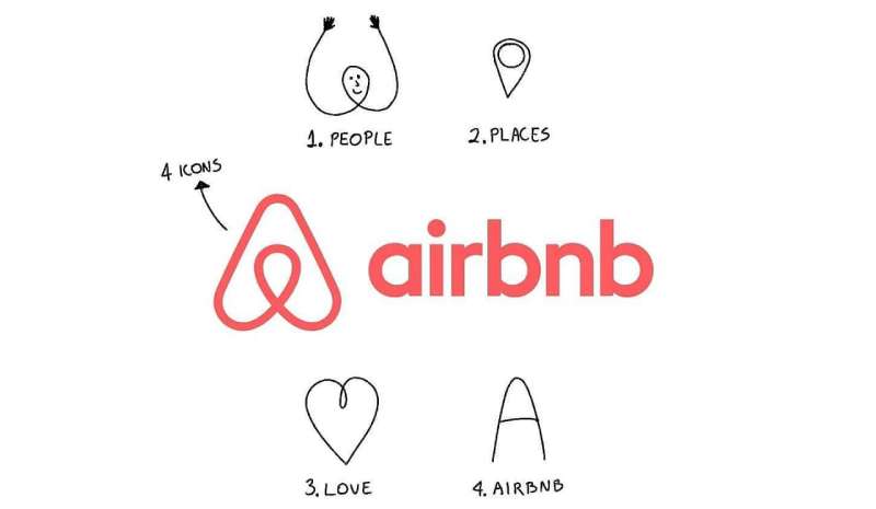
Let’s clear up something first, friends. This isn’t just a logo. It’s a symbol. A symbol that Airbnb has named: Bélo.
It’s this crazy blend of four elements: a head, to symbolize people, a location icon, to represent a place, a heart, for love, and then an A, for Airbnb. Bam, all in one logo. Brilliant, isn’t it?
A Sense of Belonging Everywhere
Bélo, it doesn’t just look cool. It’s got a mission. A mission to signify belonging. Yup, you heard it right. Airbnb wants you to feel like you belong, no matter where you are. That’s the power of this emblem. It’s more than just design—it’s an emotion.
The History of the Airbnb Logo

From Amateur to Professional
Hey, we all start somewhere, right? Airbnb was no different. The logo’s journey? A mirror of Airbnb’s own. It started off with something that looked like it came straight out of Microsoft Word. But that was okay, because it was a start.
A Shift in Identity
Over time, as Airbnb evolved, so did the logo. There were a few tweaks here and there, but nothing groundbreaking. Not yet. Then, in 2014, boom! The Bélo was born.
The Birth of Bélo
Bélo, the final form. A symbol that speaks a thousand words, or rather, one very important word: belonging. A simple, elegant icon that encapsulates the brand and its values. A design that started a whole new chapter for Airbnb.
The Colors of the Airbnb Logo

The Power of Red and White
Red and white, they’re more than just colors. They’re a statement. Red grabs attention, it screams passion, energy, and excitement.
Then, there’s white, the symbol of purity, simplicity, and cleanliness. Combine these two, and what do you get? A powerful logo that pops and stands out yet remains clean and simple.
A Subtle Dash of Grey
Ever noticed that dash of grey in the Airbnb text? It’s subtle, but it’s there. Grey, it represents balance, neutrality. It tones down the energy of the red, brings a bit of calmness to the logo.
The Font Used in the Airbnb Logo

Creating Connection Through Font
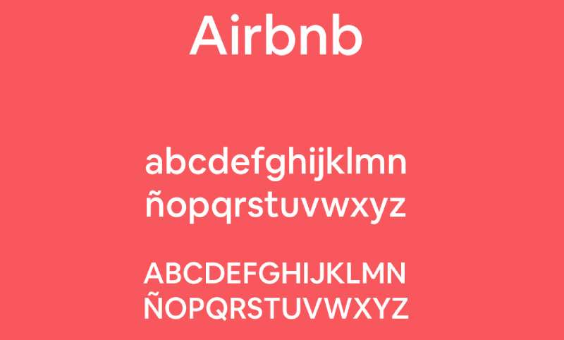
The font used in the Airbnb logo, it’s not just for show. It’s a custom typeface called Airbnb Cereal. Designed with readability and friendliness in mind, it aims to establish a connection with the audience.
The Beauty of Simplicity
Airbnb Cereal, it’s simple, yet beautiful. It’s got these round shapes, which give it a soft and friendly feel. But at the same time, it’s modern and sleek, just like the brand it represents.
The Impact of the Airbnb Logo
A Global Symbol of Belonging
Across continents, across cultures, the Bélo has become a symbol of belonging. It stands as a global reminder of Airbnb’s mission to create a world where everyone can belong anywhere.
How it Defines the Airbnb Brand
The Airbnb logo, it’s not just a logo—it’s the very soul of the brand. It echoes Airbnb’s values, its mission, its vision.
The simple elegance of the Bélo, the vibrant pop of its colors, and the softness of the Airbnb Cereal font, all come together to define the Airbnb brand as we know it.
The Evolution of the Airbnb Logo

The Ongoing Journey
The Airbnb logo, like the company, has had an evolution. It’s gone through changes, it’s seen some tweaks, it’s transformed. And who’s to say it’s done evolving? In the world of design, evolution is inevitable.
Embracing Change, While Staying True to Roots
The best part about this journey? No matter how much the logo changes, it always stays true to its roots. It continues to encapsulate the essence of Airbnb, and continues to symbolize belonging.
The Airbnb logo, folks, is more than just an icon. It’s a story, it’s an emotion, it’s a symbol of belonging. And as Airbnb continues to evolve, so will its logo, adapting, growing, and always reminding us of the sense of belonging that lies at the heart of Airbnb.
FAQ On The Airbnb Logo
What’s the story behind the Airbnb logo?
Ah, the Bélo. It’s a symbol for belonging, crafted to resonate with tales of travel and connection. It’s more than a logo; it’s the embodiment of sharing economy ideals, articulating a brand message without borders, about people, places, and love.
Has the Airbnb logo changed over time?
You bet. The logo evolved alongside the brand, stepping up from a basic script to the current iconic emblem – the Bélo. Reflecting a journey through logo design evolution, the Airbnb logo has matured, becoming a visual shorthand for modern hospitality.
What does the Airbnb logo represent?
The design’s a combo of four elements: people, places, love, and Airbnb itself. It’s a global brand symbol, communicating a sense of belonging and community – key to the powerhouse’s ideology. It’s the heart of Airbnb’s visual identity.
Can the Airbnb logo be used freely?
Not quite. It’s Airbnb’s trademark, so using it needs their nod. They’ve got brand guidelines to maintain their image. It’s about protecting a brand’s equity. Always check their policy before you even think about putting that logo on anything.
How has the Airbnb logo impacted its brand recognition?
Massively. A solid emblem amps up a brand’s recognizability. This one? Speaks volumes without a word. It’s laced into the public psyche – the emblem of vacation rental branding, building up that brand equity every company dreams of.
What are the key design elements of the Airbnb logo?
Simple, yet profound. Four elements: head for people, a location dot for place, heart for love, and an A-shape for Airbnb. Mixed together, they whisper tales of connection – a corporate identity symbol that’s downright iconic.
Who designed the Airbnb logo?
The credit goes to London-based design studio, DesignStudio. Collaborated closely with Airbnb to deliver a refreshed look which wasn’t just a refresh—it was a statement of start-up culture evolution, a brand maturing into a global hospitality symbol.
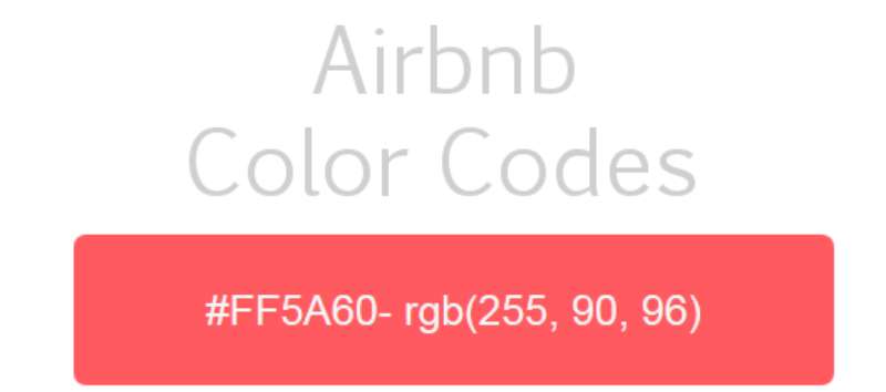
What color is the Airbnb logo?
That shade you can’t miss? Rausch. Punchy, memorable, but not in-your-face; it nails the brief for visibility and distinctiveness. It helps the logo stand out, making it a visual anchor in the landscape of digital platforms.
What does the Airbnb logo say about the company’s culture?
It says “open doors and hearts”. There’s a story in there, whispering the core of Airbnb—belonging. The logo underlines the company’s dedication to community, travel, and transformative experiences that shape start-up culture and peer-to-peer services*.
Is Airbnb’s logo considered effective in terms of marketing?
Absolutely. It’s one of those logos that sticks. It does the heavy lifting in terms of marketing, a visual branding strategy workhorse. It’s instantly recognizable, translating to free advertising every time it pops into view. It’s a brand imagery home run.
Conclusion
So, we wrap this up, right? Our journey’s end, or the trailhead for your own creative scramble. We ventured deep into the anatomy of the Airbnb logo, its bones made of belonging, its skin crafted by stories of connection—a testament to brand recognition on a global scale.
- We’ve dissected the depth of design that creates a symbol for millions.
- We’ve unveiled the colors, the curves, the ethos encased in every loop.
- We’ve also dodged the legal snares while pondering the power of branding, and hey, isn’t that visual identity just a storytelling vessel?
With a logo like this, imbued with ideals of community and hospitality, you’ve got to tip the hat to the creatives—cooking up nothing short of design alchemy. Whether you’re sketching out your own logo or pondering the greats, let this be a compass pointing you towards designs that don’t just market, but resonate, whisper to souls, and maybe, just maybe, stay with folks long after they’ve logged off.
If you liked this article about the Airbnb logo, you should check out this article about the new Patreon logo.
There are also similar articles discussing the Facebook logo, the Amazon logo, the Apple logo, and the Twitter logo.
And let’s not forget about articles on the Netflix logo, the Microsoft logo, the Samsung logo, and the IBM logo.