


You might’ve caught wind of the chatter about Patreon shaking things up with their new look. Everyone’s talking about the new Patreon logo, and for good reason.
Patreon’s been in the game for some time, always having the backs of creators. Yet, as with all things in our fast-paced digital age, shifts happen.
It’s the nature of brands to adapt and grow. For Patreon, it was about more than just jazzing things up with a new emblem.
It’s a nod to the lively essence of logo designs today and the fluid world of creators out there.
This makeover? It’s not just aesthetics. It’s a bold declaration. A shoutout that Patreon’s gearing up for what’s next, amping up their game for creators. And the centerpiece of this transformation? That revamped Patreon logo.
The Logo Redesign
![]()

Now, I’ve seen my fair share of logos and I also wrote about them since 2008.
But this new Patreon logo?
It’s something else. It’s not just a picture. It’s an identity. It’s a reflection of Patreon’s brand identity and where they see themselves in the future.
The New Logo: Design and Philosophy
Alright, let’s dive deeper into this logo.
The Dynamic Nature of the Logo
Logos are tricky. They need to be simple, yet convey a message. They need to be memorable. And the new Patreon logo does just that.
It’s not static.
It moves, it breathes. It has this dynamic logo design that’s just… cool. It’s got this abstracted 3-D “P” shape that’s both modern and timeless.
Logo’s Presence Across Platforms
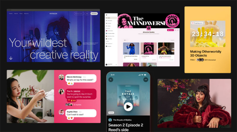

A logo isn’t just something you slap on a website and forget about. It’s everywhere. It’s on merchandise, it’s on ads, it’s on social media.
And this new Patreon logo? It’s been designed to shine everywhere. Whether it’s a tiny icon on your phone or a massive billboard, it stands out.
Logo Customization for Creators
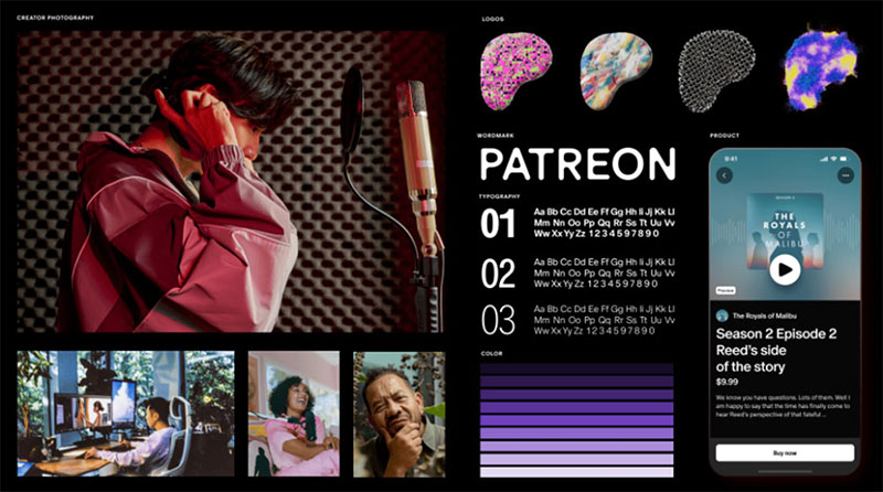

The Vision of Giving Creators Ownership
Imagine having a logo that’s not just a static image. A logo that you can play around with, tweak, and make your own.
That’s what Patreon’s doing here. They’re giving the power back to the creators.
Creators can now take this dynamic logo design and add their own flair to it.
Whether it’s changing up the colors to match their brand or playing around with the abstracted 3-D “P” shape, the possibilities are endless. It’s all about creator branding and making sure their identity shines through.
Personalized Logo Design
This isn’t just about tweaking a logo. It’s about personalization. It’s about taking the new Patreon logo and making it a reflection of the creator’s own brand.
It’s about standing out in a sea of content and saying, “Hey, this is me. This is my brand.”
Broader Implications of the New Logo
We live in a digital age. Everything’s online. And in this world, the old ways of doing things? They don’t always cut it. That’s where Patreon’s coming in.
They’re shaking things up. They’re challenging the branding conventions we’ve all grown up with.
The new Patreon logo isn’t just a picture. It’s a statement. It’s saying that in this digital-first world, brands need to be fluid.
FAQ on the New Patreon Logo
Why did Patreon decide to redesign their logo?
Well, brands evolve, right? Just like fashion or music. Patreon felt the need to reflect its growth and the changing dynamics of the creator economy.
The new Patreon logo is a fresh take, aiming to resonate better with the digital age and the diverse community it serves.
What’s the main concept behind the new design?
The new Patreon logo is all about dynamism and adaptability. With its abstracted 3-D “P” shape, it’s designed to be fluid, representing the diverse and ever-changing world of creators.
Can creators customize the new logo for their pages?
Absolutely! Patreon’s all about empowering creators. With the dynamic logo design, creators can add their own flair, making it align with their personal brand.
It’s about giving more control and creator branding tools in their hands.
How does the new logo fit into the broader rebranding strategy?
Patreon’s rebranding is a holistic approach, challenging traditional branding conventions.
The new Patreon logo embodies the company’s vision for the future, emphasizing a digital-first world and the importance of the creator community.
Are there any specific colors associated with the new logo?
Patreon has moved towards a more flexible color palette. Instead of rigid brand colors, they’re emphasizing creator expression.
How has the community reacted to the new design?
As with any major change, reactions vary. Some love the fresh look, while others need time to adjust.
But overall, the emphasis on creator branding and adaptability has been appreciated. It’s a bold step into the future.
What was the inspiration behind the abstracted 3-D “P” shape?
The abstracted 3-D “P” shape is a nod to the digital, dynamic nature of today’s content creation.
It’s designed to be modern yet timeless, capturing the essence of creativity and the spirit of the Patreon community.
How does the new logo enhance Patreon’s digital presence?
In this digital-first world, brands need to stand out. The new Patreon logo, with its dynamic design, ensures Patreon remains recognizable and distinct, whether it’s on an app icon or a website banner.
Are there guidelines for creators on how to use the new logo?
Yes, while Patreon encourages customization, they also provide guidelines.
It ensures the logo retains its essence while allowing for creator branding and personalization. It’s a balance between brand consistency and individual expression.
What’s next for Patreon after this rebranding?
Patreon’s always evolving. With this rebranding, they’ve set the stage for more innovations.
While the new Patreon logo is a significant step, expect to see more features and tools that further empower the creator community in the future.
Conclusion
Amidst the constantly shifting digital realm, the revamped Patreon logo emerges as a symbol of fresh thinking. It’s more than just a visual update; it embodies the essence of modern-day creator branding.
This emblem defies age-old branding norms, showcasing a design that’s both contemporary and evergreen.
It pays homage to the myriad of creators, channeling their heart and soul into their craft, signaling Patreon’s readiness for what’s ahead. With its unique 3-D “P” silhouette and its versatile nature, it resonates deeply with the spirit of the creator-driven world.
In conclusion, it’s evident that it’s more than just an icon. It signifies a paradigm shift in our perception of branding in this digital era. Through this audacious move, Patreon paves the way, championing the idea that creative expression remains paramount.
If you liked this article about the new Patreon logo, you should check out this article about the Facebook logo.
There are also similar articles discussing the Amazon logo, the Apple logo, the Twitter logo, and the Netflix logo.
And let’s not forget about articles on the Microsoft logo, the Samsung logo, the Airbnb logo, and the IBM logo.