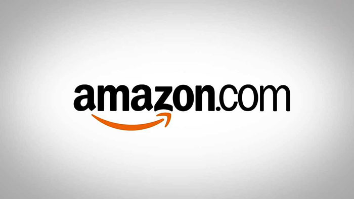
The Amazon logo stands as one of the most recognized corporate symbols in global commerce. That curved orange arrow underneath the wordmark? It does more work than most people realize.
Within the landscape of tech company logos, Amazon’s design holds a unique position. It manages to communicate both friendliness and ambition without feeling cluttered.
The current version launched in 2000, created by Turner Duckworth. Since Jeff Bezos founded the company in 1994, the logo has gone through three major iterations. Each version reflected where the company was headed next.
What Is the Amazon Logo?
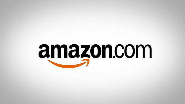
The Amazon logo is a wordmark featuring the company name in lowercase black letters with an orange curved arrow beneath it. Introduced in 2000 and designed by Turner Duckworth, the arrow points from “a” to “z,” symbolizing the company’s vast product selection and customer satisfaction.
Design Type: Combination mark (wordmark plus symbol)
Primary Elements:
- Lowercase “amazon” text
- Orange curved arrow (the “smile”)
- Arrow connecting letters “a” to “z”
Official Introduction Date: 2000
Designer/Agency: Turner Duckworth
Trademark Status: Registered trademark of Amazon.com, Inc.
Color Palette:
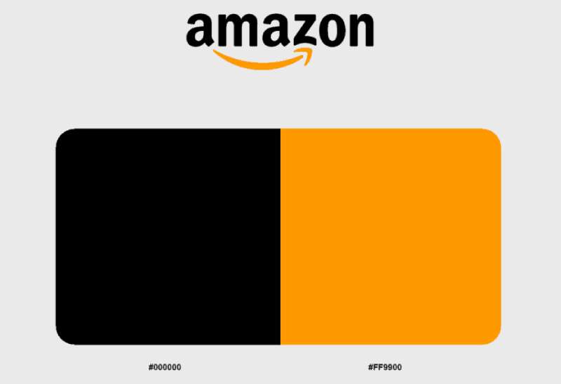
- Black: #000000
- Amazon Orange: #FF9900
Usage Context: Website, mobile app, packaging, delivery vehicles, Prime branding, AWS (modified), physical retail locations, marketing materials
How Has the Amazon Logo Evolved Over Time?
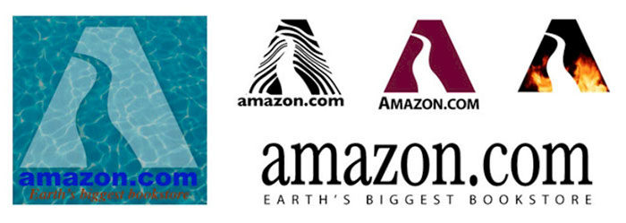
Amazon’s visual identity has changed dramatically since 1994. The company started with a stylized “A” featuring river imagery, then moved to a text-heavy design, before landing on the clean wordmark we recognize today.
Each redesign marked a shift in business strategy. The logo grew simpler as the company grew larger.
Original Amazon Logo (1994-1997)

Years Active: 1994-1997
Design Description: A stylized letter “A” with a river running through it, representing the Amazon River. The design was detailed and attempted to capture the “world’s largest” concept through natural imagery.
Color Scheme: Blue, brown, and green tones
Designer: Internal design team
Context: Bezos chose “Amazon” partly because it started with “A” (good for alphabetical listings) and because the river reference suggested scale. The logo tried to make that connection literal.
Key Changes from Previous: This was the first logo, so no prior version existed.
Cultural Significance: It reflected the early internet era’s tendency toward complex, illustrative logos. Very 1990s in its approach.
Transitional Amazon Logo (1997-1998)
Years Active: 1997-1998
Design Description: Black text spelling “Amazon.com” with a gold underline and the tagline “Earth’s Biggest Bookstore.” Much cleaner than the original but still somewhat generic.
Color Scheme: Black and gold
Designer: Internal team
Context: Amazon was preparing for its IPO and needed a more professional appearance. The bookstore tagline would soon become outdated as the company expanded into other categories.
Key Changes from Previous: Dropped the river illustration entirely. Moved to pure text. Added explicit description of the business.
Cultural Significance: Represented the dot-com boom era when companies added “.com” prominently to establish internet credibility.
Second Transitional Logo (1998-2000)
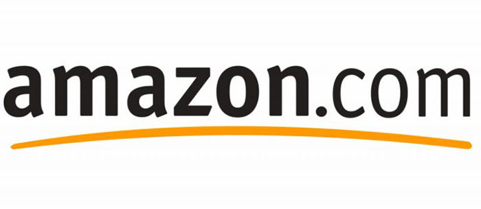
Years Active: 1998-2000
Design Description: “amazon.com” in black lowercase letters with a curved yellow swoosh underneath. Getting closer to the modern version but not quite there yet.
Color Scheme: Black and yellow
Context: Amazon was rapidly expanding beyond books. The generic swoosh was trendy at the time but lacked distinctive meaning.
Key Changes from Previous: Removed the tagline. Introduced the curved element that would later become the arrow.
Cultural Significance: The swoosh trend was everywhere in the late 1990s. Amazon followed the crowd before finding its own voice.
Current Amazon Logo (2000-Present)
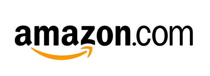
Years Active: 2000-present
Design Description: Lowercase “amazon” in a custom sans-serif font, with an orange curved arrow starting at the letter “a” and ending at “z.” The arrow also resembles a smile.
Color Scheme: Black (#000000) and Amazon Orange (#FF9900)
Designer: Turner Duckworth
Context: Amazon needed a logo that could represent unlimited product categories, not just books. The A-to-Z concept solved that problem elegantly.
Key Changes from Previous: The swoosh became a purposeful arrow with clear start and end points. The yellow became a warmer orange. Every element now carried meaning.
Cultural Significance: This logo has endured for over two decades with minimal changes. It proved that simplicity and cleverness can coexist. The smile/arrow has become one of the most recognized symbols in global commerce.
What Do the Design Elements of the Amazon Logo Mean?
The arrow carries dual symbolism that most people pick up on instinctively. It suggests forward motion, pointing right like an arrow should.
But the curve makes it look like a smile. Customer satisfaction, essentially.
The A-to-Z positioning reinforces the “everything store” concept. You can find anything here, from A to Z.
What Does the Arrow Symbol Represent?
The arrow starting at “a” and landing on “z” communicates product range. Amazon sells everything from A to Z.
The curved shape doubles as a smile, suggesting customer happiness. It’s doing two jobs at once.
Arrows also imply movement and progress. There’s a sense that things are going somewhere.
Why Did Amazon Choose These Specific Colors?
Black (#000000)
- Symbolic meaning: Authority, sophistication, reliability
- Psychological impact: Creates trust and professionalism
- Brand connection: Grounds the playful orange element
Amazon Orange (#FF9900)
- Pantone: Closest to Pantone 1375 C
- Symbolic meaning: Energy, warmth, affordability
- Psychological impact: Stimulates action and optimism
- Brand connection: Differentiates from competitors while suggesting friendliness
The orange stands out against competitors who lean heavily on blue (eBay, Walmart’s accent, PayPal). It’s warm without being aggressive.
Black keeps things grounded. Without it, the orange might feel cheap or gimmicky.
What Typography Style Is Used in the Amazon Logo?
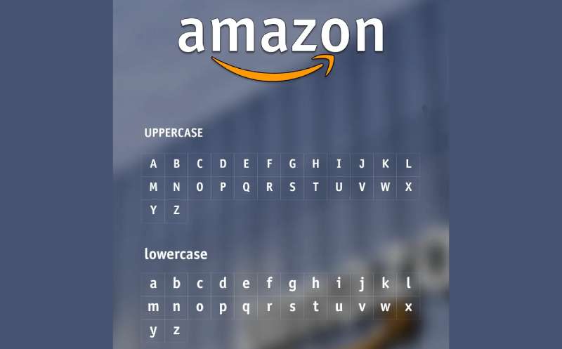
Amazon uses a custom typeface based on geometric sans-serif principles. The letterforms are clean with consistent stroke widths.
Lowercase letters create approachability. All-caps would feel more corporate and distant.
The kerning is tight but readable. Letters sit close together without cramping.
Over time, the typography has been refined slightly for digital clarity. The changes are subtle enough that most people wouldn’t notice.
What Are the Hidden Meanings in the Amazon Logo?
The smile/arrow pointing from A to Z is the primary “hidden” meaning. Though at this point, it’s pretty well known.
Some people see the arrow as a dimple, making the entire wordmark look like a face. That’s probably unintentional.
Turner Duckworth has stated the dual meaning (smile plus A-to-Z) was absolutely deliberate. They wanted a single element doing multiple jobs.
The orange color temperature was carefully chosen. Warmer than yellow, friendlier than red.
How Does the Amazon Logo Compare to Competitor Logos?
Among e-commerce giants, Amazon’s logo stands out for its warmth. eBay uses a playful multicolor approach. Walmart relies on a spark symbol. Alibaba features a stylized “a” figure.
Amazon’s design feels more personal than most. The smile does a lot of that work.
Amazon vs. eBay: eBay’s overlapping letters suggest community and diversity. Amazon’s single-focus wordmark feels more streamlined. Different philosophies, different visual choices.
Amazon vs. Walmart: Walmart’s spark is energetic but abstract. Amazon’s arrow tells a story. The A-to-Z concept communicates something specific.
Amazon vs. Alibaba: Both use stylized “a” elements. Alibaba’s figure is more illustrative, almost mascot-like. Amazon stays typographic.
Among orange logos, Amazon’s usage is distinctive. The color appears only in the arrow, not throughout the wordmark. That restraint makes it more memorable.
What Are the Technical Specifications of the Amazon Logo?
Official Color Codes:
Primary Color: Amazon Black
- Hex: #000000
- RGB: (0, 0, 0)
- CMYK: (0, 0, 0, 100)
Secondary Color: Amazon Orange
- Hex: #FF9900
- RGB: (255, 153, 0)
- CMYK: (0, 40, 100, 0)
- Pantone: 1375 C (approximate)
Dimensions and Proportions:
- Aspect ratio: Approximately 3.5:1 (width to height)
- Minimum size: 55 pixels wide for digital, 0.5 inches for print
- Clear space: Equal to the height of the “a” on all sides
Official Usage Guidelines:
- Do not stretch, distort, or rotate
- Do not change colors outside approved variations
- Do not add effects like shadows or gradients
- Maintain clear space requirements
- Use only official logo files from Amazon’s brand portal
What Cultural Impact Has the Amazon Logo Had?
The smile arrow has become shorthand for e-commerce itself. When people think online shopping, they often picture that orange curve.
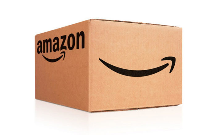
On Amazon delivery boxes, the logo creates instant recognition at doorsteps worldwide. It’s almost become a status symbol of consumer culture.
The design has inspired countless imitations. Startups frequently try to replicate the “hidden meaning” approach, sometimes awkwardly.
During the COVID-19 pandemic, the boxes with that smile became a constant presence in neighborhoods. The logo took on new cultural weight as a symbol of changed shopping habits.
How Does the Amazon Logo Fit Into the Overall Brand Identity?
The logo anchors a broader visual system. Amazon Prime, AWS, Alexa, and Whole Foods all connect back to the parent brand in different ways.
Prime uses the arrow prominently, creating a sub-brand that feels related but distinct. AWS takes a different approach, using an angular design that suggests cloud architecture.
The orange appears across touchpoints. Packaging tape, app icons, website buttons. That consistency builds recognition.
Amazon’s brand guidelines are strict about logo usage. The company protects its visual identity aggressively, which keeps the brand feeling cohesive across millions of customer interactions.
How Should the Amazon Logo Be Used?
Official Usage Do’s:
- Use official logo files only
- Maintain minimum clear space
- Use approved color variations (full color, black, white)
- Follow size minimums for legibility
Official Usage Don’ts:
- Don’t recreate the logo manually
- Don’t alter proportions or colors
- Don’t place on busy backgrounds without proper contrast
- Don’t combine with other logos without approval
- Don’t use outdated versions
Where to Access Official Logos: Amazon provides brand assets through their trademark guidelines page and partner portals. Sellers and affiliates have access to approved assets through Seller Central and the Associates program.
Licensing Information: The Amazon logo is a registered trademark. Commercial use requires explicit authorization. Editorial use follows standard fair use principles.
Trademark Protection: Amazon actively monitors and enforces its trademark rights. Unauthorized use, especially anything suggesting false endorsement or affiliation, will likely result in legal action.
FAQ on The Amazon Logo
What Does the Amazon Logo Mean?
The Amazon logo carries a dual message. The orange arrow points from “a” to “z,” representing the company’s massive product range.
That same arrow curves into a smile. Customer satisfaction, built right into the design.
Simple concept. Effective execution.
Who Designed the Current Amazon Logo?
Turner Duckworth created the current version in 2000. The San Francisco and London-based agency developed the smile arrow concept that replaced the generic swoosh.
Jeff Bezos approved the design personally. It’s remained largely unchanged for over two decades.
When Was the Amazon Logo First Created?
The original logo appeared in 1994 when Bezos founded the company. It featured river imagery reflecting the Amazon name.
Three major redesigns followed. The current wordmark design launched in 2000 and became the lasting version.
What Are the Official Amazon Logo Colors?
Two colors define the brand. Black (#000000) for the text. Amazon Orange (#FF9900) for the arrow.
The orange sits close to Pantone 1375 C. This specific shade appears across Amazon packaging, the app, and all marketing materials.
Why Does the Amazon Logo Have an Arrow?
The arrow serves multiple purposes. It connects the letters A to Z, showing product variety across the digital marketplace.
The curved shape also forms a smile. One element, two meanings. That’s efficient logo design at work.
Can I Download the Official Amazon Logo?
Amazon provides official logo files through their trademark portal. Sellers access brand assets via Seller Central.
Affiliates get approved versions through the Associates program. Always use official files. Never recreate the logo manually.
What Font Does Amazon Use in Its Logo?
Amazon uses a custom font based on geometric sans-serif principles. The letterforms are clean with consistent stroke widths.
Lowercase letters create approachability. The tracking keeps things tight but readable.
Has the Amazon Logo Changed Over the Years?
Yes. The logo evolution includes four distinct versions since 1994.
It started with river imagery. Then came a text-heavy transitional phase. A generic swoosh followed briefly.
The 2000 redesign introduced the smile arrow. That one stuck.
What Is the Hidden Message in the Amazon Logo?
The arrow pointing from A to Z isn’t exactly hidden anymore. Most people recognize it now.
The smile interpretation adds another layer. Some see the whole wordmark as a face with the arrow as a dimple. Probably unintentional.
How Can I Use the Amazon Logo Legally?
The Amazon trademark symbol is protected. Commercial use requires explicit authorization from the company.
Editorial use follows fair use principles. Check Amazon’s brand standards before any usage. They enforce their visual identity aggressively.
Conclusion
The Amazon logo proves that great brand identity doesn’t require complexity. One arrow. Two colors. Multiple meanings.
That smile connecting A to Z has become synonymous with e-commerce itself. From Seattle startup to global retail giant, the visual identity scaled perfectly.
Turner Duckworth’s 2000 redesign gave Amazon something rare. A symbol that communicates product range and customer satisfaction simultaneously.
The orange arrow now appears on millions of packages daily. It shows up on Prime streaming, Alexa devices, and Kindle readers.
Few corporate logos achieve this level of brand recognition. Fewer still manage to feel friendly while doing it.

Renowned for his expertise in logo design and visual branding, Bogdan has developed a multitude of logos for various clients.
His skills extend to creating posters, vector illustrations, business cards, and brochures. Additionally, Bogdan's UI kits were featured on marketplaces like Visual Hierarchy and UI8.
He also wrote in the past years on sites like Design Your Way, WebDesignerDepot, WPDean, Designmodo, Speckyboy, Slider Revolution, and more.
- Canva for Teams Review: Is It Worth the Business Plan? - 24 July 2026
- 5 Brand Compliance Checkpoints Every Enterprise Should Automate - 23 July 2026
- Timeless Open Sans Font Pairing for Any Project - 22 July 2026

Bogdan Sandu is a seasoned designer who has been designing websites since 2008. Renowned for his expertise in logo design and visual branding, Bogdan has developed a multitude of logos for various clients. His skills extend to creating posters, vector illustrations, business cards, and brochures. Additionally, Bogdan's UI kits were featured on marketplaces like Visual Hierarchy and UI8. He also wrote in the past years on sites like Design Your Way, WebDesignerDepot, WPDean, Designmodo, Speckyboy, Slider Revolution, and more.
You Might Also Like