
Imagine a simple curve, a playful arc that somehow encapsulates the spirit of athleticism and the promise of human potential.
This isn’t just any random design—it’s the Nike logo, a symbol recognized across the globe. Its grace belies the colossal tenacity and innovation that have propelled a brand to global ubiquity.
Delving into the anatomy of this corporate icon, I’ll unravel the tapestry of stories, from Phil Knight’s vision to Carolyn Davidson’s creation, that illustrate more than mere branding success.
It reflects the zeitgeist of generations, and its evolution echoes the dynamism of the athletic apparel industry.
By the end of this article, an understanding of how the Swoosh symbol became synonymous with excellence—and how it transcends being a mere trademark sign—will be unveiled.
Explore with me the quintessence of an emblem where graphic design, brand identity, and cultural impact coalesce.
Strap in for an exploration that moves beyond aesthetics; it delves into brand equity and sports culture, mapping the voyage of a design that strokes the realms of legend.
A brief history of Nike

Nike’s story started with two people seven years before it was founded. Philip Knight, who was a track athlete from the University of Oregon, collaborated with his coach Bill Bowerman to design athletic shoes. At the time, he founded a company called Blue Ribbon Shoes who distributed shoes for Onitsuka Tiger, a Japanese brand which is today known as Asics.
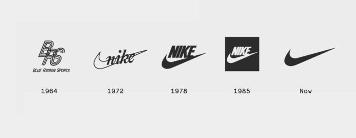
The logo used was a combination of the store’s initials. The Nike brand is headquartered in Washington Country Oregon under the leadership of Phil Knight and Bill Bowerman. Even though they founded the brand in 1964, they changed their name in 1978 from Blue Ribbon Sports to Nike.
Nowadays, over 44,000 employees are employed by Nike across the world. The company has massive assets with a worth of $15 billion. There are over 700 Nike outlets across the globe. Nike sells a wide range of products aside from shoes that also carry this famous Nike logo.
Victory’s Wing


The name Nike has a great history as it is named after an ancient Greek Goddess. According to Greek folklore, it is said that Nike, the Goddess was the reason why warriors won numerous battles for their motherland. Each time they won a battle they used to say, Nike, to each other.
The goddess’ wings are called swoosh and history has it that the wings brought audacity and motivation to warriors when they headed towards the battlefields. Experts like to believe that this was the main reason behind the design of the Swoosh Nike logo.
Who is Carolyn Davidson?


The graphic design student, Carolyn Davidson from Portland State University met Phil Knight in 1969. She was just another poor student looking for ways to earn extra money. Phil Knight was looking for someone to help him to design a logo and he turned to her.
He offered her $2 an hour to help him design a Nike logo. Phil Knight wanted an image or stripe that could come on the side of their athletic shoe. She decided on the Swoosh, which as we know it is a check marked shape which is both fluid and resembles speed and movement.
At the same time is it hinting after the name of the Greek Goddess, Nike, as the image also resembles a wing. Even though Knight was initially unhappy with the logo, he still accepted it and the logo remained. She continued to work for Nike for a few years longer until she decided to work from home.
Small Job, Big Payoff
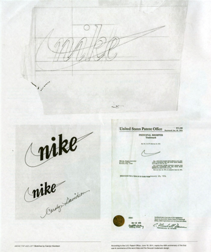

Carolyn Davidson was paid $2 per hour and she billed Phil Knight for 17.5 hours which gave her a paycheck of $35. She continued to work for Nike for four years, and eventually got $1 million and a ring of gold and diamonds in the Swoosh design.
The evolution of the Nike logo
The Nike logo changed and evolved through the years since its inception, despite the simplicity of the original Nike logo.
1971

When Knight first received the Nike logo drawing, he wasn’t impressed, but accepting that it would grow on him in time, chose to use it, nevertheless.
1978

The cursive serif font that was initially used, was replaced by Futura Bold in 1978. It featured a more geometric shape while the E that runs into the Swoosh’ tail was more fluid. Each letter also had varied spacing between them.
1985
![]()

In 1985 the Nike logo was in a red square and used it only for a short period. Major athlete endorsements followed in the mid-eighties with Michael Jordan being the most prominent. The slogan “Just Do It” was introduced by the late 80s
1995
![]()

The lone swoosh was introduced in 1995 and still used today. The Swoosh symbol is meant to be a symbol of athleticism, speed, and high-quality apparel. While it makes a strong argument for utmost simplicity, the Nike logo is one of the world’s most recognizable logos.
The Nike co-founder, Phil Knight wrote a book in 2016 about the amazing and simple history of Nike and its evolution to become a world leader. The book is called Shoe Dog.
Meaning of the Nike Logo

When something moves swiftly past you, it is referred to as the swoosh. It means that it was a fast movement, therefore does the word stand for fast motion, speed and sound. This is why the Nike logo shows a fast movement arch.
Main design elements of the Nike logo
The Nike logo is memorable as a swoosh symbol and one of the most uncomplicated designs in the world. This symbol is what the entire brand is based on.
Shape
The shape of the Nike swoosh logo is the Greek Goddess, Nike’s wing or that is what the designer had in mind when she initially drew the logo. She borrowed the mythical shape of a Goddess’ wing from historical and cultural sources to engage the world.
Color


The swoosh logo has changed color more than once since its design. for many years it was black before the brand color changed to a dull orange. Initially, the original Nike Swoosh logo was red and white.
At the time the company and the designer of the logo decided that red is suitable for joy, passion, and energy while the white of the logo represented charm, purity, and nobility. The color schemes were changed later to have a classier and sleeker logo design.
Font


While the Nike logo is a symbol, the designers often place the Just Do It slogan at the logo’s top. At times you will also see the company name appearing on the logo. The text font used for the writing is elegant and the name always appears in bold.
The font used for the additional wording is a combination of Futura Bold Condensed Oblique that is tweaked a bit. To make the text more visible and distinctive, the k has a slanting to it. Until 1995, the Nike logo was written in Futura bold.
Without a doubt, it is obvious that developing a brand requires research, planning, and a lot of thought. However, as seen with Nike, the branding does not need or have to be expensive either.
Look at the iconic logo that was designed by a student looking for a few dollars and delivering one of the world’s most recognizable and memorable designs.
FAQ On The Nike Logo
Who designed the Nike logo?
The Nike logo, known as the Swoosh, was crafted by Carolyn Davidson, a graphic design student. She created this iconic symbol back in 1971, earning her $35—a modest sum for a design now valued in the billions.
What does the Nike logo represent?
The Swoosh symbolizes motion and speed, echoing Nike, the Greek goddess of victory’s wing. It’s an embodiment of athletic pursuit and excellence, aiming to inspire athletes and consumers alike.
Why is it called the Swoosh?
The name “Swoosh” references the sound you might associate with something zipping past quickly, capturing the essence of movement and the quick strike of athletic competition. It’s a sonic representation of speed and performance.
How much did the Nike Swoosh cost?
In its inception, Carolyn Davidson was compensated $35 for her design work. Years later, as the logo became synonymous with the brand, Nike honored her contribution with stock that is now worth a substantial sum.
Has the Nike logo ever changed?
While the logo’s core design, the Swoosh, has remained constant since its inception, its presentation has evolved. Earlier incarnations included the brand name, while modern applications often use the Swoosh alone.
What’s the significance of the ‘Just Do It’ slogan with the logo?
“Just Do It” complements the Swoosh in conveying motivation and action. This powerful slogan, introduced in 1988, bolsters the Nike brand’s message of empowerment and determination.
Why is the Nike logo on the right side of clothing?
The Swoosh is often placed on the right side to align with the movement of the heart across the chest as it beats—it’s a location intentional for visibility and brand consistency.
Is the Nike logo trademarked?
Absolutely, the Nike Swoosh is a trademark registered globally, protecting the brand’s identity and preventing unauthorized use—a cornerstone of Nike’s branding strategy.
How has the Nike logo influenced branding?
The Nike Swoosh revolutionized branding, showing that a simple, yet distinctive design can profoundly impact brand recognition and consumer loyalty. It has become a textbook case for effective visual branding elements.
What messages does the Nike logo convey to consumers?
The Nike Swoosh communicates inspiration, achievement, and innovation. It encapsulates the spirit of perseverance inherent in athletics, aligning with Nike’s image as a promoter of sports and fitness to a broad consumer base.
Conclusion
Peeling back the layers behind the Nike logo, it’s quite the odyssey—one echoing with creativity, brand evolution, and cultural significance. In a mere stroke, the Swoosh encapsulates movement, aspiration, and the ethos of athletic apparel. It’s more than a symbol; it’s a global beacon.
- Dissecting the Swoosh’s ancestry, we tip our hats to Carolyn Davidson’s genius, a testament to the profound impact of design.
- We acknowledge the emblem’s unwavering presence amidst trends and shifts—yet unwavering in its roots.
- We’ve seen its resonance, a badge worn with equal pride by world-class athletes and the commonfolk.
In essence, the Swoosh’s journey from a classroom project to a trademark of triumph, is a narrative in branding’s powerful play. It stands as a sentinel over a domain where passion, progress, and the pursuit of greatness convene. Just Do It—a simple call to action, yet, an indelible pact between a logo and its legacy.
If you enjoyed reading this article about the Nike logo, you should read these as well: