


Imagine crafting a visual symphony, where every element sings in harmony with the rest. That’s the crux of graphic design, and the difference between scale and proportion takes center stage in this ensemble.
It’s about more than just size or ratios—dive into this intricate dance, and you’ll see how these twin pillars elevate a design from good to unforgettable.
You’re in for a revelation today. By unraveling the subtleties that set apart scale and proportion, you’ll unlock a new perspective on visual composition.
Explore how manipulating the relative size of elements can sway the mood of your work or how the golden ratio guides the eye with an almost magnetic pull.
Harmonious design isn’t happenstance; it’s a calculated orchestration of design elements.
As we dissect each concept, anticipate a cascade of ‘aha’ moments—those bursts of clarity that will refine your craft.
We’ll navigate through design principles, aspect ratios, and the psychological wizardry of Gestalt principles, en route to a richer understanding of visual language.
Understanding Scale
Definition of Scale in Graphic Design

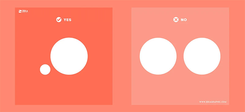
Scale—it’s that secret sauce that makes you go, ‘Whoa, that’s huge!’ or ‘Look how tiny that is!’ when eyeballing a design.
We’re talking about the size of stuff, like when something’s as big as you are (life-sized), tinier than your pinky (miniature), or sprawling out like a giant’s picnic blanket (oversized). It’s a game of comparison.
Scale in graphic design sets the stage for visual weight and impression, giving muscle to the message you’re pumping out.
And hey, throwing some common adjectives in the mix spices things up.
Describe something as ‘enormous’, and suddenly, it’s the star of the show, the center of the universe in your design cosmos.
The Role of Human Body Size in Judging Scale

So, why does scale stick out?
Well, it’s all about the yardstick you use, and more often than not, it’s the human bod. It’s like that familiar measuring tape we all carry around mentally.
Seeing a smartphone design that’s as tall as a person? Instantly, you know that’s not your regular phone—it tells a story, it’s a statement. The body gives context to scale, making it relatable.
Common Adjectives Associated with Scale (Life-sized, Miniature, Oversized, Enormous)
These words? They’re your flavor packets.
Life-sized renders realism, puts you in the scene.
Miniature? It’s the cute, the delicate, the attention-to-detail champ.
Go oversized, and you’ve got drama, emphasis, a shout in a sea of whispers.
Enormous is the big sibling to oversized—it’s all about awe and impact.
The Significance of Scale in Art and Design


Tip the scale—literally—and you tip the feeling. Need a detail to pop? Go oversized. It’s like putting a megaphone to an element.
Emphasizing importance through scale lets you control what grabs the eyeballs first. And that’s powerful. Historically, artists have used this tactic to highlight heroes, gods, the good stuff.
Emphasizing Importance Through Oversized or Miniature Objects
A ginormous apple in a painting isn’t just about hunger—it symbolizes abundance, possibly temptation.
Flip to a delicate, miniature clock in an ad, and the tick-tock is suddenly about precision, intricacy, maybe even time slipping away.
Scale’s the volume knob for importance in design.
Examples of Scale Use in Artworks
Art’s loaded with scale play. Take historical paintings—the big figures are usually the VIPs. Modern ads?
A huge watch face on a billboard screams luxury, time, you-need-this-in-your-life. Scale’s the drama queen, drawing the eye, making statements that stick.
Exploring Proportion
Definition of Proportion in Graphic Design

Proportion is the cool cousin to scale. While scale sizes things up or down, proportion goes Internal Affairs, checking relative sizes within the design itself.
It’s a balancing act, a does-this-look-right glance-over. It’s pieces to a puzzle fitting smoothly, nothing too chunky, nothing too skimpy.
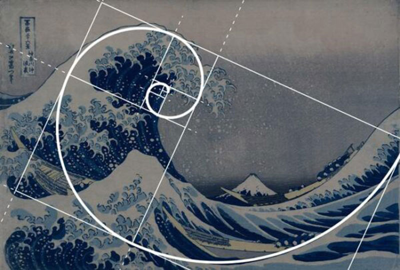
The Golden Ratio in Proportion
Cutting through the math mumbo jumbo, the golden ratio is like that natural balance code artists and designers have followed for ages.
For real, it’s deep-rooted, cropping up in snail shells to galaxy spirals to the Pyramids. Tap into it, and designs just work. It’s easy on the eyes, like a visual lullaby.
Mathematical Method for Determining Proportion
Numbers on canvas, without the yawn. Crunch the right ratios, and proportions turn artistic.
Whip out the golden ratio, and it’s like having Da Vinci’s cheat sheet. Numbers become guides—divine architecture for your graphics where visual hierarchy reigns.
Application of the Golden Ratio in Design and Art

Think of the golden ratio as a VIP backstage pass; it’s your entry to the inner circle of design gods.
It’s how logos, layouts, and artwork get that ‘feels perfect’ vibe. And it’s old-school cool—been around since pharaohs were a thing.
FAQ On The Difference Between Scale And Proportion
How do scale and proportion impact visual hierarchy in graphic design?
When tinkering with scale, we amplify or tone down elements, carving out a path for the eye.
Proportion?
Think of it as the rhythm to scale’s melody—the two work in tandem to structure visual hierarchy. It’s a gentle nudge, guiding viewers through the content with intention.
Are scale and proportion in design just about size?
Nope, it’s way more nuanced. Scale is the size of one object relative to another, while proportion is the ratio between elements.
They’re not just about ‘big or small’, but how parts of your design shake hands with each other, creating an overall aesthetic and balance.
Why does the golden ratio matter in graphic design?
Ah, the golden ratio—it’s like nature’s secret code for beauty. In design, it serves as a map for aesthetic proportions.
Following it can lead to layouts that feel just ‘right’, delivering a visual appeal that’s hardwired into our brains. It’s pretty much design symmetry’s best friend.
How can scale be used to emphasize the most important element in a design?
By simply going big. But it’s a strategic choice. Scale up that crucial element and viewers can’t miss it; it becomes the visual anchor, the focal point.
It’s visual weight in a nutshell—making sure what’s critical catches the viewer’s eye first and holds it captive.
Can ignoring scale and proportion cause design issues?
Absolutely. Ignore them and risk a design that feels off-key. It can morph into visual chaos with no clear entry point or visual flow.
You want your elements synced, not stepping on each other’s toes. So yeah, ignoring proportional relationships is practically inviting trouble.
How do scale and proportion relate to the overall composition?
They’re the yin and yang of composition—the invisible glue. They dictate the ebb and flow of the design, how each piece fits in the puzzle.
Scale sets presence; proportion maintains harmony. Both together? They orchestrate the visual composition to sing harmoniously.
Can scale and proportion affect user experience in web design?
Oh, they’re VIPs in UX land. Scale guides users’ eyes to what’s important—like those ‘Sign Up’ buttons.
Proportion ensures the site feels natural, usable. Get it wrong, and users will bounce faster than a skyrocket. In web design, balance in design isn’t just nice—it’s necessary for good UX.
How do I choose the right scale and proportion for my design project?
Intuition’s your start line, but back it up with design theory and composition techniques.
Consider the project’s goal, its visual elements, and how they interact with human perception. Test different scales and proportions until you hit that sweet spot where everything clicks.
In what way is the concept of scale subjective in graphic design?
Scale’s a shapeshifter—what feels mammoth on a postage stamp is a speck on a billboard. It’s subjective, shaped by context and negative space.
Play with it smartly, and you can bend perception, create focus, or even craft illusion in your art. Scale manipulation—it’s kinda magical.
How does cultural context influence scale and proportion in design?
Design doesn’t exist in a vacuum, and culture colors our lens on proportion and scale. What’s harmonious in one culture might be chaotic in another.
So, we adjust our scales and ratios, tuning into the cultural frequencies. It’s part aesthetic, part psychology—and a whole lot of adaptability.
Conclusion
Wrapping this up, we’ve journeyed through the landscape where scale and proportion duel and duet. It’s clear they’re not just design jargon; they’re the heartbeat of compelling visuals.
Toying with scale alters the visual impact of each element, while playing with proportion is akin to composing a well-tuned melody in the visual hierarchy.
Armed with understanding the difference between scale and proportion in graphic design, wield these concepts like a pro.
Remember that balance isn’t just symmetry—it’s about crafting a purposeful direction for the eyes to follow, creating narratives within the canvas, be it print or pixels.
Let’s create bravely. Let’s design with intent. Let those design elements sing in a chorus, aesthetic proportions and all, leaving an imprint that feels just right.
Embrace the rules, then bend them. After all, that’s where visual composition starts to feel like second nature, and your designs begin to resonate, truly resonate, with the audience.