Helvetica’s neutrality makes it one of the most versatile typefaces in design, but pairing it correctly separates amateur work from professional execution.
Finding fonts that go with Helvetica requires understanding both contrast and harmony. The wrong combination destroys visual hierarchy and confuses readers. The right pairing strengthens your message.
This guide explores ten proven typeface combinations that work with Helvetica across print and digital contexts. You’ll learn which sans-serif fonts maintain consistency, which serif fonts create elegant contrast, and when each pairing works best.
From geometric alternatives like Futura to classical complements like Garamond, each option includes specific use cases, design attributes, and contextual recommendations for immediate application in your projects.
Fonts That Go With Helvetica
| Font Name | Classification | Pairing Context | Design Relationship |
|---|---|---|---|
| Arial | Neo-grotesque sans-serif | Direct alternative with similar proportions and metrics for cross-platform compatibility | Nearly identical structure with subtle differences in terminal cuts |
| Univers | Neo-grotesque sans-serif | Shares neo-grotesque architecture with Helvetica but offers more systematic weight variations | Designed as comprehensive type system with uniform stroke widths |
| Futura | Geometric sans-serif | Creates strong typographic contrast through geometric forms and larger x-height difference | Contrasts Helvetica’s humanist proportions with strict geometric construction |
| Garamond | Old-style serif | Provides classical serif complement for body text when Helvetica serves display purposes | Offers organic serif warmth against Helvetica’s neutral geometric clarity |
| Georgia | Transitional serif | Screen-optimized serif designed for digital readability alongside sans-serif headlines | Balances Helvetica’s modernism with traditional serif structure and large counters |
| Baskerville | Transitional serif | Delivers refined serif elegance for extended text while maintaining modern aesthetic | High contrast and vertical stress complement Helvetica’s uniform stroke weight |
| Minion Pro | New-style serif | Professional serif choice for extensive body text in editorial and academic contexts | Contemporary serif design with multiple weights that harmonize with Helvetica systems |
| Gill Sans | Humanist sans-serif | Introduces calligraphic warmth while maintaining sans-serif functionality | Humanist proportions and organic forms soften Helvetica’s mechanical neutrality |
| Akzidenz-Grotesk | Grotesque sans-serif | Historical predecessor to Helvetica with similar architectural principles | Slightly irregular forms provide subtle contrast to Helvetica’s refined uniformity |
| Avenir | Geometric humanist sans-serif | Combines geometric construction with humanist warmth for contemporary applications | Geometric structure with organic adjustments creates modern alternative to Helvetica |
Arial

Arial serves as Helvetica’s metrically compatible twin, designed to match character widths without disrupting layouts. This neo-grotesque adds humanist touches through softer curves and fuller strokes.
Classification & Style
Neo-grotesque with rounded terminals cut at diagonal angles. The ‘R’ has an unusual flowing tail. Softer overall appearance than Helvetica with more open counters.
Pairing Rationale
Identical metrics make them interchangeable. Similar x-height prevents scale disruption. Arial’s warmth varies Helvetica’s neutrality while maintaining visual hierarchy.
Best Use Cases
- Digital interfaces with licensing limits
- Cross-platform Office documents
- Web font stacks requiring system availability
- Body text needing slight softening
Design Attributes
Matches Helvetica widths across weights. Reduced stroke contrast. Lowercase ‘a’ has simpler bowl. Diagonal ‘t’ terminal. Marginally wider apertures.
Tone & Context
Corporate functionality over prestige. Technical docs prioritizing readability. Budget projects needing professional neutrality.
Univers
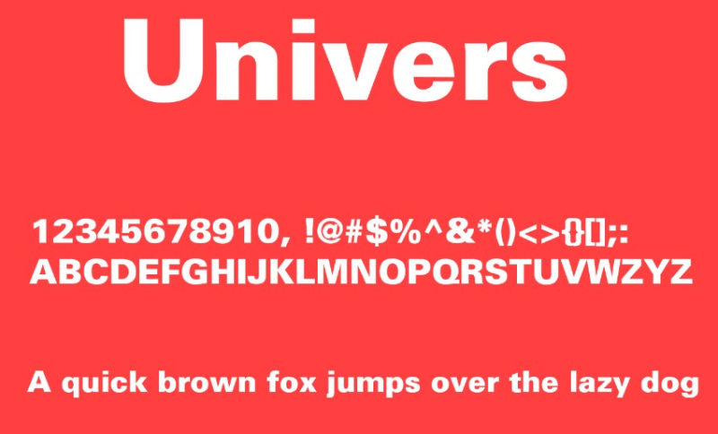
Frutiger’s 1957 systematic grotesque offers comparable neutrality with geometric precision. Two-digit numbering (55, 65, 75) indicates weight and width.
Classification & Style
Neo-grotesque, narrower than Helvetica. Consistent strokes. Rounded ‘a’ tail, spurless ‘G’. Both ‘K’ arms join at stem. ‘Q’ tail on baseline.
Pairing Rationale
Cooler, more clinical than Helvetica. Systematic structure complements Helvetica’s intuitive naming. Works for rigorous grid systems.
Best Use Cases
- Corporate identity with extensive weights
- Editorial demanding consistent text color
- Technical signage prioritizing precision
- Manuals needing clear information levels
Design Attributes
Lower contrast than Helvetica. Condensed width creates tighter blocks. Sharper terminal angles. More uniform numerals.
Tone & Context
Technical documentation, pharmaceutical branding, aviation. Swiss design projects. Minimalist contexts where simplicity is statement.
Futura

Renner’s 1927 geometric based on circles, triangles, squares brings pure form to Helvetica’s function. Perfect circular ‘O’, mathematical construction.
Classification & Style
Geometric sans-serif. Near-even strokes. Long ascenders exceed cap height. Classical capitals. Low x-height.
Pairing Rationale
High contrast pairing: Helvetica for body, Futura for display. Geometric purity opposes optical adjustments. Creates intentional tension strengthening typographic hierarchy.
Best Use Cases
- Display headlines over Helvetica text
- Poster design requiring precision
- Branding mixing geometry with function
- Fashion contexts demanding sophistication
Design Attributes
More uniform stroke weight. High-set ‘a’ bowl. Tall ascenders. Non-aligning numerals. Wider spacing needed.
Tone & Context
Avant-garde projects, architecture, fashion. Design-forward companies. Cultural institutions communicating progressive values.
Garamond

Garamond’s sixteenth-century old-style serif provides classic complement to Helvetica’s modernity. Delicate proportions create warmth against neutrality.
Classification & Style
Old-style serif, humanist roots. Low x-height, minimal stroke contrast. Small ‘e’ eye, sharp ‘a’ bowl turn. Roman capitals.
Pairing Rationale
Maximum category contrast (old-style serif vs neo-grotesque) with similar neutral tone. Historical gravitas balances contemporary directness.
Best Use Cases
- Book text with Helvetica titles
- Editorial mixing long-form with data
- Corporate reports pairing text with infographics
- Traditional materials with modern touch
Design Attributes
Much lower x-height requires size adjustment. Delicate strokes need larger points. Wider tracking. Limited weights versus Helvetica’s range.
Tone & Context
Publishing, academic institutions, legal documents. Traditional brands modernizing. Cultural organizations balancing accessibility with gravitas.
Georgia
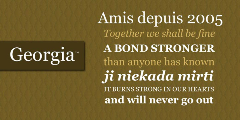
Carter’s 1993 screen-optimized transitional serif pairs perfectly for digital projects. Inspired by Scotch Roman, designed for readability.
Classification & Style
Transitional serif for screens. Large x-height matches Helvetica. Increased contrast, open apertures, ball terminals. True italic.
Pairing Rationale
Both screen-optimized creates technical harmony. Similar x-heights prevent jarring shifts. Georgia warms Helvetica without undermining professionalism. Web-safe availability.
Best Use Cases
- Web design: Helvetica UI, Georgia body
- Digital publications for extended reading
- Blog layouts mixing navigation with articles
- Email newsletters balancing headers with content
Design Attributes
Larger x-height approaches Helvetica proportions. Bolder weight for screen visibility. Wider spacing. Non-aligning numerals. Condensed variants available.
Tone & Context
Online journalism, digital magazines, corporate blogs. Educational platforms. News sites. Digital products aiming for approachable professionalism.
Baskerville
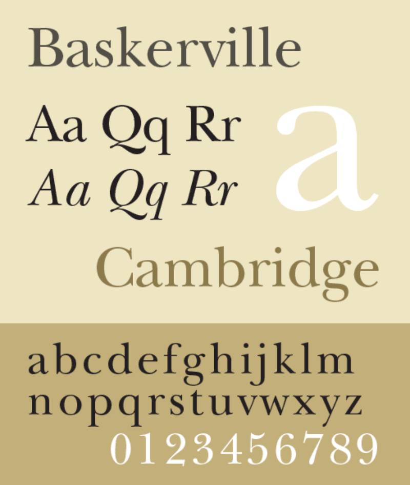
Baskerville’s 1757 transitional brings refined elegance to Helvetica’s functionality. High contrast and vertical stress create sophisticated balance.
Classification & Style
Transitional serif bridging old-style and modern. Increased stroke contrast, sharper serifs, vertical stress. Circular curves, regular shapes.
Pairing Rationale
Classical elegance against modern practicality. Stroke contrast provides visual interest Helvetica avoids. Different eras (1757 vs 1957) create historical dialogue.
Best Use Cases
- Print collateral: Baskerville body, Helvetica headers
- Book covers needing literary gravitas
- Luxury materials balancing heritage with accessibility
- Formal invitations requiring emphasis and structure
Design Attributes
High stroke contrast creates texture. Vertical stress opposes even weight. Lower x-height needs adjustment. Tapered serifs vs blunt terminals.
Tone & Context
Academic publishers, classical music, literary journals. Established brands communicating refinement. Professional services (law, finance).
Minion Pro
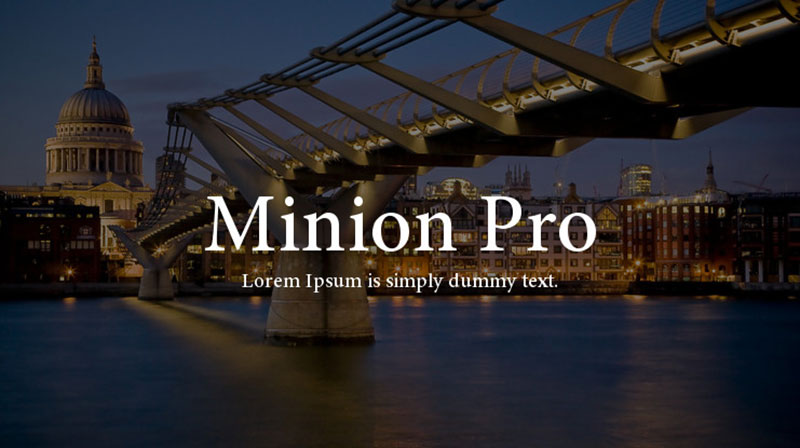
Slimbach’s 1990 Renaissance-inspired serif complements through restrained classicism. Simplified structure and moderate proportions create understated harmony.
Classification & Style
Old-style serif, Renaissance inspiration. Simplified structure, moderate proportions, large apertures. Slightly condensed. Multiple optical sizes.
Pairing Rationale
Both prioritize function over decoration. Classical roots provide depth Helvetica lacks. Optical sizes mirror weight versatility. Quiet sophistication.
Best Use Cases
- Extended text (Minion) with Helvetica captions
- Academic publishing with data visualization
- Corporate docs balancing formal text with navigation
- Packaging mixing ingredients with branding
Design Attributes
Lower x-height requires larger sizes for balance. Condensed width. Four optical sizes (Caption, Regular, Subhead, Display). Extensive ligatures.
Tone & Context
Book publishers, educational institutions, pharmaceutical docs. Professional services requiring authority. Research organizations balancing rigor with accessibility.
Gill Sans
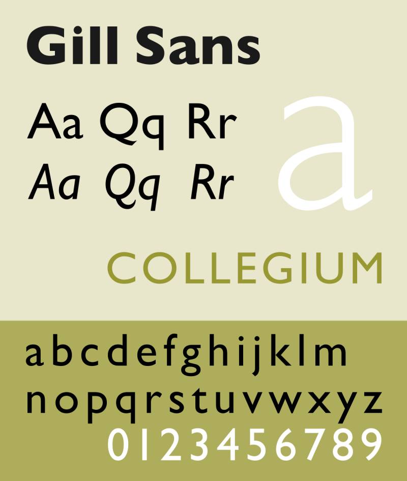
Gill’s 1928 humanist sans provides warmth alongside Helvetica’s neutrality. Based on Johnston’s Underground alphabet, bringing British sensibility to Swiss rationalism.
Classification & Style
Humanist sans-serif, calligraphic influence. Classical proportions, small x-height, double-storey ‘g’. Circular ‘O’, vertical stroke ends create thinning effect.
Pairing Rationale
Humanist warmth vs mechanical neutrality. Both maintain legibility through different means. Personality difference creates hierarchy: Gill Sans headers, Helvetica body.
Best Use Cases
- Display typography over Helvetica body
- British brands requiring local character
- Cultural organizations balancing approachability
- Transportation mixing personality with clarity
Design Attributes
Smaller x-height creates different rhythm. Variable strokes with ‘a’, ‘e’, ‘g’ exceptions. Classical proportions vs industrial consistency. Extensive weights.
Tone & Context
British institutions, BBC-style broadcasting, transport. Educational organizations. Design studios balancing craft with function.
Akzidenz-Grotesk
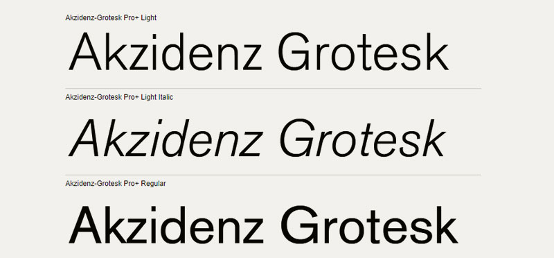
Berthold’s 1898 grotesque serves as Helvetica’s predecessor, offering similar function with irregular character. The “mother of all sans serifs.”
Classification & Style
Neo-grotesque with industrial roots. Less consistent across weights. Irregular spacing, varying terminal angles. Double-storey ‘a’. Oblique not true italic.
Pairing Rationale
Dialogue between refined Helvetica and rougher ancestor. Industrial authenticity Helvetica’s polish removes. Irregularities provide texture against mechanical perfection.
Best Use Cases
- Brutalist design valuing rawness
- Historical projects referencing Swiss design origins
- Editorial mixing contemporary with vintage
- Authentic industrial character
Design Attributes
Less consistent strokes. Condensed/extended have different structures. Terminal angles vary. Tighter default spacing.
Tone & Context
Design studios valuing history. Graphic design movements references. Industrial brands communicating heritage. Cultural institutions exploring twentieth-century culture.
Avenir
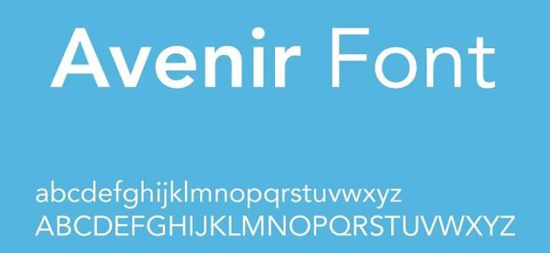
Frutiger’s 1988 geometric sans with humanist touches bridges Futura’s geometry and Helvetica’s refinement. Named “future” in French.
Classification & Style
Geometric with humanist adjustments. Circle/square base with optical corrections. Two-storey ‘a’, curved ‘t’ tail, imperfect ‘o’. Heavier vertical strokes.
Pairing Rationale
Geometric alternative to Helvetica’s grotesque roots with similar neutrality. Both Frutiger designs. Avenir display, Helvetica text. Subtle warmth creates harmony in pairing fonts.
Best Use Cases
- Corporate identity: Avenir logos, Helvetica communication
- Transportation: clean signage, readable schedules
- Digital interfaces balancing icons with text
- Tech companies communicating innovation
Design Attributes
Comprehensive weights (Ultra Light to Heavy). Generous proportions. Vertical stroke emphasis creates rhythm. Condensed widths. Optical sizes.
Tone & Context
Technology companies, transportation, modern institutions. Design-conscious brands valuing form and function. International organizations. Future-focused entities.
FAQ on Fonts That Go With Helvetica
What serif font pairs best with Helvetica?
Garamond creates the strongest serif pairing with Helvetica due to matching neutral tone with maximum category contrast. Georgia works better for digital projects because both were optimized for screen legibility. Baskerville adds refined elegance for print applications requiring sophisticated visual hierarchy.
Can you pair Helvetica with another sans-serif font?
Yes. Pairing fonts from the same category works when they differ in style or purpose. Futura’s geometric construction contrasts Helvetica’s grotesque structure. Gill Sans adds humanist warmth. Avenir provides similar neutrality with subtle personality differences for effective typographic hierarchy.
What’s the difference between Helvetica and Arial?
Arial matches Helvetica’s character widths exactly but features softer curves and diagonal terminal cuts. The ‘R’ tail differs significantly. Arial was designed as a metrically compatible alternative for digital environments. Both function similarly in typography but Arial lacks Helvetica’s refined optical adjustments.
Which font is more geometric, Futura or Helvetica?
Futura is purely geometric, based on circles, triangles, and squares with minimal optical correction. Helvetica is neo-grotesque with subtle adjustments improving legibility. Futura’s perfect circular ‘O’ and low x-height create distinctive rhythm. Helvetica prioritizes function over geometric purity through carefully balanced proportions.
Is Univers better than Helvetica?
Neither is objectively better. Univers offers more systematic family structure with numbered weights and widths. Helvetica provides warmer, slightly friendlier appearance. Univers works for technical contexts requiring clinical precision. Helvetica suits broader applications needing approachable neutrality. Both excel in Swiss design contexts.
What font should I use for body text with Helvetica headlines?
Georgia for digital reading, Garamond for traditional print, Minion Pro for extended text requiring quiet sophistication. Match x-height proportions carefully. Serif fonts typically work better for body text than sans-serif alternatives because stroke variation improves reading comfort.
Can I use Helvetica and Futura together?
Absolutely. This combination works exceptionally well when Futura handles display typography and Helvetica manages functional text. The geometric versus grotesque contrast creates strong hierarchy. Use Futura for logos, headlines, and branding elements. Reserve Helvetica for navigation, captions, and extended reading.
What makes Akzidenz-Grotesk different from Helvetica?
Akzidenz-Grotesk predates Helvetica by 59 years and features more irregular character spacing. It’s less consistent across weights with varying terminal angles. Helvetica refined the grotesque tradition with optical adjustments. Akzidenz offers authentic industrial character. Both belong to neo-grotesque classification within graphic design movements.
Should I use Avenir or Helvetica for a modern brand?
Avenir suits brands emphasizing geometric sophistication and contemporary design. Helvetica works for brands prioritizing timeless neutrality and universal recognition. Avenir combines geometric structure with humanist warmth. Helvetica maintains pure functional clarity. Consider your brand guidelines and target audience perception.
What’s the most versatile font combination with Helvetica?
Helvetica with Georgia dominates web design for universal availability and screen optimization. Helvetica with Garamond excels in print for traditional elegance. Helvetica with Futura creates maximum impact in display contexts. Choose based on medium, not versatility alone. Each pairing solves different design problems.
Conclusion
Choosing fonts that go with Helvetica depends on your project’s medium, audience, and message. The combinations covered here span geometric alternatives, humanist complements, and classical contrasts.
Sans-serif typefaces like Univers and Akzidenz-Grotesk maintain consistency across technical contexts. Futura and Avenir introduce geometric precision for display applications. Serif fonts like Baskerville and Minion Pro provide traditional authority for extended reading.
Test combinations at actual size in your specific context. What works for print design may fail on screens. What succeeds in branding might look wrong in documentation.
Pay attention to font spacing, leading, and scale and proportion when implementing these pairings. Technical precision matters as much as aesthetic choice.
Master these ten combinations and you’ll handle most professional design scenarios requiring Helvetica. The right pairing elevates your work from competent to compelling.

Renowned for his expertise in logo design and visual branding, Bogdan has developed a multitude of logos for various clients.
His skills extend to creating posters, vector illustrations, business cards, and brochures. Additionally, Bogdan's UI kits were featured on marketplaces like Visual Hierarchy and UI8.
He also wrote in the past years on sites like Design Your Way, WebDesignerDepot, WPDean, Designmodo, Speckyboy, Slider Revolution, and more.
- The Windsurf Logo History, Colors, Font, And Meaning - 10 October 2026
- How to Remove Background From Product Photos (No Photoshop) - 10 October 2026
- How Designers can Build a Stronger Online Creative Identity - 9 October 2026

Bogdan Sandu is a seasoned designer who has been designing websites since 2008. Renowned for his expertise in logo design and visual branding, Bogdan has developed a multitude of logos for various clients. His skills extend to creating posters, vector illustrations, business cards, and brochures. Additionally, Bogdan's UI kits were featured on marketplaces like Visual Hierarchy and UI8. He also wrote in the past years on sites like Design Your Way, WebDesignerDepot, WPDean, Designmodo, Speckyboy, Slider Revolution, and more.
You Might Also Like