Every layout decision starts with spacing. And spacing starts with margin.
Understanding what margin is in design matters whether you’re building a website in CSS, setting up a print layout in Adobe InDesign, or arranging components in Figma. Margin controls the space outside an element’s border, separating it from everything around it. Get it wrong and your layout feels cramped or disconnected. Get it right and content flows naturally.
This guide covers how margin works across web, print, and UI design. You’ll learn the difference between margin and padding, how margin collapse trips up even experienced developers, and how professional design systems use spacing tokens to keep margin consistent at scale.
What Is Margin in Design

Margin is the space outside an element’s border that separates it from other elements around it. Think of it as the buffer zone between objects on a page, whether that page lives on a screen or on paper.
In web design, margin is one of four layers inside the CSS box model. Content sits at the center, surrounded by padding, then the border, then margin on the outside. The W3C officially published CSS Box Model Module Level 3 as a full Recommendation in April 2024, formally defining how margin and padding create spacing in and around every CSS box.
But margin isn’t just a CSS concept. It exists across print design, UI design, packaging design, and poster design. The function is always the same: keep things from crashing into each other.
Every book page has margins. Every app screen has margins. Every business card, every logo lockup, every banner ad. Without margin, content bleeds into borders, text touches edges, and layouts feel suffocating. With it, elements get breathing room, and users get a much easier time finding what they’re looking for.
Nielsen Norman Group research shows that 79% of users scan web pages rather than reading word by word. Margin directly affects how scannable a layout is. Tight margins create dense blocks of content that eyes skip over. Generous margins guide the eye and signal where one section ends and another begins.
Your mileage may vary depending on the project, but the function of margin stays constant everywhere it’s applied.
Margin vs. Padding

This is the single most common spacing confusion in design and front-end development. Both control spacing, but they control different spacing.
The Core Difference
| Property | Position | Affects Background | Collapses |
|---|---|---|---|
| Margin | Outside the border | No | Yes (vertically) |
| Padding | Inside the border | Yes | No |
Margin pushes other elements away. Padding pushes content inward, away from the border.
If you set a background color on an element, padding is covered by that color. Margin is not. That one detail changes everything about how spacing decisions affect the look of a component.
How the CSS Box Model Defines Them
The CSS box model wraps every HTML element in four concentric layers. Content first, then padding, then border, then margin.
Two box-sizing modes change how width calculations work. With content-box (the default), width only covers content. Padding and border sit on top of that. With border-box, width includes padding and border, making layout math way more predictable.
Most developers default to border-box these days. It prevents the kind of layout breakage where adding 20px of padding suddenly makes your 300px-wide element take up 340px.
When to Use Which
Use margin when separating siblings, placing distance between cards in a grid, stacking sections vertically, or pushing something away from its neighbor.
Use padding when spacing within a container, adding room inside a button, building inner space for a card component, or creating a text area that doesn’t touch its border.
Took me a while to internalize this. A good rule: margin for between, padding for within. If your click target needs to be bigger, that’s padding. If two cards need separation, that’s margin.
How Margin Works in CSS

Margin in CSS is defined through the margin property, which accepts values for all four sides of an element: top, right, bottom, left.
You can set them individually (margin-top: 16px) or use shorthand. The shorthand follows a clockwise pattern: top, right, bottom, left. Two values set vertical and horizontal. A single value applies to all four sides.
Auto Margins and Centering
Horizontal centering with margin: 0 auto remains one of the most commonly used layout tricks in CSS. The browser splits leftover horizontal space equally between the left and right margins, centering the block element within its parent.
Auto margins also work inside Flexbox containers. Setting margin-left: auto on a flex item pushes it to the right side of its container. This technique is more reliable than using floats and a lot less finicky.
Percentage and Negative Margins
Percentage-based margins are calculated against the width of the containing block. Even vertical margin percentages use the parent’s width, not its height. This surprises a lot of people.
Negative margins pull elements in the opposite direction. A margin-top: -20px drags an element 20 pixels upward, overlapping whatever sits above it. They’re a legitimate CSS tool, and sometimes the cleanest way to handle overlapping layouts, but they can create maintenance headaches if overused.
Margin Collapse
This is the part that trips up even experienced developers.
When two vertical margins touch, they don’t add together. They merge into one margin equal to the larger of the two. If one element has a bottom margin of 30px and the next has a top margin of 20px, the space between them is 30px, not 50px.
MDN Web Docs defines three scenarios where margin collapse happens:
- Adjacent siblings: the bottom margin of one block meets the top margin of the next
- Parent and first/last child: when no padding, border, or content separates a parent’s margin from its child’s margin
- Empty blocks: an element with no content, border, or padding collapses its own top and bottom margins into one
Margins never collapse inside Flexbox or Grid containers. That’s actually one of the reasons developers keep moving toward the gap property for spacing instead of relying on margin between items.
Fixes include adding padding or a border to the parent, setting overflow: auto, or using display: flow-root. Each creates a new block formatting context that prevents the merge.
Margin in Print and Graphic Design
Margin existed in print for hundreds of years before CSS was a thing. Page margins in books, magazines, and academic papers aren’t decorative, they’re functional.
Standard Page Margins
Books typically use wider inside margins (called gutters) to account for the spine. A 0.75-inch inside margin with 0.5-inch outside margins is common for trade paperbacks. Academic formatting like APA and MLA calls for 1-inch margins on all four sides.
Magazines run tighter. Editorial spreads might use 0.25 to 0.5-inch margins depending on the publication’s style. Bleed areas extend content past the trim line so there’s no unintended white edge after cutting.
Adobe InDesign remains the standard tool for setting print margins, along with Affinity Publisher for those who prefer a one-time purchase.
How Margin Affects Readability in Print
Margins frame text. They give readers a visual boundary and help the eye return to the start of the next line, which is why leading and margin work together to control reading flow.
MIT typography research recommends maintaining margins around body text and never packing content against edges. The margin helps readers find line endings during saccade movements, which are the quick eye jumps between fixation points.
Smashing Magazine (2024) data shows that balanced spacing can reduce reading fatigue by 25%. That figure applies to both print and screen, since the underlying cognitive principles are the same: less visual crowding means less effort.
Margin also plays a role within the broader typographic hierarchy of a page, signaling section breaks and grouping related content blocks together through proximity.
Margin in UI and Mobile Design

Screen-based margin works differently from print in one big way: screens come in hundreds of sizes. A fixed 40px margin that looks great on a 1440px desktop monitor becomes awkward on a 375px phone screen.
Spacing Systems and Design Tokens
Base-8 spacing is the most widely adopted system in UI design. Margin values follow multiples of 8: 8px, 16px, 24px, 32px, and so on. Some teams use a base-4 system for finer control.
Figma, which holds a 40.65% market share in design tools and supports over 13 million monthly active users as of early 2025, handles spacing through auto layout, variables, and spacing tokens. These tokens define margin and padding values at the system level, so individual designers don’t have to guess.
Google’s Material Design system prescribes specific margin values for different component types and screen sizes. Apple’s Human Interface Guidelines do the same for iOS and macOS. Both systems use incremental spacing scales that keep margin consistent across an entire product.
Safe Areas and Platform-Specific Margins
Modern phones have notches, dynamic islands, rounded corners, and gesture bars that eat into available screen real estate.
iOS defines safe area insets that push content away from these hardware features. On Android, the edge-to-edge display model requires developers to handle window insets manually. Ignoring these safe area margins results in text or buttons hidden behind a notch or buried under a navigation bar.
Loop11 research shows that 73% of mobile users will leave a site if the design negatively affects their experience. Poor margin handling on mobile, overlapping elements, unreadable text squeezed against edges, contributes directly to that number.
How Margin Affects Layout and Visual Hierarchy

Margin doesn’t just separate elements. It tells users what belongs together, what’s separate, and what matters most.
The Proximity Principle
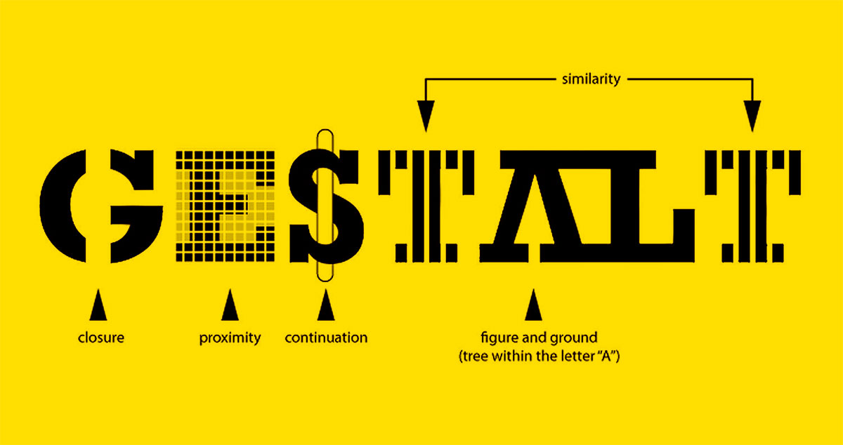
The Gestalt principles explain this clearly. Objects placed close together are perceived as a group. Objects with more space between them feel like separate items.
A form with tight margins between a label and its input field reads as a single unit. Add 40px of margin below that pair, and it cleanly separates from the next form field. Get the margin wrong, and users associate the wrong label with the wrong input.
White Space as a Product of Margin
White space is the direct result of margin decisions. It’s not wasted area. According to Loop11, 84% of users prefer simple, clean designs over overcrowded pages.
Apple’s product pages are the obvious example. Massive margins around product images and text blocks. Every element gets room. The result is a layout that feels premium and guides the eye exactly where Apple wants it to go.
Starbucks takes a similar approach on their website, using generous page margins and consistent section spacing to create a layout that’s easy to scan across both desktop and mobile.
Inconsistent Margins Create Visual Noise
When margins vary randomly across a page, the layout looks unfinished. The visual hierarchy breaks because the spacing signals don’t match the content structure.
This is why grid systems exist. They enforce consistent margins and gutters so that every element sits on the same spatial foundation. A well-maintained grid keeps margins predictable, which keeps alignment tight and the overall design feeling deliberate rather than haphazard.
The golden ratio and the rule of thirds both deal with spatial relationships that include margin decisions. Whether you follow those models strictly or not, the principle holds: consistent, intentional spacing separates professional design from amateur work.
Common Margin Mistakes

Most spacing bugs aren’t caused by not knowing what margin does. They’re caused by applying it in the wrong context or missing a quirk in how browsers handle it.
Using Fixed Margins That Break on Smaller Screens
A 60px margin that looks balanced on a 1440px desktop layout will eat a huge chunk of a 375px mobile screen. Fixed pixel values don’t adapt to screen size changes.
Responsive margins need relative units (rem, em, vw) or media queries that adjust spacing at breakpoints. Tailwind CSS handles this with responsive prefix classes. Bootstrap uses its own spacing utility scale.
Ignoring Margin Collapse
Zeroheight’s Design Systems Report 2025 found that 79% of organizations now have dedicated design system teams, yet margin collapse remains one of the most commonly reported CSS layout bugs across those teams.
Developers add margin-bottom: 30px to one element and margin-top: 20px to the next, expecting 50px of space. They get 30px. The fix is understanding where collapse happens and choosing the right prevention method (padding, border, overflow, or display: flow-root).
Applying Margin to Inline Elements
Vertical margin on inline elements does nothing. A span or a tag won’t respond to margin-top or margin-bottom unless you change its display mode.
Set the element to display: inline-block or display: block first. Otherwise, the browser simply ignores the vertical margin declaration.
Using Margin Instead of Gap
The CSS gap property works in both Flexbox and Grid containers and creates space only between items, never on the outer edges. Margin can’t do that without workarounds like :last-child selectors or negative margins on the parent.
| Approach | Space Between Items | Space on Outer Edges | Collapse Risk |
|---|---|---|---|
| gap | Yes | No | None |
| margin | Yes | Yes (unwanted) | Vertical only |
| Negative margin hack | Yes | Removed manually | Possible |
Gap support in Flexbox has been stable across all major browsers since April 2021 (Safari was the last to add it). There’s very little reason to avoid it in modern projects.
How to Set the Right Margin for Any Project

Picking margin values isn’t about guessing what looks nice. It’s about building a spacing scale and applying it consistently.
Start with a Spacing Scale
Base-4 scale: 4px, 8px, 12px, 16px, 20px, 24px, 32px, 48px, 64px
Base-8 scale: 8px, 16px, 24px, 32px, 40px, 48px, 64px, 80px
Most design systems use one of these two. The base-8 scale is more common in product design because it divides evenly on most screen resolutions and pairs well with an 8-point grid. IBM Carbon’s spacing system uses multiples of 2, 4, and 8 across its entire token library.
Match Margin to Content Type
Body text: smaller margins between paragraphs (8px to 16px), enough to signal separation without breaking reading flow
Cards and components: medium margins (16px to 24px) to visually group content while maintaining clear boundaries between items
Page sections: large margins (48px to 80px or more) to create obvious breaks between major content areas, supporting scannable page structure
The U.S. Web Design System recommends keeping line lengths between 45 and 90 characters and using margin to frame text properly within those bounds.
Test Across Breakpoints
Figma research shows that 84% of designers collaborate with developers at least weekly. That collaboration should include checking margin behavior across screen sizes, not just reviewing components at a single resolution.
Chrome DevTools device mode lets you preview margin changes instantly across viewport widths. Firefox’s layout panel highlights margin and padding visually on any inspected element. These tools cost nothing and catch spacing issues before they reach production.
Tools for Auditing Spacing
- Browser DevTools: inspect margin and padding on any element with hover highlighting
- Figma plugins: spacing measurement tools like Stark or similar plugins that check consistency across frames
- CSS linting: Stylelint rules can flag hardcoded spacing values that don’t match your token scale
Margin in Design Systems

At scale, margin stops being a per-component decision. It becomes a system-level concern with its own rules, tokens, and opinions.
Spacing Tokens and Standardization
Zeroheight’s 2025 report shows design token adoption jumped from 56% in 2024 to 84% in 2025. Spacing tokens, alongside color and typography tokens, form the foundation of any modern design system.
Shopify Polaris uses a base-4 spacing scale where tokens are named by multiplier: space-100 equals 4px, space-200 equals 8px, and so on. Every component in the system references these tokens instead of raw pixel values.
IBM Carbon takes a similar approach, using multiples of 2, 4, and 8 for its spacing scale. The tokens apply to both internal component spacing and layout-level margin between sections.
Should Components Own Their Own Margin?
This is one of the longest-running debates in design system work.
Margin-free components don’t include any outer margin. The parent layout handles all spacing between children, usually through gap or a stack/layout component. This makes components more reusable because they don’t carry spacing assumptions from one context to another.
Margin-included components bake default spacing into themselves. Less flexible, but faster to drop into a page without worrying about wrapper elements.
IBM Carbon’s Stack component lets parent containers control spacing using Carbon spacing tokens, keeping individual components margin-free. Headspace reported 20% to 30% time savings on straightforward tasks and up to 50% on complex projects after adopting token-based spacing through their design system (Figma, 2025).
How Major Systems Handle Spacing
| Design System | Spacing Base | Token Format | Component Margin Approach |
|---|---|---|---|
| Shopify Polaris | 4px | space-100, space-200 | Layout components handle spacing |
| IBM Carbon | 2px / 8px | $spacing-03, $spacing-05 | Stack component controls gaps |
| Material Design | 4px / 8px | Incremental dp values | Components include default margin |
| Atlassian | 8px | space.100, space.200 | Mixed: tokens plus layout primitives |
The tradeoff is always between flexibility and consistency. Margin-free components give teams more control but require more layout scaffolding. Margin-included components ship faster but can create spacing conflicts when dropped into unexpected contexts.
Figma’s 2025 design statistics report found that teams with well-adopted design systems complete tasks 34% faster. Consistent spacing tokens are a big part of why. When every developer on a team pulls from the same spacing scale, fewer decisions get made on the fly, and fewer inconsistencies end up in the final product.
Whether you’re working with the core elements of design or building a full production UI, getting margin right means less rework, cleaner layouts, and a better experience for whoever is looking at the screen.
FAQ on What Is Margin in Design
What is margin in design?
Margin is the space outside an element’s border that separates it from neighboring elements. It exists in web, print, and UI design. In the CSS box model, margin is the outermost layer surrounding content, padding, and border.
What is the difference between margin and padding?
Margin creates space outside the border. Padding creates space inside it. Background colors cover padding but not margin. Use padding for spacing within a component, margin for spacing between components.
What is margin collapse in CSS?
Margin collapse happens when two vertical margins touch and merge into one. The browser uses the larger value, not the sum. It only affects vertical margins and doesn’t occur inside Flexbox or Grid containers.
How do you center an element using margin?
Set the element’s width, then apply margin: 0 auto. The browser splits the remaining horizontal space equally between left and right margins. This works on block-level elements inside their parent container.
What are standard page margins in print design?
Academic documents typically use 1-inch margins on all sides. Books use wider inside margins (gutters) to account for the spine. Magazine layouts often run tighter, between 0.25 and 0.5 inches.
Can margin values be negative in CSS?
Yes. Negative margins pull elements in the opposite direction, causing them to overlap adjacent content. They’re a legitimate CSS tool for specific layout needs but can create maintenance issues if overused.
What is the best spacing scale for margin?
Most design systems use a base-8 scale (8px, 16px, 24px, 32px). Some teams prefer base-4 for finer control. Shopify Polaris and IBM Carbon both build their spacing tokens around these increments.
Should components include their own margin?
It depends on your system. Margin-free components are more reusable because parent layouts handle spacing. Components with built-in margin ship faster but can conflict when placed in unexpected contexts.
What is the difference between margin and gap in CSS?
The gap property only creates space between items inside Flexbox or Grid containers, never on outer edges. Margin applies to individual elements and adds space on all sides, including the outside.
How does margin affect visual hierarchy?
Margin controls how users perceive grouping and separation. Tighter margins signal related content. Larger margins create clear section breaks. Consistent margin values keep layouts scannable and professional.
Conclusion
Margin in design is one of those things that seems basic until you actually have to get it right across breakpoints, devices, and an entire product. The difference between a layout that feels polished and one that feels off almost always comes down to spacing decisions.
Whether you’re adjusting outer spacing between elements in CSS, setting page margins in a print layout, or defining spacing tokens inside a design system, the principles stay the same. Consistent margin creates clear contrast between sections, supports readable font spacing, and gives every element room to do its job.
Build a spacing scale early. Stick with it. Let your margins do the quiet work of making everything else look good.

Renowned for his expertise in logo design and visual branding, Bogdan has developed a multitude of logos for various clients.
His skills extend to creating posters, vector illustrations, business cards, and brochures. Additionally, Bogdan's UI kits were featured on marketplaces like Visual Hierarchy and UI8.
He also wrote in the past years on sites like Design Your Way, WebDesignerDepot, WPDean, Designmodo, Speckyboy, Slider Revolution, and more.
- From Mockup to Code: How AI-Augmented Development Speeds Up the Design Handoff - 19 September 2026
- The Beehiiv Logo History, Colors, Font, And Meaning - 18 September 2026
- Why Small Teams Wait Too Long to Bring On Specialist Engineers - 17 September 2026

Bogdan Sandu is a seasoned designer who has been designing websites since 2008. Renowned for his expertise in logo design and visual branding, Bogdan has developed a multitude of logos for various clients. His skills extend to creating posters, vector illustrations, business cards, and brochures. Additionally, Bogdan's UI kits were featured on marketplaces like Visual Hierarchy and UI8. He also wrote in the past years on sites like Design Your Way, WebDesignerDepot, WPDean, Designmodo, Speckyboy, Slider Revolution, and more.
You Might Also Like