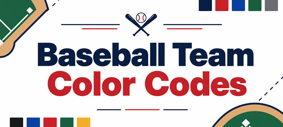
Baseball’s 30 teams run on a tighter color set than any other major league. When it comes to baseball team color codes, navy blue, red…
Author
Bogdan Sandu is a seasoned designer who has been designing websites since 2008. Renowned for his expertise in logo design and visual branding, Bogdan has developed a multitude of logos for various clients. His skills extend to creating posters, vector illustrations, business cards, and brochures. Additionally, Bogdan's UI kits were featured on marketplaces like Visual Hierarchy and UI8. He also wrote in the past years on sites like Design Your Way, WebDesignerDepot, WPDean, Designmodo, Speckyboy, Slider Revolution, and more.
Baseball’s 30 teams run on a tighter color set than any other major league. When it comes to baseball team color codes, navy blue, red…
Creating fresh visuals for every video, article, and social post can take more time than producing the content itself. AI image tools help creators develop…
Two tools. One decision that affects every piece of visual content you create. The Canva vs Adobe Express debate comes up constantly for marketers, small…
Website projects are often described as collaborative exercises where designers, developers, marketers, clients, and project managers work together to deliver a successful outcome. On paper,…
The NBA’s 30 teams run on a tighter color range than most people expect. Black, blue and red carry the league, with purple, gold and…
The Figma logo is the visual identity of one of the most widely used interface design tools in the industry. It pairs a custom wordmark…
Most design tools promise team collaboration. Few actually deliver it without friction, hidden costs, or a learning curve that leaves half your team behind. This…
The five checkpoints that carry the most legal and financial exposure are claims verification, regulatory statements, required symbols and icons, ingredient and allergen information, and…
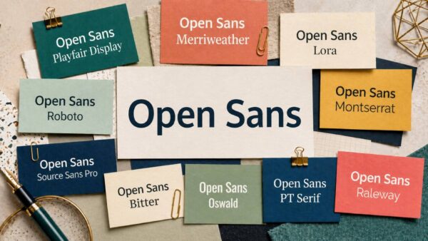
Most fonts fade into the background. Open Sans stays there on purpose. Designed by Steve Matteson and built for screen readability, it has become one…
Open ten different Android apps and the buttons, spacing, and colors follow the same underlying rules almost every time. That’s not an accident. It’s Android…
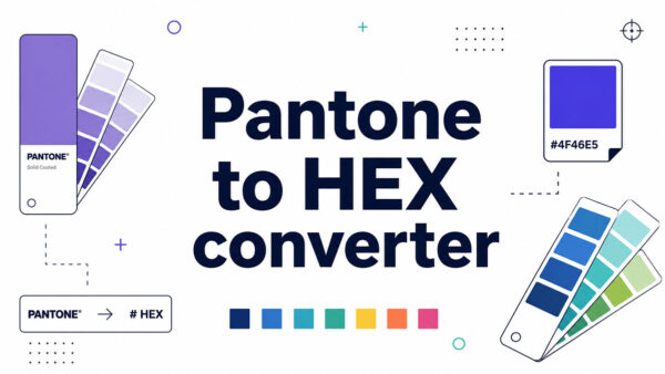
A Pantone to HEX converter is a tool that translates a Pantone Matching System code into its closest six-digit HEX equivalent for screens. It bridges…
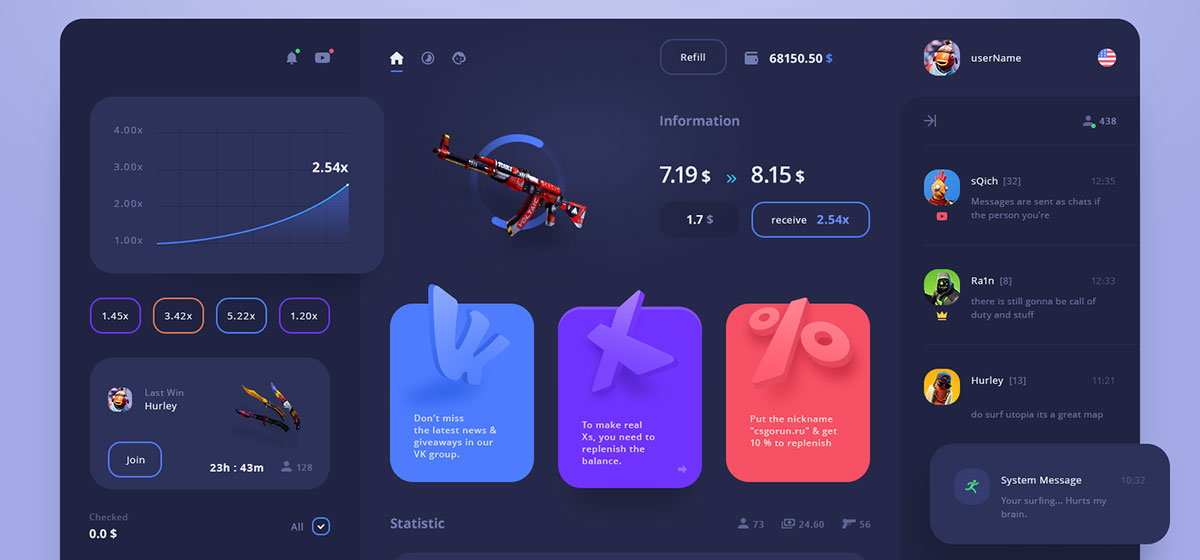
Most dashboards fail before anyone reads a single number. Dashboard UI design decides whether a screen full of metrics turns into a fast decision, or…
The Retool logo is the visual identity for one of the best-known tech company logos in the low-code software space. It represents a platform built…
A CMYK to Pantone converter takes four process values (Cyan, Magenta, Yellow, Black) and returns the closest matching Pantone Matching System code. The output is…
Most designers pick Inter for body text and then spend way too long figuring out what to put next to it. Designed by Rasmus Andersson,…
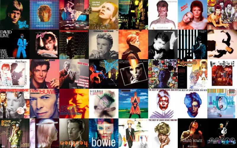
No artist treated album artwork like David Bowie did. Every record sleeve was a full identity shift, a new character, a new visual language built…
The Replit logo is the visual identity for Replit Inc., a browser-based coding platform founded in 2016 that has grown into an AI-powered software creation…
The font on your real estate website is making a first impression before a single property photo loads. Buyers and sellers form opinions fast. The…
Expanding a digital enterprise across North America demands a robust technological backbone capable of handling high traffic volumes and ensuring rapid data processing. As the…
The NHL’s 32 teams run on a fairly tight set of core colors. When it comes to NHL team color codes, Red, blue, black, gold…
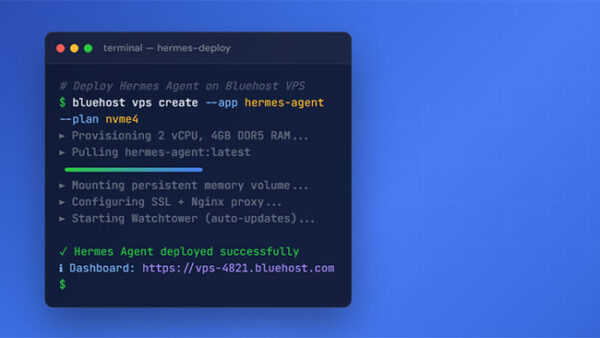
Most AI assistants work in a single session. You open a window, enter a prompt, get an answer, and lose all context the second you…
The font you put on a title does more work than any other typographic decision on the page. It sets the tone before a single…
The Airtable logo is the official visual mark of Airtable, a cloud-based database and spreadsheet hybrid platform founded in 2012. It functions as a logo…
A sharp subject against a soft, blurred background is one of the cleanest ways to make a photo look intentional rather than accidental. Knowing how…
The Kawaii Font Generator converts any text into Unicode font styles you can copy and paste directly into social bios, usernames, captions, and messages. No sign-up. No…
Streaming passed traditional TV for good in May 2025. Nielsen clocked it at 44.8% of all U.S. television viewing that month, more than cable and…
Charts on mobile break in ways a desktop screen never shows. Mobile sessions bounce at nearly 60%, roughly ten points higher than desktop, according to…
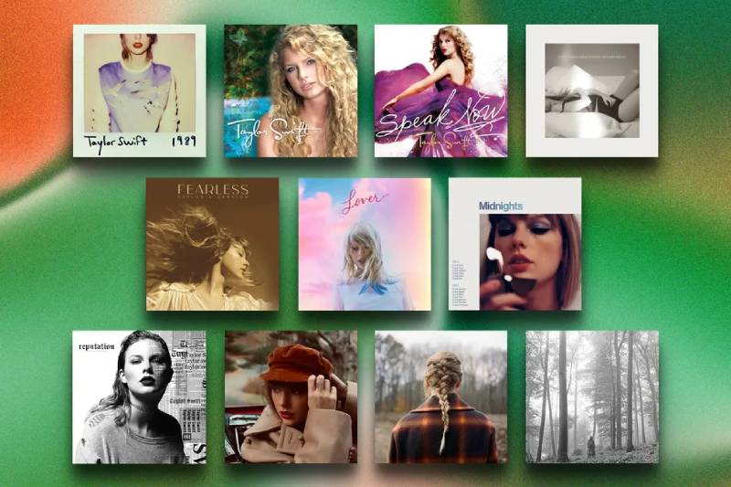
Every Taylor Swift era starts with a single image. Before you hear a note, the album cover tells you what’s coming. From the Polaroid nostalgia…
Many product teams treat design as a finishing touch applied after features are built. This misses the point: user interface design shapes how people navigate,…