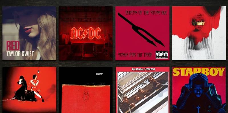
Metro Boomin doesn’t miss on album covers. From Pen & Pixel throwbacks to Pink Floyd references, every project he releases comes with artwork that gets…
Author
Bogdan Sandu is a seasoned designer who has been designing websites since 2008. Renowned for his expertise in logo design and visual branding, Bogdan has developed a multitude of logos for various clients. His skills extend to creating posters, vector illustrations, business cards, and brochures. Additionally, Bogdan's UI kits were featured on marketplaces like Visual Hierarchy and UI8. He also wrote in the past years on sites like Design Your Way, WebDesignerDepot, WPDean, Designmodo, Speckyboy, Slider Revolution, and more.
Metro Boomin doesn’t miss on album covers. From Pen & Pixel throwbacks to Pink Floyd references, every project he releases comes with artwork that gets…
The Walking Dead logo is one of the most recognized symbols in horror television. It turned a comic book property into a global franchise worth…
AC/DC have sold over 200 million records. But before anyone ever heard a single riff from Angus Young or a scream from Bon Scott, they…
White space in design is the single most ignored layout tool that separates amateur work from professional work. It’s not empty space. It’s a structural…
Art and design look similar from the outside. Same tools, sometimes the same visual language – but completely different intentions driving every decision. The difference…
The font on your screen is doing more than displaying words. It’s shaping how you feel about them before you’ve finished reading the first sentence.…
The Simpsons logo is one of the most recognized marks in television history. It first showed up in 1987 as a rough, hand-drawn wordmark on…
Since 1945, Elle magazine covers have shaped how we think about fashion photography, celebrity culture, and editorial design. From Brigitte Bardot in postwar Paris to…
Scale and proportion get mixed up constantly. Even experienced designers confuse them, and it causes real problems in layouts, architecture, and visual composition. The difference…
Bad spacing between letters can turn a perfectly good headline into an embarrassment. If you’ve ever wondered what is kerning in typography, it’s the precise…
The Cerebras logo represents one of the most ambitious players in the AI hardware space. As a visual identity, it carries the weight of a…
The Malmo FF logo is one of those football crests that just sticks with you. Not because it screams for attention, but because it doesn’t…
This HEX to Pantone Converter instantly finds the closest Pantone color match for any HEX value using perceptually accurate color science. Paste a hex code or use…
The Universal Pictures logo is one of the most recognized symbols in the film industry. It features a spinning globe surrounded by stars with the…
A single slider can make text feel polished or completely unreadable. That’s the power of tracking in typography, the uniform adjustment of space between all…
Have you ever put your clips into an editor and immediately felt drowned by the fact that there were too many buttons, layers, and tools…
The SenseTime logo represents one of the most recognized visual identities in the artificial intelligence sector. As a Chinese AI giant specializing in computer vision…
Every layout decision you make starts with one question: where does this element go? That’s alignment in graphic design, and it controls whether your work…
Every layout you’ve ever looked at and thought “something feels off” probably had a balance problem. Understanding what is balance in graphic design starts with…
This Pantone to CMYK Converter is a fast, browser-based tool for designers and print professionals who need accurate color translation without the guesswork. Search any Pantone color…
Lead generation in 2026 is no longer about collecting as many contacts as possible – it’s about finding the right prospects, verifying their data, and…
Every line of text you’ve ever read sits on a baseline. You just never noticed it, and that’s exactly the point. Understanding what a baseline…
The Studio Ghibli logo is one of the most recognized marks in animation history. It features a soft blue silhouette of Totoro, the forest spirit…
The New Line Cinema logo is one of those marks you’ve probably seen hundreds of times without really thinking about it. That film strip icon,…
The design process used to take weeks. Now, the right AI tools for UI/UX design can take you from a rough idea to a working…
The terms UI designer and UX designer get used interchangeably every day, even by people who should know better. They’re not the same role. The…
Your logo will be judged in under 50 milliseconds. That’s not a guess. That’s how fast the brain processes a visual mark and forms an…
The AI21 Labs logo represents one of Israel’s most significant artificial intelligence companies. Founded in 2017 by Yoav Shoham, Ori Goshen, and Amnon Shashua, the…
Both titles say “designer.” The work couldn’t be more different. The debate around UI designer vs graphic designer comes up constantly – in hiring decisions,…
Users form an opinion about your page in about 50 milliseconds. That’s faster than a blink. And visual hierarchy is what determines whether that snap…