Design work rarely lives in one tidy place. Fonts sit in cloud folders, mockups move through review platforms, client credentials arrive in chat, and license…
Author
Bogdan Sandu is a seasoned designer who has been designing websites since 2008. Renowned for his expertise in logo design and visual branding, Bogdan has developed a multitude of logos for various clients. His skills extend to creating posters, vector illustrations, business cards, and brochures. Additionally, Bogdan's UI kits were featured on marketplaces like Visual Hierarchy and UI8. He also wrote in the past years on sites like Design Your Way, WebDesignerDepot, WPDean, Designmodo, Speckyboy, Slider Revolution, and more.
Design work rarely lives in one tidy place. Fonts sit in cloud folders, mockups move through review platforms, client credentials arrive in chat, and license…
Most font combinations look fine. A few actually work. And when it comes to Merriweather font pairing, the right choice can be the difference between…
A client sends over the spec for one screen. It’s a purchase order form, and the field list runs to 200 entries. Some are dates,…
An emo font generator is a browser-based tool that turns plain text into dark, expressive Unicode lettering tied to the mid-2000s emo and scene aesthetic.…
Creating original characters used to feel like a full-time job. Sketching faces, refining personalities, matching styles for ads or stories—it drained hours. Then AI character…
A web-hosting plan can look inexpensive and still become a surprisingly large recurring cost. The number displayed most prominently on a sales page is usually…
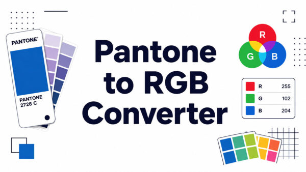
Search a Pantone code and take the values you actually need: hex, RGB, HSL, Lab and a CMYK starting point. Sample a colour from any…
App redesign projects often start with a simple complaint: the product looks outdated. The interface feels old, the colors no longer match the brand, the…
Most AI avatar demos look great for 15 seconds. Business video does not get judged in 15 seconds. It gets judged on the fifth onboarding…
Not every typeface is built for the same job. A display typeface is designed specifically for large-scale use, think headlines, posters, and short title text…
The Loom logo is the visual identity of Loom, an async video messaging platform used by teams across the world. It pairs a clean wordmark…
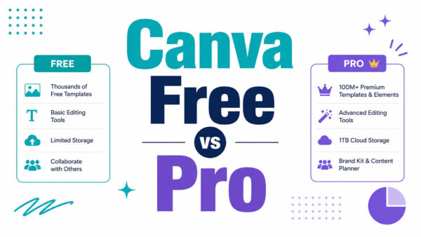
Most people sign up for Canva Free and hit a wall within a week. The Canva Free vs Pro decision is one of the most…
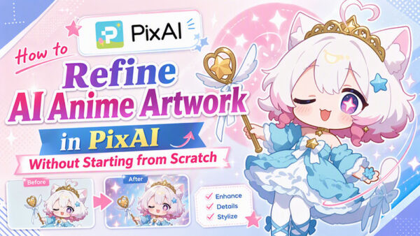
It’s possible to take dozens of generations to find the right pose, camera angle, facial expressions, or background details, only to find that your art…
The Ghost logo is the visual identity of Ghost, an open-source publishing platform built by the Ghost Foundation and launched in 2013. It consists of…
Every designer knows the concept phase is where projects either gain momentum or stall. A client asks for “a few directions,” and suddenly you are…
A7 paper size is a fixed sheet standard within the ISO 216 A-series that measures 74 by 105 millimeters, one of the smallest sizes in…
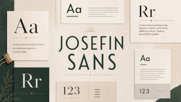
Most geometric sans-serifs play it safe. Josefin Sans does not. Designed by Santiago Orozco and inspired by 1920s typefaces like Futura and Kabel, it carries…
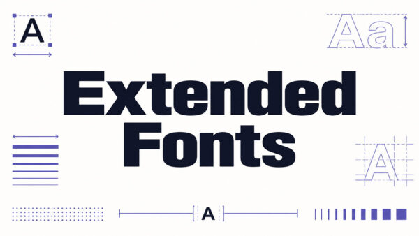
Not all wide-looking text comes from a wide font. That distinction matters more than most people think. An extended font is a typeface with characters…
The Linear logo is the visual identity for Linear (legal name: Linear Orbit, Inc.), a software project management tool built for engineering teams. It consists…
Gamma has become one of the most popular AI tools for spinning up a presentation fast. Type a prompt, and it generates a modern, web-style…
Most people comparing Canva vs Figma are asking the wrong question. It is not about which tool is better. It is about which one fits…
A shopper sizes up your clothing brand in about three seconds, and they do it with a thumb, not by reading the page closely. Fashion…
The Dualshockers logo is the visual identity of one of gaming’s most recognized news outlets, a red-and-white wordmark built entirely around bold typography. Founded in…
Cormorant Garamond is one of those display serif fonts that looks stunning in a heading and completely falls apart when you pair it with the…
This Pantone to RAL converter matches a Pantone colour to the closest shade in the RAL Classic range, then tells you how close that match actually is.…
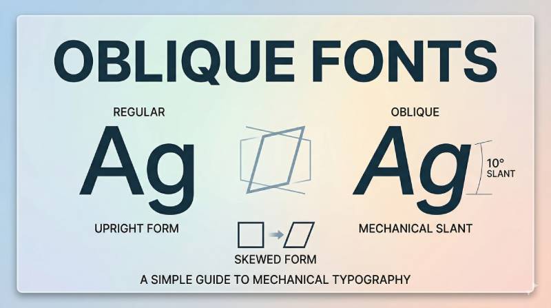
You’ve probably used an oblique font today without knowing it. Every time you hit Ctrl+I on a sans-serif typeface like Helvetica or Arial, there’s a…
AI video tools have gotten incredibly good over the last year, and it’s easier than ever to turn a flat drawing into a clip. If…
The Bolt logo is the visual identity mark for Bolt, a one-click checkout platform co-founded in 2014 by Ryan Breslow and Eric Feldman. The current…
Animation can make abstract ideas easier to follow, especially when a message involves software, data, or invisible processes. Still, some brand moments need a real…
A Pantone to RGB converter is a tool that translates a standardized Pantone spot color into its closest red, green, blue screen equivalent. You feed it a…