A printed menu board locks in a price for as long as the lamination survives. The moment a supplier raises wholesale or the kitchen runs out of a line item, the choice is between absorbing the margin and driving to a print shop.
Setting up a digital menu board removes that trade-off, and the work involved is smaller than most operators expect. This guide walks through the parts in the order you will actually meet them.
Key takeaways
- Three components, nothing else. A digital menu board is a display, a media player and signage software. Everything beyond that is content and layout.
- The software decides the workload. Template library, dayparting, remote updates and multi-screen grouping are what turn a television into a menu board. The panel itself is interchangeable.
- Start from a layout, not a blank canvas. The first board takes 15 to 30 minutes from a finished template; from scratch it takes a designer.
- Readability is set by distance, not taste. One inch of text height per 10 feet of viewing distance, a 4.5:1 contrast ratio, and 5 to 6 items per screen.
- Outdoors is a different specification. 1,500 nits minimum, IP65 enclosure, and a -30°C to 50°C operating range — none of which an indoor panel provides.
- Dayparting is what pays for the setup. Breakfast, lunch and evening boards are built once, scheduled once, and then run without anyone touching them.
The three parts of a working menu board
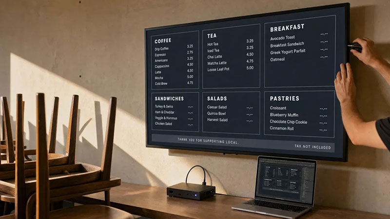
A digital menu board is a screen that shows your menu, controlled by software that updates it remotely. That is the whole concept. What separates a real menu board from a TV running a slideshow is not the panel — it is the management layer sitting behind it.
The display comes first, and it is the least interesting decision. Any TV built in the last decade will render a menu. For an indoor counter line, a 43 to 55-inch consumer set in the $300 to $700 range at 250 to 350 nits is enough. The one specification worth checking is duty cycle: consumer panels are not warranted for sixteen-hour shifts and can develop image retention, so a screen running open-to-close deserves a commercial-rated display instead.
The media player is the small device that runs the signage software and feeds the panel. Two routes exist. An external player plugs into the HDMI port of any TV and costs anywhere from $30 for a streaming stick to a few hundred for a purpose-built unit. Alternatively, a commercial display with a system-on-chip runs the software inside the panel itself, which removes the cable but ties you to that manufacturer’s platform. Most independent operators start with an external player because it is cheaper to replace when it fails.
The software is the part that actually decides whether managing a menu takes thirty seconds or thirty minutes. Four capabilities matter: a template library so nobody designs from a blank canvas, dayparting so menus switch on schedule, remote management so a price change can be pushed from a phone, and multi-screen grouping if a second location is anywhere in the plan. Static images sitting in a folder fail all four. Without that layer, the outcome is a more expensive printed menu.
Building the layout without opening a design tool
A menu board layout comes from one of two places: a finished template that you edit, or a blank canvas that needs a designer. The first route takes 15 to 30 minutes and the second takes a project, which is why most operators start from a gallery. A template also keeps typography consistent across the breakfast, lunch and evening versions you will build next.
On the software side, free digital menu board templates with editable layouts use named item slots, so a POS feed maps once and stays mapped even after the layout changes. Decker keeps portrait and landscape versions of the same design on those slots, which means a counter board and a narrow entrance panel do not need separate mapping work, and a price edit redraws the affected slot in one to five seconds rather than triggering a re-export of the whole image.
Whichever gallery you start from, replace the placeholder items first and adjust colour last. The first board takes fifteen to thirty minutes. The second and third take a fraction of that, because the grid decisions are already made.
Scheduling is the step that pays for the setup
Dayparting is the feature that pays back a menu board setup fastest: 3 boards — breakfast, lunch and evening — are built once and then switch on schedule without anyone touching a screen. It is also the step most operators configure last. A breakfast menu that disappears on its own at 10:30 removes the counter argument that starts every time someone orders pancakes at eleven.
The same mechanism handles everything else that rotates. Happy hour drink pricing, weekend brunch, a limited-time offer that runs for nine days — each is built once, scheduled once, and then runs without anyone touching it again. Playlists extend the idea within a single screen: a regular menu can alternate with a promotional frame, with a longer dwell time on whichever board you want customers looking at while they queue.
Sold-out items deserve their own rule. If the board is fed from a price and availability source rather than a flat image, an item marked unavailable disappears from the screen on the next sync. That matters more than it sounds. A customer who orders something the kitchen ran out of two hours ago creates a service problem at the counter that no amount of design polish fixes.
A useful habit after any bulk change is a ten-second look at the monitoring view. Good signage software reports whether each screen is online and what it is currently showing, which catches the stalled update in store twelve before a customer does.
Design rules that decide whether the board gets read
A menu board is read from 8 to 15 feet away in under 10 seconds, which makes readability the only design metric that decides whether it works. Everything below follows from that distance and that window, not from taste.
Limit items per screen. Five to six per board is the working ceiling. The instinct is to fit everything so nothing gets missed, but an overcrowded board slows ordering, and slower ordering costs throughput during the rush. Split a long menu across a run of screens or across dayparts instead of compressing it.
Size type by viewing distance. The rule of thumb in signage design is one inch of text height for every ten feet of viewing distance, and more for headers. A counter board read from ten feet wants prices at least an inch tall. A drive-thru panel read from fifteen to twenty feet needs substantially more.
Choose contrast over colour cleverness. Light type on a dark ground, or dark on light, reads from roughly twice the distance of a low-contrast pairing. Accessibility guidance puts the floor at a 4.5:1 ratio for body text, and public-facing displays in many jurisdictions are expected to meet it. Save the brand palette for headers, accents and item highlights.
Place margin-strong items where the eye lands. Attention gravitates toward the upper-right area of a board and toward the first and last positions in any block. Those are the slots worth spending on. Dropping the currency symbol also helps — a price rendered as 12 rather than $12.00 reads as a number rather than a cost, and descriptive naming does the rest: “grilled chicken with avocado and chipotle aioli” outperforms “chicken sandwich” without adding a single pixel.
Animate one zone, not the board. Motion lifts attention when it is contained to a featured item or a ten-second takeover. Motion across the whole board while somebody is reading a price costs comprehension and slows the queue.
What changes outdoors and at the drive-thru
An outdoor menu board needs at least 1,500 nits, an IP65 enclosure and a -30°C to 50°C operating range — three specifications that an indoor panel does not carry. The moment a screen sees daylight, indoor assumptions stop transferring.
Brightness is the first divergence. An indoor panel at 250 to 350 nits looks washed out in direct sun from six feet away, let alone from a car. Outdoor boards need 1,500 nits as an absolute floor, 2,500 to 3,500 for genuine sunlight readability, and some quick-service drive-thru panels run as high as 5,000 nits behind anti-reflective glass.
Ingress protection is the second. IP65 is the baseline for an outdoor enclosure, covering dust and water jets from any direction; IP66 is the sensible upgrade for storm-prone or coastal sites. Anything rated below IP54 belongs under a sheltered patio roof, not on an exposed wall.
Operating temperature is the third and the one most often overlooked. A consumer TV is rated to roughly 40°C at the top end and will not start reliably below freezing. Purpose-built outdoor displays typically run from -30°C to 50°C with active heating and cooling inside the enclosure. Anywhere with a real winter or a real summer, that range matters more than the nits figure.
Geometry changes too. A driver reads the board from twelve to twenty feet inside a vehicle, which is why most quick-service chains run drive-thru panels at 46 to 55 inches in portrait orientation — more vertical content sits inside the sightline. Industry counts put U.S. drive-thru locations at just over 140,000, so the hardware bar in that segment is set by operators with a great deal riding on it.
Food trucks sit in a third category entirely. The screen needs sunlight readability and weather resistance, but it also has to survive vibration in transit, run cleanly off a generator or inverter, and tolerate a parked cab that reaches 60°C on a hot afternoon. Commercial outdoor displays handle that. Standard televisions do not.
Bringing it together
A digital menu board is three components and a set of decisions. The hardware is largely interchangeable and gets cheaper every year. What determines whether the setup earns its cost is the software layer and the layout discipline sitting on top of it — whether a price change reaches every screen on its own, whether the board switches dayparts without a person, and whether a customer eight feet back can read it in the seconds they are willing to spend.

Renowned for his expertise in logo design and visual branding, Bogdan has developed a multitude of logos for various clients.
His skills extend to creating posters, vector illustrations, business cards, and brochures. Additionally, Bogdan's UI kits were featured on marketplaces like Visual Hierarchy and UI8.
He also wrote in the past years on sites like Design Your Way, WebDesignerDepot, WPDean, Designmodo, Speckyboy, Slider Revolution, and more.
- How to Set Up a Digital Menu Board: Hardware to Layout - 15 September 2026
- The Arc Browser Logo History, Colors, Font, And Meaning - 14 September 2026
- From Information to Persuasion: A Practical Framework for Strategic Presentation Design - 14 September 2026

Bogdan Sandu is a seasoned designer who has been designing websites since 2008. Renowned for his expertise in logo design and visual branding, Bogdan has developed a multitude of logos for various clients. His skills extend to creating posters, vector illustrations, business cards, and brochures. Additionally, Bogdan's UI kits were featured on marketplaces like Visual Hierarchy and UI8. He also wrote in the past years on sites like Design Your Way, WebDesignerDepot, WPDean, Designmodo, Speckyboy, Slider Revolution, and more.
You Might Also Like