The Arc browser logo is the official visual mark of Arc, a Chromium-based web browser developed by The Browser Company. It functions as both a product icon and a brand symbol, representing a new approach to how people interact with the web.
The logo sits within a broader wave of tech company logos that prioritize personality over convention. Arc launched in 2022, and its logo has remained consistent since then, signaling a deliberate, design-forward identity from day one.
What Is the Arc Browser Logo?
The Arc browser logo is a colorful, gradient-based arc shape introduced in 2022 by The Browser Company. It uses a curved, swooping form in purple and orange tones, designed to feel approachable and modern. It serves as both an app icon and brand mark across digital platforms.
- Design Type: Abstract icon / combination mark
- Primary Elements: A curved arc shape with a multi-color gradient, paired with the wordmark “Arc” in select contexts
- Official Introduction Date: 2022 (public beta launch)
- Designer/Agency: In-house design team at The Browser Company
- Trademark Status: Trademarked by The Browser Company of New York, Inc.
- Color Palette: Primary purple (#6B4EFF), coral/orange (#FF6B4E), with gradient transitions between the two
- Usage Context: macOS dock icon, iOS app icon, website favicon, marketing materials, and social media profiles
How Has the Arc Browser Logo Evolved Over Time?
Arc’s logo history is short but deliberate. The Browser Company launched with a clear visual direction in 2022 and has made only minor refinements since. Unlike legacy browsers with decades of rebranding, Arc’s identity was built from scratch with modern digital-first use in mind.
Original Arc Browser Logo (2022-Present)
- Years Active: 2022 to present
- Design Description: A bold, curved arc shape rendered in a purple-to-orange gradient. The form suggests a sweeping motion, almost like a brushstroke or an architectural arch viewed from below.
- Color Scheme: Purple (#6B4EFF) transitioning to coral orange (#FF6B4E)
- Designer: The Browser Company in-house team
- Context: Introduced alongside the browser’s closed beta in 2022. The design needed to stand out in a macOS dock dominated by flat, minimal icons.
- Key Changes from Previous: No prior version exists. This was the first and only iteration.
- Cultural Significance: Represented a shift in browser branding toward expressive, design-led identity at a time when most competitors relied on flat geometric shapes.
What Do the Design Elements of the Arc Browser Logo Mean?
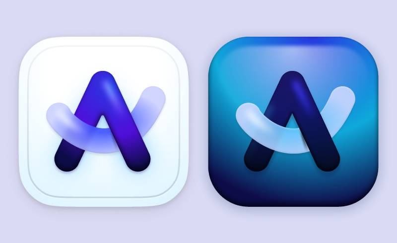
The Arc logo uses a curved, sweeping shape to suggest forward motion and openness. The gradient coloring adds energy and warmth. Together, these elements communicate a browser that feels different from the established players, less corporate, more personal.
The arc shape itself is the core of the identity. It references the product name directly while also evoking architectural and natural forms like bridges, rainbows, and trajectories.
Why Did Arc Choose These Specific Colors?
The purple-to-orange gradient is not accidental. Each color carries specific meaning within the brand.
- Purple
- Hex: #6B4EFF
- Symbolic meaning: Creativity, individuality, and a break from convention
- Psychological impact: Signals something premium and imaginative. Among purple logos, it tends to read as forward-thinking.
- Brand connection: Positions Arc as a thoughtful alternative to mainstream browsers
- Coral Orange
- Hex: #FF6B4E
- Symbolic meaning: Energy, warmth, and approachability
- Psychological impact: Softens the intensity of the purple and adds a human quality
- Brand connection: Reflects the product’s emphasis on personal expression and customization
The gradient between them creates movement, which ties back to the idea of browsing as an active, flowing experience rather than a static tool.
Understanding how color theory works in brand identity helps explain why this combination feels cohesive rather than chaotic. The two colors sit in a warm-cool balance that keeps the eye engaged.
What Typography Style Is Used in the Arc Browser Logo?
When the Arc wordmark appears, it uses a clean, rounded sans-serif style.
The letterforms are soft and approachable, avoiding sharp terminals or rigid geometry.
Readability is prioritized at small sizes, which matters for a browser icon seen at dock scale constantly.
The sans-serif font choice reinforces modernity without leaning into the cold, technical feel of more utilitarian typefaces. It matches the rounded, organic quality of the arc shape itself.
What Are the Hidden Meanings in the Arc Browser Logo?
The most intentional detail is the shape itself: it is literally an arc, making the logo a direct visual translation of the product name.
There is also a subtle sense of enclosure in the curve, as if the shape is wrapping around something. This could be read as the browser organizing and holding the user’s digital life together.
The gradient direction (cool to warm, left to right) follows natural reading direction, subtly suggesting progress and movement forward.
No stated hidden meanings have been published by the design team, but the visual emphasis on the curve over any literal symbol keeps interpretation open and personal.
How Does the Arc Browser Logo Compare to Competitor Logos?
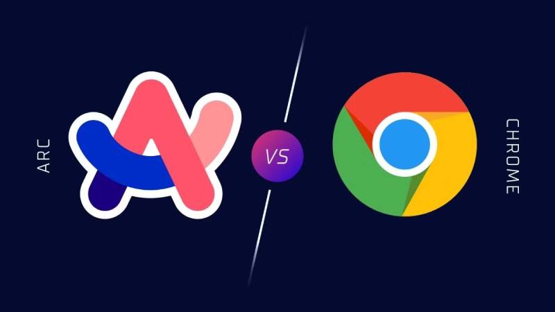
Arc’s logo stands apart from every major browser on the market. Chrome uses a flat, segmented circle. Firefox uses a stylized fox wrapped around a globe. Safari uses a compass. Edge uses a wave. Arc’s full-gradient arc shape is the only one that feels genuinely expressive rather than diagrammatic.
Chrome’s icon relies on triadic color segmentation. Arc does the opposite, blending its colors together rather than separating them. That single decision makes the icon feel less rigid.
Firefox and Arc are the two most personality-driven browser icons in current use. But Firefox’s design is illustrative and figurative. Arc’s is abstract, which gives it more flexibility across contexts.
Compared to tools like the Figma logo or the Linear logo (both design-world darlings), Arc holds its own. It feels like it belongs in the same ecosystem: clean, intentional, built for people who care about craft.
The Notion Calendar logo and the Loom logo follow a similar modern productivity app aesthetic, but neither uses color as boldly as Arc.
What Are the Technical Specifications of the Arc Browser Logo?
Official Color Codes
- Primary Color: Purple
- Hex: #6B4EFF
- RGB: (107, 78, 255)
- CMYK: (58, 69, 0, 0) (approximate)
- Pantone: Closest match Pantone 2665 C
- Secondary Color: Coral Orange
- Hex: #FF6B4E
- RGB: (255, 107, 78)
- CMYK: (0, 58, 69, 0) (approximate)
- Pantone: Closest match Pantone 171 C
Dimensions and Proportions
- Aspect ratio: 1:1 (square bounding box for app icon use)
- Minimum size requirements: 16x16px for favicon use; 1024x1024px recommended for app store submissions
- Clear space specifications: Minimum clear space equal to roughly 10% of the icon’s width on all sides
- File formats available: PNG for raster use; SVG for scalable contexts. The icon is built on vector graphics, so it scales without quality loss. For any raster exports, standard DPI requirements apply depending on platform context.
- Official usage guidelines: Published by The Browser Company; prohibit modification of gradient, distortion of the arc shape, or use of the icon in misleading contexts
What Cultural Impact Has the Arc Browser Logo Had?
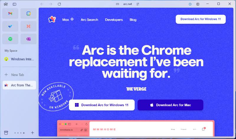
Arc’s logo became a minor symbol of the “new wave” of productivity tools that emerged in the early 2020s, products built by small teams with strong design opinions and loyal early adopters.
The icon regularly appears in screenshots shared by designers, developers, and writers on social media, not because they are promoting Arc, but because it looks good in a dock. That kind of passive visibility is rare and genuinely valuable.
It has influenced how some newer browser projects think about icon design. The idea that a browser icon does not have to be a globe, a compass, or a segmented circle gained more traction after Arc made its gradient arc shape work.
Among color psychology discussions in design communities, the Arc icon gets cited as an example of gradient use that does not feel dated or cheap, which is harder to pull off than it sounds.
How Does the Arc Browser Logo Fit Into the Overall Brand Identity?
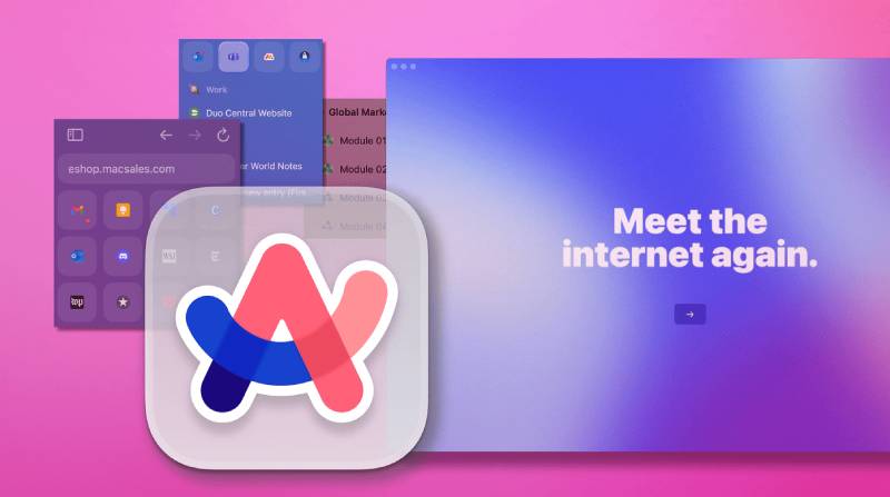
The logo is the most visible piece of a broader identity system that extends into the browser’s UI, onboarding experience, and marketing materials. Arc’s interface uses similar purple and warm tones throughout, so the icon feels like a preview of what is inside.
The color palette established by the logo carries into sidebar theming, space colors, and promotional graphics. This kind of consistency is what separates a logo from a full brand system.
The brand guidelines at The Browser Company appear to treat the icon as sacred. It has not been modified or lightened since launch, which signals internal confidence in the original design decision.
The logo also connects to Arc’s tone of voice, playful but precise, personal but polished. The gradient does that work visually before a single word is read.
How Should the Arc Browser Logo Be Used?
Do’s
- Use the official PNG or SVG files downloaded directly from The Browser Company’s press kit or official site
- Maintain the original gradient when reproducing the icon digitally
- Give the icon adequate clear space so it does not feel crowded
- Use the icon at appropriate sizes, nothing below 16x16px in functional contexts
Don’ts
- Do not recolor the logo or replace the gradient with a flat fill
- Do not stretch, rotate, or distort the arc shape
- Do not use the logo to imply official partnership or endorsement without permission
- Do not place the icon on backgrounds that reduce contrast to the point of illegibility
Where to Access Official Files
The Browser Company provides press assets through their official website. Searches for “Arc browser press kit” will surface the correct download page. Do not source the logo from third-party icon repositories, as these often carry outdated or slightly modified versions.
Licensing and Trademark Details
The Arc browser logo is a registered trademark of The Browser Company of New York, Inc. Use outside of editorial, educational, and review contexts typically requires written permission. Standard licensing principles apply: the logo belongs to the company, and reproducing it for commercial purposes without authorization is not permitted.
FAQ on The Arc Browser Logo
What does the Arc browser logo look like?
It is a curved, swooping arc shape rendered in a purple-to-orange gradient.
The form is abstract and icon-based, with no text required. Clean, expressive, and immediately recognizable in a macOS dock or iOS home screen.
Who designed the Arc browser logo?
The Browser Company’s in-house design team created it. No external agency has been credited publicly.
The logo debuted alongside Arc’s closed beta in 2022 and has not been redesigned since.
What colors are used in the Arc browser logo?
The primary colors are purple (#6B4EFF) and coral orange (#FF6B4E).
They blend through a smooth gradient rather than sitting as flat separate tones. The combination reads as warm, creative, and distinctive among browser icons.
Has the Arc browser logo ever changed?
No. The current version is the original, introduced in 2022.
Minor pixel-level refinements may have occurred, but no major redesign has been released. The Browser Company has kept the visual identity consistent since launch.
What file formats is the Arc browser logo available in?
The logo is available as PNG and SVG.
SVG is preferred for scalable digital use since the mark is built on vector graphics. PNG exports work for standard web and app contexts where raster output is needed.
What design style does the Arc browser logo follow?
It follows a modern abstract icon style, leaning toward minimalist design with expressive color.
There are no literal symbols, mascots, or wordmarks required. The shape alone carries the full identity, which is unusual for a browser product.
How does the Arc browser logo compare to Chrome or Firefox?
Chrome uses flat triadic segments. Firefox uses an illustrative fox and globe. Arc uses a pure abstract gradient shape with no figurative reference.
Arc is the most design-forward of the three, and the only one that feels at home alongside tools like the Miro logo or Webflow logo.
What does the arc shape symbolize in the logo?
It is a direct visual translation of the product name.
Beyond that, the curve suggests openness and forward motion. The emphasis on a single fluid shape rather than a complex illustration keeps the meaning open to personal interpretation.
Can I use the Arc browser logo on my website?
Editorial and review use is generally acceptable. Commercial use requires permission from The Browser Company.
Always source files from the official press kit. The logo is a registered trademark, so standard brand guidelines and trademark protections apply.
What makes the Arc browser logo stand out among app icons?
Most browser icons rely on literal metaphors: compasses, globes, foxes. Arc uses pure form and color psychology instead.
The purple-orange gradient is rare in browser branding and gives the icon a personality that holds up well next to design tools like the Framer logo or the Cursor logo.
Conclusion
The Arc browser logo is one of the few browser icons that actually has a point of view.
It skips the globes, compasses, and segmented circles that define the category and replaces them with a single expressive curve in a purple-to-orange gradient.
The Browser Company built a visual identity that matches the product’s personality, personal, opinionated, and clearly not made for everyone.
For anyone studying brand style in the productivity app space, Arc is worth looking at closely. The arc shape, the color psychology, the gradient execution. It all holds together.

Renowned for his expertise in logo design and visual branding, Bogdan has developed a multitude of logos for various clients.
His skills extend to creating posters, vector illustrations, business cards, and brochures. Additionally, Bogdan's UI kits were featured on marketplaces like Visual Hierarchy and UI8.
He also wrote in the past years on sites like Design Your Way, WebDesignerDepot, WPDean, Designmodo, Speckyboy, Slider Revolution, and more.
- The Arc Browser Logo History, Colors, Font, And Meaning - 14 September 2026
- Canva vs Photoshop: When Does Each Make Sense? - 12 September 2026
- Briefing 3D Game Animation: Rigs, Clip Lists and Engine Handoffs - 11 September 2026

Bogdan Sandu is a seasoned designer who has been designing websites since 2008. Renowned for his expertise in logo design and visual branding, Bogdan has developed a multitude of logos for various clients. His skills extend to creating posters, vector illustrations, business cards, and brochures. Additionally, Bogdan's UI kits were featured on marketplaces like Visual Hierarchy and UI8. He also wrote in the past years on sites like Design Your Way, WebDesignerDepot, WPDean, Designmodo, Speckyboy, Slider Revolution, and more.
You Might Also Like