Look at a sunflower, a cathedral rose window, or the Chrome logo. They all share the same structural logic. Understanding what is radial balance gives you a practical framework for creating compositions that feel complete, focused, and visually stable.
Radial balance is one of four main types of balance in design, and it’s the only one built around a central point rather than an axis. It shows up in nature, architecture, graphic design, and photography.
This article covers how radial composition works, where you’ll find it, how to build it in your own projects, and when to skip it entirely. You’ll also learn why the human brain responds to radial patterns the way it does, and how that knowledge applies to real design decisions.
What Is Radial Balance
Radial balance is a type of visual composition where design elements radiate outward from a central point, creating even distribution of visual weight in all directions. Think of a bicycle wheel. Every spoke extends from the hub, and the whole thing holds together because of that center.
That’s the core idea. A single focal point anchors everything, and the surrounding elements spread out in a circular or near-circular pattern.
It’s one of four main types of balance in graphic design, alongside symmetrical, asymmetrical, and mosaic. But radial balance is the only one that organizes visual weight around a center rather than along an axis.
McKinsey’s Design Index research found that top-quartile design companies see 32% higher revenue growth than their peers. Good composition, including proper use of balance types, is part of what separates high-performing design from average work.
You see radial balance in sunflower seed patterns. In spiderweb construction. In the rose windows of Gothic cathedrals. The arrangement looks different each time, but the structural logic is the same: center point, outward radiation, circular harmony.
What makes it different from symmetry? Symmetrical balance mirrors elements along a vertical or horizontal line. Radial balance mirrors them around a point. Small distinction, but it changes everything about how the viewer’s eye moves through the composition.
How Radial Balance Differs from Other Balance Types
| Balance Type | Axis | Visual Effect | Best For |
|---|---|---|---|
| Symmetrical | Vertical or horizontal line | Formal, stable | Wedding invites, official documents |
| Asymmetrical | No fixed axis | Dynamic, modern | Magazines, editorial layouts |
| Radial | Central point | Focused, unified | Logos, mandalas, circular layouts |
| Mosaic | None (distributed chaos) | Energetic, complex | Collages, pattern design |
A Smashing Magazine analysis notes that radial balance makes maintaining a strong focal point easy because everything naturally leads back to center. That’s a built-in advantage other balance types don’t have.
How Radial Balance Works in Visual Composition

The mechanics are straightforward. You place something at the center. Then you arrange supporting elements around it, distributing them so the composition doesn’t feel heavier on one side.
But “straightforward” doesn’t mean simple. Took me a while to realize that radial balance isn’t just about placing things in a circle. The spacing between elements matters. The size variation matters. The color weight of each piece affects whether the whole thing actually feels balanced or just looks like stuff arranged in a ring.
The Role of the Central Focal Point
Rudolf Arnheim wrote about this extensively in The Power of the Center (1982). His argument was that concentric spatial patterns create what he called “interacting, balancing sets of forces.” The center isn’t passive. It pulls.
Research in perceptual psychology backs this up. The brain processes radial patterns quickly because symmetrical arrangements require less mental effort to decode. Your eye goes to center first, then follows the radiating paths outward.
A Behaviour and Information Technology study found users form opinions about a composition in roughly 50 milliseconds. Radial layouts make that first impression count because the viewer knows instantly where to look.
Repetition and Rotation Around the Center
Pattern duplication: Elements get copied and rotated at equal intervals. A mandala with eight identical segments, for instance. Each slice is a mirror of the others.
Graduated variation: Elements change size, opacity, or color as they move away from center. This adds depth without breaking the radial structure.
Irregular radiation: Not every radial composition needs perfect uniformity. Loose arrangements, where things mostly radiate from center but aren’t mathematically precise, can feel more organic. Look at how petals grow on a daisy.
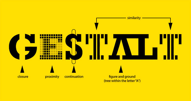
The key principle from Gestalt design theory that applies here is proximity. Elements that share spatial relationships around a central point appear grouped, even if they’re physically separated. That grouping effect is what makes radial compositions read as unified rather than scattered.
Radial Balance in Nature

Sunflower seed heads are probably the most cited example, and for good reason. The seeds arrange themselves in spirals that follow Fibonacci numbers. Count the clockwise spirals and you’ll get 34. Count counterclockwise, 55. Divide the larger by the smaller and you land close to 1.618, the golden ratio.
This isn’t decorative. It’s functional. The arrangement maximizes seed packing efficiency.
Spiderweb construction follows similar logic. The radial threads extend from a central hub, and the spiral threads connect them. The whole structure distributes tension evenly, which is why webs can catch insects without tearing apart immediately.
Where You’ll Find Radial Patterns in the Wild
- Citrus fruit cross-sections (orange, lemon, grapefruit)
- Starfish and sea urchin body structures
- Snowflake crystallization, which exhibits fractal radial symmetry
- Tree ring growth patterns visible in cross-cut wood
What’s interesting is that these natural patterns directly influenced human design for thousands of years. The radial layout of a sunflower became the radial layout of a cathedral window. The symmetry of a starfish informed decorative tile patterns in Islamic architecture.
According to a 2022 study published in the MDPI journal Symmetry, the golden ratio appears across natural phenomena from galactic to atomic scales. Radial balance is one of the most common structural expressions of this mathematical relationship in living organisms.
People can remember 65% of visual information three days later but only 10% of written content, according to research cited by Skillademia. That retention gap partially explains why nature’s radial patterns stick with us. We recognize them fast, and they stay lodged in memory.
Radial Balance in Art and Architecture

The Pantheon in Rome is a 2,000-year-old example of radial balance in architecture. Its coffered dome radiates from the central oculus, a circular opening at the top that lets in natural light. Stand underneath and your eye goes straight to center, then follows the receding coffers outward and downward.
That pull is intentional. Roman architects understood that a circular plan with radial elements creates a feeling of completeness. Everything is connected to everything else through the center point.
Radial Balance in Religious and Sacred Art
Mandalas in Hindu and Buddhist traditions are built entirely on radial composition. Tibetan sand mandalas, which are destroyed after completion, use concentric rings of colored sand radiating from a center. The practice is meditative, and the radial structure supports that purpose. Your gaze settles inward.
Rose windows in Gothic cathedrals, like those at Chartres and Notre-Dame de Paris, work on the same principle. Stained glass panels radiate from a central medallion, with tracery creating the structural framework.
Islamic geometric art relies heavily on radial patterns too. Star-and-polygon configurations expand outward from center points, creating intricate tiled surfaces. No figurative imagery needed. The mathematics of the pattern does the visual work.
Radial Balance in Architecture

Ancient structures: The Colosseum’s elliptical plan distributes seating radially around the arena floor. The Temple of Heaven in Beijing uses concentric circular platforms.
Modern applications: The Guggenheim Museum in New York (Frank Lloyd Wright, 1959) features a spiral ramp that radiates around a central atrium. Visitors experience the space as a continuous radial path.
Le Corbusier, whose Modulor system was based on the golden ratio and Fibonacci proportions, integrated radial thinking into his architectural philosophy. His work bridged classical proportional systems with modernist design principles.
According to G2 research, 93% of people say that visual dimensions influence their purchasing decisions. Architecture and spatial design that uses radial balance taps directly into this preference for structured, visually coherent environments.
Radial Balance in Graphic Design and Digital Media
Radial balance shows up in logo design constantly. The Mercedes-Benz three-pointed star. The BP sunburst. The Chrome icon. All built around a center point with elements radiating outward.
These aren’t random choices. Shopify reports that 62% of consumers feel overwhelmed by marketing materials. A radially balanced logo cuts through that noise because the eye processes it quickly. Center, outward, done.
Logo and Brand Identity Examples

Mercedes-Benz: Three-pointed star in a circle. Perfect radial symmetry. Communicates precision and completeness.
BP (2000 rebrand): The “Helios” mark uses overlapping petals radiating from center. Designed by Landor Associates to suggest energy and nature simultaneously.
Target: Concentric circles. The simplest possible radial composition. According to Cropink data, businesses using professionally designed content see 35% higher conversion rates.
When building a visual identity for a brand, radial balance offers a shortcut to perceived stability. The circular structure reads as complete and trustworthy, which is exactly what most brands want.
Radial Layouts in Web and Interface Design

Circular navigation menus use radial balance. So do pie charts, radial progress indicators, and those expanding “burst” menus you see in mobile apps. The structure works because it puts options equidistant from a center point, making no single choice feel prioritized over another.
For infographic design, radial layouts let you display interconnected data points without the linear constraints of a bar graph or timeline. A central topic branches outward into subtopics, and the viewer reads in whatever direction they want.
Canva’s 2024 Visual Economy Report found that 77% of business leaders say communicating visually has directly increased their business performance. Radial design patterns are one of the tools that makes visual communication work, especially when you need to show relationships between multiple elements and a central idea.
CSS radial gradients also fall under this category. They create depth and dimension by radiating color from a center point, making flat backgrounds feel more dynamic. It’s a small detail, but it reinforces radial balance at the background layer of a design.
Radial Balance vs. Symmetrical Balance vs. Asymmetrical Balance
These three get mixed up constantly. And honestly, I get it. They all deal with distributing visual weight. But the mechanism is different each time, and picking the wrong one for your project can throw off the whole composition.
Core Differences at a Glance
| Feature | Radial Balance | Symmetrical Balance | Asymmetrical Balance |
|---|---|---|---|
| Reference point | Center point | Vertical/horizontal axis | No fixed reference |
| Weight distribution | Equal in all directions | Mirrored on each side | Unequal but balanced |
| Eye movement | Center → outward | Side to side | Unpredictable path |
| Emotional tone | Unity, completeness | Formality, stability | Energy, tension |
| Difficulty level | Moderate | Straightforward | Hardest to execute well |
Symmetrical balance is the most predictable. Mirror one side, and you’re done. Smashing Magazine describes it as evoking “formality and elegance,” but notes the downside: it can feel static and boring. Half the composition is predetermined by the other half.
Asymmetrical balance gives you the most creative freedom. But it’s tricky. You’re distributing unequal elements and trusting that the overall composition still reads as balanced. Get it wrong and the whole layout feels like it’s tipping over.
Radial balance sits between these two. It’s structured enough to feel orderly (every element relates back to center) but flexible enough to allow variation in what radiates outward.
When to Choose Radial Over the Others
Use radial balance when you need a clear focal point that the viewer should notice first. It works well for circular logos, medallion designs, dashboard interfaces, and any composition where hierarchy flows from center outward.
Symmetrical balance is better for text-heavy layouts where you need even columns. Web design uses it frequently for headers and navigation bars.
Asymmetrical balance fits editorial work and poster design where you want movement and visual tension. It’s the go-to for modern layouts where rigid structure would feel stiff.
According to Venngage, radial balance is a strong choice when “you have a key message with supporting facts.” The center carries the main point, and the radiating elements provide context. That’s a structure worth remembering.
How to Create Radial Balance in a Design

Start with one decision: where’s the center? Everything else follows from that.
The center point doesn’t have to be the geometric middle of your canvas. It can sit slightly off-center if the surrounding elements still radiate from it convincingly. But you need to commit to it before placing anything else.
Tools and Techniques for Building Radial Compositions
Figma holds roughly 40% market share in collaborative design tools, according to 6sense data. It’s where most teams build radial layouts today, alongside Adobe Illustrator and Procreate for illustration work.
| Tool | Best For | Radial Feature |
|---|---|---|
| Adobe Illustrator | Vector graphics, print | Rotate tool, polar grid |
| Figma | UI/UX, collaboration | Auto layout + rotation plugins |
| Procreate | Hand-drawn illustration | Radial symmetry drawing guide |
| Canva | Quick marketing assets | Circular frame templates |
Procreate’s radial symmetry drawing guide is probably the fastest way to sketch out a concept. Set the number of segments (4, 8, 12, whatever), and every stroke you make gets mirrored around the center in real time.
In Illustrator, the approach is more manual. Draw one element, duplicate it, then use the Rotate tool with “Copy” at specific degree intervals. For an eight-segment pattern, that’s 45 degrees per copy.
Common Mistakes to Avoid
Overcrowding the center. The center point needs breathing room. If you stack too many elements at the origin, the eye doesn’t know where to land first.
Inconsistent spacing. Even slight irregularities in the gaps between radiating elements break the visual rhythm. Use grid systems or guide circles to keep distribution even.
Ignoring color theory. A radially balanced layout can still look off if the color weight isn’t distributed properly. A bright red element on one side and muted tones everywhere else will pull the eye away from center.
Cropink research found that businesses using professionally designed content see 35% higher conversion rates. Sloppy execution of any design principle, including radial balance, works against that goal.
Psychological Effect of Radial Balance on Viewers
Radial patterns pull the eye inward. That’s not a guess. It’s how human visual perception works.
Rudolf Arnheim dedicated an entire book to this, The Power of the Center (1982), where he argued that centralized compositions create “interacting, balancing sets of forces.” The center acts like a gravity well for attention.
Why Radial Compositions Feel Complete
Research published in the journal i-Perception assessed Arnheim’s theory using large collections of art photographs. The study confirmed that center-of-mass positioning relative to axes does affect how viewers perceive compositional stability and balance.
Our brains associate circular, radial patterns with wholeness. Think about it. Clocks. Compass roses. Dartboards. These objects use radial structure because the form itself communicates “everything is accounted for.”
A Behaviour and Information Technology study found users form visual opinions in about 50 milliseconds. Radial compositions give the brain a quick anchor (center point) plus a clear scanning path (outward radiation), which speeds up that first impression.
Practical Applications of Radial Psychology
Meditation tools: Mandala coloring books and apps use radial balance to induce focus. The structure draws attention inward, which is the whole point of a meditation practice.
Brand trust: Circular logo structures communicate stability and inclusiveness. That’s why financial institutions and government seals default to radial marks.
Wayfinding: Radial layouts in maps and signage give viewers an instant sense of orientation. You know where you are (center) and where you can go (outward paths).
Canva’s 2024 report revealed 82% of business leaders have used visual tools to produce content, and 73% increased investment in visual communication over the prior year. Brands that understand how shape psychology affects perception, including the calming effect of radial patterns, use that knowledge to their advantage.
Radial Balance in Photography

Photographers don’t always set out to capture radial balance. Sometimes it shows up on its own. Spiral staircases, tunnels, the inside of a dome. The structure is already there. The photographer just has to find the right angle.
Grand View Research data shows the commercial drone market hit $30 billion in 2024, growing at 10.6% annually. Aerial photography is a significant slice of that market, and drones have made radial compositions far more accessible than they used to be.
Architectural and Aerial Photography
Look straight up inside a dome, and you get near-perfect radial composition. The oculus or ceiling medallion sits at center, and every structural element radiates outward from it. Photographers at the Pantheon in Rome or St. Peter’s Basilica know this shot.
Drone photography reveals radial patterns invisible from ground level. Roundabouts. Stadium seating. Circular gardens and mazes. The bird’s-eye perspective turns ordinary infrastructure into geometry.
The rule of thirds still applies in many compositions. But for radial shots, centering the subject often works better because the symmetry is the subject.
Lens and Post-Processing Techniques
Fisheye and wide-angle lenses amplify radial distortion, which can actually strengthen a radial composition. A circular fisheye lens wraps the scene into a sphere, pushing everything toward a center point.
Post-processing adds options too. Radial blur in Photoshop or Lightroom simulates motion radiating from center. Vignetting darkens edges, pushing focus inward. Both tools reinforce radial balance after the shot is taken.
Credence Research valued the drone photography services market at $2.79 billion in 2024, with a projected climb to $13.16 billion by 2032. That growth will continue making aerial radial compositions more common in commercial and creative photography.
When Radial Balance Is the Wrong Choice
Radial balance isn’t a universal fix. There are situations where it actively works against what you’re trying to do.
Well, actually, let me back up. It’s not that radial balance is “wrong” per se. It’s that certain contexts demand a different spatial arrangement, and forcing radial structure into those contexts creates friction.
Text-Heavy and Editorial Layouts
Reading flows in lines. Left to right (or right to left, depending on language). Circular or radial text layouts fight this natural pattern.
Magazine spreads, blog articles, and documentation all need linear flow for readability. The visual hierarchy in these formats depends on top-to-bottom, column-based structure. Radial arrangements break that flow and force the reader to work harder.
Cropink data shows 65% of customers prefer brands with consistent, professional design elements. If your content is primarily text, a radial layout looks like a gimmick rather than a functional choice.
Responsive Web Challenges
Circular structures don’t collapse gracefully on smaller screens. A radial navigation menu that looks clean on desktop becomes a mess on a 375px-wide phone viewport.
Mobile traffic accounts for over 58% of global web visits as of 2024. And as of July 2024, Google stopped indexing sites that aren’t mobile-accessible. Designing radial layouts for the web means building two separate interaction models: one circular (desktop) and one linear (mobile).
That’s double the development work. Sometimes it’s worth it. Usually, a standard grid-based alignment serves better.
When Tension or Movement Is the Goal
Radial balance communicates stability and completeness. If your design goal is the opposite, if you want to create tension, urgency, or a sense of forward motion, then contrast and variety through asymmetrical composition will get you there faster.
Event posters, protest graphics, action-oriented ads. These formats benefit from visual imbalance that keeps the viewer slightly uncomfortable. Radial balance would neutralize that energy.
At least in my experience, the biggest mistake people make with radial balance is treating it like a default. It’s a specific tool for specific situations. When you need focus and completeness, it’s hard to beat. When you need anything else, look at other options first.
FAQ on What Is Radial Balance
What is radial balance in design?
Radial balance is a type of visual composition where elements radiate outward from a central focal point. It distributes visual weight evenly in all directions, creating circular harmony. Think of a wheel, a mandala, or a sunflower’s seed pattern.
What is the difference between radial and symmetrical balance?
Symmetrical balance mirrors elements along a vertical or horizontal axis. Radial balance arranges elements around a center point instead. Both create stability, but radial compositions guide the eye inward toward the middle rather than side to side.
What are some examples of radial balance in nature?
Sunflower seed heads, spiderwebs, starfish, snowflakes, and citrus fruit cross-sections all display radial symmetry. These natural patterns follow mathematical relationships like the Fibonacci sequence and often maximize structural efficiency.
How is radial balance used in graphic design?
Designers use radial balance in logos, circular navigation menus, badge designs, and infographic layouts. Brands like Mercedes-Benz and BP built their visual identities around radial composition. It works well when you need a clear center of attention.
What is the focal point in radial balance?
The focal point is the central element from which everything else radiates. It anchors the composition and draws the viewer’s eye first. Every surrounding element relates back to this center, creating a sense of unity and completeness.
Can radial balance be asymmetrical?
Yes. Radial compositions don’t require perfect uniformity. Elements can vary in size, color, or spacing as they radiate outward. The overall arrangement still reads as balanced if the visual weight distribution around the center feels roughly even.
What tools can I use to create radial balance?
Adobe Illustrator’s rotate-and-copy function, Figma with rotation plugins, and Procreate’s radial symmetry guide all work well. Start by defining the center point, then duplicate and rotate elements at equal angular intervals around it.
Why does radial balance feel calming to viewers?
The brain processes radial patterns quickly because they’re symmetrical in multiple directions. Rudolf Arnheim’s research on visual perception showed that centralized compositions create a sense of order. The structure reduces visual ambiguity, which feels settled.
Where is radial balance used in architecture?
The Pantheon’s coffered dome, Gothic rose windows at Chartres Cathedral, and the Guggenheim Museum’s spiral ramp all use radial balance. These structures organize space around a central axis, guiding movement and attention from center outward.
When should I avoid using radial balance?
Skip radial balance for text-heavy layouts, responsive web interfaces, and designs that need tension or forward motion. Circular structures don’t collapse well on mobile screens, and they fight the linear reading flow that editorial content requires.
Conclusion
Radial balance is one of those design principles that works quietly until you start noticing it everywhere. This article on what is radial balance covered its definition, its presence in nature and architecture, and its practical applications across graphic design, photography, and brand identity.
The core takeaway is simple. A central focal point plus evenly distributed visual weight creates compositions that feel whole and focused.
Whether you’re building a circular logo in Illustrator, shooting a spiral staircase from above, or arranging repeated elements around a center in Figma, the structural logic stays the same. Center first, radiate outward, keep the weight balanced.
But know when to skip it. Linear layouts, responsive interfaces, and tension-driven compositions need different tools. Radial balance handles focus and completeness. Use it for that, and it won’t let you down.

Renowned for his expertise in logo design and visual branding, Bogdan has developed a multitude of logos for various clients.
His skills extend to creating posters, vector illustrations, business cards, and brochures. Additionally, Bogdan's UI kits were featured on marketplaces like Visual Hierarchy and UI8.
He also wrote in the past years on sites like Design Your Way, WebDesignerDepot, WPDean, Designmodo, Speckyboy, Slider Revolution, and more.
- Beautiful Fonts Similar to Poppins You Should Try - 22 October 2026
- Website Redesign: How to Improve Your Website without Losing SEO Rankings - 22 October 2026
- The Coda Logo History, Colors, Font, And Meaning - 20 October 2026

Bogdan Sandu is a seasoned designer who has been designing websites since 2008. Renowned for his expertise in logo design and visual branding, Bogdan has developed a multitude of logos for various clients. His skills extend to creating posters, vector illustrations, business cards, and brochures. Additionally, Bogdan's UI kits were featured on marketplaces like Visual Hierarchy and UI8. He also wrote in the past years on sites like Design Your Way, WebDesignerDepot, WPDean, Designmodo, Speckyboy, Slider Revolution, and more.
You Might Also Like