


The history of typography stretches back over 5,000 years, from carved inscriptions on stone to variable fonts rendered on smartwatch screens. Every typeface you read today carries the DNA of punch cutters, printing press operators, and digital designers who came before.
This article traces that full arc. From Bi Sheng’s ceramic movable type in 11th-century China through Johannes Gutenberg’s metal press, the rise of serif and sans-serif classifications, phototypesetting, desktop publishing, and the web font systems shaping modern screen design.
You’ll walk away understanding how letterforms evolved, why specific type classifications exist, and what forces (cultural, technical, commercial) pushed typography into the form we use right now.
What Is Typography?

Typography is the practice of arranging type to make written language readable, clear, and visually interesting. It covers everything from choosing a typeface to adjusting spacing between characters and lines.
People often mix it up with lettering or calligraphy, but these are different disciplines. Calligraphy and typography sit at opposite ends of the production spectrum. Calligraphy is hand-drawn, one-of-a-kind. Typography deals with repeatable, systematized letterforms.
Core Building Blocks
A few terms show up constantly when discussing type, and getting them straight helps everything else make sense.
Typeface vs. font: A typeface is the design itself (like Garamond). A font is a specific weight, style, or size within that design (Garamond Bold Italic, 12pt).
Kerning: The adjustment of space between individual letter pairs. Bad kerning turns “click” into something unfortunate.
Leading: Vertical space between lines of text. Named after the strips of lead that typesetters physically placed between rows of metal type.
Tracking: Uniform spacing applied across an entire word or block of text, unlike kerning which targets specific pairs.
The global font and typeface market was valued at $1.14 billion in 2024, according to Global Growth Insights. That number is projected to reach $1.66 billion by 2034.
Monotype’s 2024 Font Use & Forecasting Survey found that 83% of designers consider typography a critical factor in branding and communication. It’s not decoration. It’s structure.
How Writing Systems Led to Early Typographic Thinking
Typography didn’t appear from nowhere in 15th-century Germany. Thousands of years of experimentation with writing systems laid the groundwork.
Mesopotamian cuneiform tablets from around 3400 BC used wedge-shaped marks pressed into clay. Egyptian hieroglyphs carved into temple walls introduced the idea that letterforms could carry both meaning and visual weight simultaneously.
Roman square capitals (known as Capitalis Monumentalis) on Trajan’s Column in 113 AD still influence typeface design today. If you’ve used Times New Roman or any traditional serif font, you’re looking at letterforms descended from those inscriptions.
By the medieval period, European monasteries had developed blackletter script. Scribes spent months copying a single book by hand, and the price reflected it. One hand-copied book in the 14th century cost roughly as much as a house, according to historian Ada Palmer at the University of Chicago.
East Asian Block Printing and Bi Sheng’s Movable Type
The oldest known printed book, the Diamond Sutra, was produced in China during the Tang Dynasty around 868 AD using woodblock printing. That’s nearly 600 years before Gutenberg.
Bi Sheng invented ceramic movable type in China around 1040 AD during the Song Dynasty. Each character was molded from baked clay and arranged in an iron frame.
Korean printers took it further. The Jikji, printed with metal movable type in 1377, predates Gutenberg’s Bible by about 78 years.
So why didn’t these systems spread the way Gutenberg’s did? The Chinese writing system uses tens of thousands of characters. Storing and organizing that many individual pieces made the process far less practical than working with a 26-letter Latin alphabet. The materials played a role too. Clay type was fragile, and while Korean metal type was more durable, the scale of character sets still created a bottleneck.
Gutenberg and the Invention of the Printing Press

Johannes Gutenberg built his metal movable type system in Mainz, Germany, around 1440. He was a trained goldsmith, and that metalworking skill turned out to be exactly what the technology needed.
His contributions went beyond just movable type. He developed an alloy of lead, tin, and antimony that produced durable, consistent characters. He created a hand mould for rapid type casting. He adapted the agricultural screw press (used for wine and olive oil) into a printing press. And he introduced oil-based ink, which stuck to metal type far better than the water-based inks used before.
The Gutenberg Bible and Its Reach
The first major project was the 42-line Bible, completed around 1455. About 180 copies were printed, three quarters on paper and the rest on vellum.
According to Wikipedia’s aggregation of historical data, a single Renaissance printing press could produce up to 3,600 pages per workday. Hand-printing managed about forty. Hand-copying, just a few.
Book prices fell by 2.4% per year for over a hundred years after Gutenberg, according to research by Dittmar and Seabold at the London School of Economics. When an additional printing firm entered a city market, prices dropped by 25%.
By 1500, presses had spread to over 200 cities across a dozen European countries, and historians estimate between 15 to 20 million books were already in circulation. For context, before 1450, there were perhaps a few tens of thousands of books in all of Europe.
Why It Worked This Time
Gutenberg didn’t succeed just because the technology was good. The timing mattered.
Universities had been multiplying since the 12th century, driving demand for books. The urban middle class was growing through trade and commerce. Venice became the first real distribution hub, with German printers fleeing Mainz and setting up shop near the Mediterranean’s central shipping routes. Print 200 copies of a book in Venice, and you could sell five to the captain of each ship leaving port.
Gutenberg himself died broke. His presses were seized by creditors. But the technology was already unstoppable.
The First Typeface Designers and the Birth of Roman Type
The shift from blackletter to Roman letterforms changed how most of Europe reads. It didn’t happen overnight, but it happened faster than you’d expect.
Nicolas Jenson, a French printer working in Venice, cut his Roman type around 1470. His letterforms drew from humanist manuscripts and Capitalis Monumentalis inscriptions. Jenson’s type was so refined that it became the model for hundreds of typefaces that followed, and its proportions are still referenced in modern typographic elements.
Aldus Manutius, also in Venice, hired punch cutter Francesco Griffo to create the first italic type in 1501. The original purpose wasn’t emphasis. It was space-saving. Italic letters were narrower, which meant you could fit more text per page, which meant cheaper books.
Claude Garamond and the Standardized Font
Claude Garamond working in 16th-century France created what many consider the first widely adopted standard typeface. His designs were sold as matrices to other printers, which made them the first commercially distributed fonts.
Garamond’s typefaces reflected Renaissance humanism. Clean proportions, moderate contrast between thick and thin strokes, and an elegance that moved decisively away from the dense blackletter tradition.
Germany held onto blackletter far longer than the rest of Europe. That persistence would carry political significance centuries later.
The Punch Cutters Who Shaped Modern Type
Punch cutting was the actual craft behind every typeface for about 500 years. A craftsman would carve a letter in reverse on a steel rod, hammer it into a copper bar to create a matrix, then use that matrix to cast identical metal characters.
| Punch Cutter | Period | Key Contribution |
|---|---|---|
| William Caslon | Early 18th century | Established the dominant English typeface tradition |
| John Baskerville | Mid 18th century | Transitional type with sharper contrast and wider spacing |
| Giambattista Bodoni | Late 18th century | High-contrast Modern type with extreme thick–thin variation |
| Firmin Didot | Late 18th century | Developed the Didone classification alongside Bodoni |
Baskerville’s work was controversial at the time. Critics said his thin strokes would “blind readers.” He didn’t care. His Transitional typefaces bridged the gap between Caslon’s Old Style and the extreme contrast of Bodoni and Didot’s Modern faces.
Around 70% of Fortune 500 companies now use sans-serif fonts in their logos, according to Linearity. But the serif tradition these punch cutters built still dominates book publishing and long-form reading.
The Industrial Revolution and the Explosion of Display Type
Before the 1800s, type design was mostly about books. The Industrial Revolution turned it into a mass-communication tool practically overnight.
Steam-powered presses made newspapers cheap. Advertising became a real industry. And suddenly, printers needed type that could scream from a poster across the street, not just sit politely on a page.
The Birth of Display Typefaces
Wood type solved the size problem. Metal type was too heavy and expensive to cast at large sizes, but wood could be carved with a pantograph router into display faces several inches tall.
This period gave us an explosion of new type classifications:
- Slab serif typefaces (also called Egyptian) with their thick, blocky serifs built for impact
- Fat faces with exaggerated thick strokes and extreme visual weight
- Decorative Victorian lettering that crammed ornament into every available surface
The first sans-serif typeface is often credited to William Caslon IV in 1816. When it debuted, it was called “grotesque” because it looked so strange without serifs. The name stuck as a classification.
Mechanized Typesetting Machines
Hand-setting individual metal characters was painfully slow. Two inventions changed that.
Ottmar Mergenthaler’s Linotype machine (1886) cast entire lines of type from molten metal. A single operator could set type about five times faster than by hand. Newspapers adopted it almost immediately.
Tolbert Lanston’s Monotype machine (1887) cast individual characters instead of whole lines, which made corrections easier. Book publishers preferred it because you could fix a single letter without resetting an entire line.
These machines shaped newspaper and book production for nearly a century. They also locked typeface design into the physical constraints of hot metal casting, which affected letterform proportions, spacing between characters, and the relationship between type sizes.
Modernist Typography and the Swiss Style

The 20th century brought something new. Designers stopped treating type as just a carrier for words and started treating it as a design element with its own visual logic.
Bauhaus and Die Neue Typographie
The Bauhaus school in 1920s Germany rejected ornament. Herbert Bayer pushed for universal letterforms. László Moholy-Nagy argued that typography should function like architecture: structured, efficient, stripped down to purpose.
Jan Tschichold’s 1928 manifesto “Die Neue Typographie” took this further. He demanded asymmetric layouts, sans-serif typefaces, and clear visual hierarchy based on function rather than tradition.
Tschichold later softened his position. He actually returned to classical type design. But the ideas he launched changed the field permanently.
The International Typographic Style
The Swiss design movement (also called the International Typographic Style) came out of Zurich and Basel in the 1950s. It took Bauhaus principles and gave them a system.
Grid systems became the structural backbone of page layout. Objective photography replaced illustration. And two typefaces released in 1957 defined the movement’s look:
| Typeface | Designer | Approach |
|---|---|---|
| Helvetica | Max Miedinger & Eduard Hoffmann | Neutral, clean, no intrinsic meaning |
| Univers | Adrian Frutiger | Systematic family with 21 coordinated weights and widths |
Helvetica was originally called Neue Haas Grotesk. It was renamed in 1960, drawing from “Helvetia,” the Latin name for Switzerland, to make it easier to market internationally.
Helvetica became one of the most widely used typefaces in corporate logo design. BMW, NASA, Nestlé, Panasonic, Target, American Airlines. The list keeps going. It was ranked number one among the top 100 typefaces of all time.
Monotype’s 2024 survey found that 76% of designers prioritize readability and accessibility in their font choices, which helps explain why clean sans-serif designs from this era remain so heavily used.
Adrian Frutiger took a different approach with Univers. Instead of expanding one weight at a time (like most type families), he designed the entire system at once, with a numbering scheme that mapped weight and width on a grid. It was the first truly systematic font family, and his thinking influenced how variable fonts work today.
Phototypesetting and the Transition Away from Metal
Most people skip this era. They jump straight from hot metal to digital. But phototypesetting dominated type production from the 1960s through the mid-1980s, and it changed how designers thought about letterforms.
The technology worked by projecting light through film negatives of characters onto photographic paper or film. No molten metal. No physical type blocks. Just light, lenses, and chemistry.
How Phototype Changed Design
The Lumitype/Photon machine, introduced in the 1950s, was among the first commercially viable phototypesetting systems. It freed designers from the physical constraints of metal type in ways they hadn’t imagined.
Tight letterspacing became possible for the first time. Metal type had physical boundaries. You couldn’t overlap two pieces of lead. But with phototype, characters could be set so close together that they touched or even overlapped.
Herb Lubalin and Tom Carnase took this to its logical extreme with ITC Avant Garde in 1970. The logo and its accompanying display font featured tight, interlocking ligatures that would have been physically impossible in metal.
The International Typeface Corporation
ITC was founded in New York in 1970 by Aaron Burns, Herb Lubalin, and Edward Rondthaler. It was one of the first type foundries with no history in metal type production at all.
The company’s business model was new, too. ITC designed and licensed typefaces to manufacturers of phototypesetting equipment rather than making its own hardware. Gene Gable put it well: ITC designs put a face on the ’70s and ’80s.
By 1980, the ITC catalog had grown to over 100 typeface families, including revivals of classic faces like ITC Bookman and ITC Garamond, both re-cut with larger x-heights for better performance in phototype reproduction.
Desktop Publishing and the Digital Type Revolution

1985 changed everything. Three products arrived within months of each other, and together they wiped out the old typesetting industry.
| Product | Year | Role |
|---|---|---|
| Apple Macintosh | 1984 | GUI-based personal computer |
| Apple LaserWriter | Jan 1985 | First desktop PostScript laser printer |
| Aldus PageMaker | Jul 1985 | First desktop publishing software |
Paul Brainerd, Aldus Corporation’s founder, coined the term “desktop publishing.” He named his company after Aldus Manutius, the 15th-century Venetian printer. That was a deliberate link between old and new.
Adobe’s PostScript page description language was the glue holding it all together. PostScript gave desktop printers the ability to render scalable vector graphics and type at any size, a capability that had previously required equipment costing tens of thousands of dollars.
Susan Kare and the Mac’s Visual Language
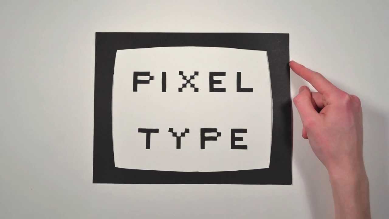
Susan Kare designed the bitmap fonts for the original Macintosh interface. Chicago, Geneva, Monaco. Each one hand-drawn on graph paper, pixel by pixel.
These weren’t just functional. They established an aesthetic that made the Macintosh feel approachable and human in ways that other computers didn’t. Kare is now recognized among the most influential graphic designers of the digital era.
Emigre and the Experimental Digital Type Movement
Zuzana Licko and Rudy VanderLans launched Emigre magazine in 1984. Licko designed typefaces that worked with the Macintosh’s low resolution rather than fighting against it.
Her early bitmap fonts (Oakland, Emigre, Emperor) didn’t try to imitate traditional type. They accepted the pixel grid as a design constraint and worked within it. The results looked nothing like anything from the phototypesetting era.
Emigre became the testing ground for a generation of digital type designers who questioned every assumption about what a glyph should look like.
OpenType and Font Format Standardization
Before OpenType, the font world was split between TrueType and PostScript Type 1. Adobe controlled Type 1. Apple developed TrueType in the late 1980s and licensed it to Microsoft. Designers had to pick sides.
In 1996, Adobe and Microsoft announced they would jointly develop OpenType. The first public specification shipped in April 1997.
What OpenType solved:
- Cross-platform compatibility (same file on Mac and Windows)
- Support for over 65,000 glyphs per font (vs. 256 for older formats)
- Advanced layout features like ligatures, small caps, and contextual alternates
- Full Unicode support for multilingual type design
By 2007, an estimated 85 to 90% of all fonts sold were in OpenType format, according to Prepressure. Adobe completed converting its entire font library to OpenType around 2003 and stopped shipping new Type 1 fonts from 1999 onward.
Web Typography and Screen-First Design

For the first decade of the web, type was barely a design decision. You got Times New Roman, Arial, Verdana, Georgia, and whatever else was installed on the user’s computer. That was it.
The @font-face Breakthrough
CSS2 introduced the @font-face rule back in 1998, and Internet Explorer 4 was the first browser to implement it. But with no licensing protection and slow dial-up connections, it went nowhere for over a decade.
Everything changed in 2009. Safari and Firefox added @font-face support. Jeffrey Veen launched Typekit in May 2009, providing a licensed hosting service for web fonts. The WOFF format, developed by Mozilla’s Jonathan Kew and type designers Erik van Blokland and Tal Leming, gave the industry a compressed, web-friendly font format.
Google Fonts launched in 2010 and made hundreds of open-source typefaces available for free. HTTP Archive’s 2025 Web Almanac reports that web fonts now appear on roughly 88% of websites.
Variable Fonts and Performance
On September 14, 2016, Adobe, Apple, Google, and Microsoft jointly announced OpenType 1.8 at the ATypI conference in Warsaw. The big feature: variable fonts.
A single variable font file can contain an entire family’s worth of weights, widths, and optical sizes. Instead of loading six separate files for Regular, Italic, Bold, Bold Italic, Light, and Light Italic, you load one.
HTTP Archive’s 2024 data shows variable fonts are now used on 33% of websites, up from about 11% in 2020. Google Fonts serves 92% of all variable fonts on the web.
Typography on Mobile Devices
Smaller screens forced real changes in how type works. Line lengths shorten. Touch targets need space. Readability at arms-length viewing distance matters more than it does on a desktop monitor.
Apple built San Francisco specifically as a system typeface for screens. Google developed Roboto for Android. Both are designed with generous x-heights and open counters for readability at small sizes.
Toner Buzz data shows that 85% of websites now prefer sans-serif fonts, partly because of their performance on mobile screens where every pixel of legibility counts.
Key Typeface Classifications and How They Developed
Every typeface classification maps to a specific historical period and cultural moment. The names can feel arbitrary if you don’t know the backstory, so here’s the quick version.
| Classification | Period | Key Traits | Example |
|---|---|---|---|
| Old Style | 15th–17th century | Low contrast, angled stress, bracketed serifs | Garamond, Caslon |
| Transitional | 18th century | Higher contrast, vertical stress | Baskerville, Times New Roman |
| Modern / Didone | Late 18th century | Extreme contrast, hairline serifs | Bodoni, Didot |
| Slab Serif | 19th century | Heavy, block-like serifs | Rockwell, Clarendon |
Sans-Serif Sub-Groups
Sans-serif is not one category. It’s at least four, and they behave differently.
Grotesque: The earliest sans-serifs, dating from the 1800s. Slightly irregular in stroke width. Akzidenz-Grotesk (1898) is the reference point.
Neo-Grotesque: Cleaned-up grotesques with more uniform strokes. Helvetica and Univers both fall here.
Geometric: Built from circles, squares, and straight lines. Paul Renner’s Futura (1927) is the benchmark. The “o” is a near-perfect circle.
Humanist: Based on the proportions of Roman inscriptions and handwriting. Eric Gill’s Gill Sans (1928) and Hermann Zapf’s Optima (1958) blend sans-serif simplicity with organic, calligraphic warmth.
Understanding these distinctions matters for pairing fonts effectively. A geometric sans next to a Didone serif creates a specific tension. A humanist sans with an old-style serif feels cohesive. The psychology behind font choices goes back to these structural differences.
Typography as a Cultural and Political Force
Type choices carry meaning beyond aesthetics. They always have. Some of the most interesting moments in typographic history have nothing to do with design and everything to do with power.
Blackletter and National Identity
Germany used blackletter (specifically Fraktur) as its standard printing script well into the 20th century, long after the rest of Europe had moved to Roman type.
The Nazi regime initially promoted blackletter as authentically German. Then, in January 1941, Martin Bormann issued a decree banning Fraktur from all official documents. The stated reason was that Fraktur was supposedly based on “Jewish letters.” The actual reason was likely more practical: Roman type was easier to read in the occupied territories.
After the war, Germany didn’t go back to blackletter. That political break became permanent.
Corporate Typography and Visual Identity
Edward Johnston’s typeface for the London Underground in 1916 was one of the first examples of a typeface built specifically for a corporate identity. Every sign, poster, and map in the system used the same lettering.
That idea (one typeface across all touchpoints) became the foundation of modern brand typography. Companies today spend significant resources developing custom typefaces. Apple, Google, Netflix, IBM all commission proprietary fonts.
Consistent font usage can increase brand recognition by up to 80%, according to Linearity’s analysis of effective logo and brand design practices.
Accessibility and Inclusive Type Design
Readability research has pushed type design in new directions. Dyslexia-friendly fonts like OpenDyslexic use weighted bottoms on letterforms to reduce visual confusion between similar characters like “b” and “d.”
Monotype’s 2024 survey found that 76% of designers now prioritize readability and accessibility when selecting fonts. That’s a shift from even a decade ago when aesthetics drove most decisions.
The W3C’s Web Content Accessibility Guidelines (WCAG) now include specific guidance on text rendering, color contrast ratios, and minimum type sizes. Typography and accessibility aren’t separate conversations anymore.
FAQ on History Of Typography
When did typography begin?
Typography’s roots go back to ancient writing systems like cuneiform and hieroglyphs. But movable type started around 1040 AD when Bi Sheng created ceramic characters in China during the Song Dynasty, centuries before Gutenberg’s press.
Who invented the printing press?
Johannes Gutenberg built the first metal movable type printing press in Mainz, Germany, around 1440. His system combined a hand mould, oil-based ink, and a screw press adapted from wine production.
What is the difference between a typeface and a font?
A typeface is the overall design (like Garamond). A font is a specific variation within that design, such as Garamond Bold 12pt. One typeface can contain dozens of individual fonts.
What was the first sans-serif typeface?
The first recorded sans-serif appeared around 1816, often credited to William Caslon IV. It was initially called “grotesque” because readers found the absence of serifs strange and unsettling at the time.
How did the Bauhaus movement influence typography?
The Bauhaus school in 1920s Germany pushed for functional, stripped-down letterforms. Herbert Bayer and Jan Tschichold promoted asymmetric layouts and sans-serif type, ideas that shaped modernist design for the rest of the century.
Why is Helvetica so widely used?
Max Miedinger and Eduard Hoffmann designed Helvetica in 1957 as a neutral, highly legible typeface. Its lack of personality made it adaptable across industries. BMW, NASA, and Target all use it in their branding.
What is OpenType?
OpenType is a font format developed jointly by Adobe and Microsoft in 1996. It unified TrueType and PostScript Type 1, supporting over 65,000 glyphs and cross-platform compatibility in a single file.
When did web fonts become possible?
CSS2 proposed the @font-face rule in 1998, but reliable browser support didn’t arrive until 2009. Typekit launched that year, and Google Fonts followed in 2010, giving designers free access to hundreds of typefaces.
What are variable fonts?
Variable fonts use OpenType 1.8 technology (announced 2016) to pack multiple weights, widths, and styles into a single file. They reduce page load times and give designers fluid control over type rendering on screens.
How does typography affect branding?
Consistent font usage can increase brand recognition by up to 80%. Companies like Apple and Google commission custom typefaces to build distinct visual identities across every product and platform they touch.
Conclusion
The history of typography is a record of problem-solving. Each breakthrough, from Gutenberg’s hand mould to OpenType variable fonts, answered a specific technical or cultural need.
Punch cutters like Garamond and Bodoni shaped letterform evolution by hand. The Linotype machine made daily newspapers possible. Desktop publishing put typesetting power on every desk. And Google Fonts made quality type free for anyone building a website.
What ties it all together is function. Type exists to be read. The best typographic decisions, whether choosing a geometric sans-serif for a mobile interface or a transitional serif for a printed book, start with that.
Understanding where typeface design came from gives you better judgment about where to take it next. The tools keep changing. The principles behind readable, well-structured typographic hierarchy don’t.

Renowned for his expertise in logo design and visual branding, Bogdan has developed a multitude of logos for various clients.
His skills extend to creating posters, vector illustrations, business cards, and brochures. Additionally, Bogdan's UI kits were featured on marketplaces like Visual Hierarchy and UI8.
He also wrote in the past years on sites like Design Your Way, WebDesignerDepot, WPDean, Designmodo, Speckyboy, Slider Revolution, and more.
- How to Install Fonts on Mac (Step-by-Step Guide) - 20 September 2026
- From Mockup to Code: How AI-Augmented Development Speeds Up the Design Handoff - 19 September 2026
- The Beehiiv Logo History, Colors, Font, And Meaning - 18 September 2026

Bogdan Sandu is a seasoned designer who has been designing websites since 2008. Renowned for his expertise in logo design and visual branding, Bogdan has developed a multitude of logos for various clients. His skills extend to creating posters, vector illustrations, business cards, and brochures. Additionally, Bogdan's UI kits were featured on marketplaces like Visual Hierarchy and UI8. He also wrote in the past years on sites like Design Your Way, WebDesignerDepot, WPDean, Designmodo, Speckyboy, Slider Revolution, and more.
You Might Also Like


