The Eli Lilly logo is one of those designs that catches you off guard. You expect clinical precision from a pharma giant. Instead, you get a handwritten script in red ink that looks like it belongs on a perfume bottle or a fashion label. And that’s the point.
Eli Lilly and Company has been around since 1876. That’s nearly 150 years of making medicine, starting with malaria treatments and eventually producing the world’s first mass-manufactured insulin. The logo, based on founder Colonel Eli Lilly’s actual signature, has stayed remarkably consistent through all of it. It’s been refined, adjusted, and cleaned up over the decades, but the core idea has never changed.
The company is headquartered in Indianapolis, Indiana. It operates in 18 countries and sells products in about 125. We’re talking about a Fortune 500 company with a market cap that puts it among the most valuable pharmaceutical logos you’ll see on a stock ticker. And yet, the logo itself is just a word, written in cursive, in red. That simplicity has served the brand well across at least six major iterations since the early 1900s.
What Is the Eli Lilly Logo?
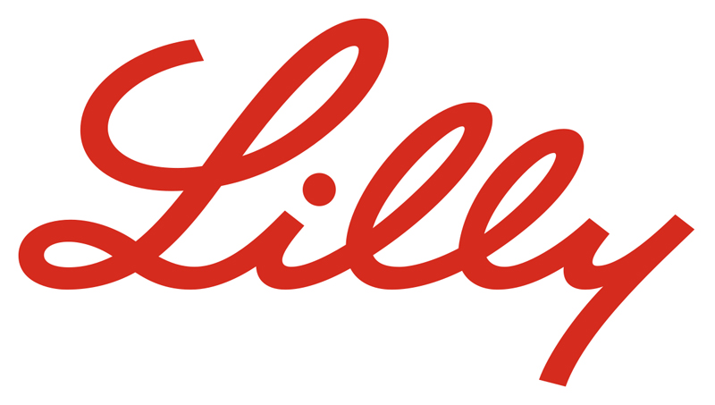
The Eli Lilly logo is a wordmark featuring a stylized cursive rendering of the word “Lilly,” based on founder Colonel Eli Lilly’s personal handwriting. Officially adopted around 1906, the logo uses bold red lettering on a white background. No design agency has been publicly credited. The signature represents heritage, personal accountability, and trust in pharmaceutical quality.
Here’s a breakdown of the key attributes:
- Design Type: Wordmark (cursive script)
- Primary Elements: Stylized handwritten inscription of “Lilly” with a decorative capital “L” featuring looped flourishes
- Official Introduction: The signature was first used on product labels from the company’s founding in 1876, then formally adopted as the corporate logo around 1906 following the Pure Food and Drug Act
- Designer/Agency: Based on Colonel Eli Lilly’s original handwriting. No external agency credited for the initial design. In-house refinements have been made over the decades.
- Trademark Status: Registered trademark of Eli Lilly and Company. The company holds over 3,400 trademarks with the USPTO.
- Color Palette: Primary color is Vivid Red (#D52B1E). The logo also appears in black or white for specific applications.
- Usage Context: Product packaging, prescription drug labels, corporate communications, digital platforms, marketing materials, investor documents, and the company’s favicon (which uses just the capital “L”)
How Has the Eli Lilly Logo Evolved Over Time?

The Eli Lilly logo has gone through roughly six versions since the late 1800s. Each revision refined the founder’s handwriting into a cleaner, more modern form. The changes have always been gradual, never drastic. The company treats its visual identity like its research pipeline: careful, methodical, and resistant to trends.
Original Eli Lilly Signature (1876-1906)
Colonel Eli Lilly personally signed each bottle of medicine his company produced. This wasn’t a logo in the formal sense. It was literally the man’s handwriting on a label.
The full name “Eli Lilly” appeared in an elegant cursive script, confirming authenticity and quality. Black ink on paper. Nothing fancy.
But this practice set the tone for everything that followed. The personal touch told customers there was a real person standing behind the product. That mattered in an era when quack remedies flooded the market.
- Years Active: 1876-1906
- Design Description: Full handwritten signature reading “Eli Lilly” in flowing cursive
- Color Scheme: Black ink on white/cream labels
- Designer: Colonel Eli Lilly himself
- Context: Used directly on product bottles as a personal quality guarantee
- Cultural Significance: Established the tradition of signature-based branding that the company still follows today
First Formal Logo (1906-1915)
The Pure Food and Drug Act of 1906 changed everything for pharmaceutical labeling in the United States. New regulations required manufacturers to list active ingredients and standardize their packaging.
Eli Lilly responded by turning the founder’s signature into an official, standardized emblem. Designers cleaned up the handwriting, making it more uniform while keeping the original character of Lilly’s penmanship.
The result looked almost too perfect. Every curve was smooth, every line measured. The decorative loop on the capital “L” became a defining feature. But the “y” at the end lost its loop, making it look a bit like the number “4.” A small quirk that actually added personality.
- Years Active: 1906-1915
- Design Description: Standardized cursive “Lilly” with refined strokes and a disconnected “L” from “i”
- Color Scheme: Black and white
- Context: Created in response to new FDA labeling requirements
- Key Changes from Previous: Shift from an actual personal signature to a standardized, reproducible design
Refined Script Version (1915-1940)
The 1915 version pulled back from perfection. Designers made the lettering slightly rougher, more organic. It looked less like a font and more like an actual person’s handwriting again.
The baseline of the word started curving gently upward toward the end. Thicker strokes gave the inscription more weight, though some legibility was lost. The two lowercase “l” characters looked almost like “e” letters, which was a problem that would persist through a few more versions.
Still black and white. The “L” remained separate from the “i,” functioning almost as its own design element with visual emphasis.
- Years Active: 1915-1940
- Design Description: Heavier strokes with an upward-curving baseline, rougher edges on letterforms
- Color Scheme: Black and white
- Key Changes from Previous: More organic, less idealized handwriting style. Thicker lines. Reduced legibility on lowercase letters.
- Cultural Significance: Reflected the company’s growth period, coinciding with expansion into research laboratories and new product lines
Elegant Thin Script (1940-1950)
This version went in the opposite direction. Thin, delicate strokes. The letterforms became sharper and more defined.
Designers outlined the edges of each letter to achieve smoother, more precise lines. The capital “L” reached a new level of decorative beauty with balanced loops at top and bottom. The “i” became more compact.
But those two lowercase “l” characters? Still too short. Still looking like “e” letters. The designers didn’t seem to mind, though. They treated it as a brand quirk that actually made the logo more unique.
- Years Active: 1940-1950
- Design Description: Light stroke width, defined edges, elegant capital “L” with balanced loops
- Color Scheme: Black and white
- Key Changes from Previous: Much thinner letter strokes. Cleaner edges. Restored horizontal baseline direction.
Modernized Script (1950-2000)
This is where things got cleaner. The letter proportions were finally corrected, with the two “l” characters stretched taller so they no longer resembled “e” letters.
The ends of the capital “L” were shortened. The top line no longer passed through the loop, and the lower portion stopped hanging over the “i.” The whole thing felt more balanced, more breathable.
The dot on the “i” was reduced and flattened diagonally, giving it a sense of movement. Small detail, but it added energy. This version kept the black-and-white palette for most of its run, though red started appearing in certain applications toward the later decades.
- Years Active: 1950-2000
- Design Description: Corrected letter proportions, balanced “L” flourishes, refined “i” dot placement
- Color Scheme: Primarily black and white, with red introduced later
- Key Changes from Previous: Fixed legibility issues with lowercase “l” letters. More proportional overall.
- Cultural Significance: Coincided with the company’s expansion into antibiotics, the introduction of Prozac, and growth as a global pharmaceutical leader
Current Eli Lilly Logo (2000-Present)
The 2000 redesign brought the logo to its current form. Red became the primary color. The word “Lilly” was refined into what feels like a single continuous stroke from the top of the “L” to the bottom of the “y.”
For the first time in decades, the “L” was connected to the “i.” That one change made the whole inscription feel unified, like one flowing movement rather than disconnected parts.
The second-to-last “l” was shortened to match the founder’s original signature more closely. But designers kept it tall enough that nobody would mistake it for an “e.” They found the right balance between historical accuracy and readability. The slant was increased slightly, and letter endings were made angular rather than rounded.
- Years Active: 2000-present
- Design Description: Unified cursive script with connected letters, increased slant, angular endings
- Color Scheme: Vivid Red (#D52B1E) on white background
- Key Changes from Previous: Connected “L” to “i.” Shorter second “l.” Increased letter slant. Angular rather than rounded endpoints. Full transition to red.
- Cultural Significance: Represents the company’s modern identity as a leader in diabetes care (Humalog, Mounjaro), oncology, and neuroscience
What Do the Design Elements of the Eli Lilly Logo Mean?
Every part of the Eli Lilly logo connects back to one idea: a real person created this company, and that person cared about what went into each bottle. The cursive script is the founder’s handwriting. The flowing lines communicate a human touch in an industry that can feel impersonal.
The decorative capital “L” serves as the focal point of the design. Its looped flourishes draw the eye first, then guide it through the rest of the word. The uniform stroke width across all letters creates a sense of continuity, as if the whole word was written in one unbroken motion.
Why Did Eli Lilly Choose These Specific Colors?

The red in the Eli Lilly logo wasn’t always there. For most of the company’s history, the logo was black and white. The shift to red happened gradually, with the current vivid red becoming standard around 2000.
Red is one of the most common colors in healthcare branding, and there’s good reason for that. According to color psychology, red signals energy, urgency, and life itself. Blood is red. Hearts are red. The connection to health is instinctive.
Here are the official color specifications:
- Vivid Red (Primary): Hex #D52B1E | RGB (213, 43, 30) | CMYK (0, 80, 86, 16) | Pantone PMS 485 C
- White (Background): Hex #FFFFFF | RGB (255, 255, 255)
- Black (Alternate): Used in monochrome applications where monochrome color reproduction is needed
The complementary relationship between red and white gives the logo strong contrast. You can spot it from across a pharmacy. That instant recognition is exactly what a drug company needs. Among collections of red logos, the Lilly wordmark stands out because of its handwritten quality in a field dominated by geometric, clinical marks.
What Typography Style Is Used in the Eli Lilly Logo?

The typography in the Eli Lilly logo is a custom cursive script derived from the founder’s handwriting. It’s not a commercially available typeface, though the closest match is probably Palm Canyon Drive Heavy.
The letterforms have a consistent slant and uniform stroke weight, which is unusual for handwriting-based logos. Most signature logos have variable thickness. Lilly’s doesn’t, and that makes it feel more modern while still reading as personal.
The x-height is relatively low compared to the capital “L,” which creates a clear typographic hierarchy within a single word. Your eye hits the “L” first, then drops to read the rest. Smart kerning between the characters keeps the word compact without feeling cramped.
What Are the Hidden Meanings in the Eli Lilly Logo?
There’s an interesting duality to the design. The cursive script looks more like something you’d find on a high-end cosmetics brand than on a bottle of insulin. That’s intentional, at least in effect. It makes the brand feel approachable, even warm.
The connected letterforms (introduced in the 2000 version) create the impression of an unbroken line. Start to finish. Beginning to end. In a healthcare context, that can read as continuity of care.
The looped “L” is doing double duty. It’s decorative, sure. But it also contains the visual DNA of the brand. Without it, the word “Lilly” could be anything. With it, it’s only one company.
How Does the Eli Lilly Logo Compare to Competitor Logos?
The pharmaceutical industry leans heavily toward clean, geometric, sans-serif wordmarks. Most big pharma logos look like they were designed by the same committee on the same Tuesday afternoon. Eli Lilly’s cursive script is the exception, and it’s a significant one.
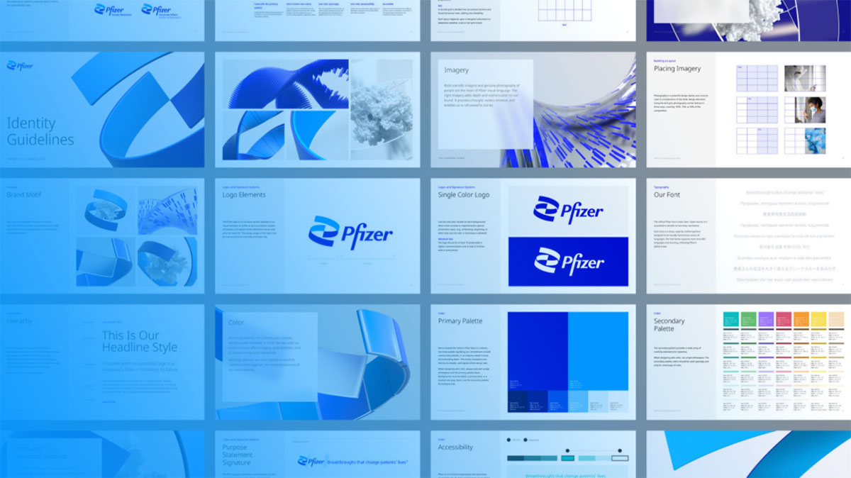
Look at the Pfizer logo. Clean sans-serif type in blue. Professional, but generic. The Novartis logo does the same thing with a different shade of blue. Merck goes with a teal-ish green. AstraZeneca uses a combination mark with a blue-purple gradient and geometric letterforms.
Johnson & Johnson is actually the closest comparison to Lilly. J&J also uses a script-based wordmark, though theirs feels more like a serif-influenced design than true cursive handwriting. Both brands share the strategy of using personal, human-feeling type to build trust in healthcare.
The Novo Nordisk logo, one of Lilly’s biggest competitors in the diabetes market, uses a bull symbol next to a sans-serif wordmark. Completely different approach. Roche keeps things minimal with a blue wordmark. Sanofi recently rebranded with a more modern look.
Where Lilly wins is memorability. You might mix up Pfizer and Novartis in a lineup. You’re not going to mix up Lilly with anything.
What Are the Technical Specifications of the Eli Lilly Logo?
Official Color Codes
- Primary Color (Vivid Red): Hex #D52B1E | RGB (213, 43, 30) | CMYK (0, 80, 86, 16) | Pantone PMS 485 C
- Background (White): Hex #FFFFFF | RGB (255, 255, 255) | CMYK (0, 0, 0, 0)
- Alternate (Black): Hex #000000 | RGB (0, 0, 0) | CMYK (0, 0, 0, 100)
Dimensions and Proportions
The logo maintains a roughly 2:1 aspect ratio (width to height). The capital “L” takes up about one-third of the total horizontal space, which is a lot for a single letter. But that’s how the visual hierarchy works here. The “L” is the anchor.
Eli Lilly requires a minimum clear space around the logo, typically equal to the height of the lowercase letters, to preserve readability. The logo is available in vector format (SVG) for scalability, and as pixel-based files (PNG) for digital use. A favicon version exists using only the capital “L” for smaller applications.
The company’s brand guidelines specify exact proportions and placement rules. These cover minimum size requirements, background color restrictions, and spacing from other visual elements.
What Cultural Impact Has the Eli Lilly Logo Had?

The Eli Lilly logo has become one of the most recognized marks in global healthcare. It’s appeared on products that changed medicine. Insulin. Prozac. The polio vaccine. Mounjaro.
That context matters. When people see this handwritten “Lilly” in red, they’re not just seeing a company name. They’re seeing decades of pharmaceutical breakthroughs attached to a single visual identity.
The logo’s influence on pharma branding is subtle but real. It proved that a pharmaceutical company doesn’t need to look clinical to be taken seriously. You can have warmth and authority at the same time. Not many companies in the industry have tried to follow that lead, which says something about how hard it is to pull off.
For people living with diabetes in particular, the Lilly logo is tied to a very specific emotional experience. Seeing it on an insulin pen or a Mounjaro injector means something personal. Took me a while to appreciate how much a simple wordmark can carry when it’s been on life-saving medication for a century.
How Does the Eli Lilly Logo Fit Into the Overall Brand Identity?

The logo sits at the center of a broader visual system that includes the company’s red color palette, its corporate typeface system, and a brand style guide that covers everything from packaging to digital ads.
Lilly’s sub-brands (Humalog, Trulicity, Mounjaro, Verzenio) each have their own visual identities, but they all connect back to the parent logo. The red wordmark appears on every product as a seal of origin.
In recent years, the company has adapted the logo for digital-first environments. The favicon version (just the “L”) works in browser tabs and app icons. The full wordmark appears on the main website, corporate reports, and print materials.
The overall brand identity leans into storytelling. The signature-style logo tells the story of a company founded by one person with a clear mission. Everything else, from the color choices to the typographic elements, supports that same narrative.
How Should the Eli Lilly Logo Be Used?
Eli Lilly maintains strict trademark protection over its logo. Here’s what you need to know if you’re working with it or referencing it:
- Do: Use the official logo files from Eli Lilly’s brand resources. Maintain minimum clear space. Place on approved background colors (white preferred).
- Don’t: Alter the logo’s proportions, change its colors outside approved variations, add effects like drop shadows or gradients, or place it on busy backgrounds that reduce legibility.
- Official Logo Access: Brand assets are available through Eli Lilly’s corporate communications team and select brand asset platforms like Brandfetch.
- Licensing: The Eli Lilly logo is a registered trademark. Unauthorized commercial use is prohibited. Editorial and informational use is generally permitted with proper attribution.
- Trademark Protection: Eli Lilly and Company holds thousands of registered trademarks with the USPTO. The “Lilly” wordmark and its visual representation are actively protected.
If you’re a designer working on anything that involves the Lilly logo, get the official files. Don’t try to recreate it. The curves and spacing are specific enough that even a close approximation will look off. Your mileage may vary, but I’ve seen enough botched attempts to know it’s worth the extra step of requesting proper assets.
FAQ on The Eli Lilly Logo
What does the Eli Lilly logo look like?
The Eli Lilly logo is a cursive wordmark spelling “Lilly” in bold red lettering on a white background. It’s based on founder Colonel Eli Lilly’s handwritten signature. The decorative capital “L” features looped flourishes that make the pharmaceutical company logo instantly recognizable.
When was the Eli Lilly logo first created?
Colonel Lilly’s signature appeared on medicine bottles starting in 1876. It became the official corporate emblem around 1906 after the Pure Food and Drug Act required standardized labeling.
The Lilly brand identity has roots in the company’s founding in Indianapolis, Indiana.
What font is used in the Eli Lilly logo?
The logo uses a custom cursive script derived from the founder’s actual handwriting. It’s not a commercial iconic font you can download. The closest match is Palm Canyon Drive Heavy, though only a few letterforms overlap. The uniform stroke width gives it a modern feel despite its handwritten origins.
What color is the Eli Lilly logo?
Vivid Red, hex code #D52B1E. That’s the primary color. Pantone equivalent is PMS 485 C.
The logo also appears in black or white for specific uses. Red was chosen for its association with health, energy, and life, which aligns with color theory principles used in healthcare branding.
Has the Eli Lilly logo changed over the years?
Yes, roughly six times. But every version kept the founder’s signature as its base. Changes were always refinements, not overhauls. Letter proportions, stroke thickness, and the connection between the “L” and “i” shifted across decades.
The current version dates to around 2000.
What does the Eli Lilly logo symbolize?
The handwritten script represents personal accountability and heritage. Colonel Lilly signed each bottle himself, and that tradition became the company’s visual identity. The signature connects a Fortune 500 pharmaceutical giant back to one person’s commitment to quality medicine.
Why does Eli Lilly use a signature-style logo?
Because that’s literally how the company branded its products from day one. The founder autographed labels to guarantee quality. Most tech company logos and pharma marks use geometric type. Lilly went the opposite direction, and it worked.
The approach sets Lilly apart from competitors like AbbVie or Amgen, which use standard corporate wordmarks.
Where can I download the official Eli Lilly logo?
Brand asset platforms like Brandfetch host the Lilly logo in SVG and PNG formats. For commercial use, you’d need to contact Eli Lilly and Company’s corporate communications team directly. The logo is a registered trademark with the USPTO, so unauthorized commercial use isn’t allowed.
How does the Eli Lilly logo compare to other pharma logos?
Most pharmaceutical brands use clean sans-serif wordmarks in blue. Bayer uses a cross pattern. Boehringer Ingelheim goes with a stylized emblem.
Lilly’s red cursive script stands alone in the industry. It reads more like a luxury brand than a drug manufacturer, which is exactly why people remember it.
Is the Eli Lilly logo trademarked?
Yes. Eli Lilly and Company holds over 3,400 trademarks with the United States Patent and Trademark Office. The “Lilly” wordmark is actively protected. Any reproduction for commercial purposes requires explicit permission from the company’s legal team in Indianapolis.
Conclusion
The Eli Lilly logo proves that a founder’s handwriting can outlast every design trend for over a century. Few corporate identities in the pharmaceutical industry carry that kind of staying power.
From Colonel Lilly’s hand-signed medicine bottles in 1876 to the red cursive wordmark on Mounjaro injectors today, the brand mark has only grown stronger. Each refinement sharpened the logo design principles without abandoning the original character.
The saturated red, the flowing script, the human touch. It all works because it’s rooted in something real.
That’s the lesson here. The best logos don’t chase what’s current. They hold onto what’s true.

Renowned for his expertise in logo design and visual branding, Bogdan has developed a multitude of logos for various clients.
His skills extend to creating posters, vector illustrations, business cards, and brochures. Additionally, Bogdan's UI kits were featured on marketplaces like Visual Hierarchy and UI8.
He also wrote in the past years on sites like Design Your Way, WebDesignerDepot, WPDean, Designmodo, Speckyboy, Slider Revolution, and more.
- Canva vs PowerPoint: Which Is Better for Presentations? - 22 September 2026
- How to Install Fonts on Mac (Step-by-Step Guide) - 20 September 2026
- From Mockup to Code: How AI-Augmented Development Speeds Up the Design Handoff - 19 September 2026

Bogdan Sandu is a seasoned designer who has been designing websites since 2008. Renowned for his expertise in logo design and visual branding, Bogdan has developed a multitude of logos for various clients. His skills extend to creating posters, vector illustrations, business cards, and brochures. Additionally, Bogdan's UI kits were featured on marketplaces like Visual Hierarchy and UI8. He also wrote in the past years on sites like Design Your Way, WebDesignerDepot, WPDean, Designmodo, Speckyboy, Slider Revolution, and more.
You Might Also Like